A B S T R A C T I O N
abstract
adjective
ˈabstrakt/
adjective
ˈabstrakt/
- existing in thought or as an idea but not having a physical or concrete existence.
"abstract concepts such as love or beauty"
synonyms:theoretical, conceptual, notional, intellectual, metaphysical, philosophical, academic - relating to or denoting art that does not attempt to represent external reality, but rather seeks to achieve its effect using shapes, colours, and textures.
"abstract pictures"
synonyms:non-representational, non-realistic, non-pictorial, symbolic, impressionistic
"abstract art"
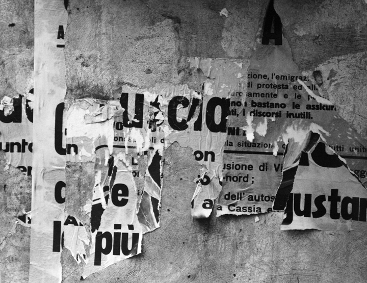
F R A N C O I S D E L F O S S E
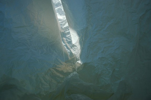
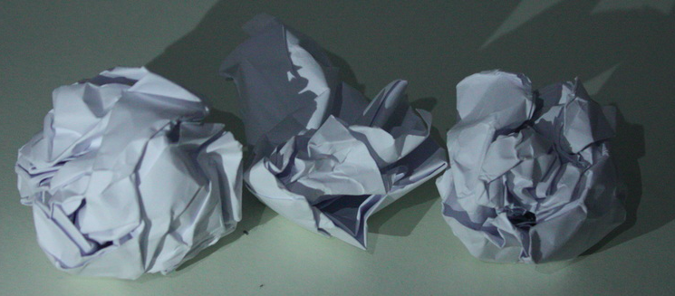
Belgium architect Francois Delfosse captures abstract images of the inside of crumpled up, used bags, trying to recreate images of Antarctica. He says that the images were taken in a "glacier cave just North of the South Pole", before adding that they are "viewed from the inside of a plastic bag". These three photographs are part of a series called "Antarctica In a Bag". Delfosse has captured the insides of plastic bags to try and recreate icy areas. He did this by creating appropriate lighting and positing the bags accordingly so that he could make them look similar the the caves of ice and creases of snow in Antarctica. All of these images are very similar to each other so they are not that interesting or unique, however they have been taken to precisely replicate Antarctica and don't look like plastic bags at all which is very clever and intriguing.

W H I T E P A P E R T A S K
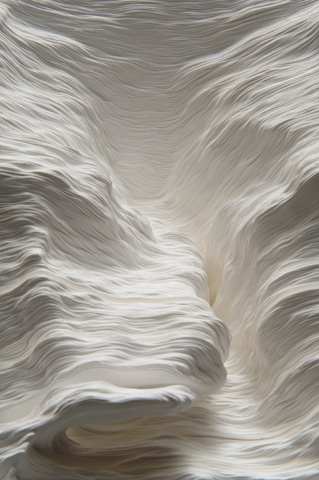
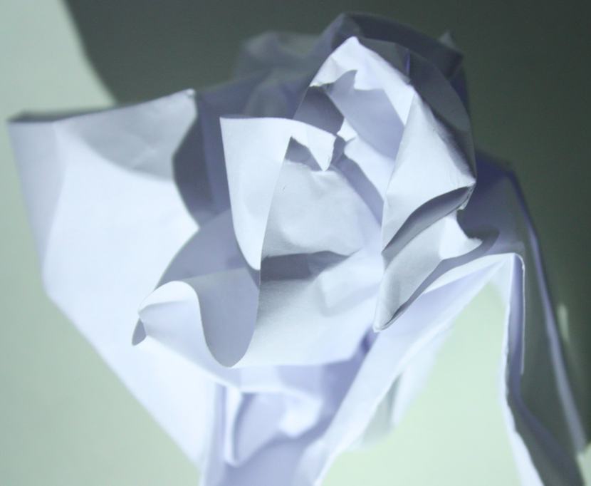
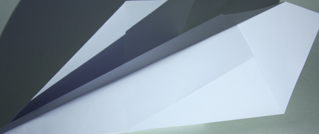
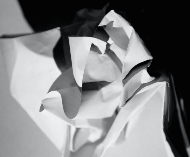
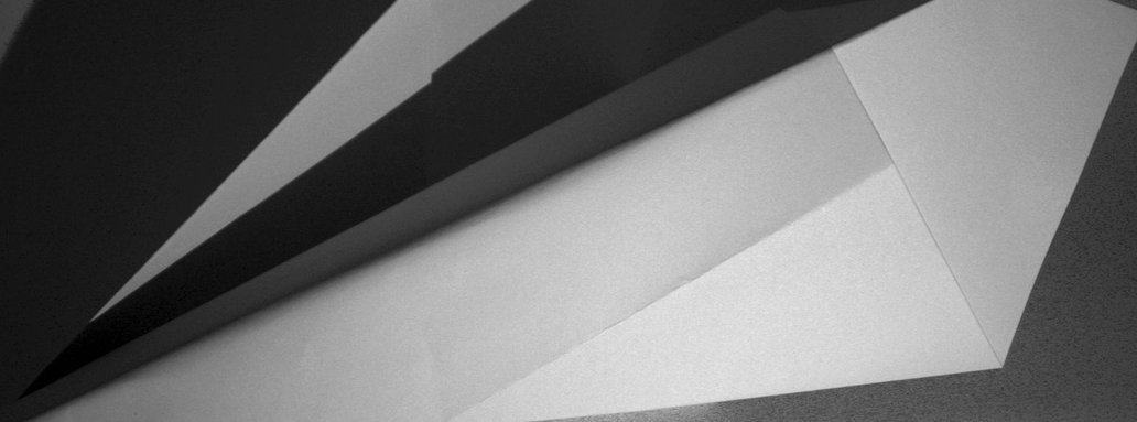
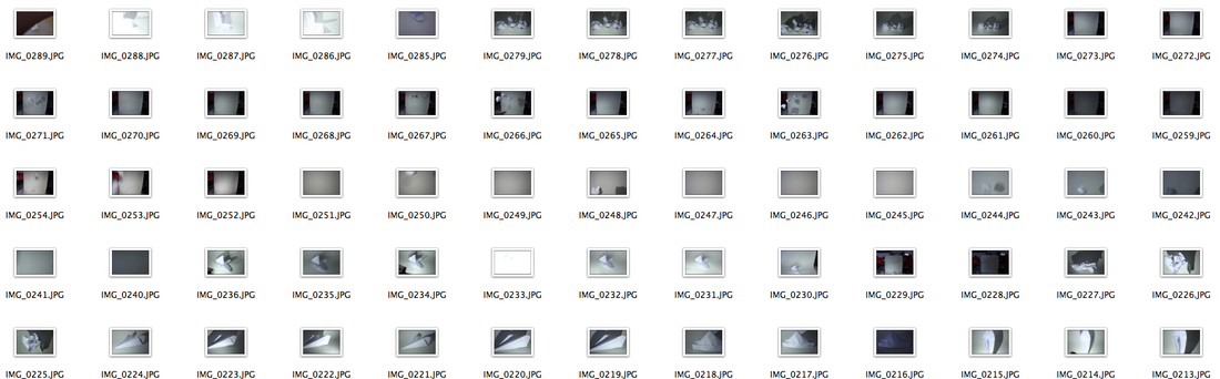
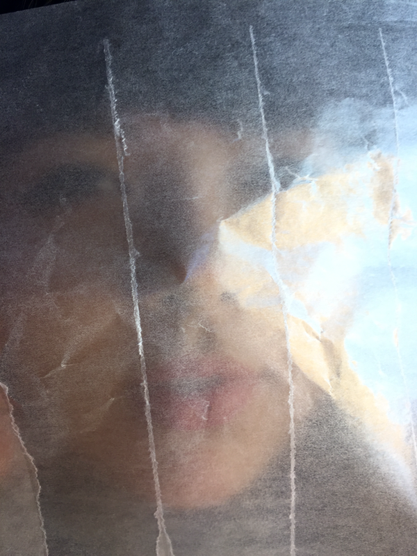
Unlike other visual art forms which begin with a blank space or surface that has to be filled by the artist, photography begins with a world full of information. The conventional job of the photographer is to select and capture a small portion of reality in a relatively faithful manner. For this task we had to take 24 images of white paper and crop them to make them look abstract. This was done using a white background and used torches on our phones to experiment with the shadows and make the images look more detailed and interesting, we also twisted and crumpled them in order to create a more abstract effect. I took the photos close up and far away for more variation. Once these abstract images were captured they were edited on photoshop to try and make them look even more abstract.
F I R S T R E S P O N S E
E D I T E D O N P H O T O S H O P

S E C O N D R E S P O N S E
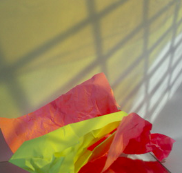
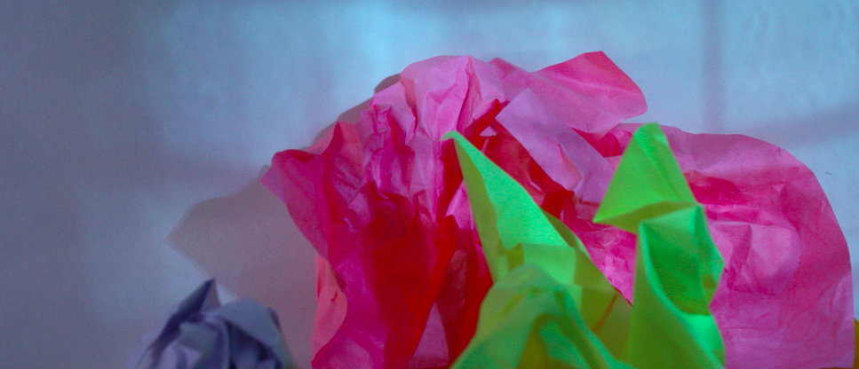
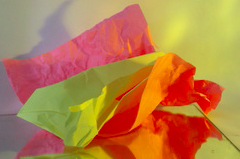
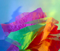
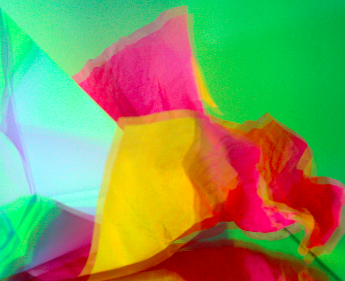
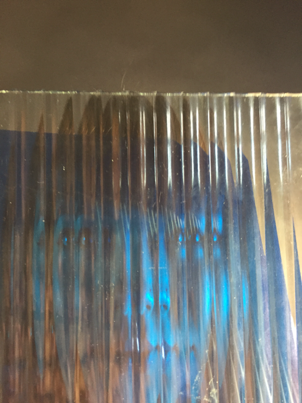
Continuing our experimenting with paper, we included coloured issue paper, card, glass, coloured acetate and mirrors to try and distort the images further. These created interesting patterns and colours on the background which when edited and cropped made abstract images.

E D I T E D O N P H O T O S H O P


A B S T R A C T T A S K
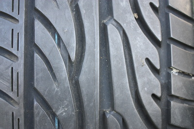
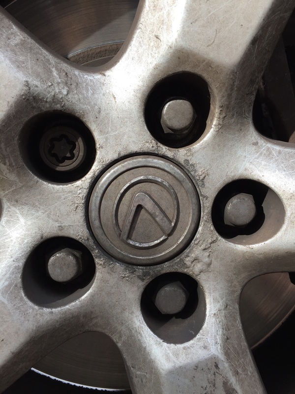
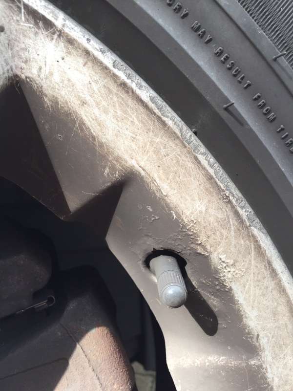
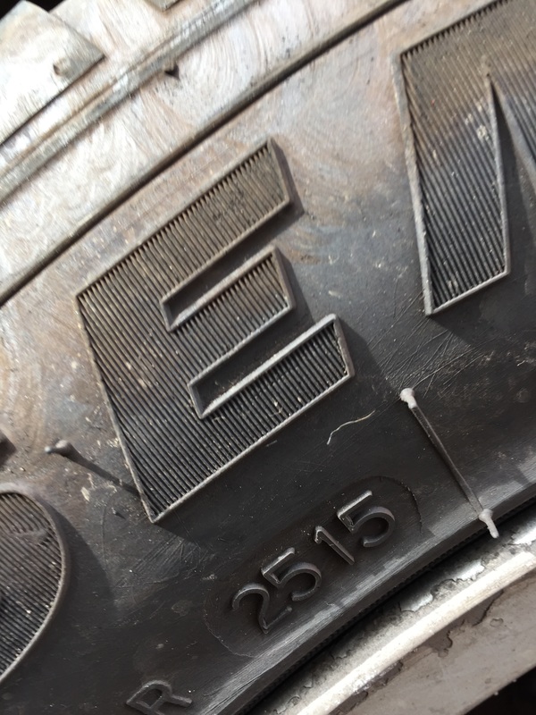
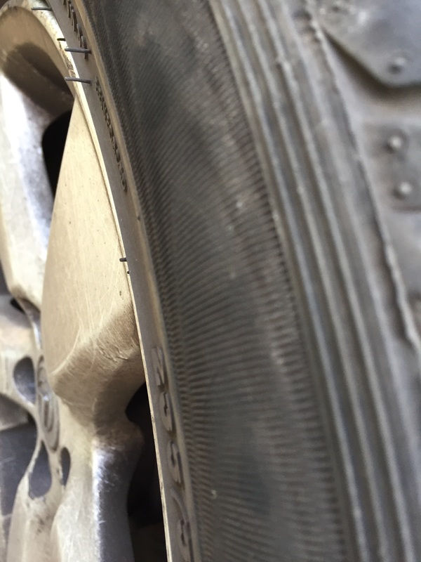
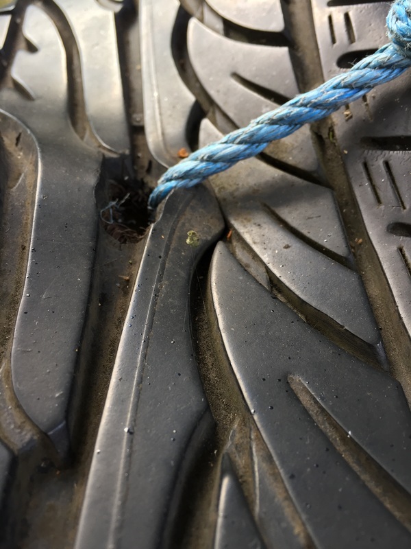
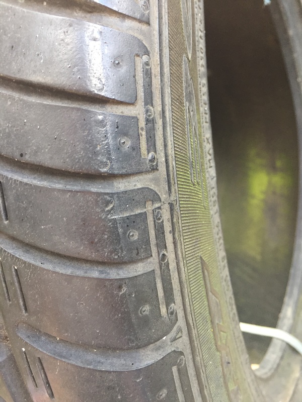
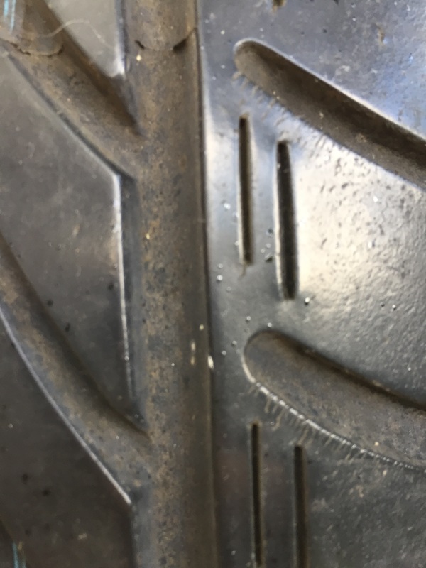
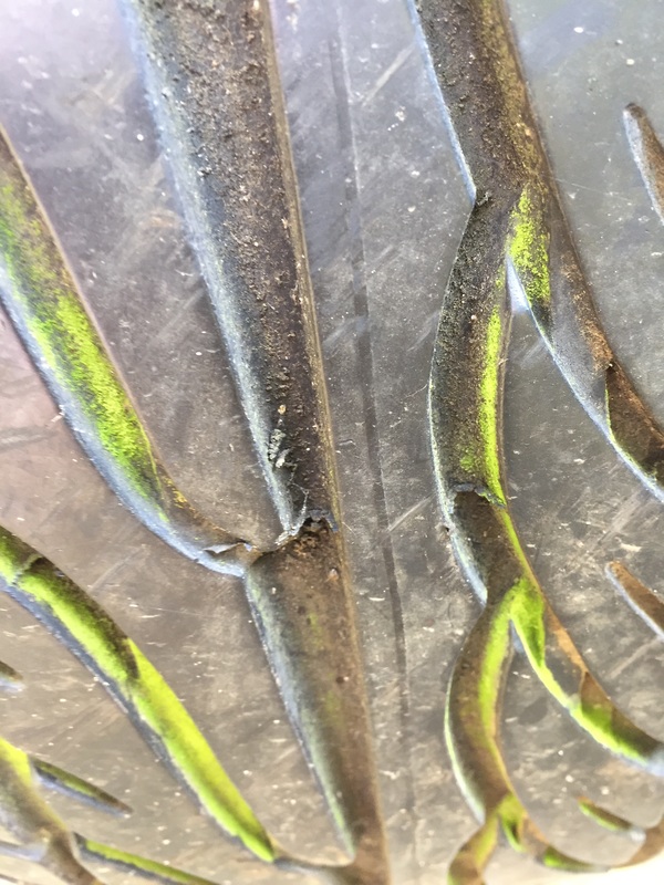
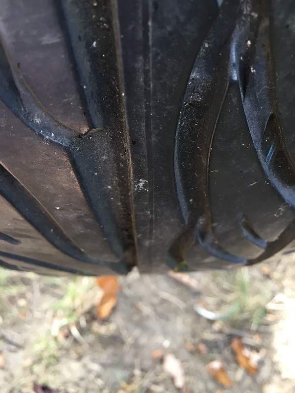
For this task we had to take a series of 24 images. I chose to take them of tyres as it was one subject I could take a series of photos of without drifting away from the task and take them of random things. Additionally, for my GCSE unit I had taken pictures of the formal elements and when I did this I emphasised on focus and pattern, the ones that turned out the best were the ones of the tyres so I replicated this.


A B S T R A C T I O N E X P E R I M E N T
For this task we had to chose one image to print out and distort it using a variety of techniques. Firstly, this image was printed out in black and white, in colour, and on acetate. Using the acetate, we developed this image onto photographic paper. It was developed in several different ways, we painted with developer, used bleach, painted on them and scratched the images. Below in the gallery are attempts of this, the middle image is the one I chose to put through different processes in order to create an abstract image.
O R I G I N A L I M A G E S
Below are my original prints of the photos I developed.
P R O C E S S E S
This image was produced by painting with developer, this created an abstract look. I then covered half the image with coloured acetate and uploaded it onto photoshop, I inverted the colours to turn it into a positive print and this also changed the green to pink. I enhanced the colours by used auto contrast and auto tone to make the images look much more vibrant.
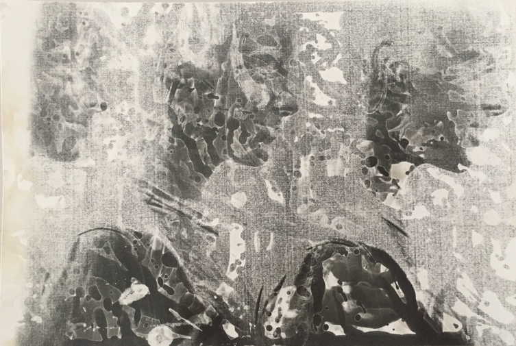


N E G A T I V E T O P O S I T I V E
Using 'cmd I' on photoshop the negative image produced from being developed in the darkroom was turned positive.
|
|
R E S P O N S E S O N P H O T O S H O P
I used photoshop to edit these responses. I used colour and painted on some, used the wave, liquefy and extrude tool to distort the images.
|
|

|
|
A B S T R A C T P O R T R A I T T A S K
Erwin Blumenfeld was a photographer and artist born in Germany. He was best known for his fashion photography published in Vogue and Harper's Bazaar in the 1940s and 1950s. He is regarded as one of the most influential photographers of the twentieth century. An experimenter and innovator, he produced an extensive body of work throughout his thirty-five year career including black and white portraits and nudes, celebrity portraiture, advertising campaigns and his renowned fashion photography. Blumenfeld drew early inspiration from the Dadaists, incorporating experimental techniques like solarization, multiple exposures, and photomontage into his darkroom practice.
E R W I N B L U M E N F E L D

M Y R E S P O N S E
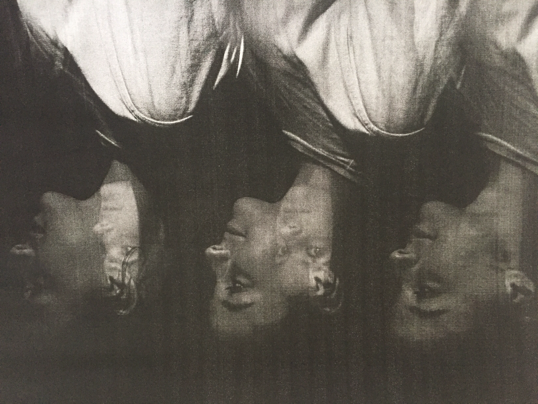
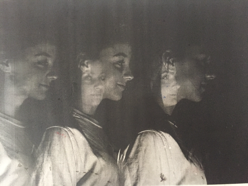
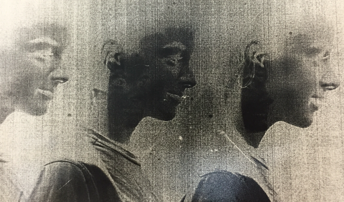
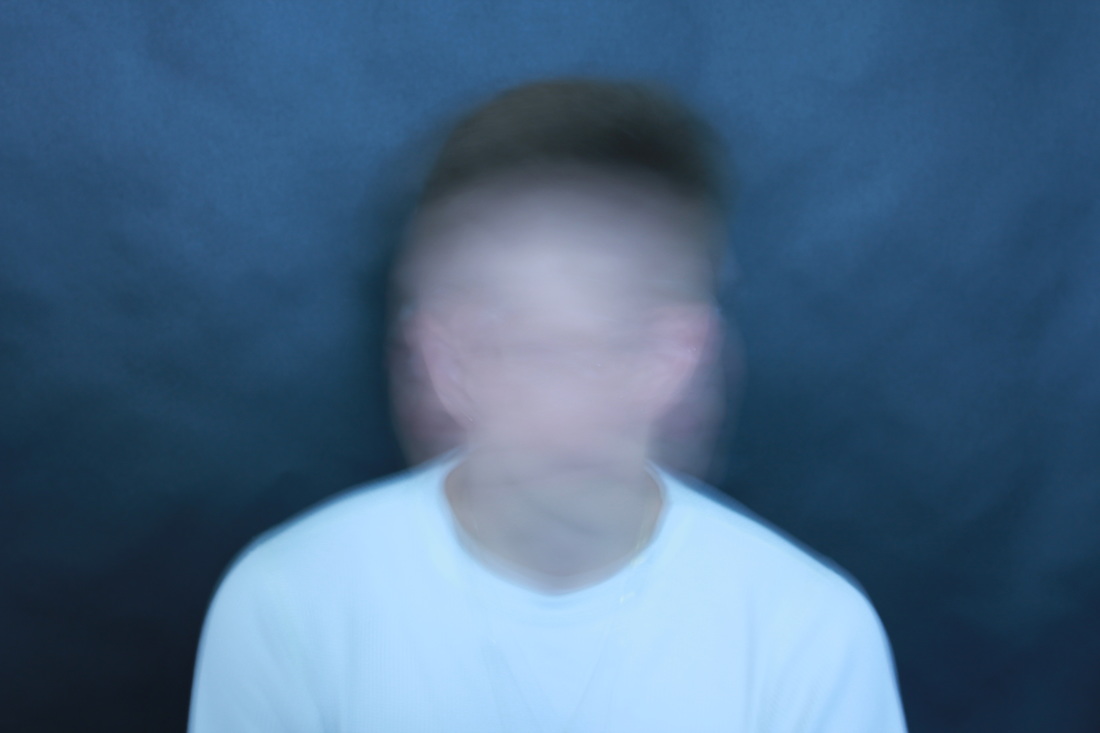
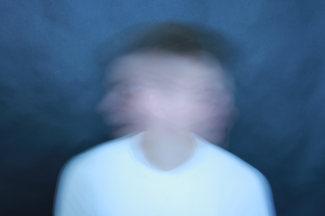
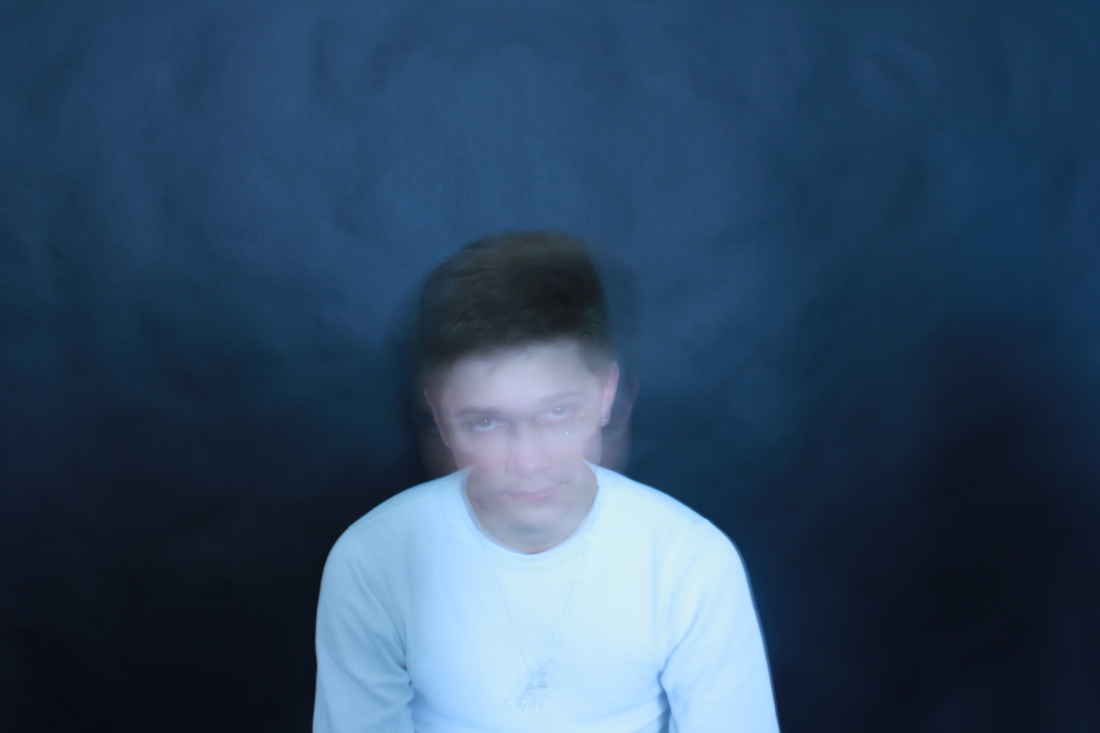
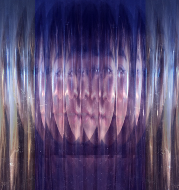
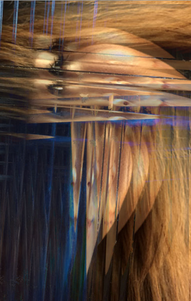
Using the work of Bill Jacobson and Erwin Blumenfeld as inspiration, we created abstract photos by using patterned glass, acetate and paper. We created several images and videos to try and replicate Blumenfeld's work. We then took more photos in order to capture the more blurred abstract effect of Jacobson. We used a slower shutter speed in order to blur the image and edited them all on photoshop. This involved using the lighten and free transform tool to flip the image and rotate them. We also changed the second series of images to black and white and changed the exposure levels.


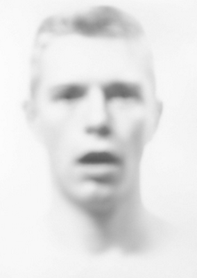
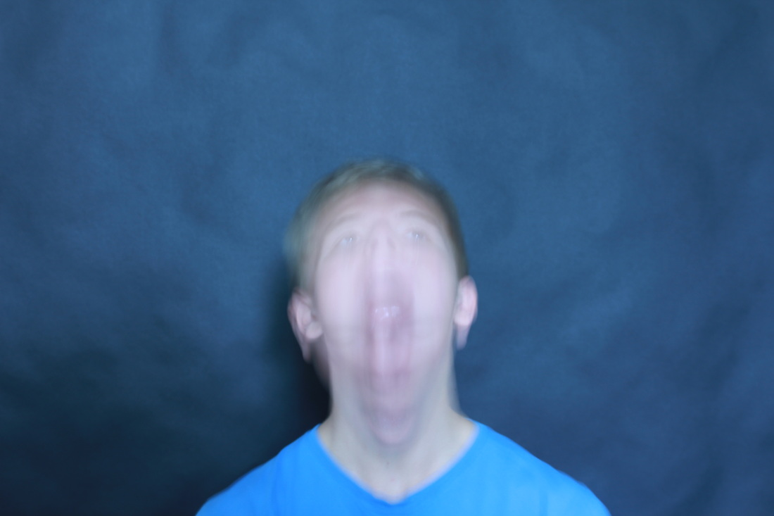
B I L L J A C O B S O N
Each photograph depicts a man’s face, its edges and features blurred and softened in a painterly style that reflected Jacobson’s preoccupation with loss and mortality in the early 1990s; themes closely tied to his observations of the AIDS epidemic. The faces are hard to grasp, difficult to discern as they recede into the white field of the photograph. Jacobson conveys the sense of futility in trying to capture a human likeness in memory or portraiture.
These – and other – ‘defocused’ monochromic images defined Jacobson’s early successes as a photographer. They were inspired, in part, by the artist’s fascination for early twentieth-century photography and the blurred or obscured subjects of the medium’s early pioneers. Collecting anonymous old snapshots at flea markets, Jacobson was interested in the ‘layers of time’ that these photographs revealed, and by their ability to transport the viewer back to the precise moment of their making, when the people, their lives and their surroundings were ‘current’.
These – and other – ‘defocused’ monochromic images defined Jacobson’s early successes as a photographer. They were inspired, in part, by the artist’s fascination for early twentieth-century photography and the blurred or obscured subjects of the medium’s early pioneers. Collecting anonymous old snapshots at flea markets, Jacobson was interested in the ‘layers of time’ that these photographs revealed, and by their ability to transport the viewer back to the precise moment of their making, when the people, their lives and their surroundings were ‘current’.


A R T I S T & M E
M Y R E S P O N S E |
E R W I N B L U M E F E L D |
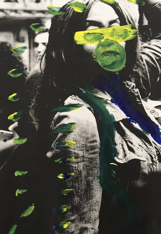
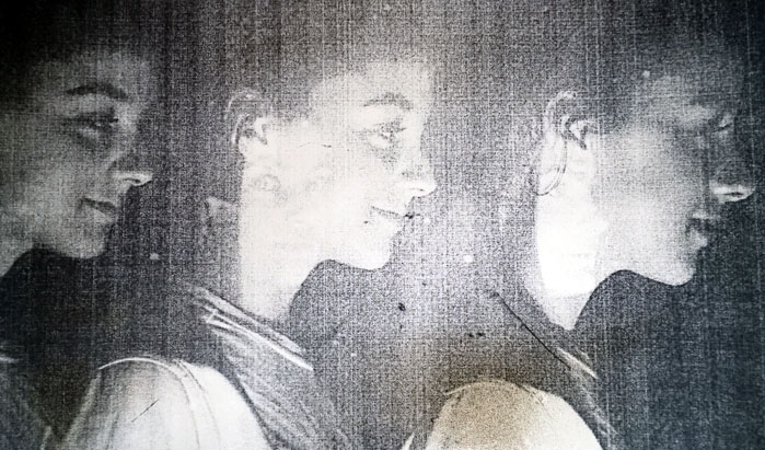
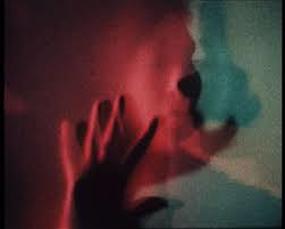
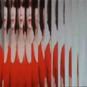
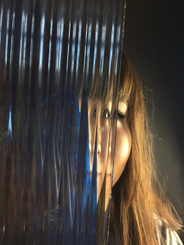
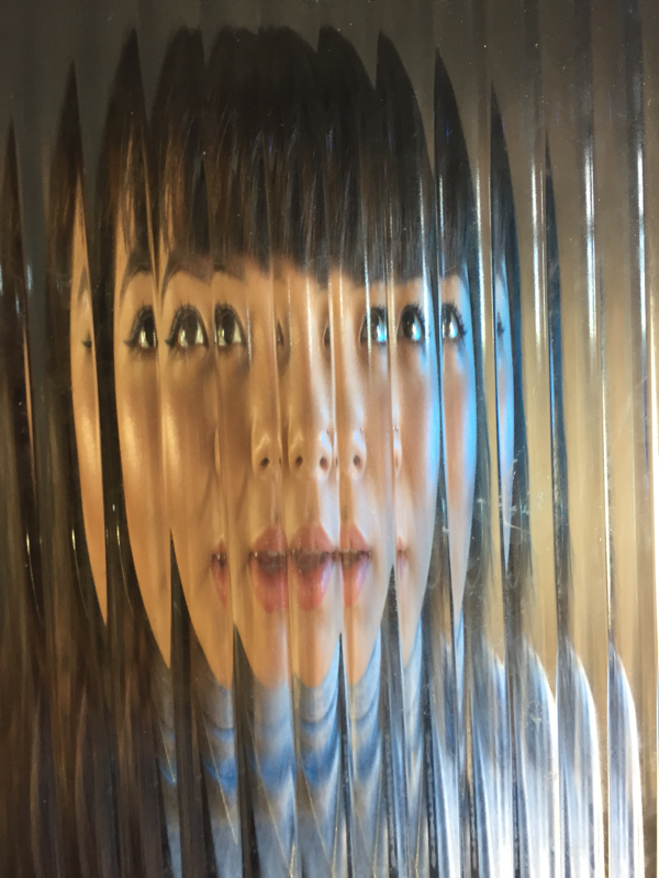
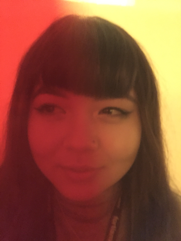
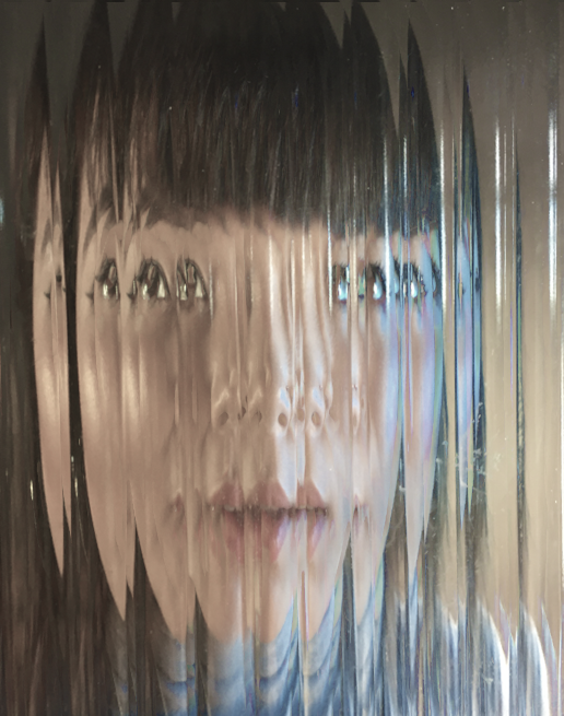
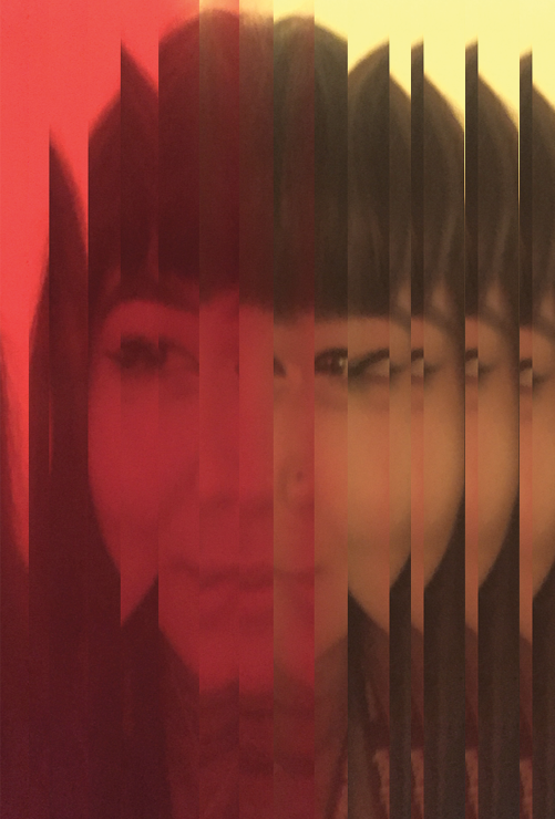
Blumenfeld's photo on the right reveals a woman wearing red, on the left of the image with slices of the image edited to make it took distorted and abstract. I tried to replicate this when taking my photos, I did this by using a red light to try and match the colours used in Erwin's work. Additionally I used photoshop and selected slices of this image, used free transfer and flipped them horizontally. I did this all through the image until I reached the end and copied and pasted the last flipped section of her face. I did this in the same direction that this occurred in Blumenfeld's work. In order to improve my photo, I could have used a clear background and captured more than just the face. This would show a greater contract with the red clothes and the background and would make the photo look more abstract.

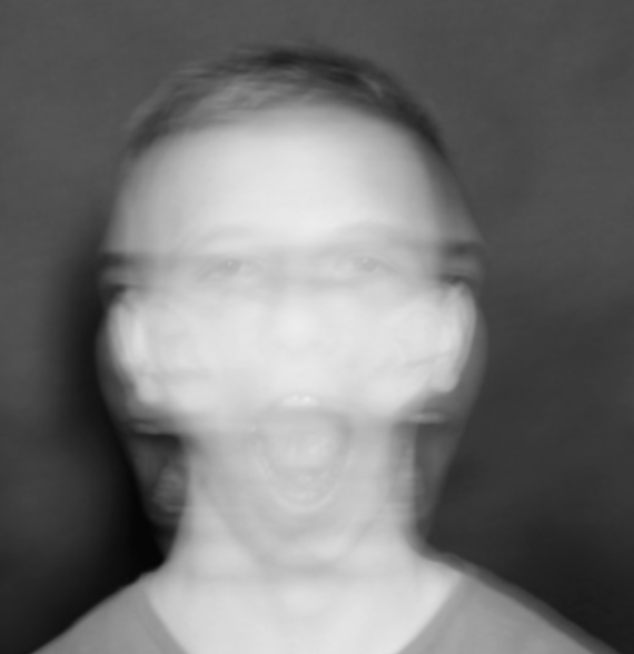
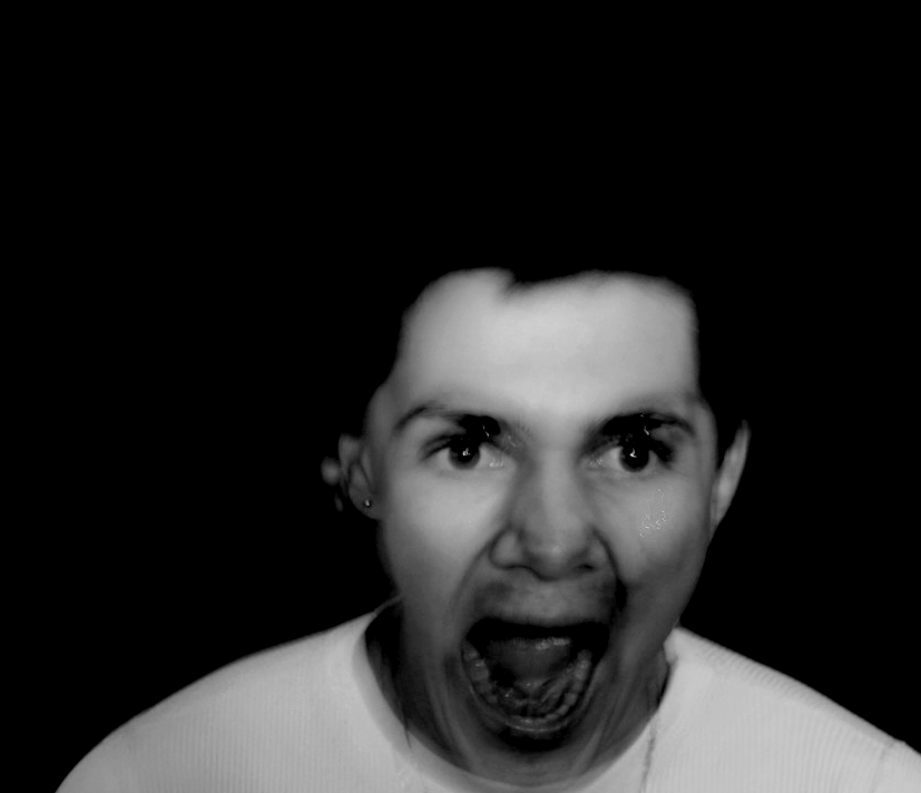
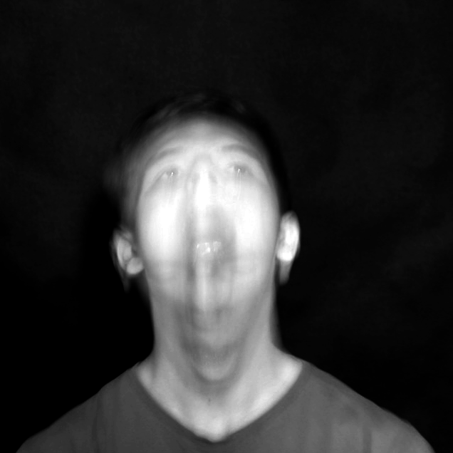
M Y R E S P O N S E |
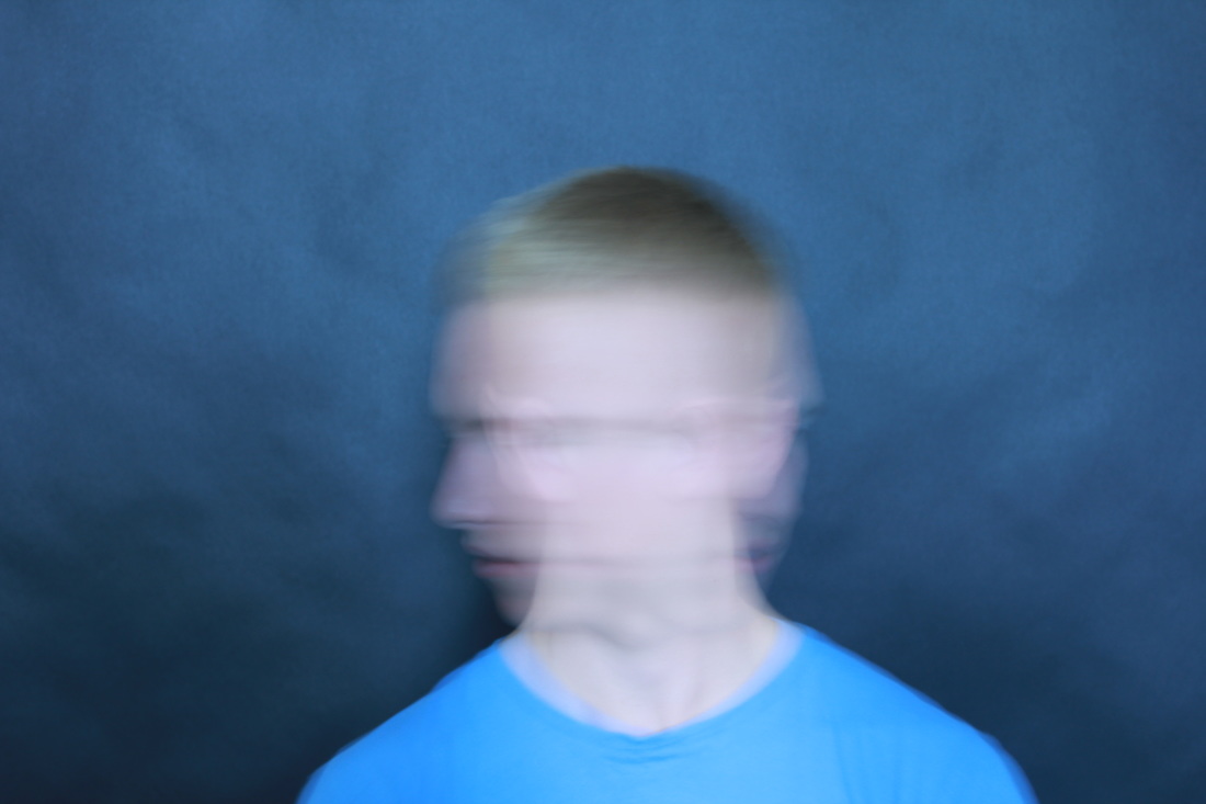
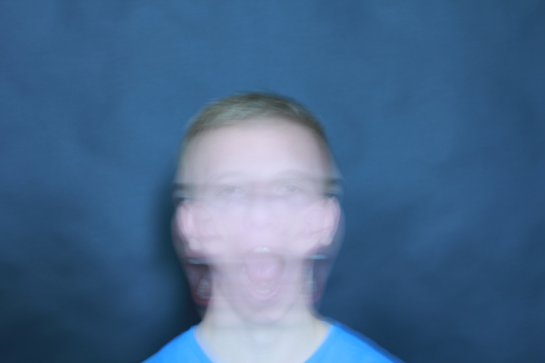
B I L L J A C O B S O N |
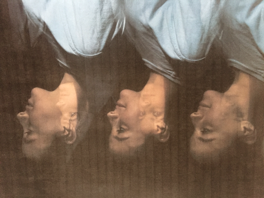
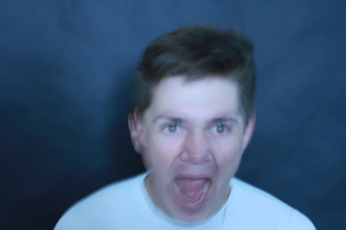
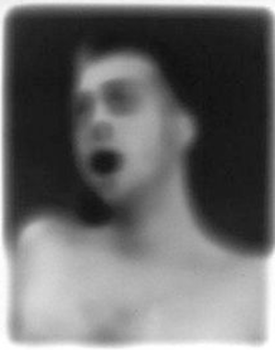
On the right is a photograph taken by Bill Jacobson. It shows a man looking slightly to the left with an open mouth, the background is black and the image is blurred. I tried to replicate this by photographing movement with the subject's mouth open and used photoshop to change it to black and white and changed the exposure levels until the image was dark. This aspect of the image is similar to Jacobson's work. Both subjects are in the centre of the composition, however in order to make my image more similar I would blur the photo much more on photoshop until a more abstract effect is acquired.

S A U L L E I T E R
Saul Leiter was an American photographer and painter whose early work in the 1940s and 1950s was an important contribution to what came to be recognized as the New York school of photography. Leiter was also a pioneer of color photography: He developed a distinctive, dreamy style that played with shallow depths of field and a vibrant palette. In his photos he captures his subjects through rainy windows or capturing a reflection in these windows
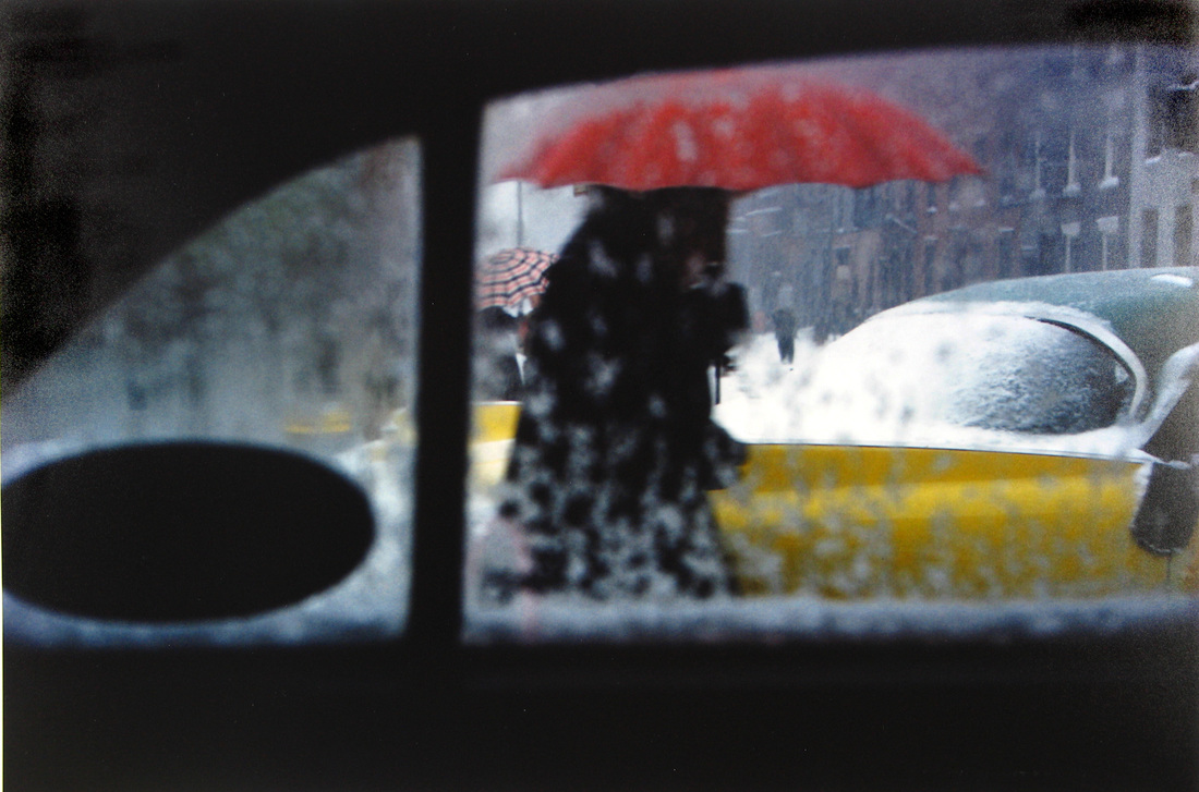
S E L E C T S
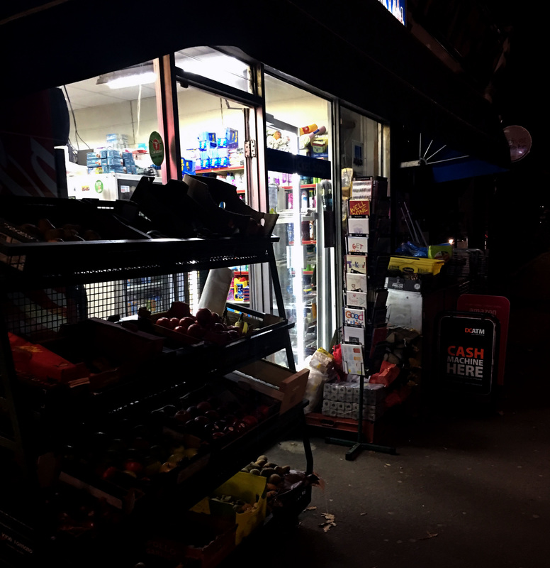
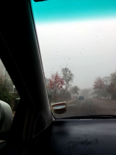
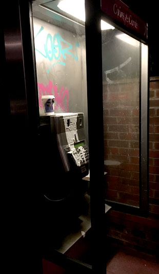
In order to respond to Leiter's work, I walked around Muswell Hill and Golders Green in order to try and capture photos similar to his. I took a couple in Golders Green when it was dark, and these came out best as they gave a more misty look and eerie feel compared to those taken in the day. The first image on the left is an example of this, like Leiter's the image is darker but also luminous at the windows. However, on my contact sheet the rest of the photos were taken in the day when it was sunny so the hazy effect wasn't acquired. As my photos didn't look quite like Leiter's I edited them on photoshop, adjusting the exposure and brightness levels. Although this did help my photos look more similar, they do look quite edited. In order to improve this I would go out and take photos on a day when it is raining and edit them less.
S E C O N D R E S P O N S E
For my second response I tried to take more varied pictures, I found whiter light in shops and took pictures when the weather was foggy/rainy - similar to Leiter's. Additionally, I edited them less on photoshop because they looked slightly fake and overly photoshopped.
3 STRANDS
For my 3 strands linking to the theme of abstraction, I have chosen to use close-up images, close up street abstraction and weaving and altering on photoshop. I'm doing this by exploring the works of other artists as well as looking through photography magazines for inspiration.
E D I E N A D E L H A F T
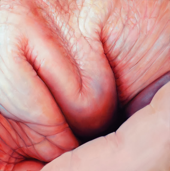
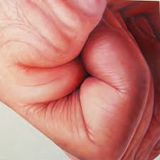
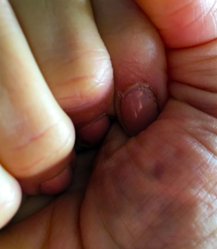
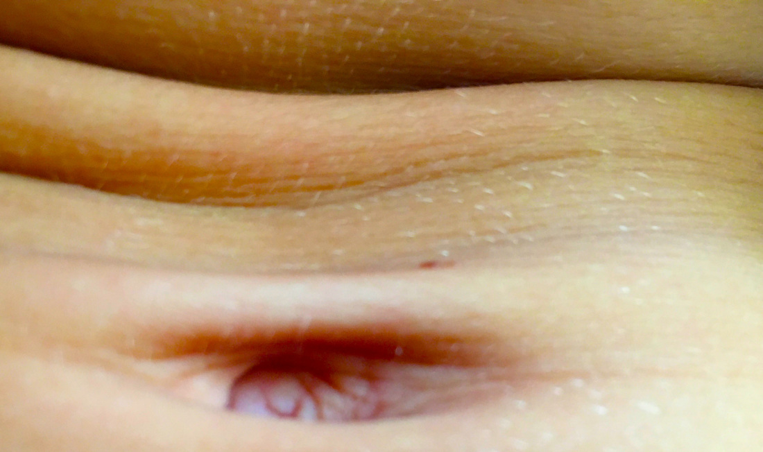
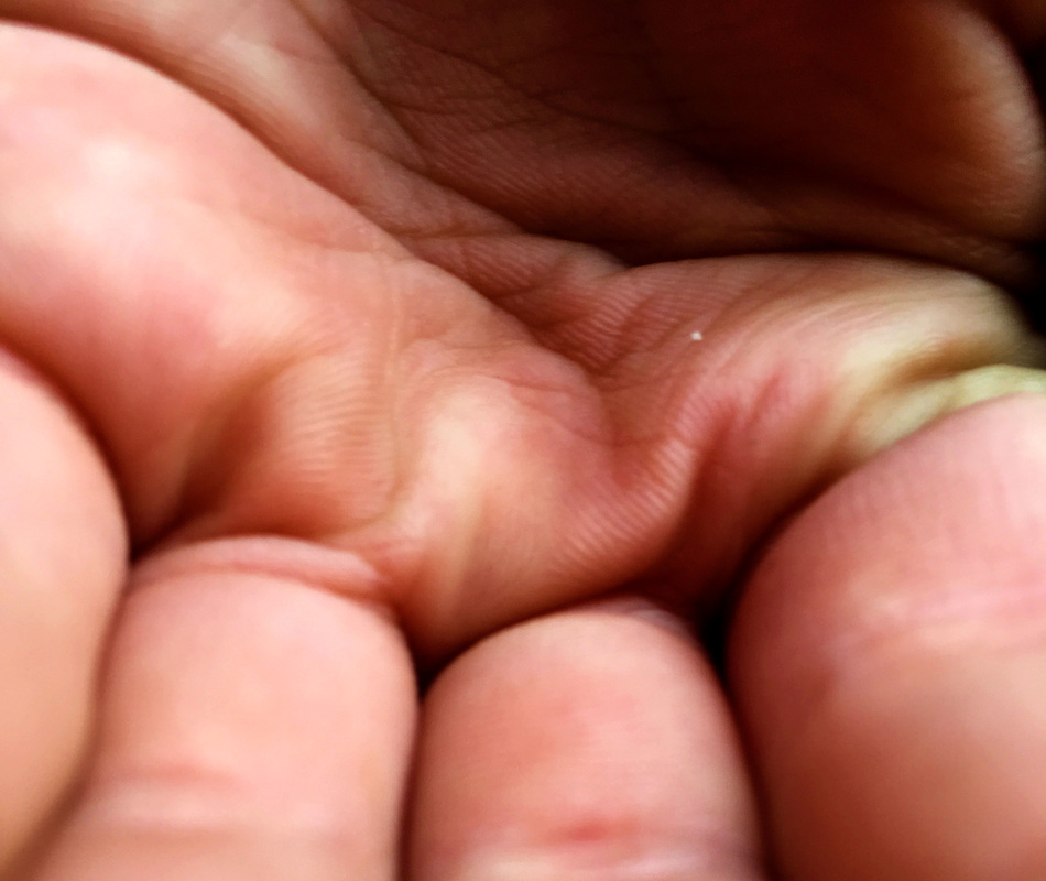
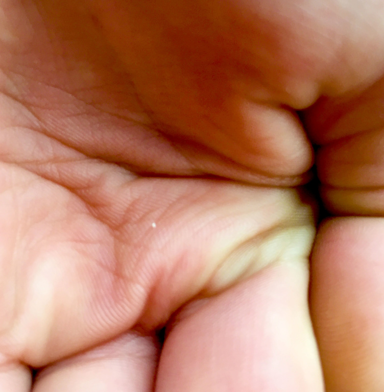
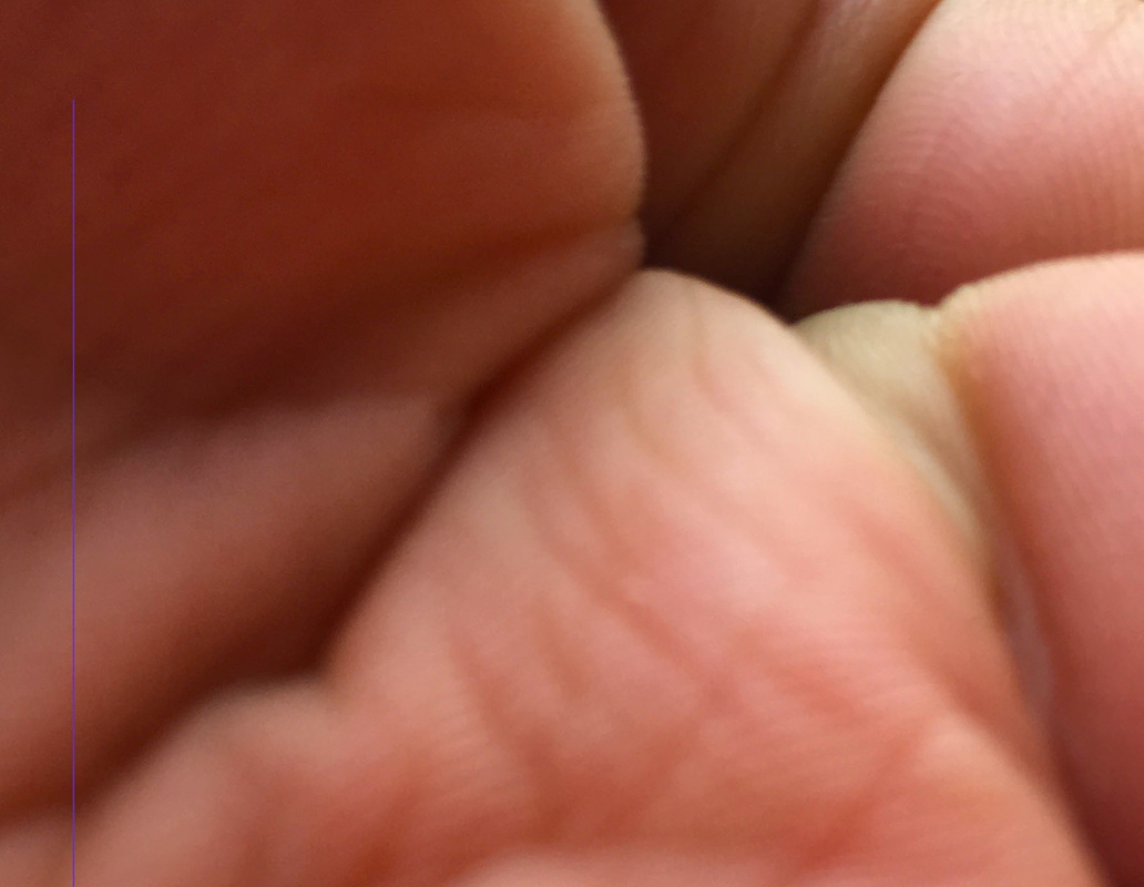
Edie Nadelhaft is a New York-based painter and mixed media artist whose work is inspired by a fascination with the physical world and thoughtful consideration of the impact of digital culture on visual and sensual experience. I chose this artist's work to respond to reflecting our topic of abstraction because of the intrigue and mystery of the images. At first glance you can't make out what the image is actually of, this is because of how close up the image is and creates a more abstract look. Although these are paintings, in order to respond to these images I took close up pictures of different parts of the body, or cropped my photos until it was harder to tell what it what they were of.
F I R S T R E S P O N S E
S E L E C T S
I found responding to Nadelhaft's work quite difficult as every photo I took, it was easy to identify which part of the body it was, unlike hers. My 3 selected photos show a stomach, and two hands. Although you can distinguish which parts of the body they are, I cropped them and changed the saturation and vibrance of them until they resembled the paintings above.

S E C O N D R E S P O N S E
S E L E C T S
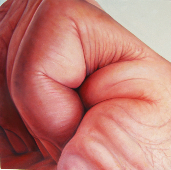
I decided to do a second response to Nadelhaft's work in order to refine my photos. In my first response I took pictures of different parts of the body, whereas Edie Nadelhaft mainly focused on the close up images of hands. I tried to improve my work by taking another series of photos and ensured I changed the focus points for each picture. Additionally, I used different levels of vibrance and saturation as my edited images from my first response were more yellow, whereas these are more similar to Nadelhaft's work.
street abstraction
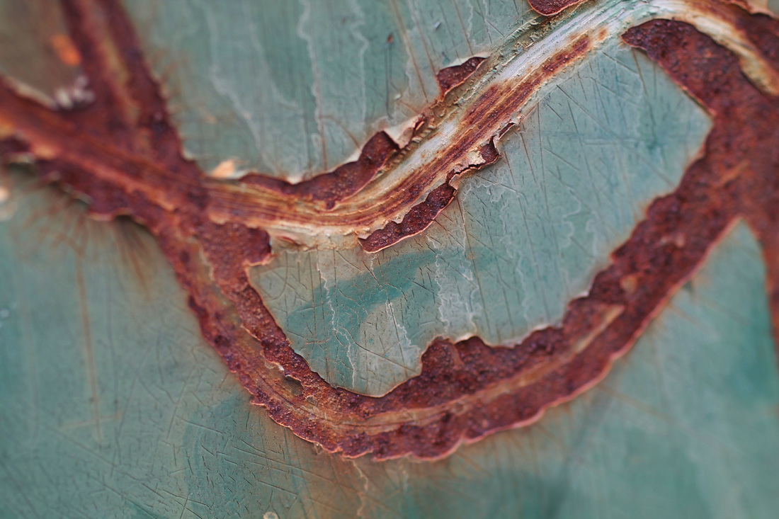
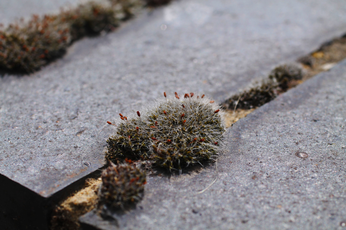
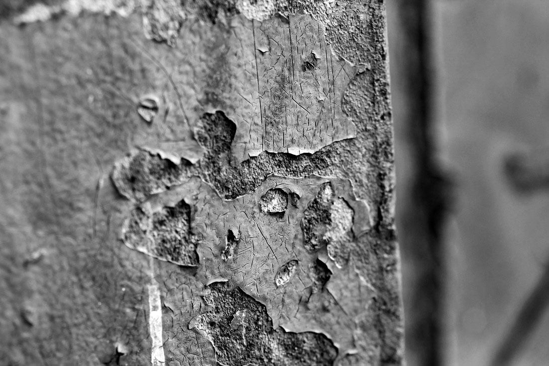
A A R O N S I S K I N D
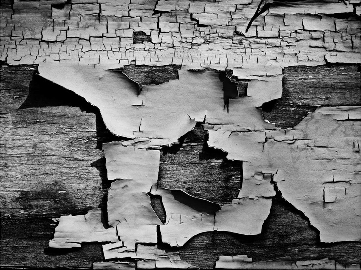
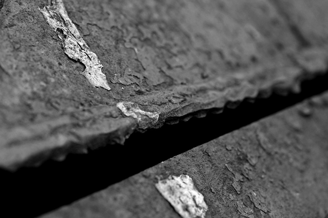
Aaron Siskind's early work as a social documentary photographer is best seen in his contributions to the Harlem Document (1932-40), a survey of life in Harlem. Siskind also identified with the ideas and styles of the Abstract Expressionist artists in New York in the 1940s. In these later photographs he continued to emphasize the modernist concern with the flatness of the picture plane, but intensified his approach to picture making - with close-up framing, as well as emphasis on texture, line, and visual rhymes - creating abstract images of the real world.

F I R S T R E S P O N S E
I went to locations that displayed signs of decay, such as rust, moss and overrown vegetation, mould and peeling surfaces. In order to capture these images in high focus I used a macro lens which allowed clear up close images. The angles of the pictures taken vary and I tried to take pictures of a different textures/patterns each time to try and replicate Siskind's work. I also tried to make each photo different in order to show variation.

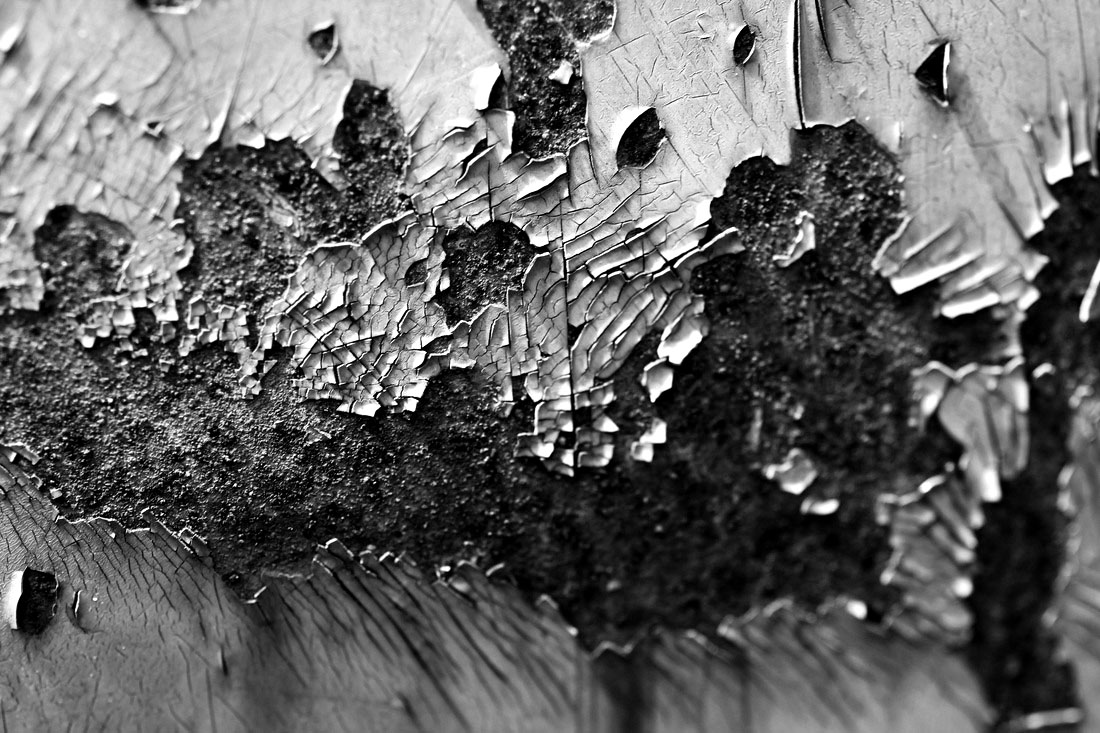
S E C O N D R E S P O N S E
I responded further to this artist by taking more pictures with the macro lens, focusing more on the peeling aspect and changing them to black and white on photoshop.
portrait disorder
D A V I D S A M U E L S T E R N
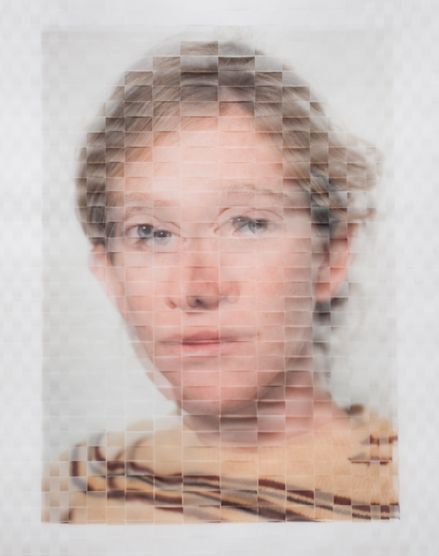
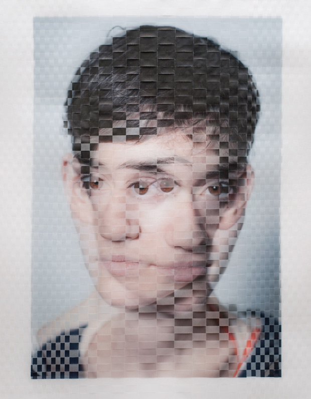
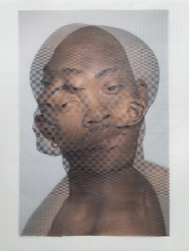
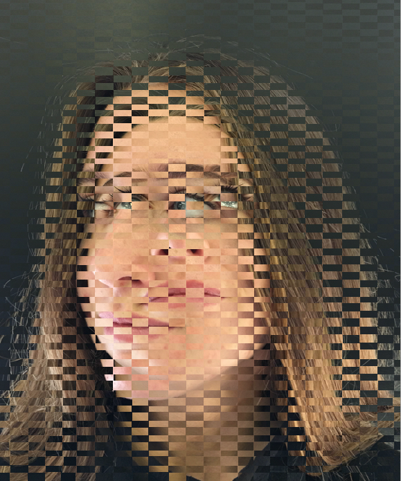
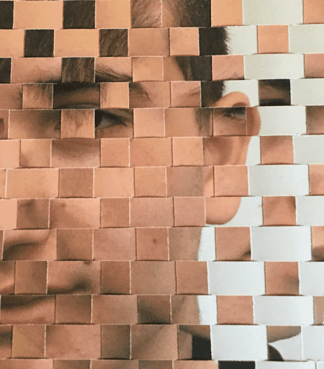
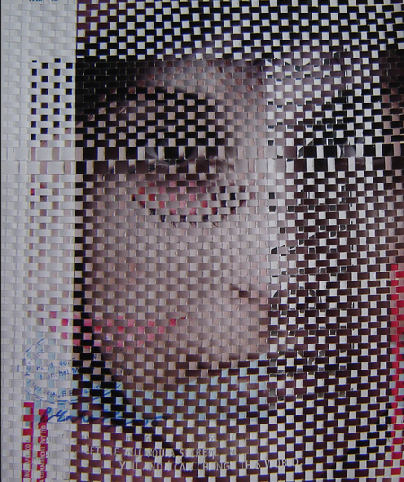
By actually weaving two separate prints on vellum of the same model, Brooklyn-based Photographer David Samuel Stern aims to build a bridge between direct portraits and abstraction. This way of abstracting the images does not only offer his subjects a way to hide within themselves, but also turns digital photography into physical objects by adding geometric texture. Being poets, choreographers, artists or programmers, all of the models featured in “Woven Portraits” are creative types in their own field.
I chose to to this as a strand in response to abstraction as I think the physical distortion of the face not only reveals abstraction as the face is literally altered through weaving, but also as faded memories. The fading effect seen through the movement of the people may correlate with how as a person ages, memories fade and are forgotten, and this can literally be seen as they are losing a part of them.
I chose to to this as a strand in response to abstraction as I think the physical distortion of the face not only reveals abstraction as the face is literally altered through weaving, but also as faded memories. The fading effect seen through the movement of the people may correlate with how as a person ages, memories fade and are forgotten, and this can literally be seen as they are losing a part of them.
F I R S T D E V E L O P M E N T
For my first response, I took two images of the same person looking in different directions. I then used photoshop and selected squares and deleted one layer to get this effect. I only did one before I decided to go onto my second response because I wanted to improve the composition of the picture. The attention was drawn to the black jumper as it contrasted and didn't give me the effect I wanted.


S E C O N D D E V E L O P M E N T - D I G I T A L R E S P O N S E S
For my second response I photographed three different people looking in different directions, not only to the left and right. When I photoshopped them, I selected rectangles instead of squares and selected a smaller area. I did this to try and replicate the woven effect in Stern's work. I think that this worked a lot better as they look more distorted, however i'm going to do a third response in order to try and emphasise the fading aspect.
After I found the right size and shape to make the rectangles to use a s a template for my images, I merged different people's faces together, and rotated some images in order to achieve a more abstract result. These photos are below, however, they didn't look a s good as my previous response so I decided to develop my response in another way and make gifs.
S E C O N D R E S P O N S E

T H I R D D E V E L O P M E N T
To further develop my portrait strand I made two gif's of two different people. I used the previous template of the small rectangles overlapped onto one of the pictures and changed the opacity of the photo on photoshop. I started on 0% and saved the image, each time increasing the opacity by 10% and then making this series of images into a gif. I did this twice with two different people as one gif had a black background and the other had a white so I wanted to see how the contrasting affected the gif. Additionally, I made them in order to incorporate the idea of fading memories, the pictures didn't show this as they were still and weren't woven like the artists.
|

|
F O U R T H D E V E L O P M E N T
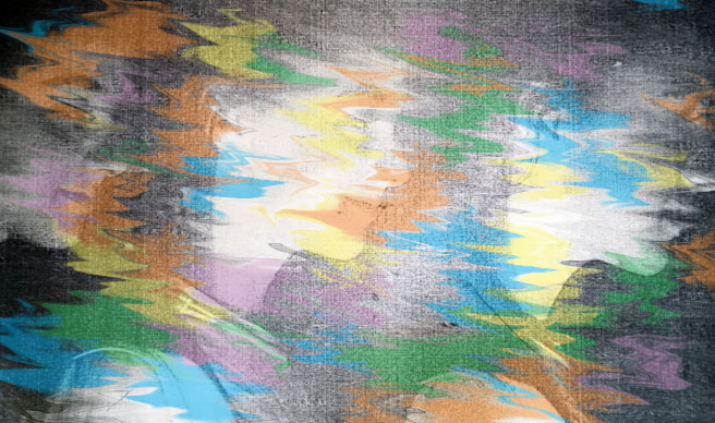
For my fourth response I wanted to incorporate colour into my images. I changed the colour channels on photoshop using cyan, magenta and yellow as they're primary colours and can represent a root or based sense of stability amonsgt the abstraction.

F I F T H D E V E L O P M E N T
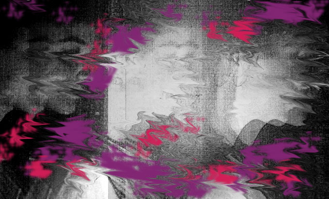
I developed my colour response further by using red and cyan channels to create a 3D effect. I did this by creating 2 additional layers and changed their paths, then I changed the arrangement of the layers and positioning of them to obtain different outcomes. I chose to do this because the 3D effect can be interpreted as the third dimension acting another method of distoring the photo, and also seems more abstract as the 3D jumps out at you and has more depth than the photo being a block of colour.
S E C O N D R E S P O N S E
I responded to my fifth development by creating a gif, like how I made my first gifs I changed the opacity by 10% each time and saved each image as a newone before loading the files as a stack and turning the series of photos in a gif on photoshop.
S I X T H D E V E L O P M E N T
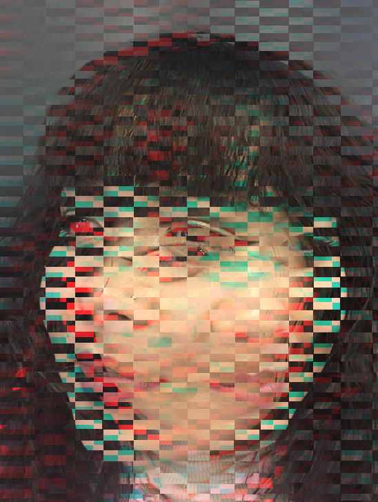
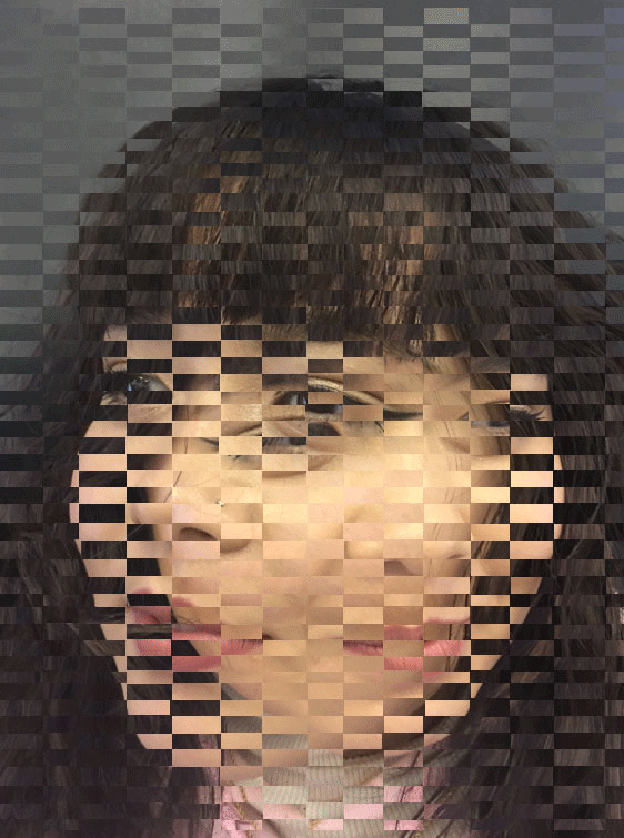
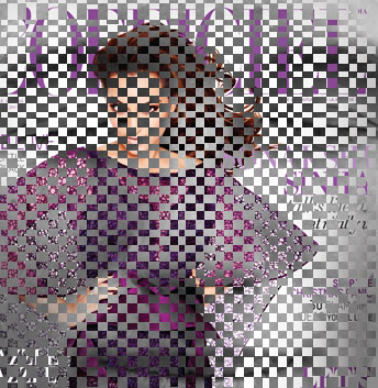
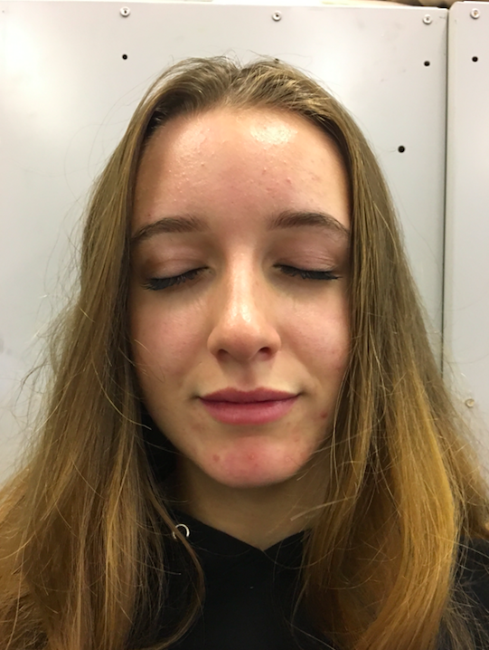
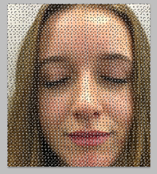
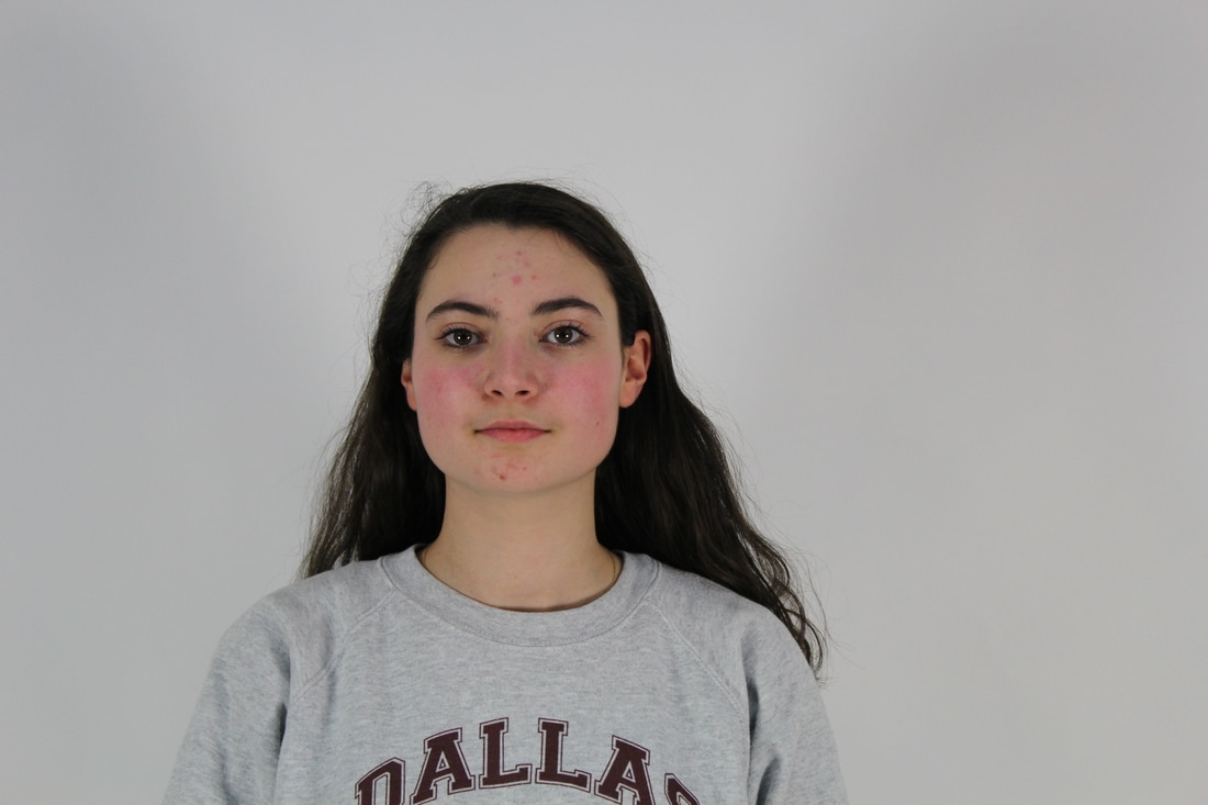
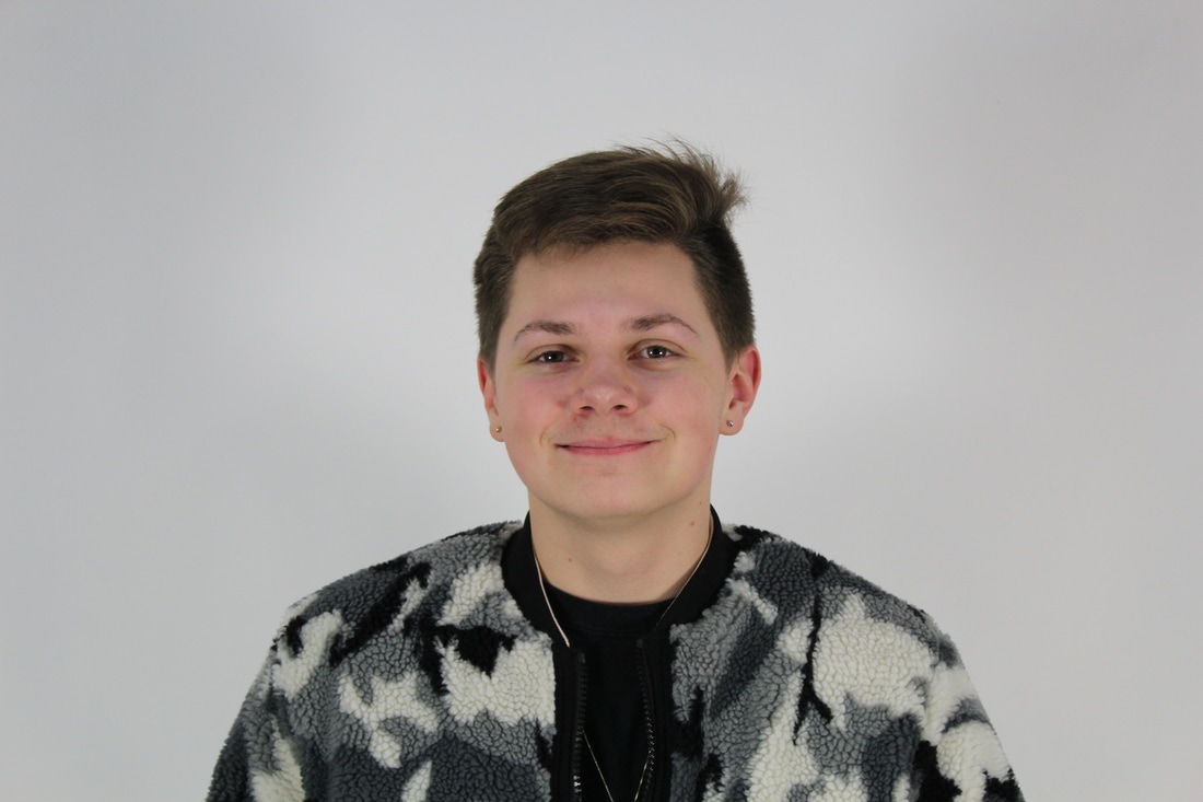
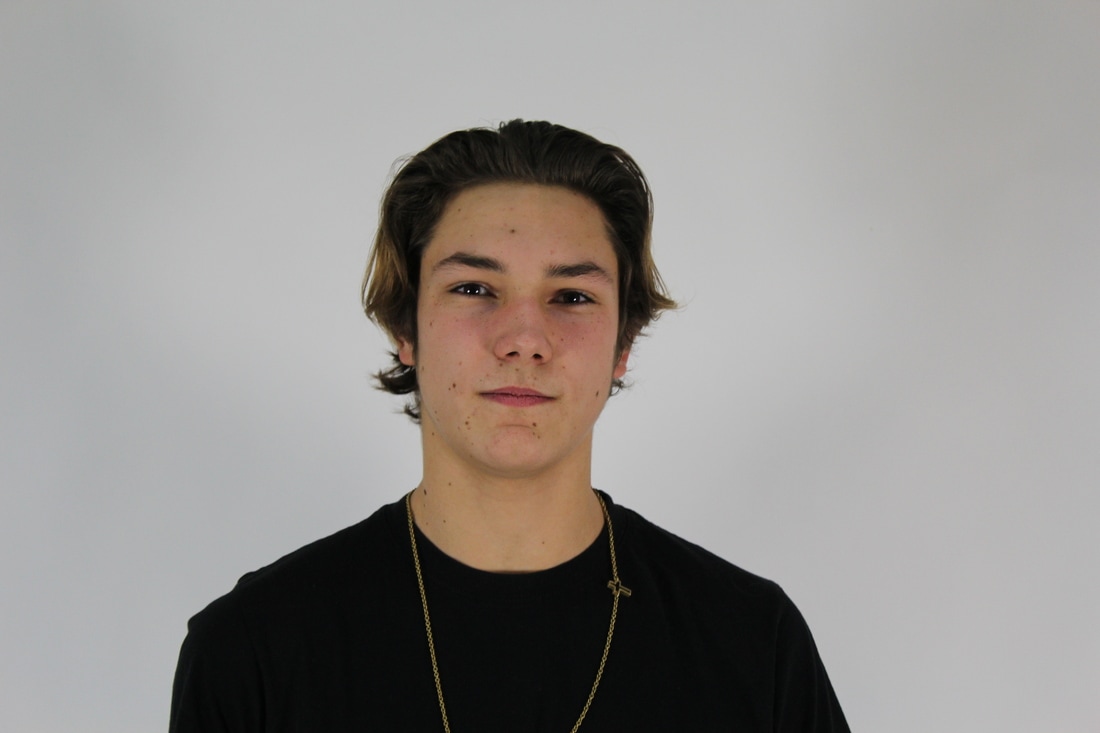
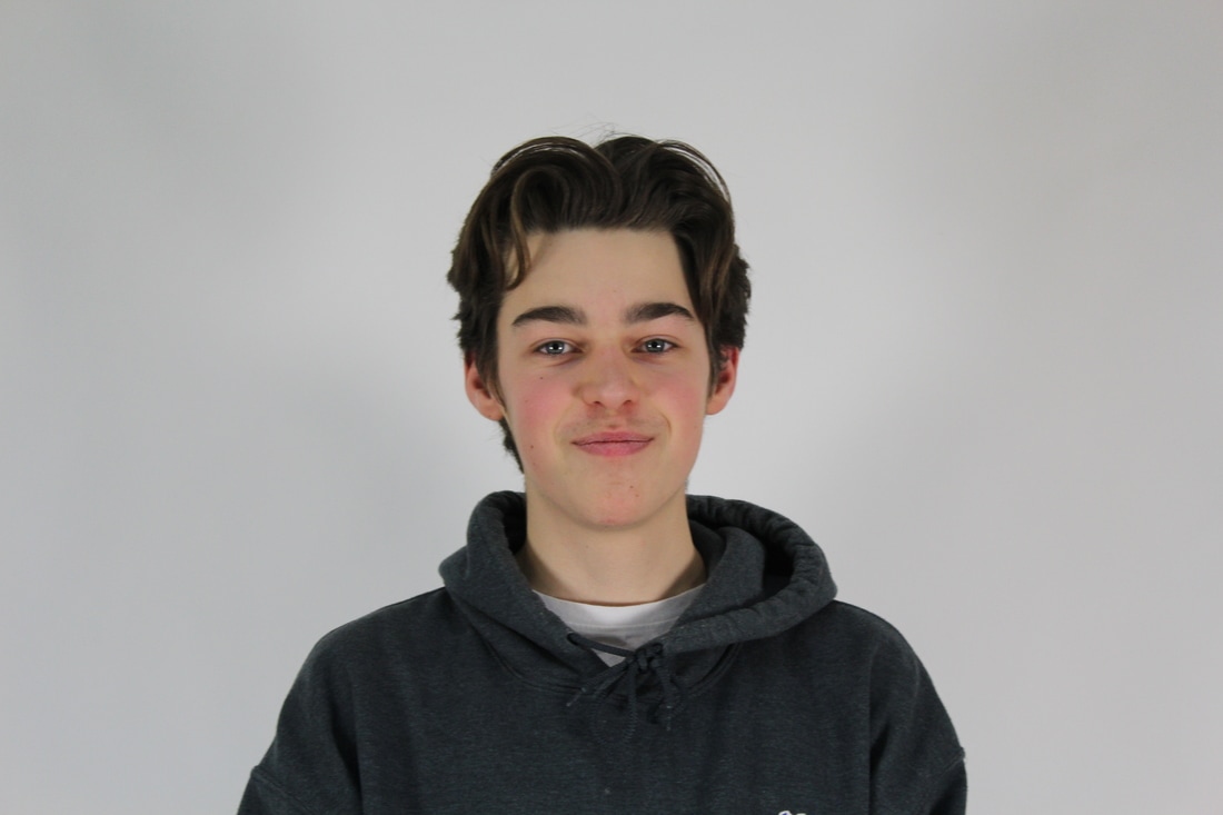
My sixth development consisted of a physical response to my previous work, this was to try and replicated Stern's work more closely as he physically weaved, whereas I had been creating multiple photoshop responses. I took two photographs of the same person with the same background, but looking in differnt directions. I took these using the same criteria as I did when I took the portrait photos for my photoshopped responses; white background, having the subject's face as the focal point; instead of any item of clothing, in focus, and takes up the majority of the frame. I printed out the 2 images onto card and marked and measured even points as to where to cut the image with the guillotine. I then weaved them to create the distorted and fragmented look David Samuel Stern obtained.

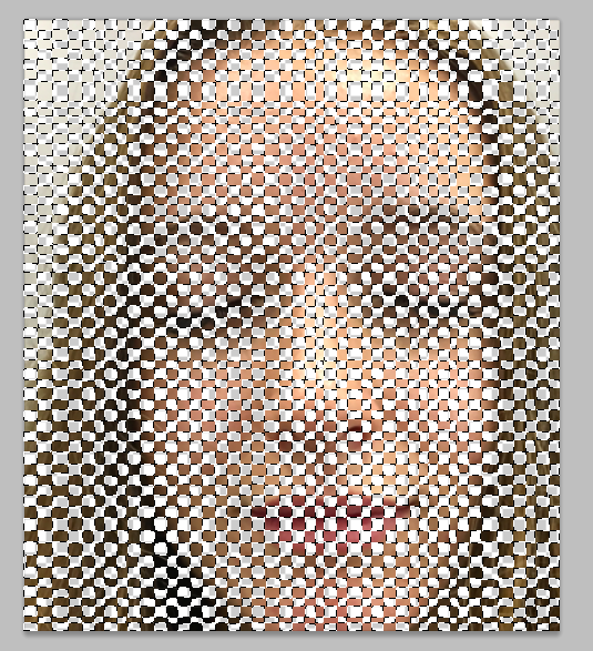
M A H E S H P O T T A B A T H I N I
Mahesh Pottabathini is a famous Indian artist who bases his work on nostalgia. His paintings and drawings, in cubistic and abstract style, consist of weaving and spinning implements, he exploits the forms of weaving tools in order to show their impractical use in modern era, where power-looms over took the vocation. He changes his style of work as he improvises his visual idiom depending on the materials he uses.
S E V E N T H D E V E L O P M E N T
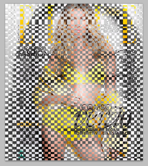
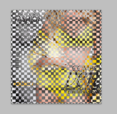
I used photoshop to respond to the work of Mahesh Pottabathini. Like his work, I took close up photos of people's faces with their eyes closed, and cropped them so you could only see the features of thier faces. I used different coloured magazines as in Pottabathini's work, he incorporated colour into the weaving. I attempted to do this 3 times, however I think that my second try turned out the best as you can see the person much more clearly and the woman in the magazine is in the corner so it doesn't take all of the focus away from the image.
S T E P S O N P H O T O S H O P :
Firstly I selected small squares on photoshop to use as a template for my photos. I uploaded my photo and deleted the selected squares so it looked fragmented, then I changed it to black and white and chose a colourful magazine cover to use with my image. I adjusted the levels and cropped my image until I got the result I wanted.


S E C O N D R E S P O N S E
|
I made a gif of one of my previous photos using photoshop, Iused the selected template and deleted half of the squares on the subjects face. Keeping the image black and white, I moved the image to the side and saved the image each time, when I turned this into a gif it looked more fragmented and abstract. However, in order to improve this I would use a more zoomed in image and experiment with different colours and shapes. |
|
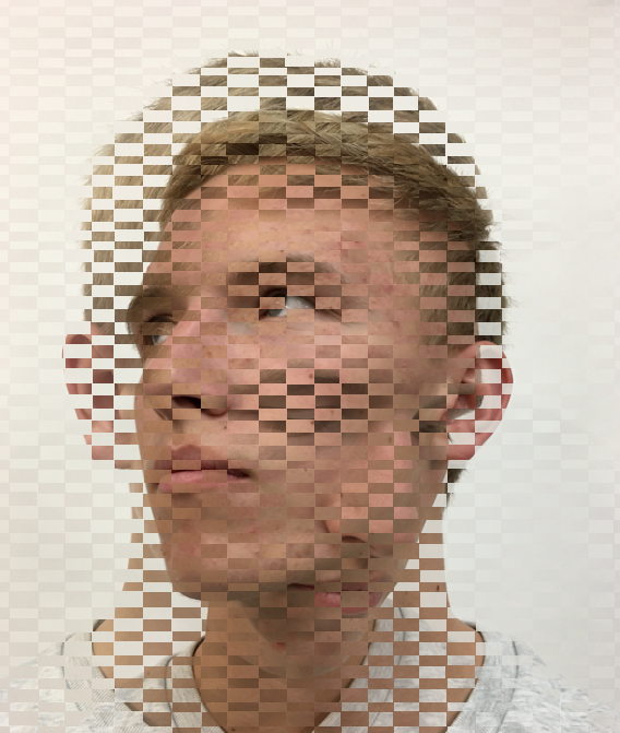
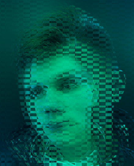
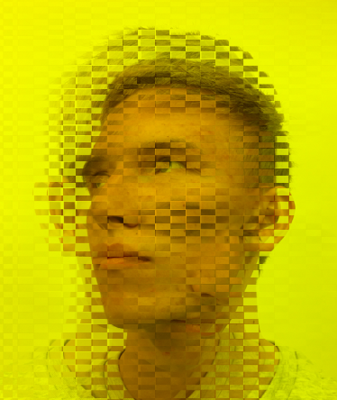
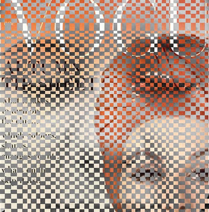
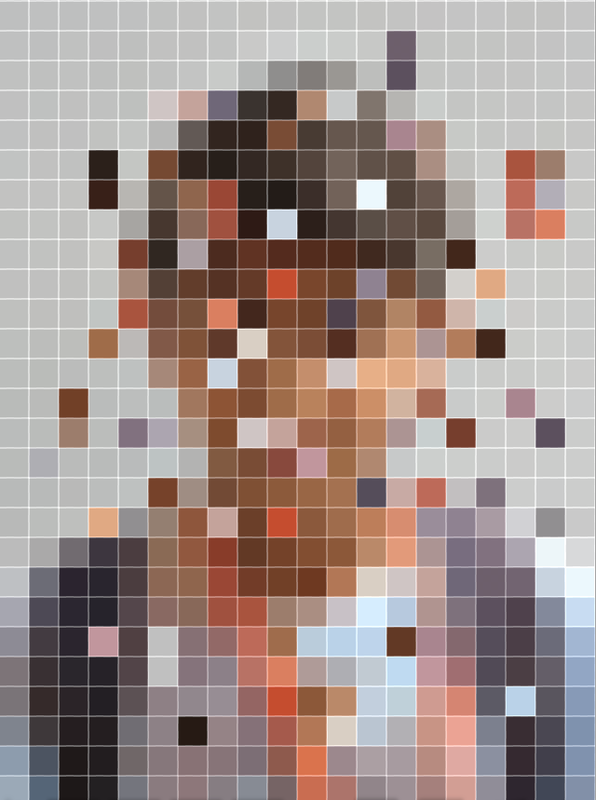
J O H A N R O S E N M U N T H E
"Pixelated people" is a photography project by artist Johan Rosenmunthe. While the surroundings are as analog as possible, subjects in the image are pixelated, this is a way to think about our place in this new dematerialized environment. The artist use pictures found on Facebook, from people he only knows through the Internet. One interpretation of his work is that we are insignificant in our society and don't really have a voice, or a face as everything is so fast moving and trivial. Rosenmunthe's implies that his work represents how digital communication, e,g. Facebook, Twitter and online dating sites streamline personalities. He talks about how one is able to project themselves into the world, sharing personal information and ideas about what they're like as a person, all while censoring details and being able to invent fictional characteristics. He also explains how much accsess we have into one anothr's lives through mass media, however this information could all be unreliable. He only uses pictures of his friends from the internet and gives them a new context by presenting them through digital representation, additionally, the sceneries photographed are placed that are invited to interaction - places that don't miss the company of human beings. The milieu adds a new meaning to the way the digital personas act, and gives their simplified characteristics meaning and personality again, by adding a setting to their digital components.
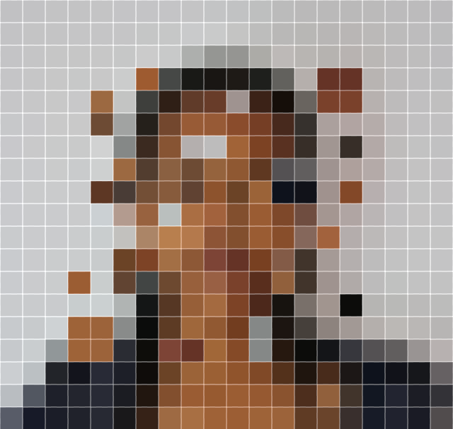
E I G H T H D E V E L O P M E N T
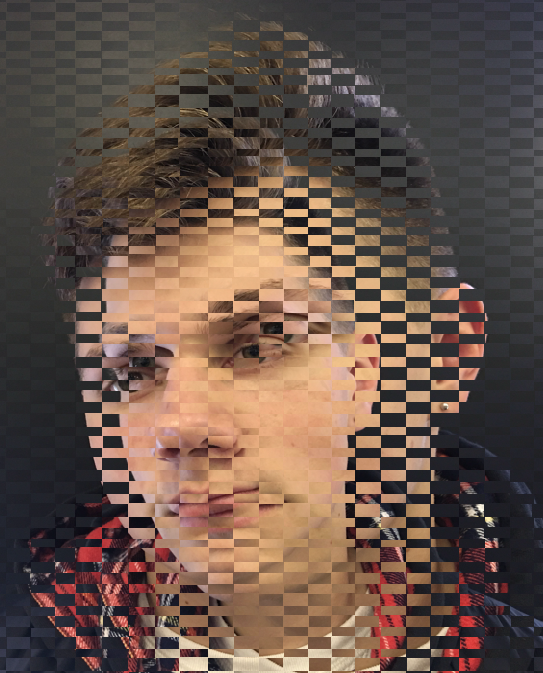
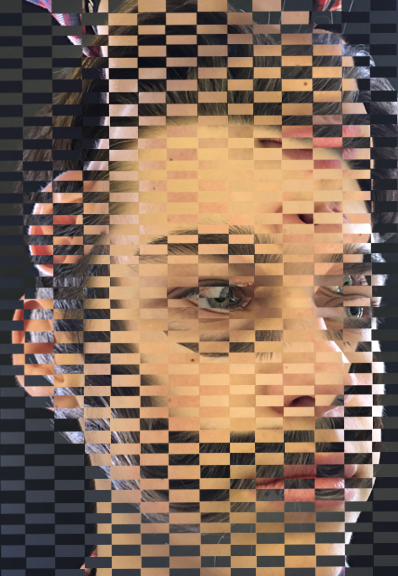
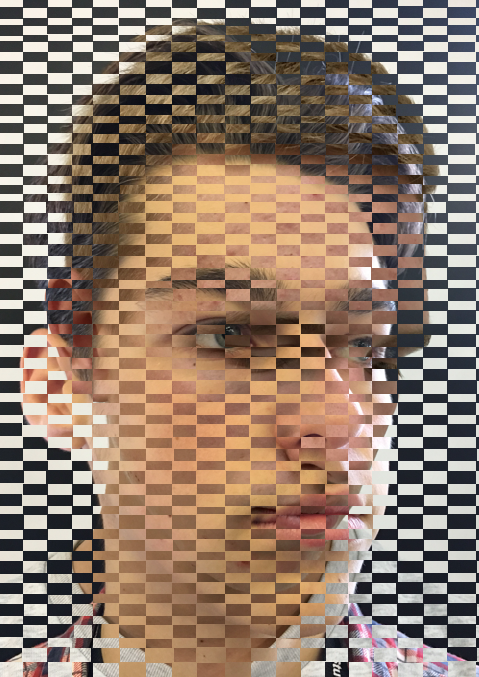
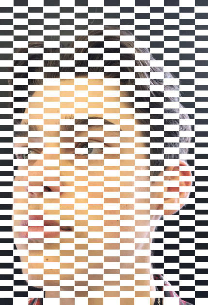
For my eigth development I decided to pixelate my images, I used inspiration from Rosenmunthe's work by pixelation faces, however didn't incorporate the bleak backgrounds as I wanted to focus on portrait images. I did this by taking portrait photos and changing the image size to 20 on photoshop and then zooming in. I moved on from weaving to pixelation because the concept of distorting the subject's faces and the sense of hiding their identity is similar. For my first response I used three girls as the hidden idenity aspect can be linked to the idea of women's insecurities and how concealment is normalised in our modern society.
S E C O N D R E S P O N S E
After pixelating my photos on photoshop, I decided to move blocks around to further distort the subjects' faces as this proved to look more abstract as the original image is harder to make out, however you can still tell what the image is of and can still recognise aspects of the face.
N I N T H D E V E L O P M E N T
I further developed this concept by turning the pixelated photos in gifs. I did this on photoshop by again making the image size 20 and zooming in until this result was obtained. I then selected a square at a time and copied and pasted it onto new area, each time I had to screenshot the picture as the image size was too small to save each time. I did this multiple times and created a gif; the image on the left was my first attempt, however, as I had to screenshot each frame the gif moved. For my second attempt I used the ruler tool to screenshot accurately, and my final gif was still. I also moved more squares around and moved more than one at a time to conceal the face more, additionally the second image had more colour in it which emphasised the abstraction and further distorted the gif as there was a greater contrast between the colours.
|
|
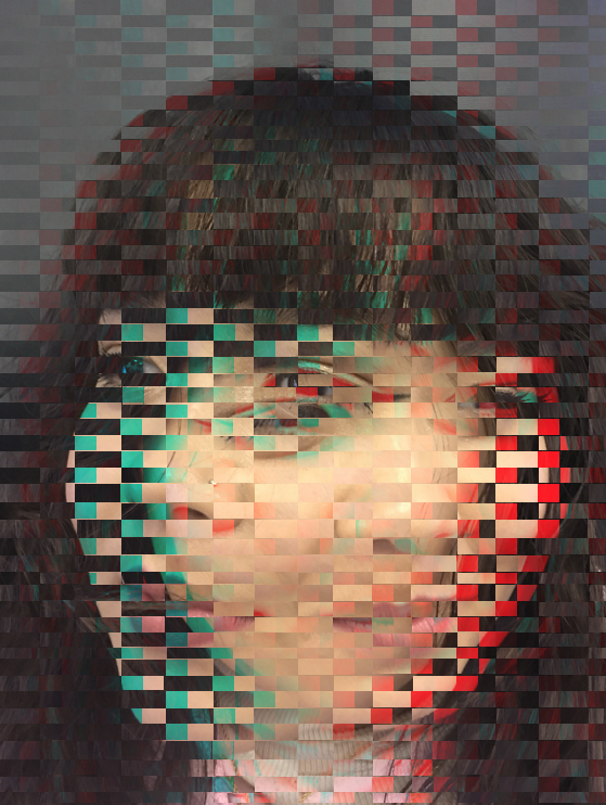
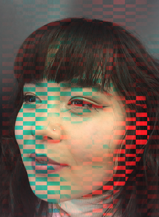
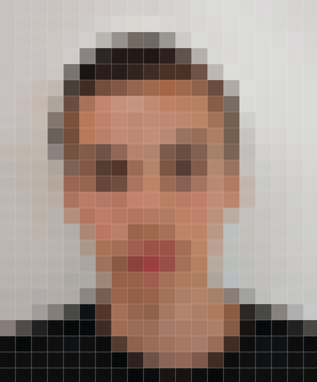
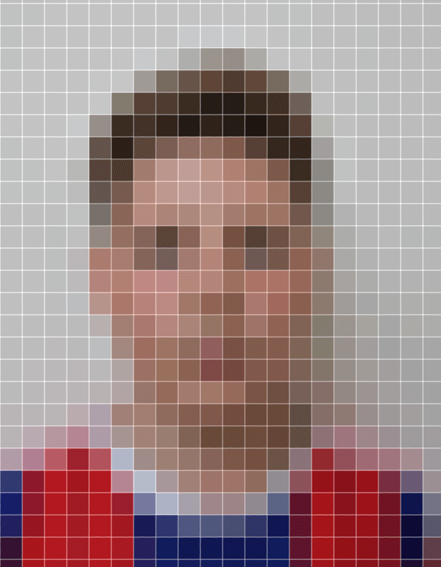
M O C K E X A M
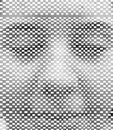
E R I C D A I G H
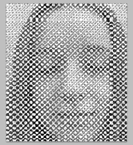
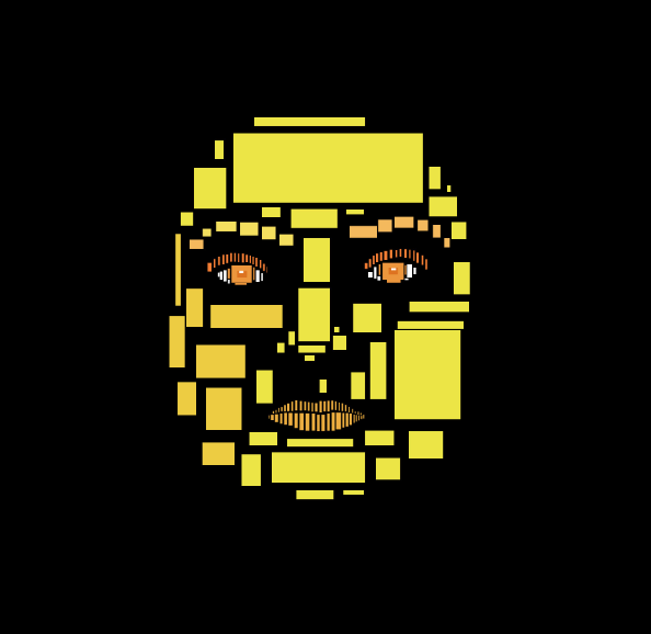
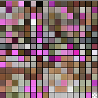
Eric Daigh's pushpin portraits illustrate how a whole image can be made up out of tiny fragments. As I have previously focused on weaving, and then developed that into pixelated portraits, I used Daigh's work as inspiration to use the aspects of the push pins as pixels. This reveals abstraction as the image can be viewed up close, or far away and still show meaning as every block or push pin makes up a bigger picture. The complexity is achieved by Daigh's ability to create such intricate images from such a simple palette of colours. Daigh incorporates regular household colored push pins in his portraiture work to create a these pointillism pieces. He uses the same 5 colored push pins (red, yellow, blue, white, black) to elaborately build up tones and contrasts in his work.
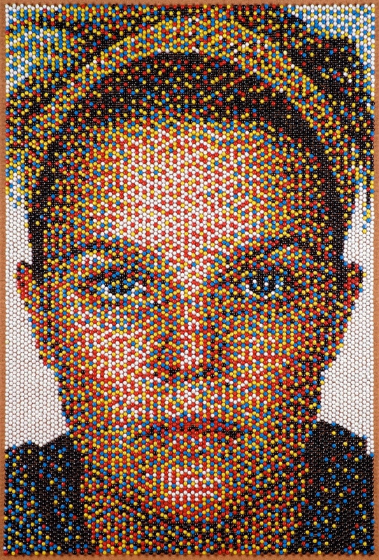
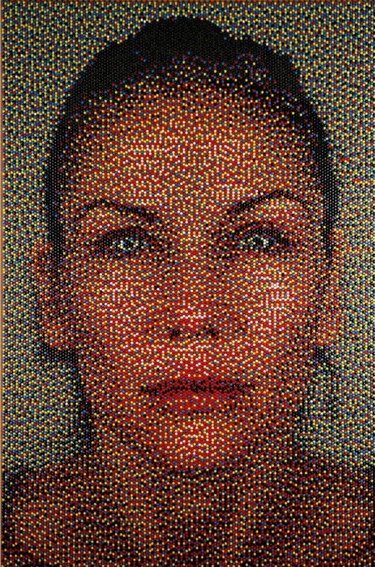
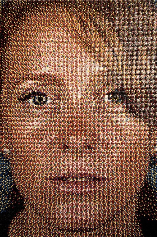
These 3 images were all created using Eric Daigh's push pin technique. You can clearly see how they're made up in each image, however each one has been created slightly differently to the others, and which portrays the life like aspect to the portraits. In the first image, you can see the push pins much more clearly as it's easy to point the five different colours out. However, the white and black pins used to create the bolder tones of the face are really emphasised, but also look natural at the same time. The white background emphasises the colours in the face and the contrast makes the image stand out much more. In the second image there is much more detail, shadows can been seen and your attention is instantly drawn to the piercing eyes as they've been made to stand out by creating glints and contrasting colours. The background of this image isn't a block colour so this softer colour contrasts less and makes the image look more natural. The third image has the most detail and you can clearly see the wrinkles and the whites parts where her skin is sagging or is lighter in places. As it's much more zoomed in you can really see the colour palette used to emphasise aspects of the face.
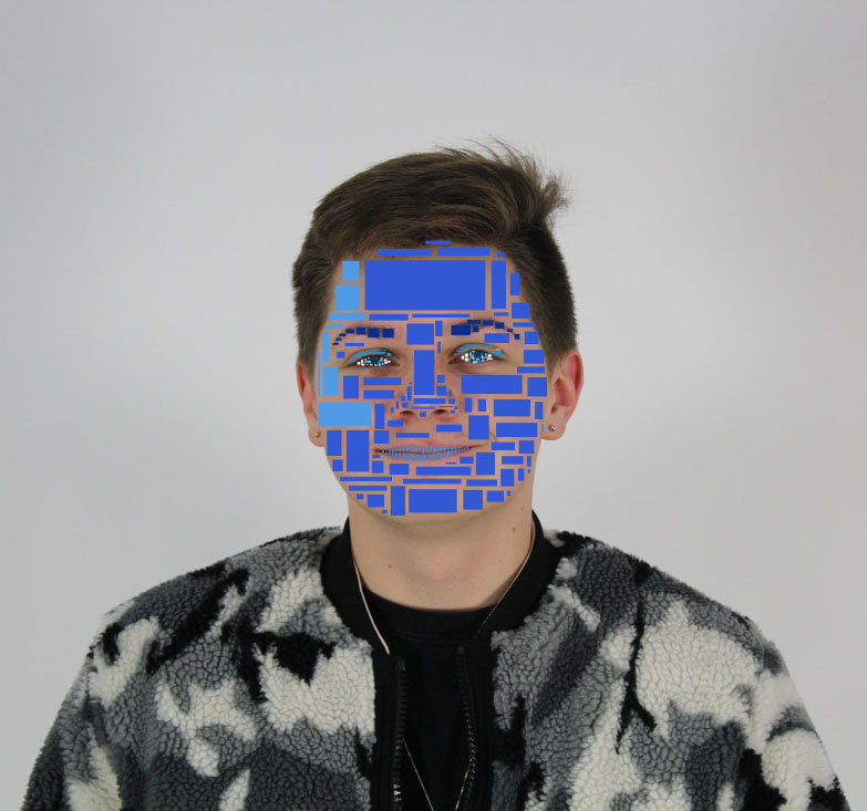
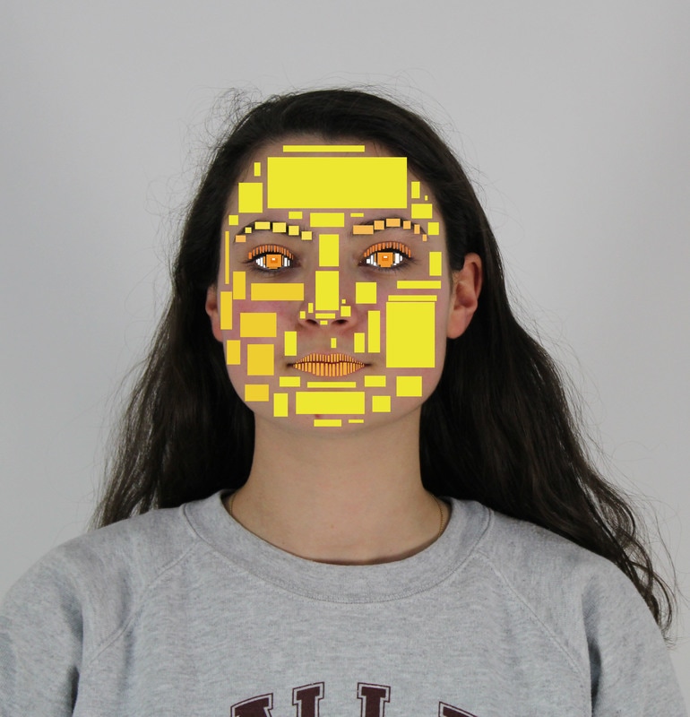
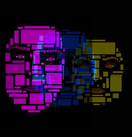
P O R T R A I T S :

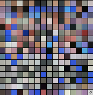
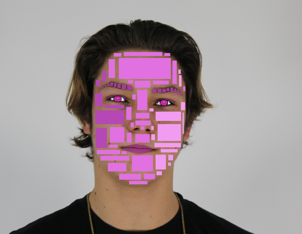
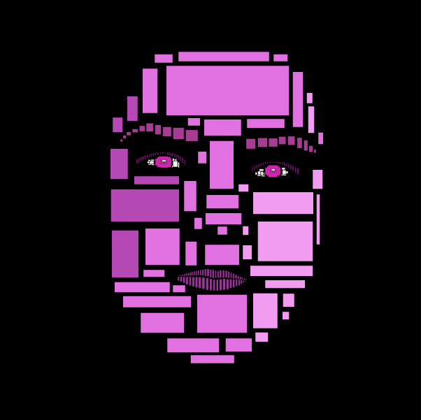
I used photoshop and selected 3 bold colours in which I could use to select block colours over certain features of the face, ensuring that is still resembled the subject while not looking like them at the same time. To enhance this abstraction I painted the background black to remove all human aspect so that solely the blocks of colour could be seen. The purpose of this was drawn from Eric's push pin portrait's as I used the idea of single blocks creating a bigger picture to incorporate into my original idea of pixelation. I used a colour table which I added to the side of each series of colour images as it links to the pixels aspect and also as one of my developments was to incorporate colour as it adds personality and enhances the pixelation. This idea of adding personality is an idea thought of by Daigh as he said that in his work he aims to explore the themes of individuality and representation, which I tried to replicate in the form of abstraction.
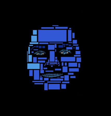
F I N A L P I E C E S
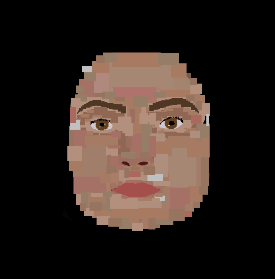
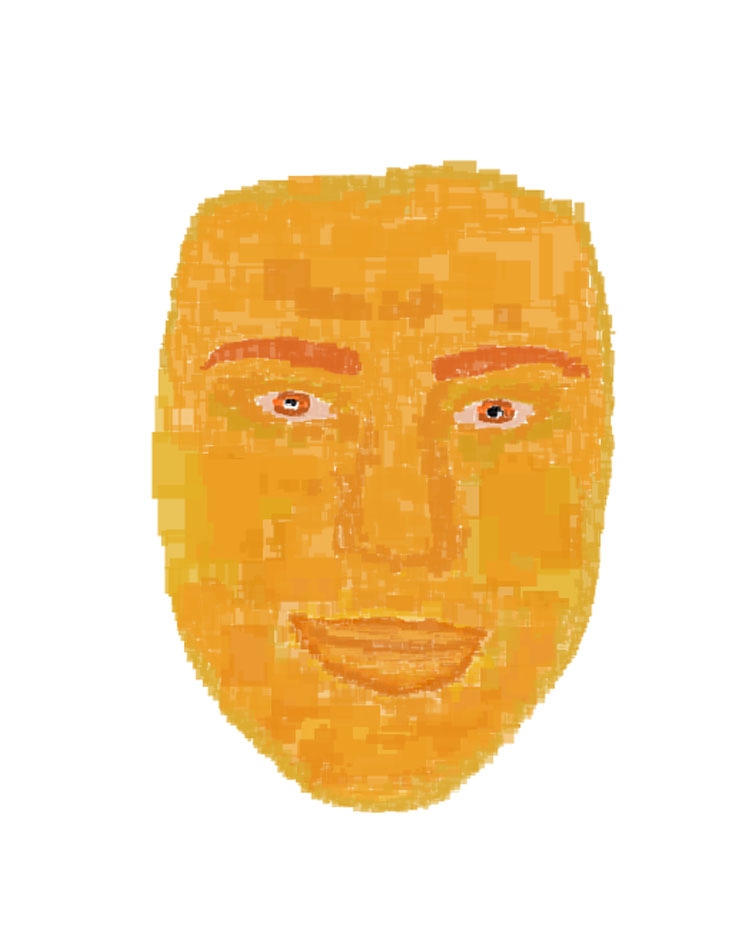
Additionally, I tried to make my image look more pixelated by creating a face out of more squares, continuing the theme of pixelation, however, removing the gaps in the face to make it look more like a person.
|
|
To do
Print out final images and create giffs for the final three portraits
Add visual brainstorms and artist and me sections throughout the weenly
Print out final images and create giffs for the final three portraits
Add visual brainstorms and artist and me sections throughout the weenly
