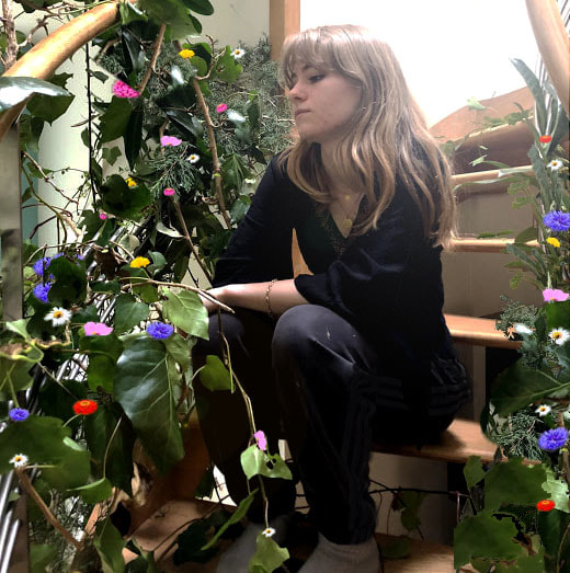
f r e e d o m a n d / o r l i m i t a t i o n s
Freedom is usually defined as being able to speak, think or act as you want, up to a certain point. This point might be where offence occurs or where the law prevents you from doing certain things, these things all place limitation on freedom. Limitations are most often defined as being restrictive or a barrier to something. Although everybody wants to and has the right to freedom, many people argue that limitations are a necessity in society in order to regulate behaviour and have boundaries so that lines aren't crossed. Many of these limitations are broken however; it can also be argued that we will never have complete freedom, as we set many limitations on ourselves, often to prevent us from being victims. This can include drug and alcohol abuse, and prostitution, these are limits many people would abide by, as freedom, and limitations can start and end with our bodies. Freedom is a human right, however, there are positive and negative limitations to it. Positive restrictions to freedom would be the law, as it tries to prevent bad or dangerous things from happening, and an example of a negative limitation would be race or gender inequality; a barrier for people in society and personally.
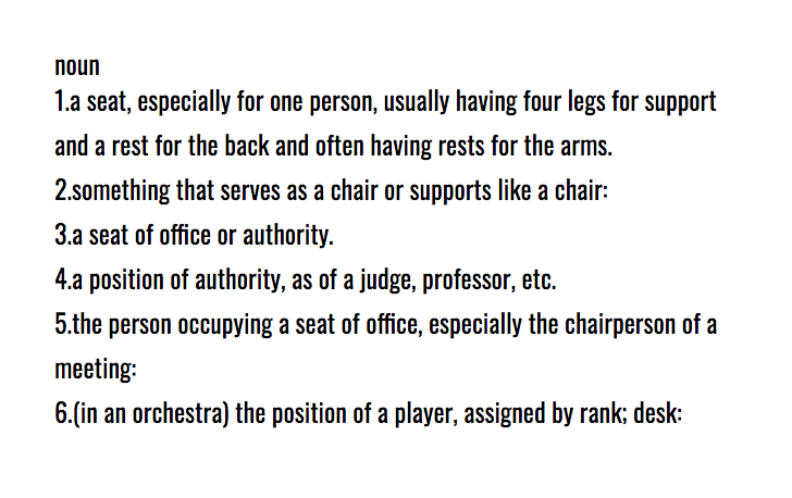
d e f i n i t i o n s :
freedom
- the power or right to act, speak, or think as one wants.
- the state of not being imprisoned or enslaved.
- a limiting rule or circumstance; a restriction.
- a legally specified period beyond which an action may be defeated or a property right does not continue.
|
|
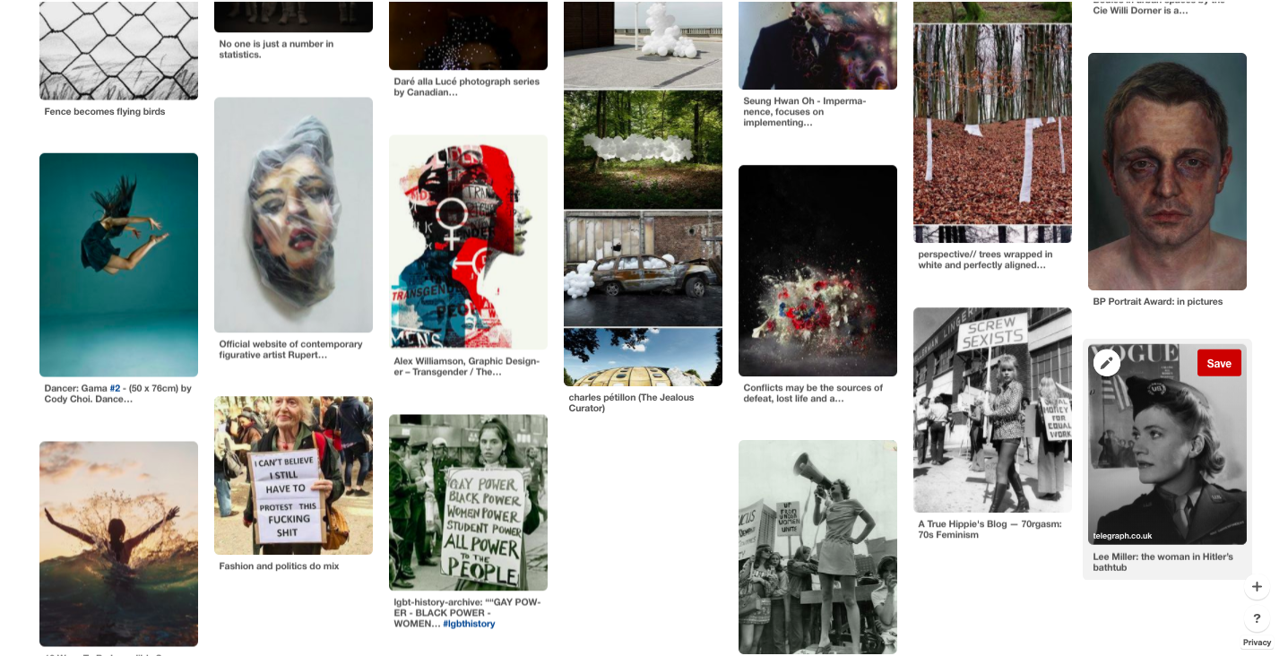
Pinterest board: www.pinterest.co.uk/graceharrisonpo/freedom-andor-limitations/
h a l f - t e r m h o m e w o r k
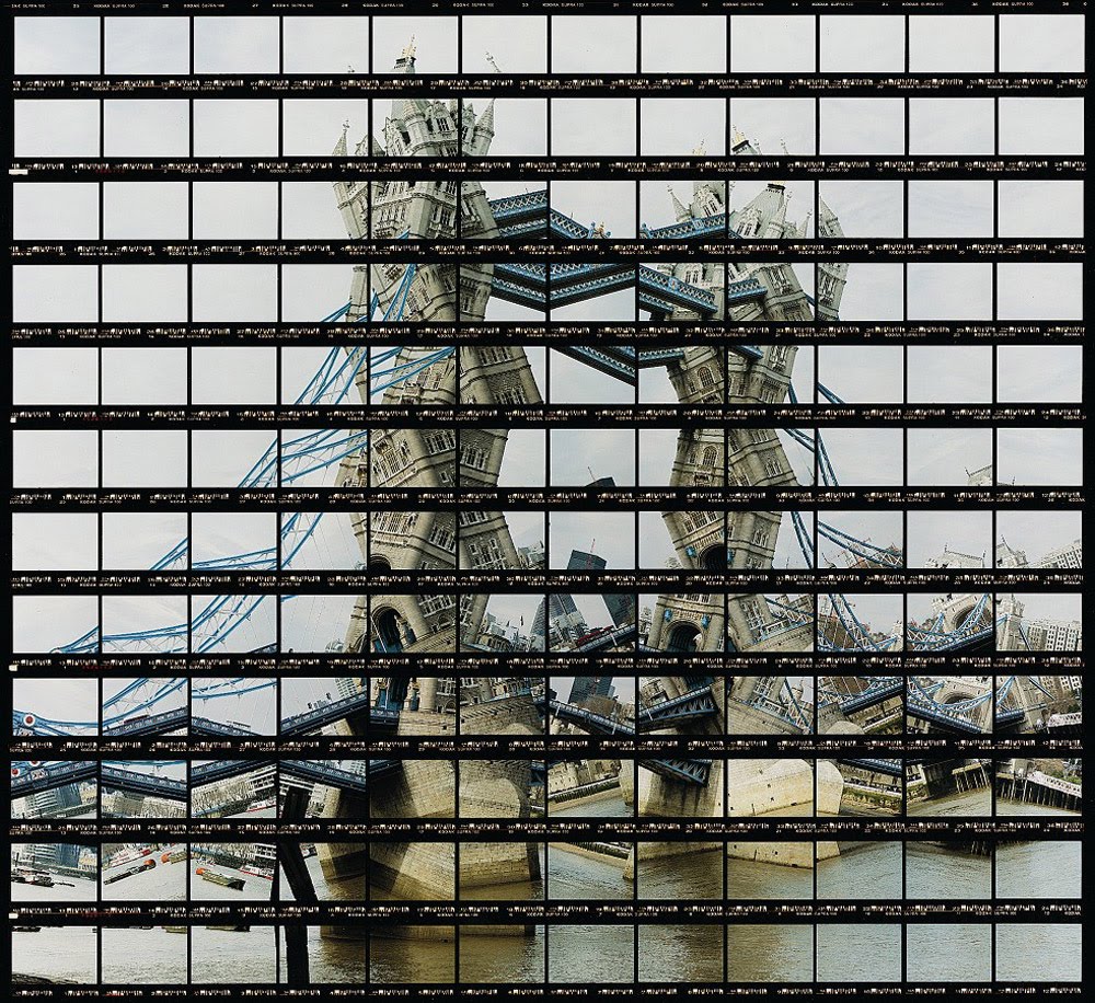
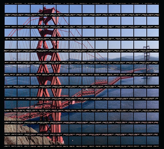
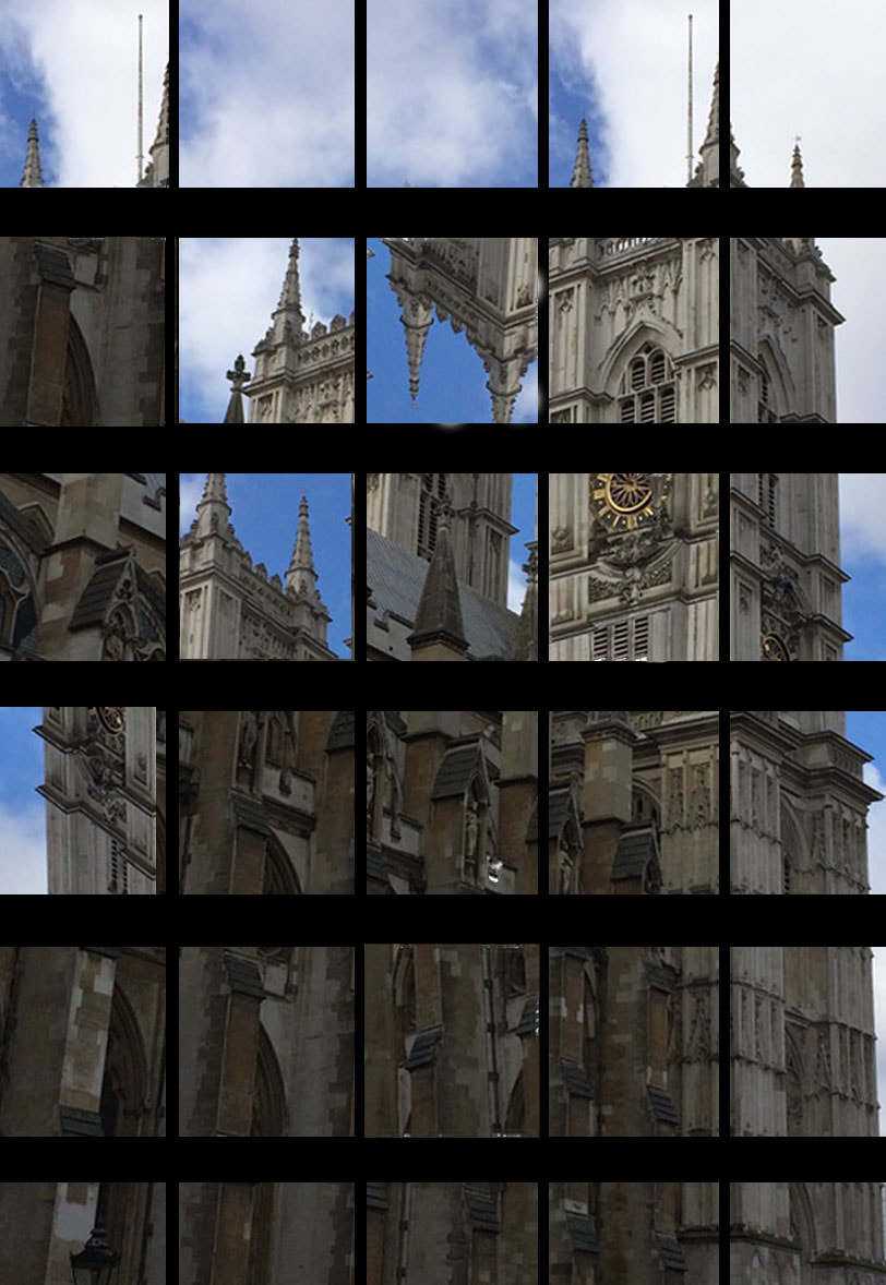
b r e a k t h e s t r u c t u r e - t h o m a s k e l l n e r
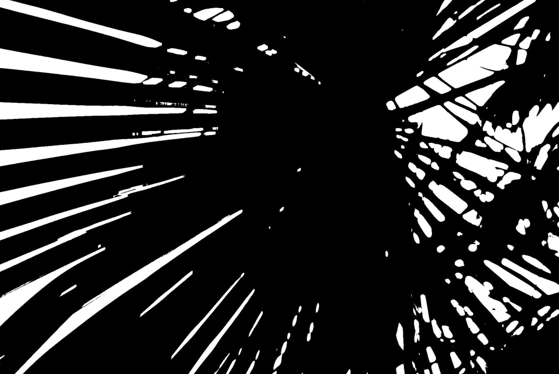
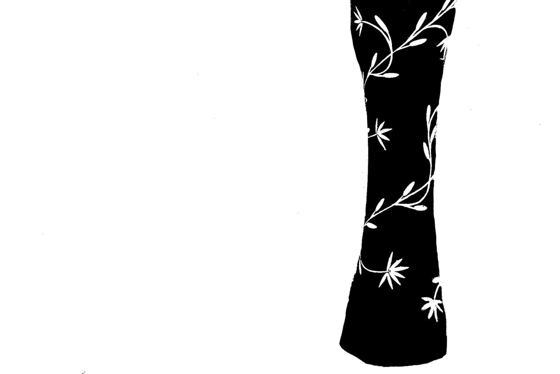
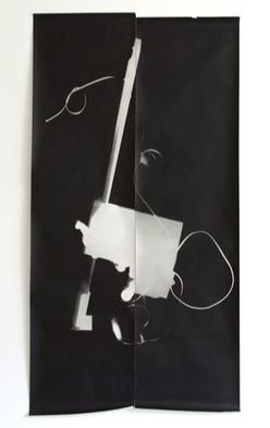
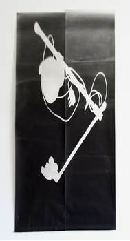
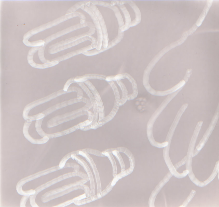
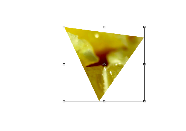
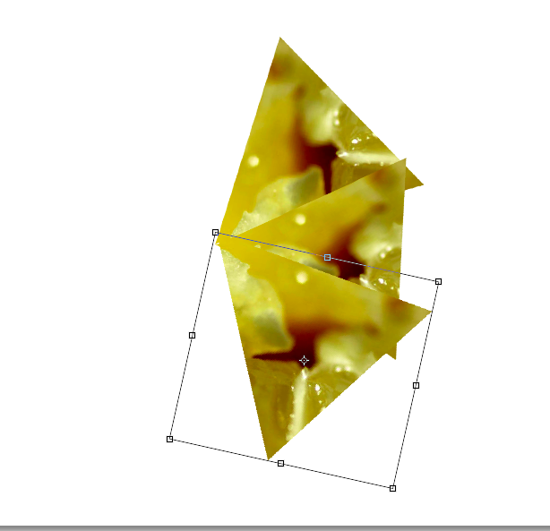
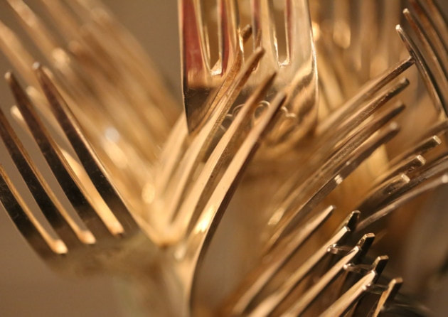
German photo artist Thomas Kellner is known for his photographs of seemingly dancing architectural exteriors and interiors of tourist attractions from all over the world. Even though his photographs show popular motives that have been mass-produced, his work is unique due to his new artistic method called “visual analytical synthesis” in which he does not take one shot but several thoughtfully planned ones in order to create a picture out of contact sheets. His work is often referred to Cubism considering that his creative process includes a construction but the results resemble a deconstruction. Thomas Kellner’s works imitate the wandering look of the eye, showing us segments of the total which come together as one image. Therefore his photographs do not deconstruct architecture but reconstruct our view on it.
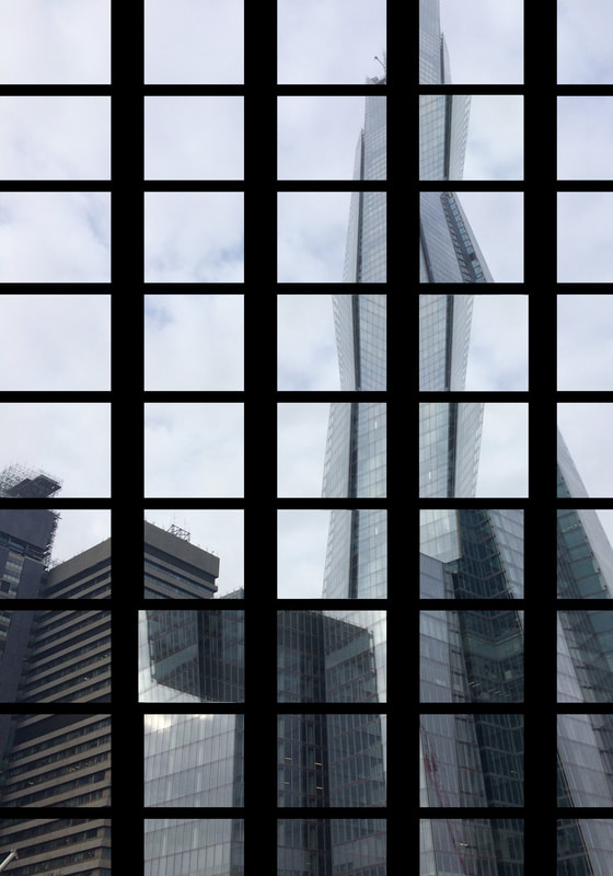
m y r e s p o n s e :
As I responded to Thomas Kellner's work, I chose to do so on photoshop as taking as many photos as he did on a camera and rearranging them to distort the overall image is a lot more difficult and I would not have been able to take that many pictures of such a large building. The first image that I did worked slightly better as when I rearranged the squares, it was more noticeable because the shard is tall and the image looked more distorted. In the second image I changed around random pieces of the building to try and distort it, however, it was a wider building instead of a tall one so the outcome wasn't the same. I think that if I did this on a larger scale by making the squares and black lines smaller, and used buildings that were more monumental and taller, the result would be much more like Kellner's work.
|
|
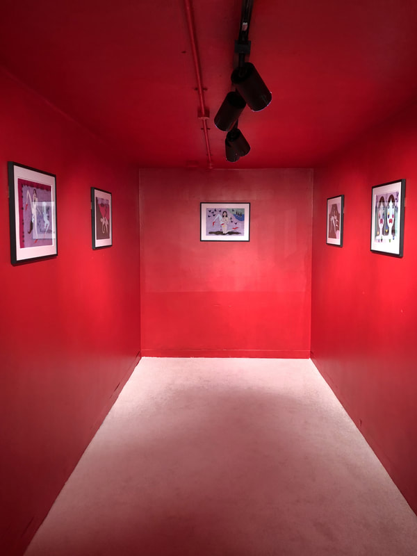
g a l l e r y v i s i t s
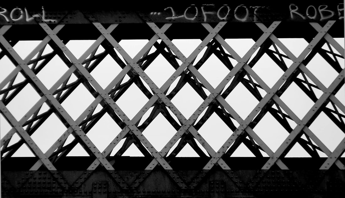
g a l l e r y 1 : b r i d g e - t o s h i o s h i b a t a
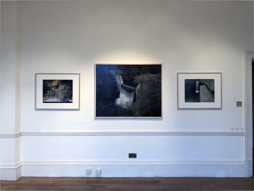
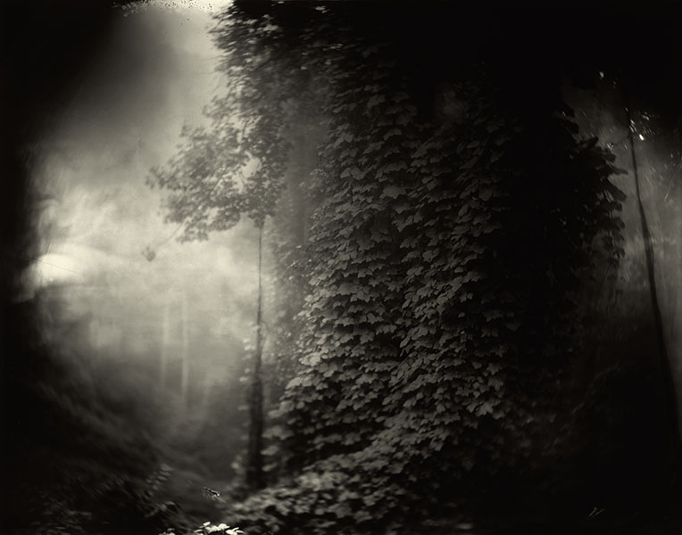
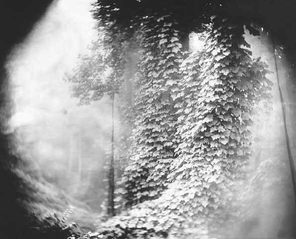
Toshio Shibata was born in 1949. After completing a BFA and a MFA with a major in Oil Painting at the Tokyo National University of Fine Arts and Music, Shibata left Tokyo to study photography at the Royal Academy in Ghent, Belgium. He returned to Japan in 1979, and in 1992, he was awarded the Kimura Thei Award. Shibata's works have been featured in numerous overseas exhibitions, including solo shows at the Museum of Contemporary Arts in Chicago in 1997. Bridges are one of the main subjects of the work of Toshio Shibata, one of Japan's preeminent landscape photographers. On his return to Japan, Shibata became more conscious of the Japanese landscape and embarked on an extensive travel, seeking to convey his interest in the qualities of the scenery though photography. Originally using black and white film, and a large format camera, Shibata emphasised the abstract beauty and immensity of impression of the Japanese landscape.He is known for exploring the delicate balance between man-made structures and nature. Photographing erosion control barriers, water catchments, roads, dams and bridges, he examines the unique appearance of these structures in his native land. Through his lens, rivers can look like origami, and waterfalls resemble kimonos.
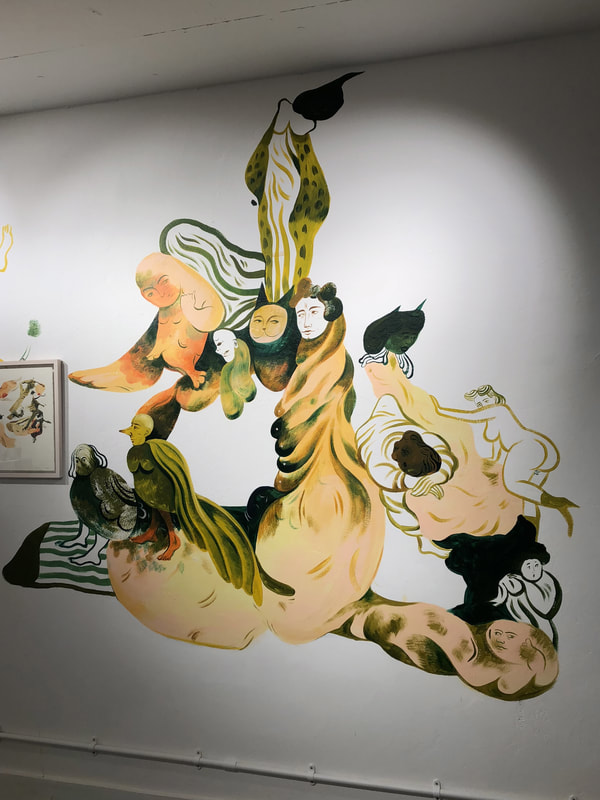
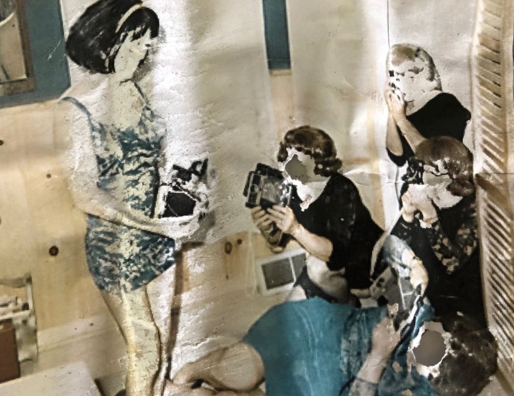
g a l l e r y 2 : b r e a k i n g s h e l l s - t h e k o p p e l p r o j e c t
Breaking Shells is a group exhibition presented by the Koppel group, curated by Justine Do Espirito Santo. Bringing together nine contemporary artists, the show examines the body from a female perspective. The exhibition takes over the two Koppel project galleries, Baker Street and The Hive, to present two distinct but continuous explorations of this subject. Part I, at Baker street (this gallery), explores narratives and representations of the body, both from a historical and a contemporary point of view. The artists examine subjects including the relationship between body and identity, how female bodies are represented in art, history and pop culture, cliches surrounding black bodies, taboos and ideas about sexuality, sex work and fetishism, the relationship between body and language, Together, the display takes the viewer into the past and present, where the body, omnipresent, is in turn scrutinised, idealised, objectified and empowered.
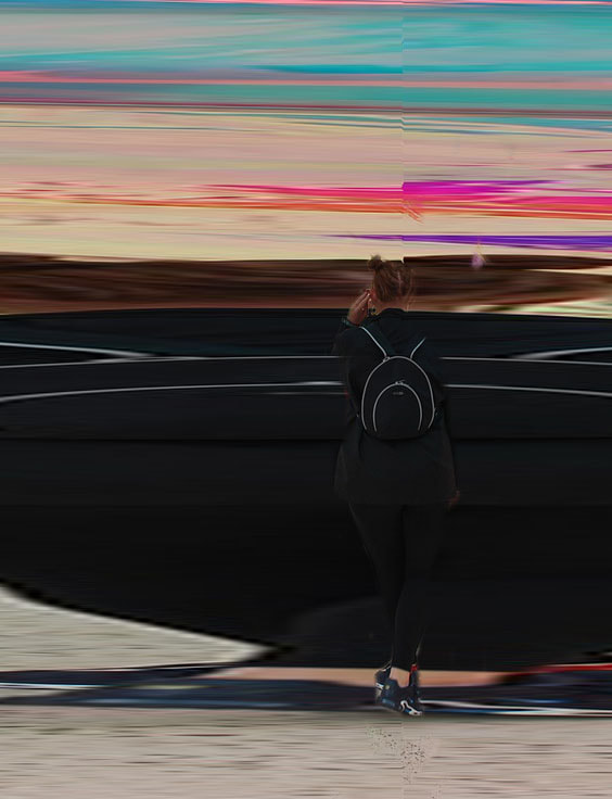
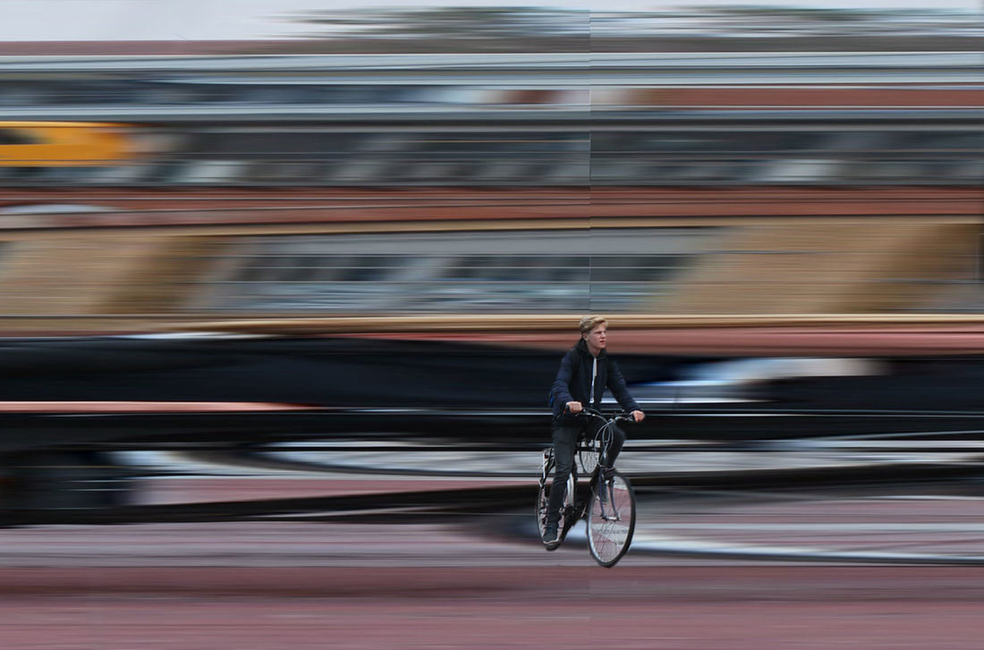
m o v e m e n t
The shutter and aperture controls of a camera limit the exposure time and the outcome of a photographic image. These controls can capture movement in different ways. How you capture movement can give the impression of freedom or freeze a moment, trapping the figure in a still that appears to imprison them. There are many different styles of photography that encapsulate and explore these two types of movement, shown through various artists.
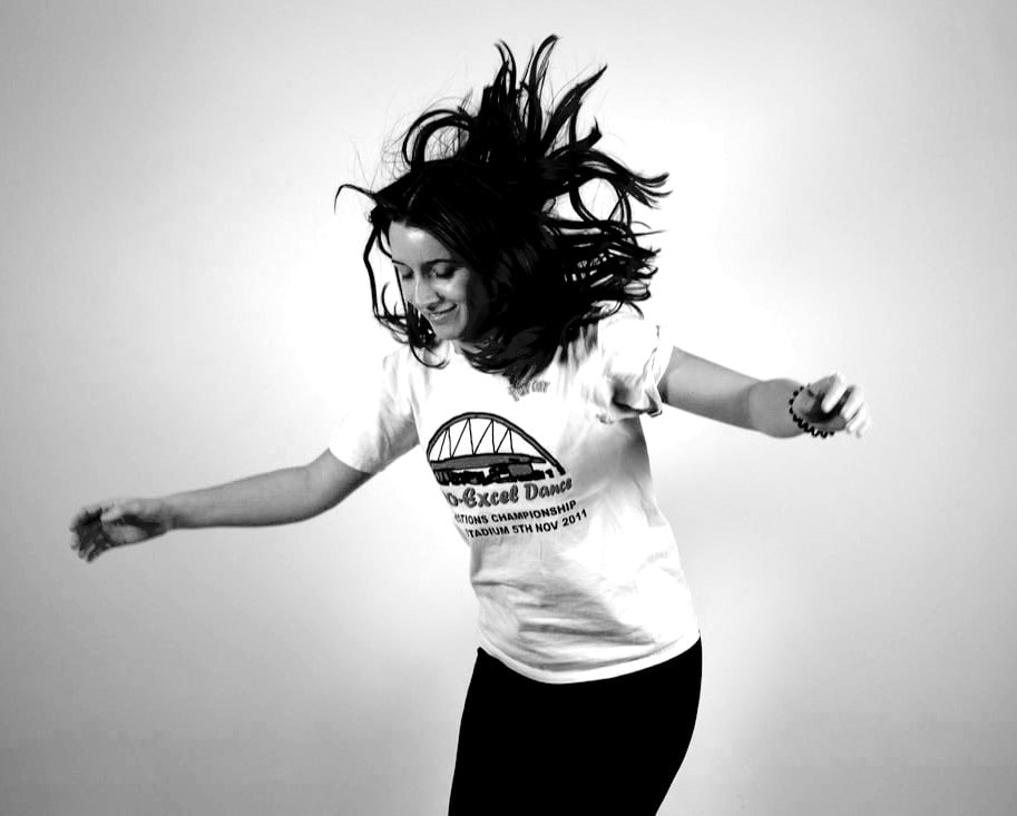
1. f a s t s h u t t e r s p e e d
r o b e r t l o n g o
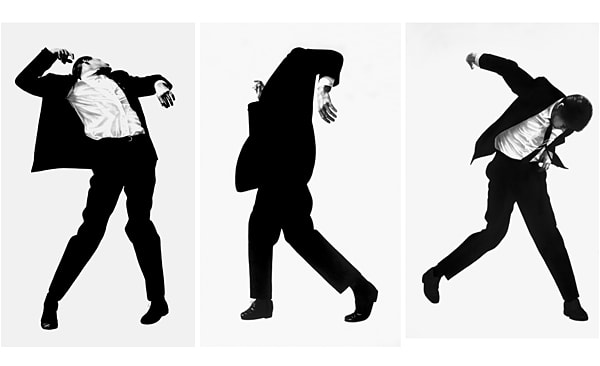
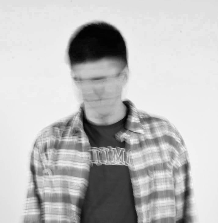
Robert Longo creates series' of graphite and charcoal drawings of smartly dressed men and women. Created between 1977 and 1983, the figures appeared trapped in a tortuous moment, limited by their daily grind. The white background emphasise this limitation, yet the images are seen to be sharp and not blurred. He was fascinated by the arrested gestures of the figures which reminded him of spasmodic movements of punk musicians and fans. Longo threw objects towards, and tied ropes around, his smartly dressed friends and photographed their reactive movements; the images were then projected on to paper, and Longo drew over them in great detail.
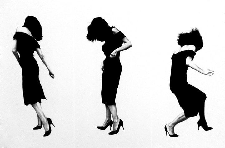
m y r e s p o n s e :
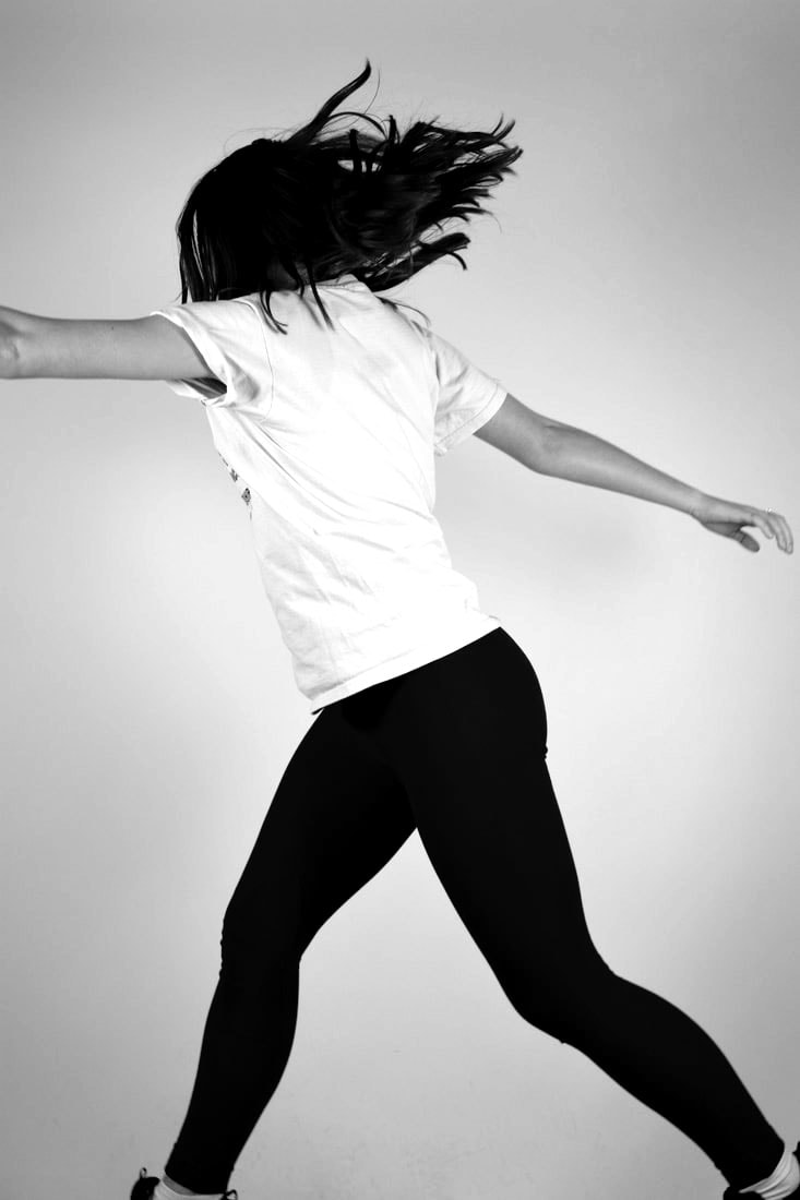
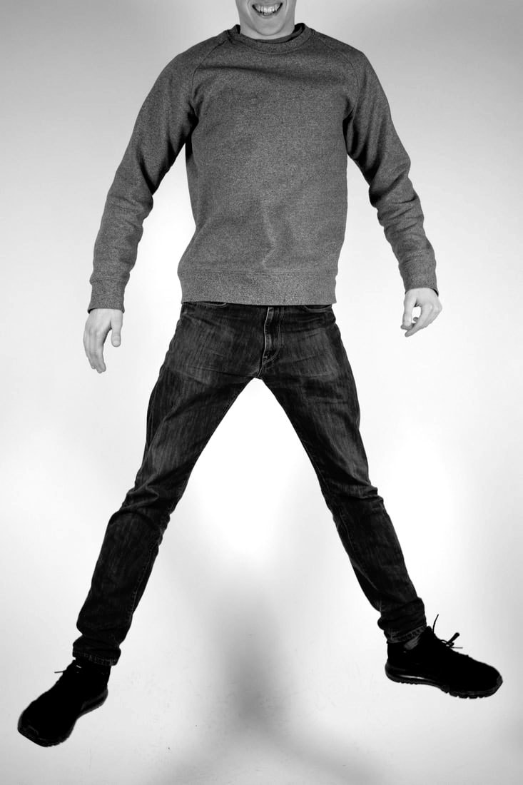
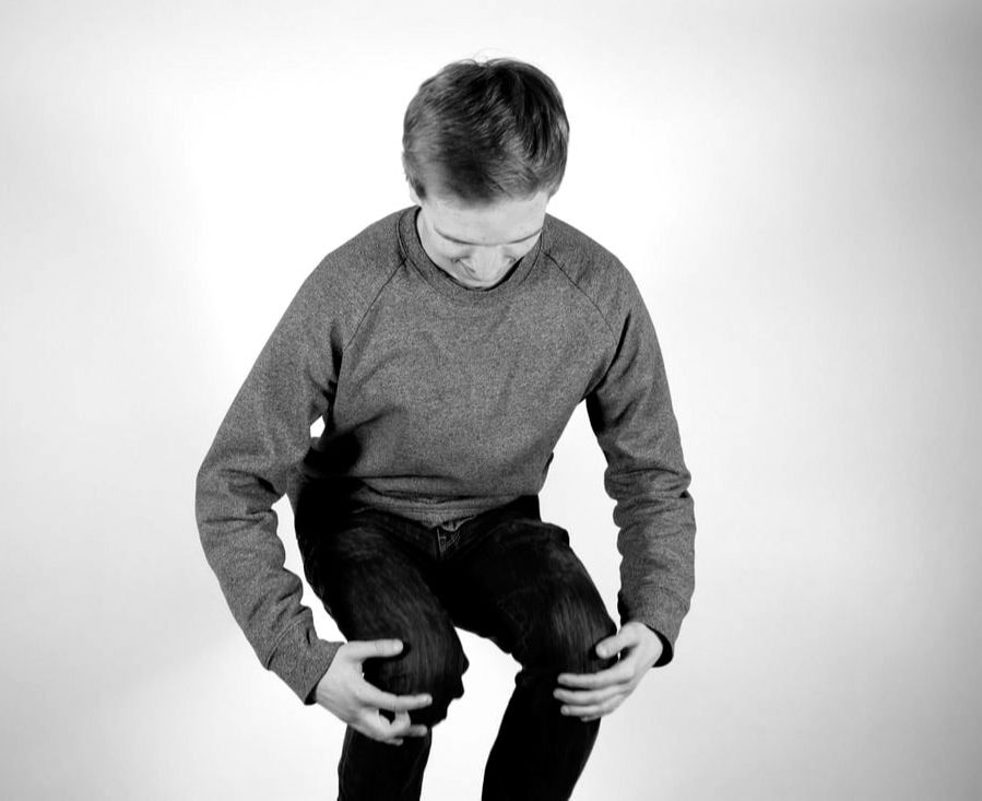
When trying to replicate Robert Longo's work, I took the actions of the subject and the background into consideration. I used the studio as it had a white background like Longo's, and I asked the people to jump up straight, use their arms jump in various positions in order to get different results. After shooting the images, I used photoshop to turn the image black and white, and change the contrast and tones of the images to try and make the black and white look like blocks of colour. I think the photographs where the subject is turned to the side and is using her arms are the most successful because they're most like Robert Longo's images. In order to improve them I would change the clothes they are wearing to more professional clothes, and would also try and get the whole body in the fame, as well as taking more images of them dancing or skipping to get positions similar to Longo's.
|
|
|
|
2. s l o w s h u t t e r s p e e d
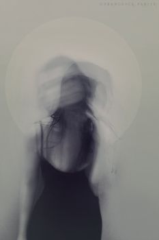
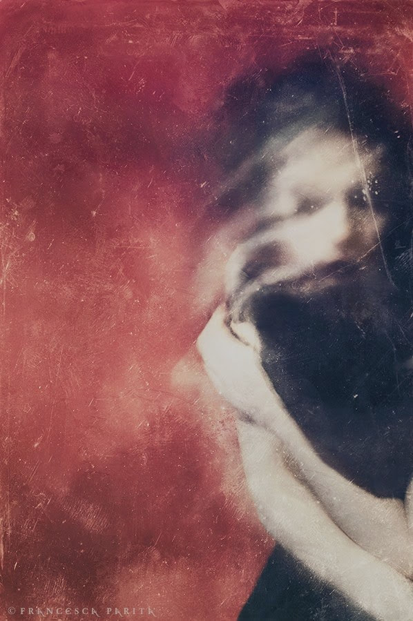
f r a n c e s c a p a r i t a
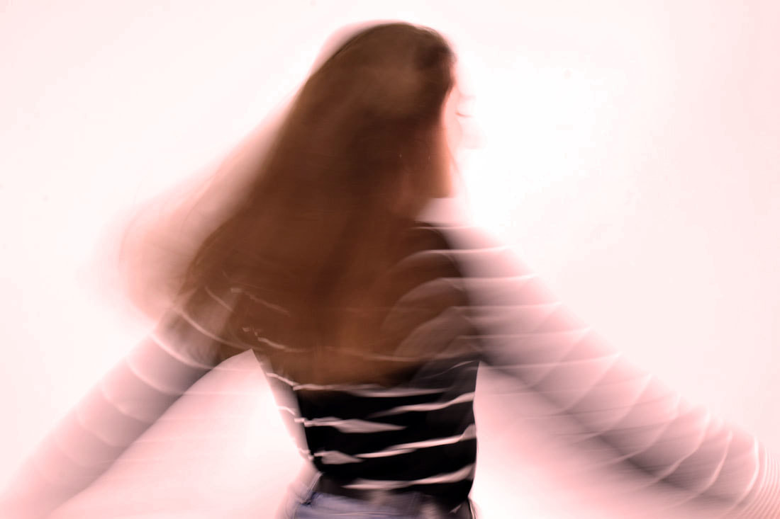
Francesca Parita is an Italian photographer, she is a wedding photographer that also makes blurred images of women. The faces are slightly eerie as the face is often distorted and the subjects looks like they are behind a screen as they look distorted and slightly like a painting. This is an example of how using a slow-shutting speed can look.
|
|
m y r e s p o n s e :
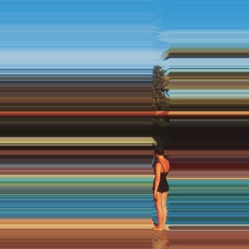
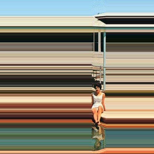
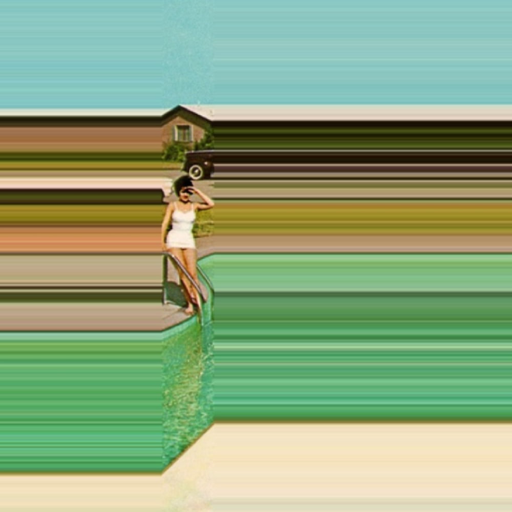
I took several images when trying to respond to Francesa Parita, the first was a response to the first image above as the subject's head is the main thing moving, although the blur in my subjects face is seen, the movement of the head is less obvious. I changed the photo to black and white to try and make it resemble Partia's work more. The second image I selected is of the subject moving more freely, I chose this photo as it shows the slow shutter speed through the camera more clearly than the first one. In order to make the colours more similar, I chose a red filter to try and capture the more sincere and mysterious mood the image by Parita conveys.
|
|
p h o t o s h o p p r o c e s s :
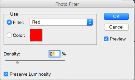
For the first image, I changed the contrast, highlighting the black more. For the second image, I firstly changed the contrast and then added a red photo filter to add more colour, in order to make it more similar to Francesca Parita's work.
|
|
e x t e n s i o n : p h o t o s h o p & s c a n o g r a p h y
f r a n c e s b e r r y
Frances Berry is a photographer, painter, and collage artist from Memphis, Tennessee. By re-working vintage photographs via digital collage and other photoshop techniques, she gives life to interesting surrealistic works. Frances manipulates images in a way that leaves you feeling like you are looking at a painting. She uses mostly vintage photos in her work, distorting the way we view the image. Many of her images use blurring as a means to show how many women are trapped in their assumed roles.
m y r e s p o n s e :
I found this quite difficult as the images I was using ween't giving me a result similar to France Berry's work, my first attempt didn't turn out well, and neither did my second, as I didn't take any new pictures for this experimentation, it was hard to find ones I had already taken that would be suitable for this. I tried to repeat the process on a photo with more going on in the background, and with a bigger image so that I could stretch it out further to get a more blurred effect. This worked much better than my first two images, although I didn't use the guidelines so you can see where I misaligned the selection of the photo.
p h o t o s h o p p r o c e s s :
p u s h i n g t h e l i m i t s o f p h o t o g r a p h y
In order to create a 'good' image a number of things are needed. A few being focus, strong composition and good exposure.
e x p e c t a t i o n 1 : f o c u s
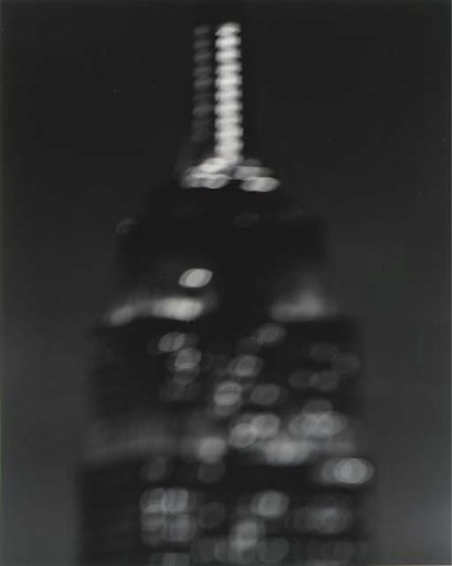
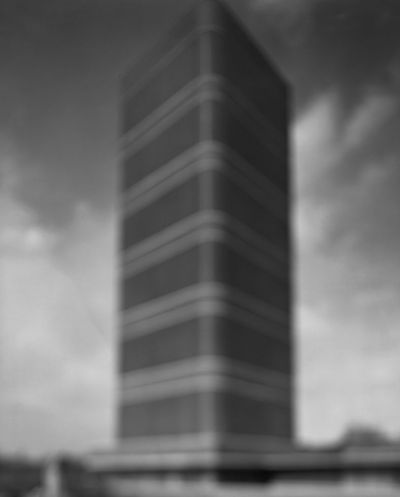
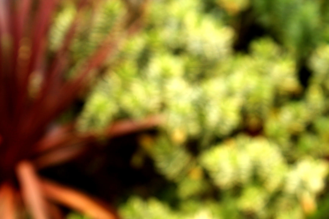
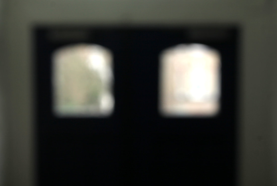
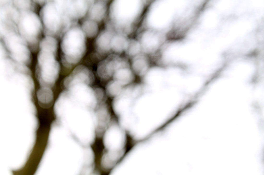
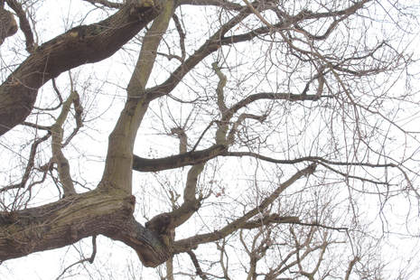
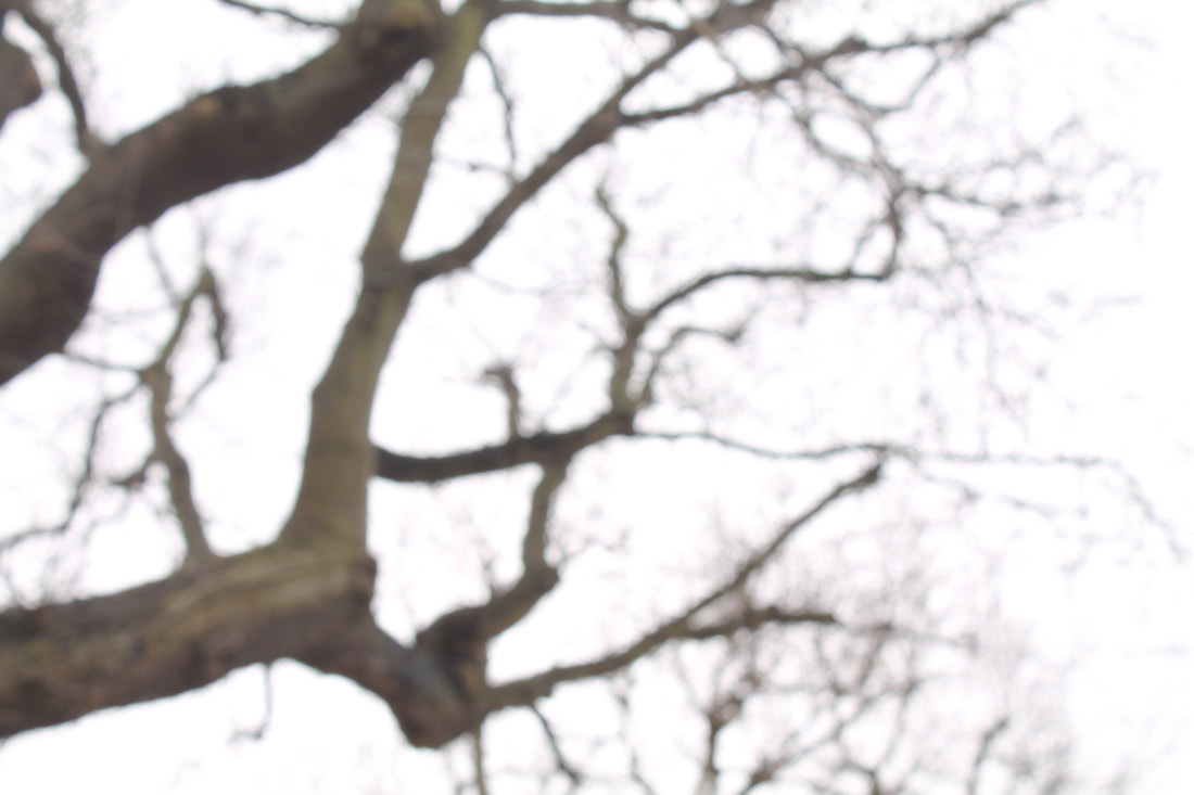
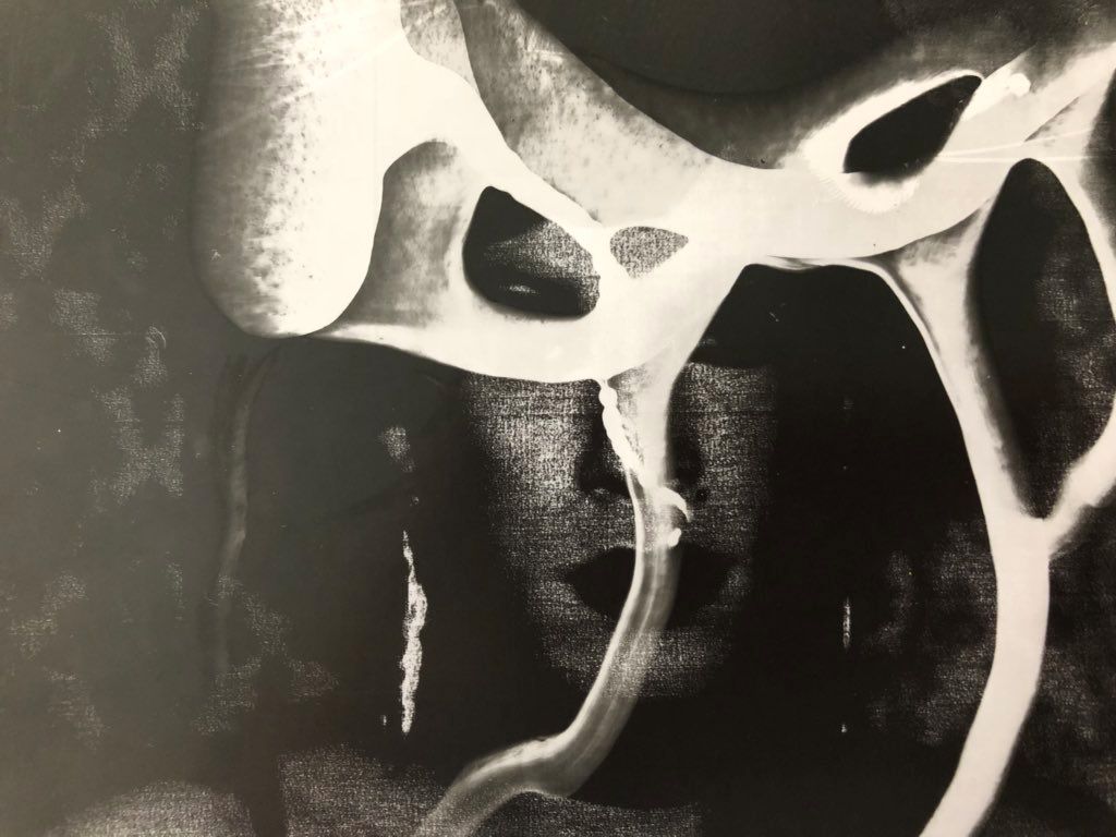
h i r o s h i s u g i m o t o
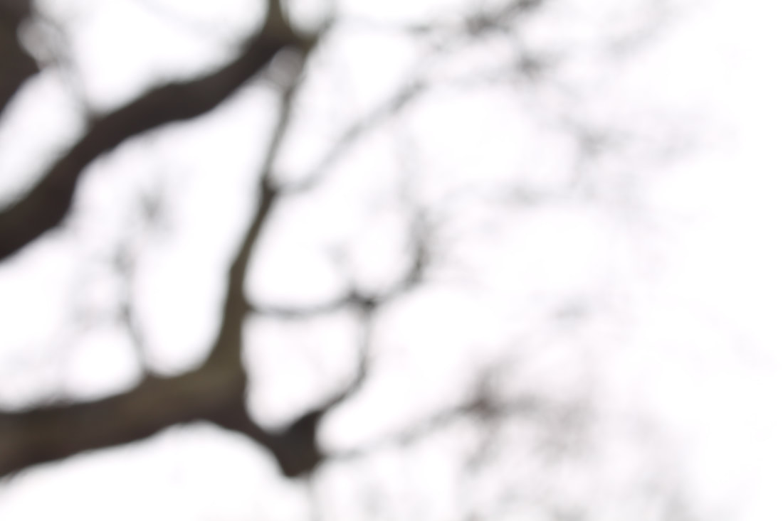
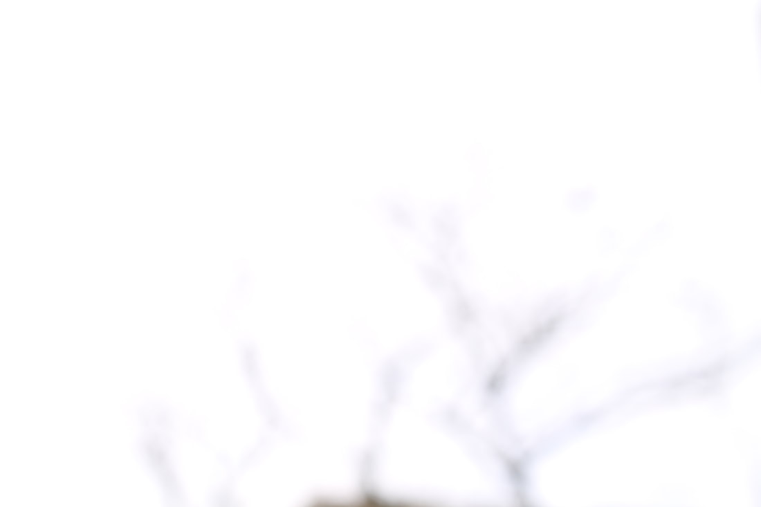
Hiroshi Sugimoto was born in Japan in 1948, he's a Japanese photographer and architect and leads the Tokyo-based architectural firm New Material Research Laboratory. A photographer since the 1970s, his work deals with history and temporal existence by investigating themes of time, empiricism, and metaphysics. To craft his exquisite black-and-white images, Hiroshi Sugimoto uses a 19th-century-style, large-format camera, exploring his idea of photography as a method for preserving and modelling time. By defocusing the lens and thereby blurring the specific features of the buildings, Sugimoto distilled each structure to its core form in both light and shadow, highlighting the vision of the architect. These photos are evocative of the images or shapes that are left behind in your eyelids after looking at something meaningful for a long time and it’s almost as if you have seen the buildings up, close and personal.
|
|
|
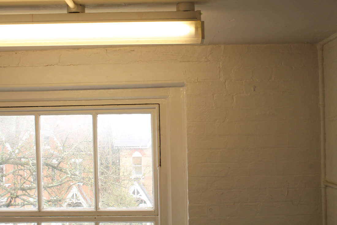
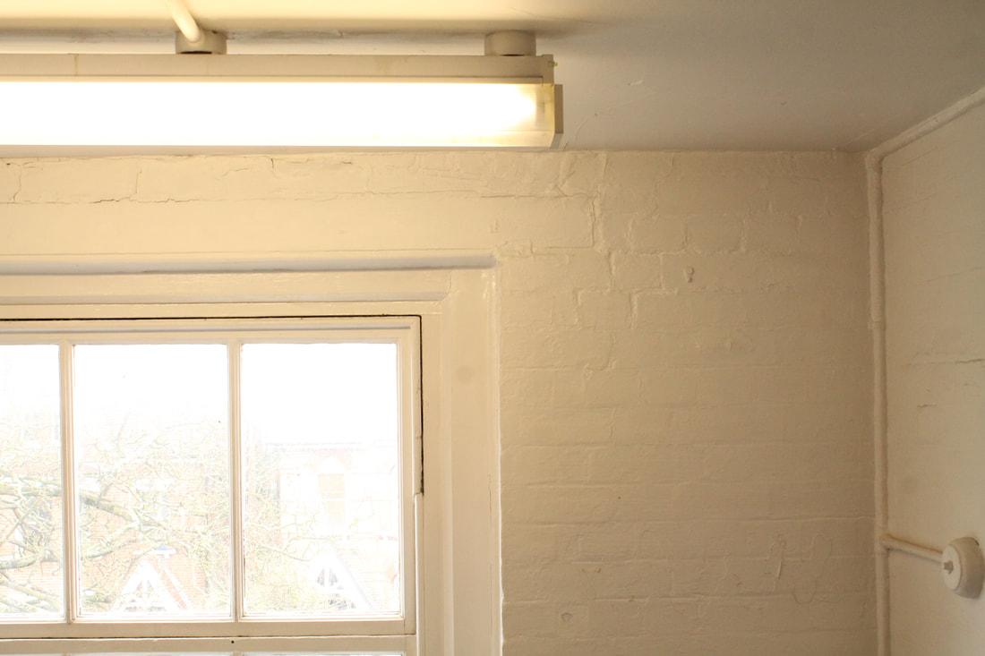
m y r e s p o n s e :
I walked around school finding things that I could blur with my lens. I decided to rake pictures of these plants as their vivid colours could still be seen when blurred, but the subject of the images becomes so blurred that it gets to the point where it's hard to tell what it is. The second image of two windows in the doors is effective because of the colour contrasts , however you can still tell what it is. For the third mage, although you can tell it's a tree, I wanted to experiment with how far it could be blurred until it became unrecognisable, however, the branches were still visible.
e x p e c t a t i o n 2 : c o m p o s i t i o n
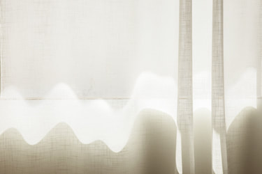
u t a b a r t h
Uta Barth is a contemporary photographer who lives and works in Los Angeles, California. She examined photographic and visual perception—how the human eye sees differently from the camera lens and how the incidental and atmospheric can become subject matter in and of themselves. These lushly coulored images tested connections between the descriptive clarity of photography and the haze of memory. In 2007, Barth produced Sundial, a series of photographs in her home at dusk. Made at the moment when light begins to transition and fade, these images operate between positive and negative, visibility and invisibility, and shadow and light.
|
|
m y r e s p o n s e :
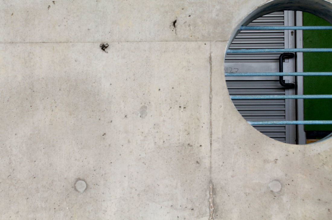
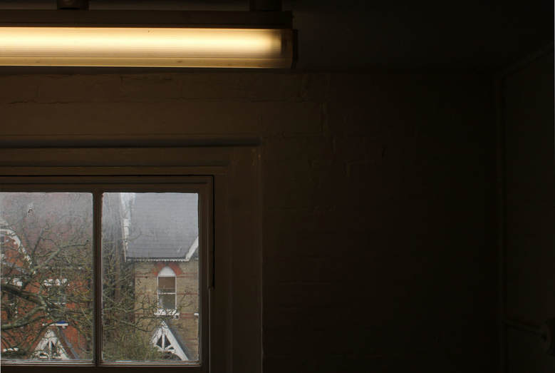
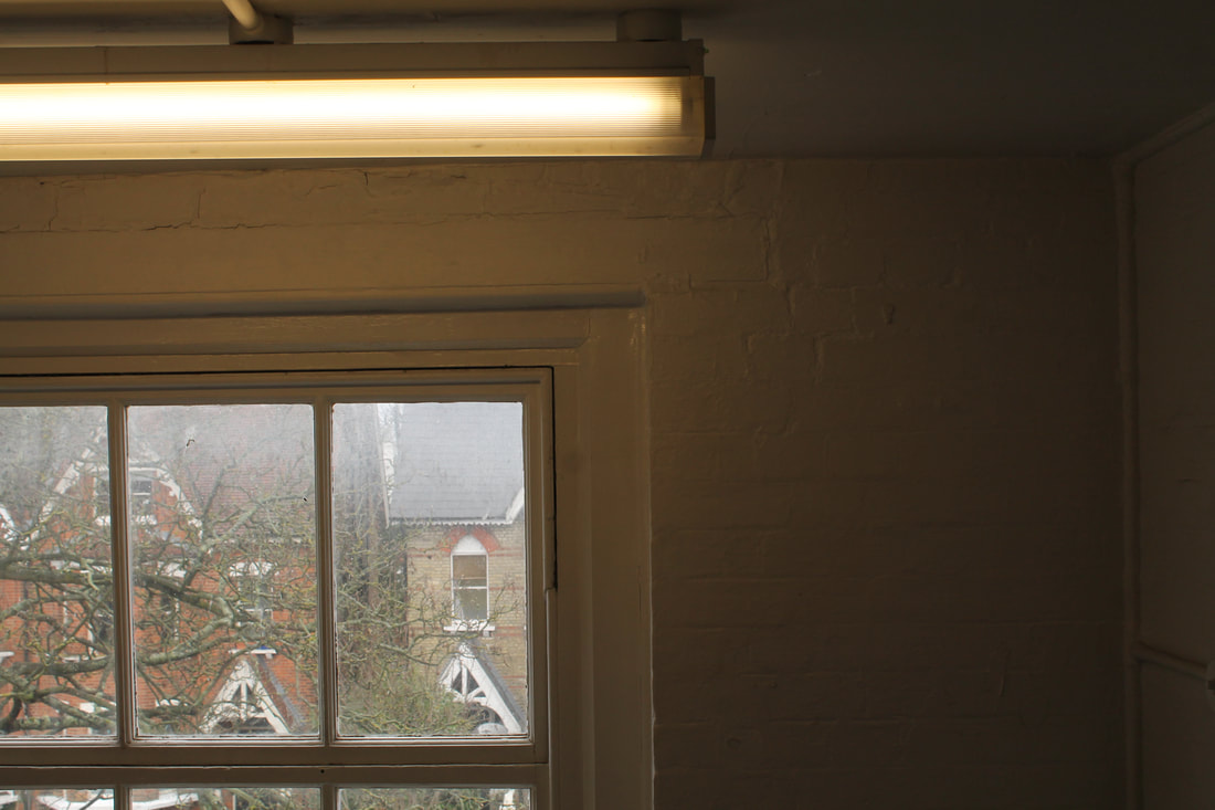
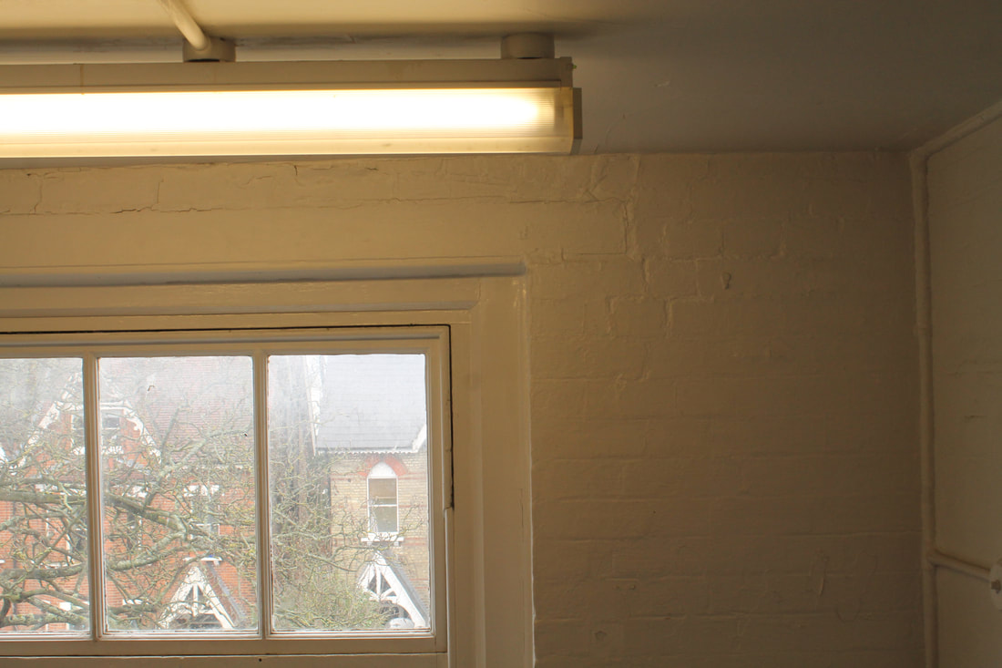
When taking these images, I tried to consider my composition at all times, this included the severe cropping of photos, or having a slight glimpse of them in the image as this would cause intrigue. For my first image I took a picture of a wall with a hole in it, I think the composition of this image is good as the solid block wall makes you divert your attention straight to the wall. However this would be a better image if there wasn't a door behind, and instead was just a block colour. My second image shows how the cropping of an image can shift your focus, all attention is on the small section of the window, especially as it contrasts with the darkness of the wall.
e x p e c t a t i o n 3 : e x p o s u r e
s a l l y m a n n
Sally Mann is an American photographer, best known for her large-format, black-and-white photographs—at first of her young children, then later of landscapes suggesting decay and death. Capturing the land and historic architecture, her haunting black and white images capture a particular essence of her interpretation of what it means to live in the South. The philosopher Roland Barthes once admitted that his fascination with photography "probably has to do with death". One can sense that Mann not only shares that sensibility but has made it central to her work, even her landscape photography. "Time, memory, loss and love are my main artistic concerns," she said in 2007, "but time, among all of them, becomes the determinant."
|
|
|
m y r e s p o n s e :
I went around school taking a variety of images, and changing the exposure of them. I took pictures of trees like Mann did, and changed the ISO various times when capturing the image to see what the different exposures would look like. The two sets of images below demonstrate how exposure can change an image. The two examples I chose were inside and outside; natural light sand artificial light. As the first set of the tree reveals, the higher ISO of the trees makes the image disappear and can completely change what is originally looked like.
|
|
|
|
|
|
|
|
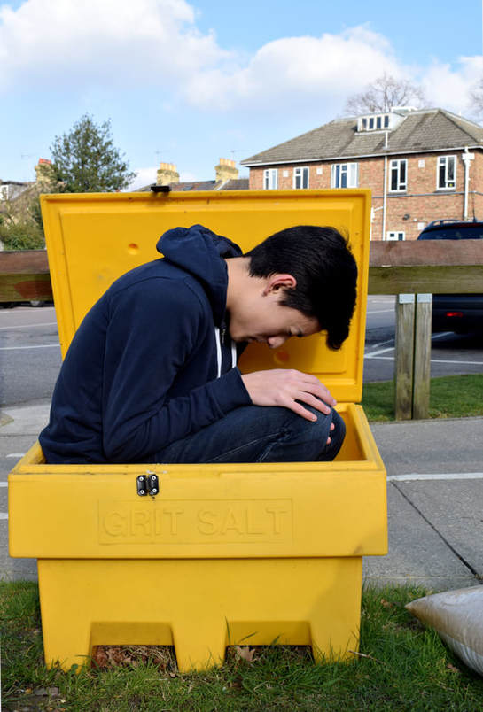
l i m i t e d s p a c e
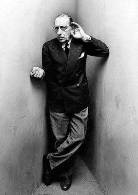
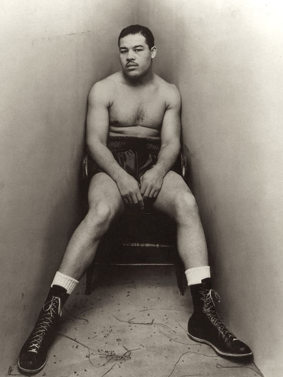
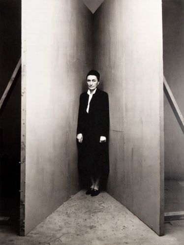
Around 1948, photographer Irving Penn began making unusual portraits of a number of writers, artists, musicians, politicians, dancers and other celebrities. Each one was asked to position in a small corner (sharper than 90°) created with two studio flats pushed together and a carpet on the floor. The photographic studio was no longer part of the natural environmen, but became an active agent of it as it was included in all of the photos. This changed the composition, emotions and tones of the photographs. Irving Penn allowed the studio to have a presence in the images, electrical wires and photographic materials are often seen in the images. The studio becomes a architectural limiter of the subjects movements.
i r v i n g p e n n
|
|
|
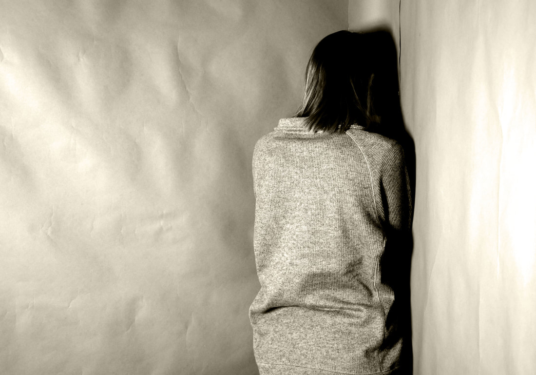
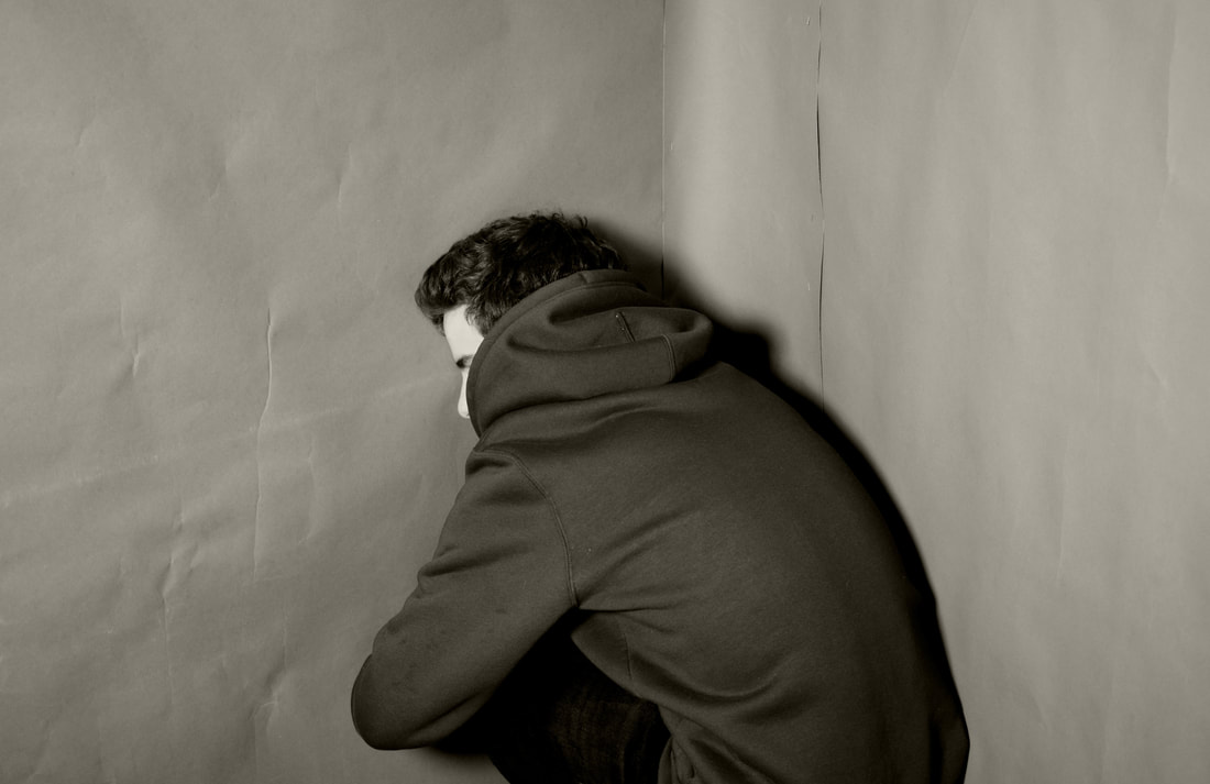
m y r e s p o n s e
For my response to Irving Penn's work, the subject's went into the corner of two walls. I changed the tone and contrasts on photoshop and made the first image slightly sepia by using a warming photo filter because Penn's images aren't completely black and white. I think the fist image turned out better because the subject is standing up and it has the photo filter on it, however as you cant see the faces in either of the photographs it takes a lot away from it/ Also if I made the two walls slightly closer I think it would have a greater effect as they don't look that squashed or confined. Additionally the paper takes away from the image as it creases and slightly diverts the focus away, whereas in Penn's images, the walls are more concrete.
|
|
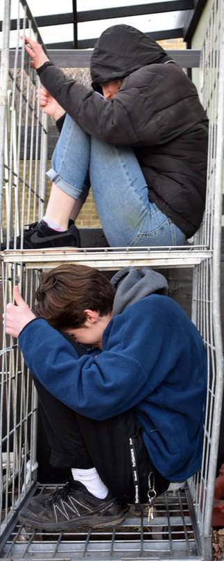
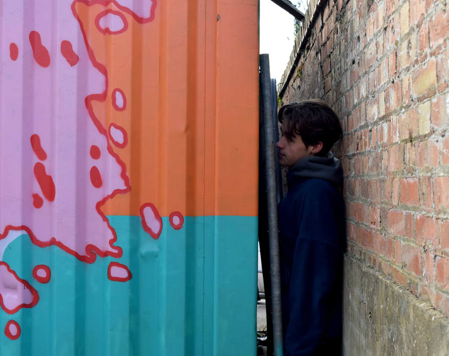
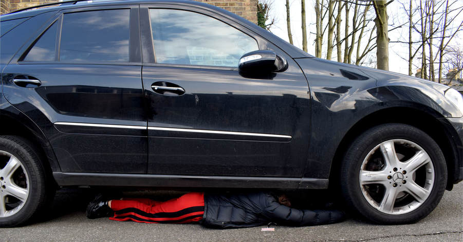
w i l l i d o r n e r
Willi Dorner squeezes human bodies into nooks and crannies for his Bodies in Urban Spaces project. Groups of dancers, climbers and performers wearing brightly coloured clothes run through busy shopping centres and high streets, cramming themselves into doorways, alcoves and any gap they can find in public buildings. The group of 20+ performers have often got attention from local police who had feared that the groups were burglars or vandals, but to Dorner even bad reactions from the public and local authorities are considered a success. "The project is about making people think about codes of conduct for behaviour and where certain behaviours are appropriate or inappropriate," he said "A public bench, for example, you are allowed to sit on it but not lie on it or stand on it. When you see someone behaving differently to the social norms it catches your attention...We are never causing any damage or aiming to upset anyone. Some people love it and laugh or smile but others respond very negatively. They shake their heads and say we shouldn't be climbing around. The mix of reactions is amusing. America and the UK were certainly the most difficult places to do the performances," he said. "Britain in particular has such a strong health and safety culture it made organising the shows quite a challenge"
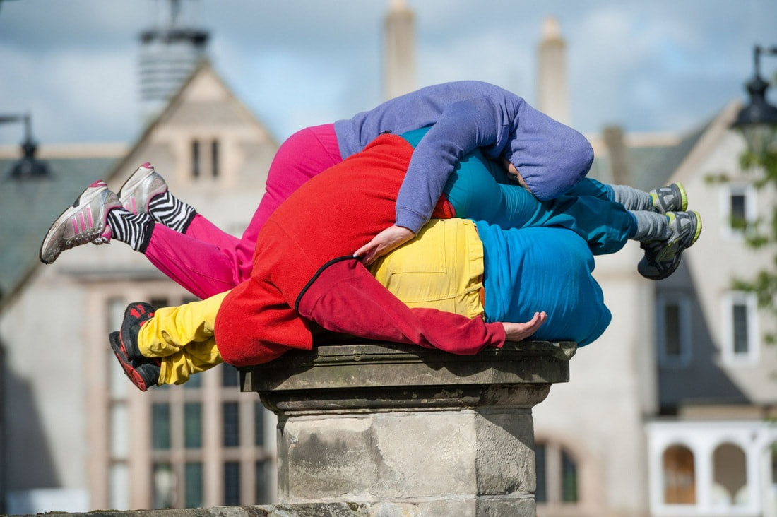
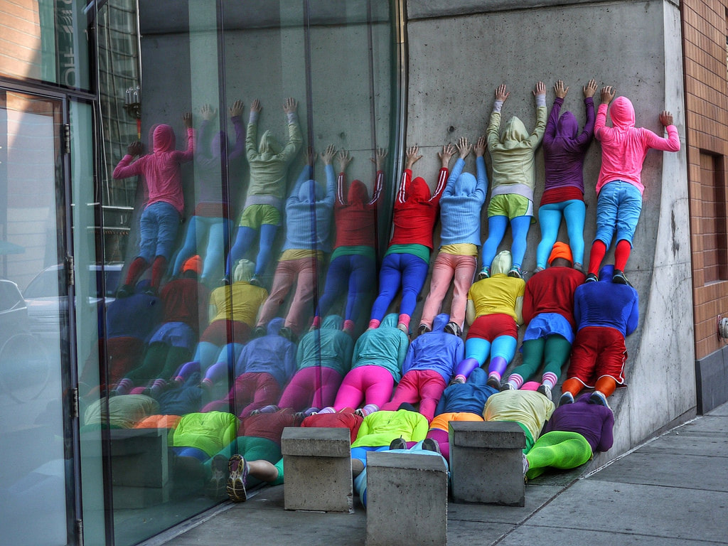
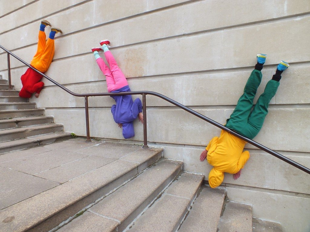
m y r e s p o n s e
I went around school and tried to find as many as places as possible to squeeze into. This included bins, under cars, table, chairs, behind crates and boxes. I think this worked quite well as the colours of the environments contrasted with the clothes and made the subjects look more out of place, however I think the images would be much better if some of the positions and arrangements occurred like in Willi Dorner's work. I also think that these images were a lot more effective than Irving Penn's in the studio because they're more contemporary and stand out more as they're in public places.
|
|
p o s t p r o d u c t i o n
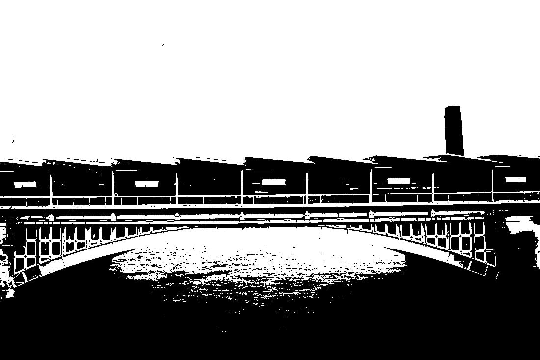
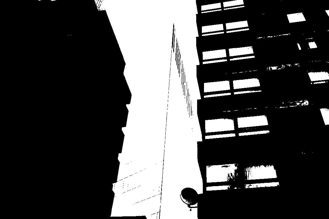
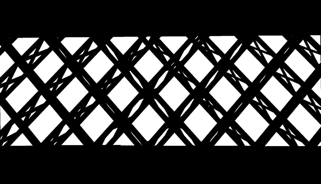
k e l d h e l m e r - p e t e r s o n
Keld Helmer-Petersen was a Danish photographer who achieved widespread international recognition in the 1940s and 1950s for his abstract colour photographs. Petersen used a very high contrast to achieve the look, and published books designated to this particular type of abstract photography. Often, the photos were so highly contrasted that the subject was hard to make out. All mid tones have been removed. He created and found these images, using both cameras and flat bed scanners to achieve the effects he was looking for.
m y r e s p o n s e :
I chose photos that were of buildings or some kind or architecture, this was because the final outcome would look more abstract after being edited because of its design. This included a bridge that had an interesting pattern, an image that included two buildings which created large silhouettes, and a building that had an abstract shape. I think that they came out ok as a first response, the black and white were visibly blocks of colour that were highly contrasted, however, they weren't solid as outlines and white parts could be seen. In order to improve these images I would do it again, choosing different photos that were more interesting and of particular things, rather than of buildings because I found it was quite hard to completely contrast the colours without any of the background being included.
|
|
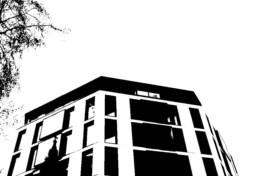
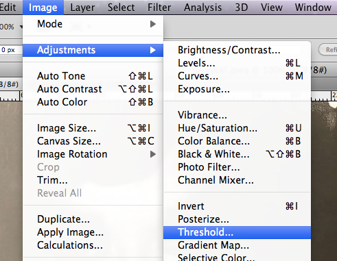
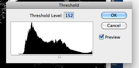
p h o t o s h o p p r o c e s s :
With all three of the images I chose, I used photoshop, went onto adjustments and chose threshold. This changed the intensity on a slider between black and white and mainly revealed the outlines of the buildings and the blocks in architecture which created large silhouettes.
|
|
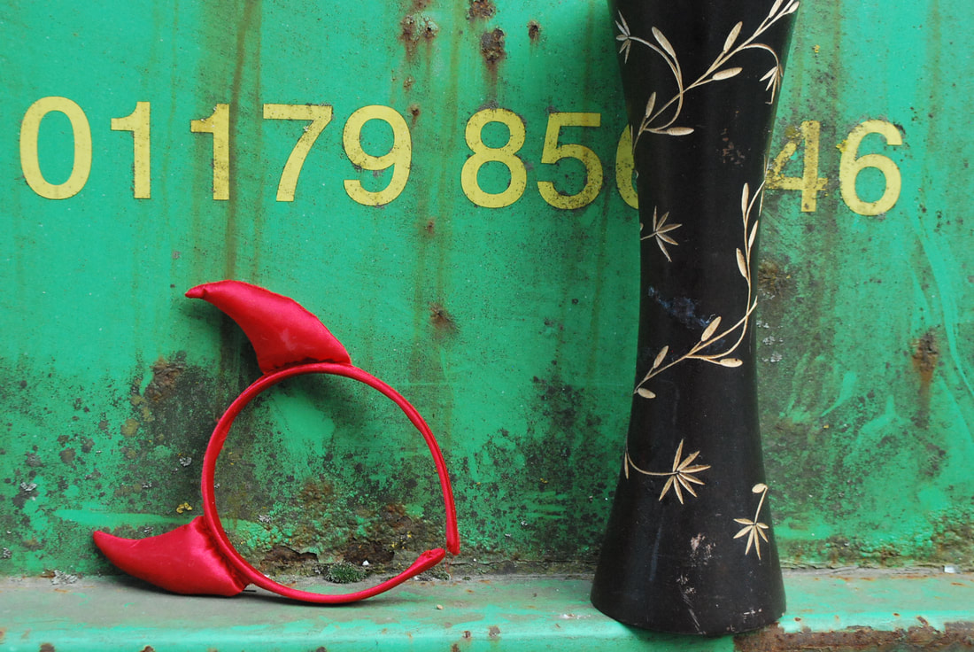
s e c o n d r e s p o n s e :
I chose to refine my response to Helmer-Peterson's work as my first response didn't come out well. Instead of using pictures of buildings that had a lot going on in them and in the background, I chose more simpler images that I thought would work better. From my SD card I chose a picture of a big leaf as I thought the solid colour with the white gaps would work well, a picture of a bridge in Southbank, and an image I took in a rubbish dump. I used the same photoshop process shown in my first response, however, in the last image of the devil ears and vase in the rubbish dump, I used the black and white paintbrush to fill in the colours as they didn't come out as solidly as the first two photos, however after doing this I got the result I wanted.
b e f o r e a f t e r
e x p e c t a t i o n 4 : d a m a g e
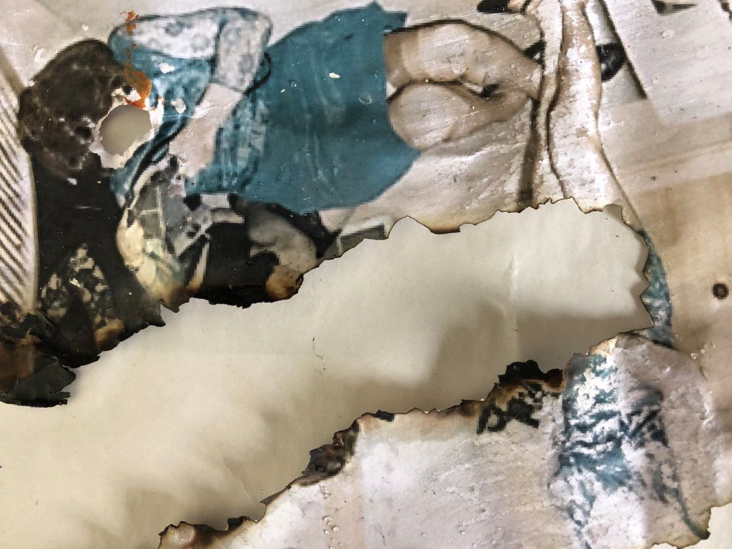
s e u n g - h w a n o h
Using homegrown bacteria, photographer Seung-Hwan Oh warps and manipulates his photographs. His intention is to “explore the impermanence of matter as well as the material limitations of photography.” It brings the artist’s studio into the laboratory, marvellously blending the organic and the artificial. Seung-Hwan Oh brutalises and mistreats his images in order to make them sick, revealing not just the physicality of the photograph itself but the life of the artwork. He states: “I use this technique to share an idea that all the matter including all the life forms collapse in this spatial-temporal dimension we belong to.”
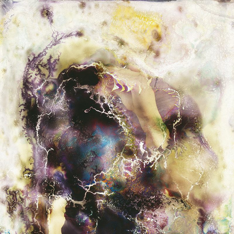
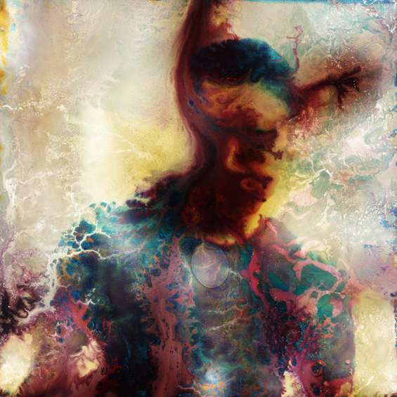
m y r e s p o n s e :
When responding to Seung-Hwan Oh, I used bleach to try and ruin both images. For the first, I used a sponge and a paintbrush to paint the bleach onto the photo and use the sponge to scratch parts of it off. The aim of this was to try and get rid of the main features, e.g their faces. However, as I did it on paper instead of photographic paper, it ripped quite easily and scrunched the paper up. The second images was a lot more successful, this was because it was done on photographic paper s the bleach had more of an effect. I poured bleach straight onto the image and moved it around so that it spread out, I then dipped the whole image in bleach and then water to wash it off. The bleached effect is most similar to Seung-Hwan Oh's work because it looks more like the chemicals have had an affect on the image.
|
|
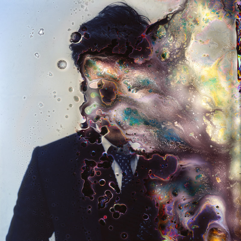
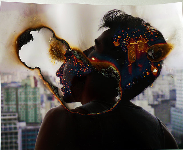
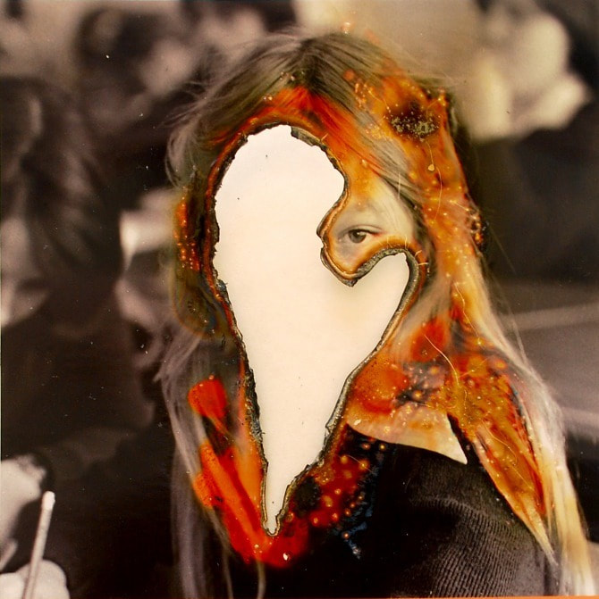
l u c a s s i m o e s
Lucas Simoes is an artist based in Sao Paulo, Brazil, who has a background in architecture and design which explains his accurate use of geometric shapes within some of the photographs. With the combination of collage and use of fire to manipulate the face, it provides a sense that artist is attempting to destroy a memory the photo holds. One of his series' called “desmemorias” is the Spanish for ‘un-memories’ and it explores the loss of people and friendships from his life, as he layers the photograph ten times manipulating their faces, representing their removal from his life. Simões has the same description for all these series on his website; stating that burning pictures is a way of physically erasing a memory, and that in time the part of the image that was burnt will be permanently lost from memory.
m y r e s p o n s e :
For my response to Simoes' work, I chose two images to manipulate. The first was painted on in an attempt to try and destroy the image, however the colours proved to be similar to some of Lucas Simoes' photos which made it more effective. Although the face wasnt burnt, parts of the body and head were, burning around the face drew more attention to the image, while revealing the manipulated nature of it. In the second image, I used the same image that I manipulated with chemicals to try and alter, this included bleach which I used to scratch out the faces of the women. The result of this was similar to Simoes, however he used burning, so I manipulated the image further by burning the paper. I think the results were alright, ti improve the outcome I would have burned more of the face in the first image, or ayer images and burn them like Lucas Simoes did to get a more interesting effect. He also used photogaphic paper, not normal paper so it altered the image more. Additionally, in the second image, when I burnt it, started burning the whole piece of paper which kind of ruined the image. Using photographic paper would make it burn more slowly and not destroy the entire photograph.
|
|
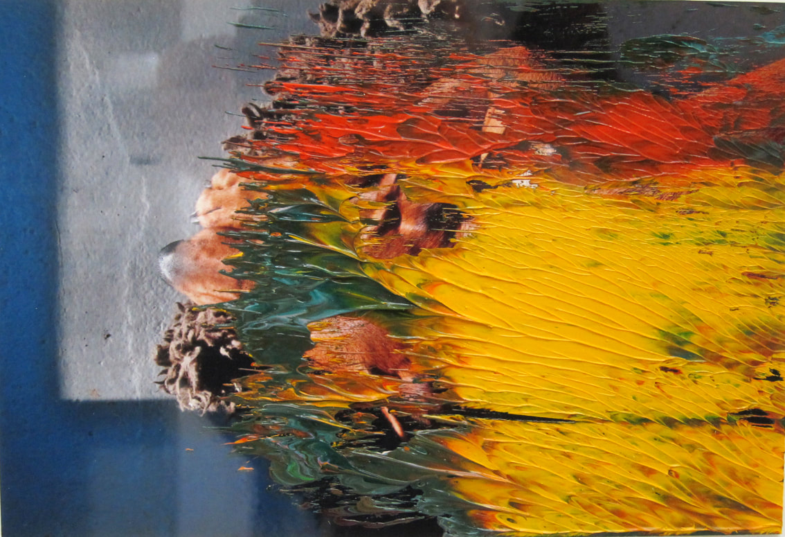
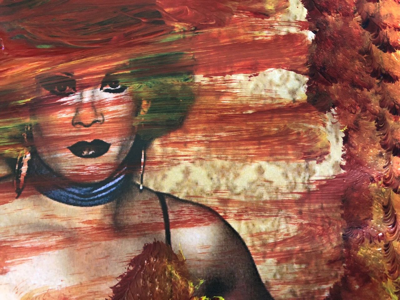
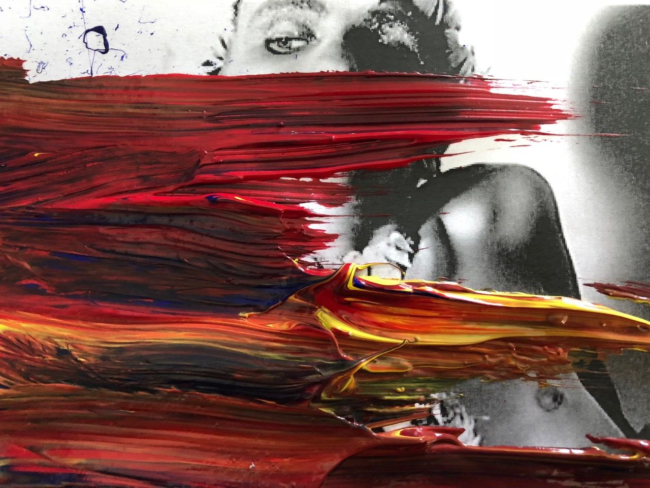
g e r h a r d r i c h t e r
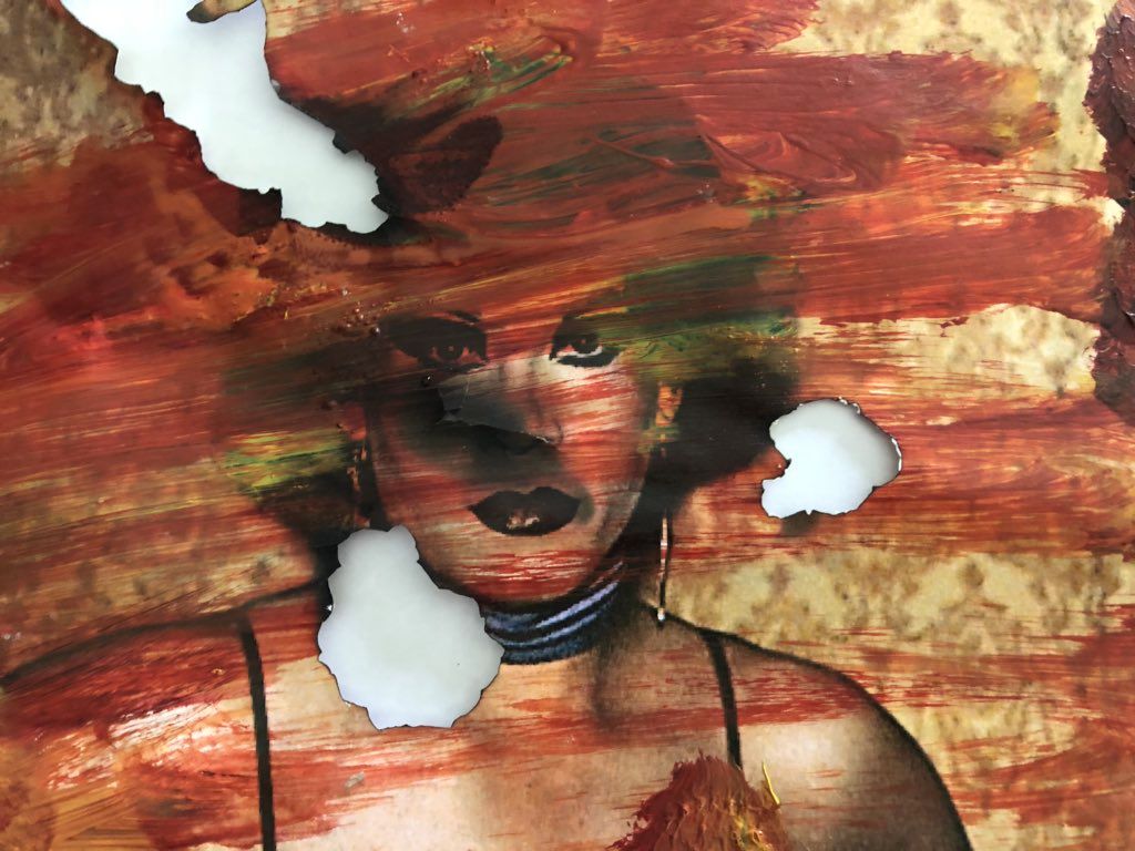
Gerhard Richter is a German visual artist. Richter has produced abstract as well as photorealistic paintings, and also photographs and glass pieces. Richter borrows much of his painted imagery from newspapers, or even his own family albums. He takes many different images that he has archived from the media over a number of years and paints on them. The images are often the ones that haven't made it into the albums, the ones with red eyes or the blurry ones. The paint often almost overs the original subject, but they complement each other and what is underneath becomes more intriguing. The paint used is often left over oil paint, with various colours that have been melded together. Richter than takes the photographs and pushes, pulls, and draws them through the surplus paint, lifting the prints to create ridges or allowing the paint to smear and drip to create spots and blobs.
m y r e s p o n s e :
When responding to Richter's work, I decided to use big blobs of paint on the image. The first image i spread the across the whole image, so it became thinner, and used the paintbrush to make patterns on the edges, although Richter didnt use paintbrushes, I tried to make quick and careless strokes to get the same effect, however, I dont think the image turn out very well. After doing one image, I tired again and I think the second image is much more similar to Richter's work. I poured red yellow and blue blobs of paint onto the edge of the image, and quickly made sideways strokes not thinking about what I was trying to achieve. This carelessness with the image created a much better picture as the stokes are messy, but colourful and intriguing, while partially covering the original picture making it more of a mystery.
|
|
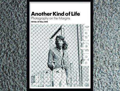
a n o t h e r k i n d o f l i f e
Another Kind of Life - Photography on the Margins, is an exhibition at the Barbican, consisting of images from all over the world, ranging from the 1950's to present day. It was about people who were outcast and lived on the margins of society. It revealed what kind of life experiences they went thorough and how this shaped and moulded their identities. It explored how each of the 20 photographers immersed themselves and got detailed authentic accounts of their experiences though learning about they way they lived= and the reasons behind why they're viewed as being marginalised. The work was curated by having one room for each artist, the aim of this was to make the viewer focus on their work fully, one room at a time, in order to experience all of their images to the fullest extent. The work was presented at eye level on the walls, pictures laid out on tables, TV's with headphones and speakers with videos. The viewers were led around the exhibition by firstly displaying a larger image of one of the photographs at the start of the room, which made you walk around looking for that image.
|
|
|
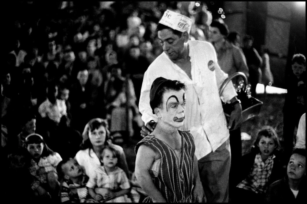
b r u c e d a v i d s o n
Bruce Davidson's series 'Circus' was photographed in 2007. Davidson describes his photography as an attempt to understand his own place in the world, and throughout the 1950s and 1960s he produced several bodies of work for which he immersed himself in communities normally hostile to outsiders. He often spent months at a time nurturing the relationships he had with this people in order to properly understand them so that he could capture their identities through the camera. He photographs the same dwarf in a circus wearing makeup. The images are in balk and white which emphasises the eeriness of the photos and the dwarf with the clown makeup. He is found both as the main subject where he is performing an being laughed at, and also in the background where he still stands out, but attention is drawn to him as many of the surrounding people are staring at him. The use of the makeup also emphasises his status as an outcast.
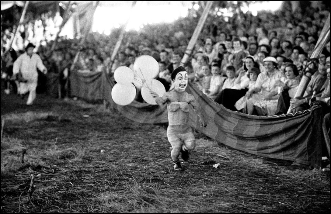
This exhibition successfully collated a range of images exploring the lives of people who lived on the margins of society and the struggles and experiences they faced in their everyday lives. It celebrates the people who would normally be turned away by society in a way that recognises and acknowledges their individual identities. The Another Kind of Life exhibition can be linked to our exam theme 'Freedom and Limitations' by exploring the limits society poses on people, freedom of speech, freedom of society, choice of media, as the photographers chose how to exhibit their work, but also the freedom for the subjects to express themselves and the way in which they present themselves to the world.
3 s t r a n d s
Strand 1 - Scale & abstraction
I decided to do this as my first strand as I thought scale was a good initial way to explore freedom and limitations. I aimed to do this by creating images that would push the limits of photography of real life things. I wanted to incorporate abstraction into this as the first artist I drew on inspiration from was Aaron Farley, I thought the technique he used to create his images would work well with the idea of scale.
Strand 2 - Surrealism
Surrealism is an art movement that has massively pushed the boundaries of art to create something new and different. I wanted to explore this as it hugely pushed the limit of what art and photography mean. It allowed the freedom of the mind to be creative and draw from unique viewpoints and imaginations to create - what has been called - a revolutionary movement. These concepts of pushing boundaries and having the freedom to express yourself in this style is what I took away from the exam title.
Strand 3 - Exploring the ordinary
This strand centres around the meaning behind objects. Context can be important in photography, whether it's the time a movement originated, if it's relevant to the artist's life, or society, or the context the viewer gives it, they're all connotations that dependent on the environment, time or individual. By changing how ordinary items are presented through different means of photography, we have the ability to change the context and therefore give normal items a deeper meaning.
s t r a n d 1 - s c a l e & a b s t r a c t i o n
This strand explores how the barriers of only using certain objects in photography can be overcome by using different techniques and style to make the abstract. Aaron Farley is an artist that does this, by using simples images and physically manipulating them to create a new image. This can be inked to the exam theme by considering how these images convey the freedom of abstracting by the use of limiting materials. Furthermore, the strand will be developed using scale, incorporating people to contrast again the vast landscapes.
a a r o n f a r l e y
Aaron Farley studied photography, acquiring the Bachelor at Washington University. He is based in Los Angeles and takes photos of clouds and water and manipulates the by turning them on their side, and rephotographing them. He also reprints and refolds his images to create a different image to the original, while still maintaining the previous effect. Farley captures the movement and develops a highly diversified work. He has the ability of elaborating admirable jobs in both urban sceneries and wide-and-natural environments. He develops it and shows to the world his "author photographs", exhibiting his single and creative perspective about a determinate object, person or situation.

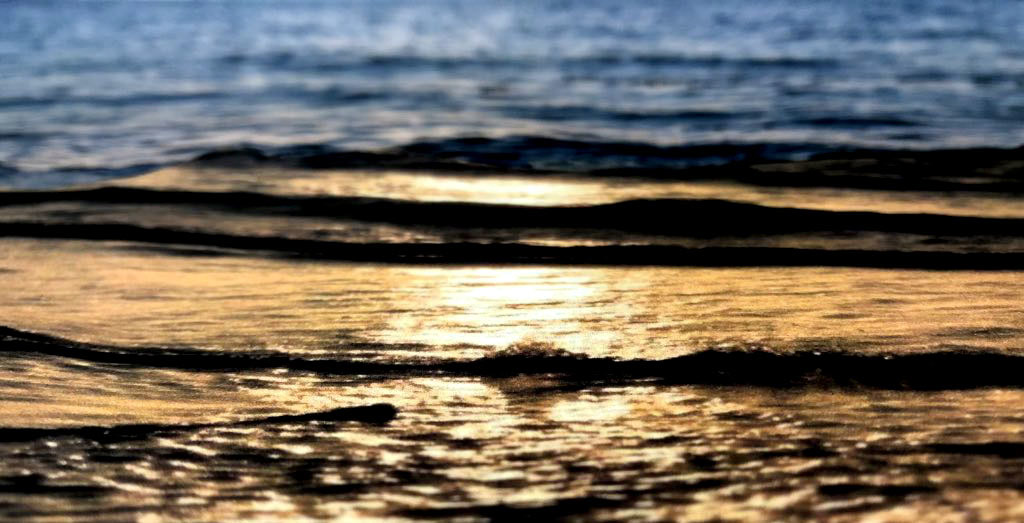
i m a g e s u s e d :
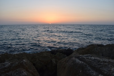
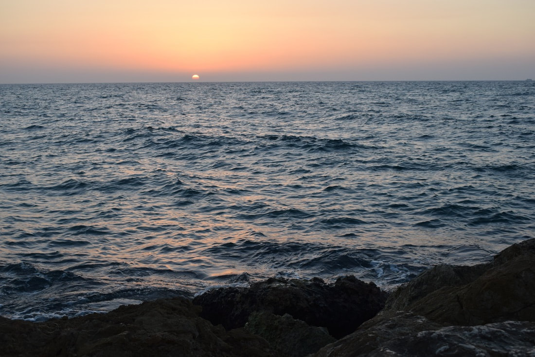
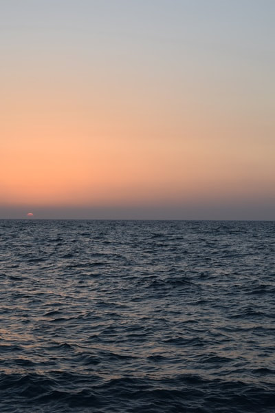
m y r e s p o n s e :
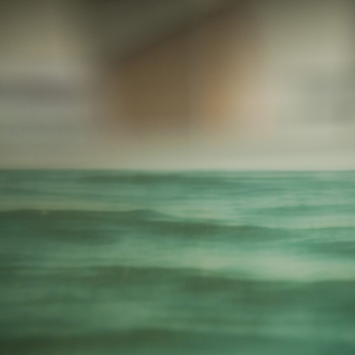
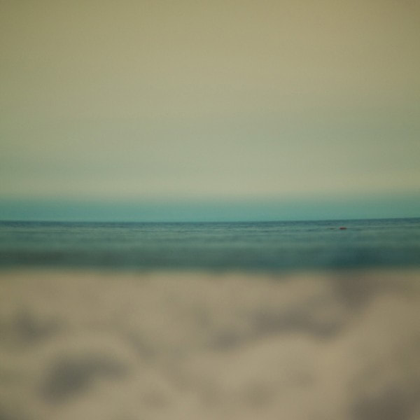
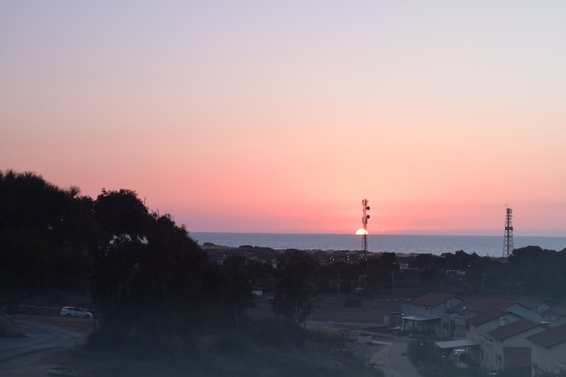
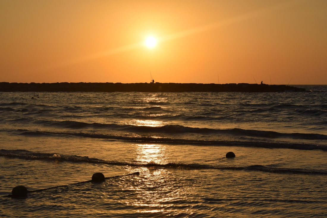
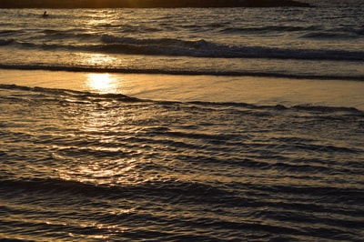
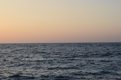
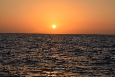
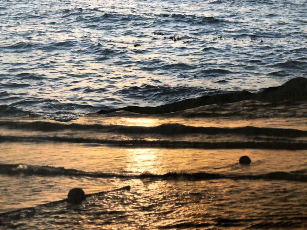
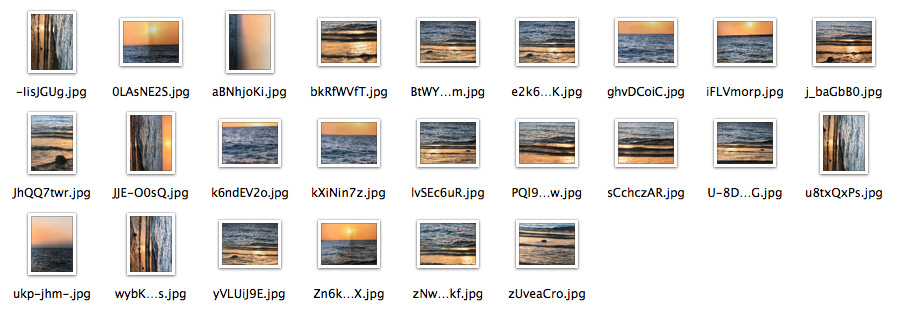
To create these images, I printed out a wide range of photos of the sea I had previously taken. They all worked well together as they were different colours because of the sunset, and becaue of the different angles they were taken at. Although I used these images to create the same sort of landscape, I create a slightly different effect. I cut out the sea part of all of the images, and the rocks and sky, and rearranged them to create new images. Aaron Farley doesn't stick his images down so that he can use this to obtain creative effect and angles, however, after I originally tried to do this, it didn't work so I stuck them down and used my camera to take pictures of my images at different angles to get different depths of field. I think the outcome was successful at the images looked like a new photograph - and I think that the depths of field used especially helped this.
s e c o n d r e s p o n s e
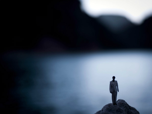
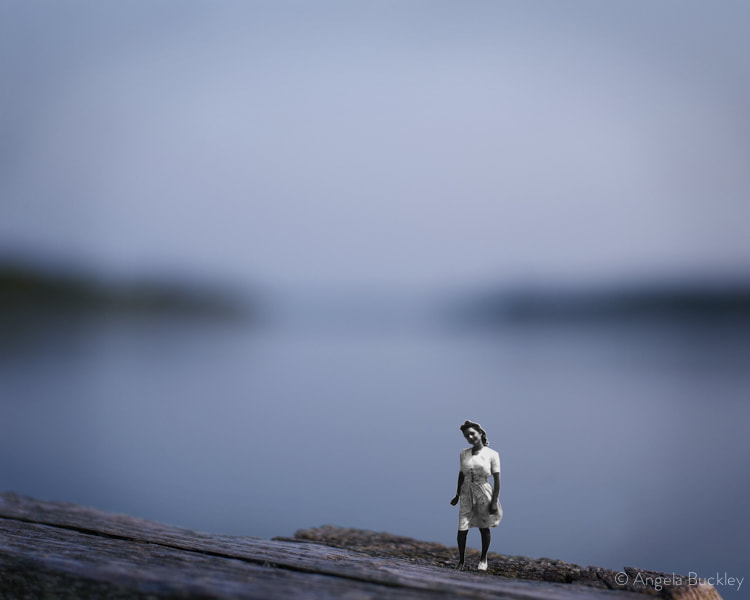
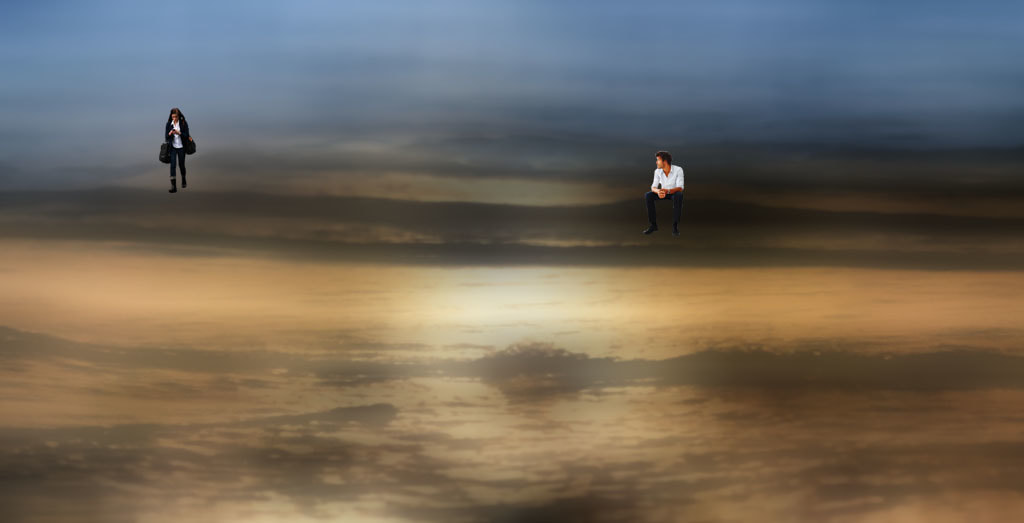
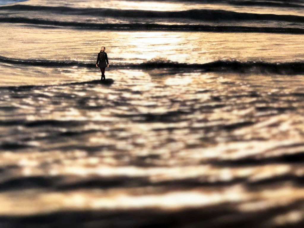
a n g e l a b u c k l e y
Angela Buckley’s photographic training is academic and classical with an emphasis on Fine Art. The work explored concepts about family an its impact on our lives and choices. Post-graduate school and through current times, the exploration of this theme continues as she highly values family and understand its impact on our society as a whole. She works as a photographer for families and groups but also incorporates this into the images seen below where she makes her subject small and places them in blurry landscapes.
m y r e s p o n s e :
I used the images that I created when responding to Aaron Farley, however I added photos of people to them. I made sure that the pictures I chose had their whole bodies in them so that they would be similar to Buckley's work. I placed them in the waves of the sea as this looked slightly surreal. I changed the size of all of the people on photoshop to emphasise this. This showed how there is no limitation to size, and demonstrates how the environment can be a limiting factor to scale, otherwise it creates a brand new image where it becomes more surreal. Angela Buckley's images have much more focus on the subject than the landscape as it' blurred, as the background of my first image was in focus, I decided to blur the next image, however, I think the depth of field created in the first imaged worked quite well. For the second image I wanted to incorporate two people into it, an I used the blur filter on photoshop to draw more attention to the subject instead of the landscape. This demonstrates how changing the focus of the image stops the environment from acting as a limiting factor of scale, as it becomes less surreal and more like it's been taken from afar.

p h o t o s h o p p r o c e s s :
When creating these images, I used the selection tool to carefully select the whole of the figure, without including any of the white as this would show up on the main image. After selecting it I copied it and pasted it as a new layer on top of the picture I made of the sea, I used the free transform tool to change the scale of the subject to really small and moved it to be on top of a wave. I then turned the brightness down and turned the contrast up to make the image darker, and also used the photo filter to make it slightly warmer so that the colours suited the picture.
|
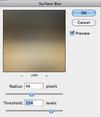
For my second picture, after using the steps above and pasting two of the subjects into the image and changing the colours of them to suit the colours of the photo, I went on filter, blur and surface blur to try and make the image more blurry. I changed the radius to 46 pixels and the threshold to 204 pixels to blur the image.
|
a r t i s t & m e

s t r a n d 2 - s u r r e a l i s m
This strand looks at the freedom unnatural environments have to change the atmosphere and meaning of an image, one way this is done is through surrealism. Surrealism can push the limits of photography by exploring unconventional concepts through creative visuals and juxtapositions. By using objects, items or people that seem as though they don't belong in that frame, it can create eerie or even comical photographs. Surrealism became popular in the 20th century, pushing the limits of what art means can be linked to the exam title, as this strengthened a new art form and became a movement expressing the unconscious mind.
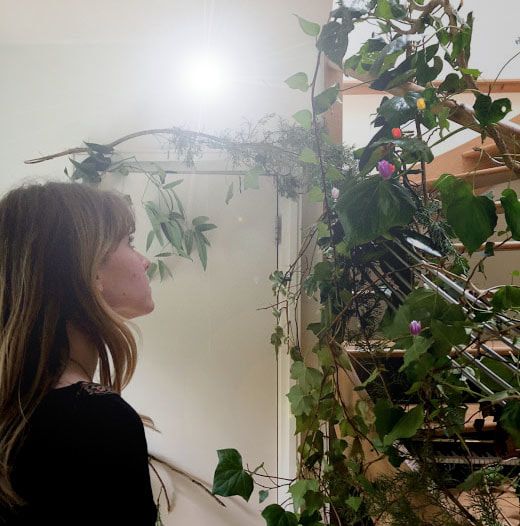
g r e g o r y c r e w d s o n
Gregory Crewdson was born in 1962 in Brooklyn, New York, he is now Director of Graduate Studies in Photography. Crewdson is an American photographer, he photographs tableaux of American homes and neighbourhoods. He uses suburban environments and sets them up in stage-like settings to depict strange film-like atmospheres that convey eerie moments. The lighting creating these atmospheres, however, is completely artificial. For more than twenty years, Crewdson has used the streets and interiors of small-town America as settings for photographic incarnations of the uncanny. Working with a large crew, he plans his images as meticulously as any movie director. His most famous bodies of work are: Natural Wonder, Twilight, Dream House, Beneath the Roses, and Sanctuary. “The ambience of that show really did have an effect, when we were making the pictures, I was very conscious of the relationship between interior and exterior space, and using a lighting style where the light coming from outside was the narrative light.” He adds: “I wanted the production value to be quiet and intimate and subtle.”
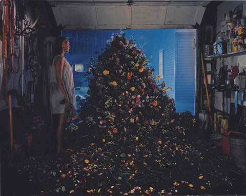
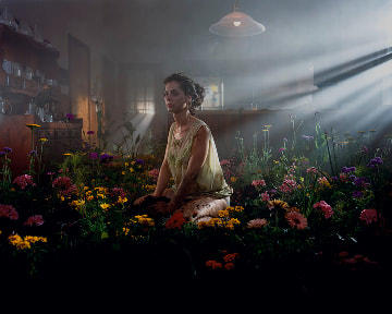
m y r e s p o n s e
When responding to Crewdon's work, I decided to directly relate m image to his using plants. I gathered many branches and leaves from around my garden and set them up in various different ways to try and capture an unnatural scenario. I told the subject to look up at the plants to make the image seem as though she was enchanted or mesmerised by them, aiming to slightly change the atmosphere to become more strange. In the second picture I asked the subject to look into the distance, although she was more in the centre of the composition of this image, I feel like the plants were still a central part, capturing most of the attention. I edited these images, incorporating flowers. These worked better on the first image as the bright colours were more subtle so it looked more realistic, where they look fake in the second image. These flowers however added to the photo as it looked very plain and uninteresting before. I also added the spots of light in the image. Crewdson said that light was very important in his images to create atmosphere, and he uses all artificial light which is why I did this on photoshop.
|
|
s t e p s o n p h o t o s h o p :
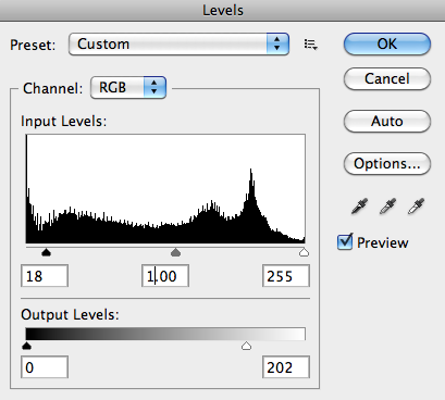
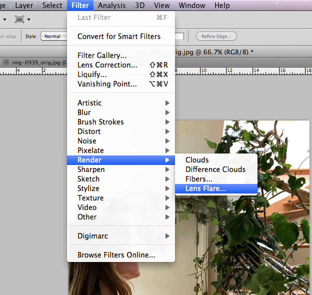
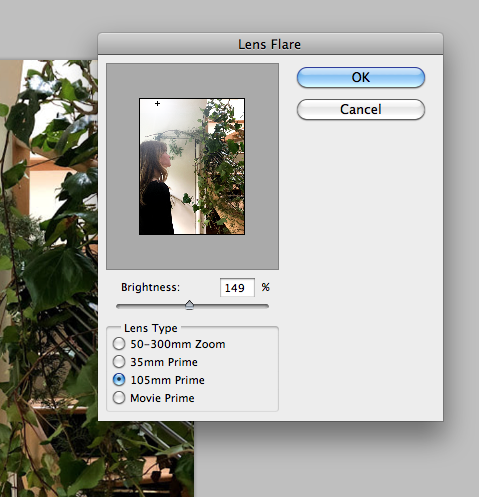
I uploaded a picture of fields of flowers and selected various flowers and copied and pasted them onto the plants. I changed the contrast and brightness of each individual flower using adjustments to make them stand out less ad flattened the image. To create the artificial light I went on filter then render and chose the lens flare option. I changed the brightness to 150% and the lens flare to 105mm prime to create the effect I wanted.
s t r a n d 3 - e x p l o r i n g t h e o r d i n a r y
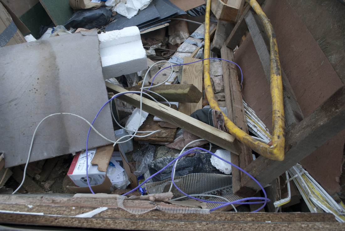
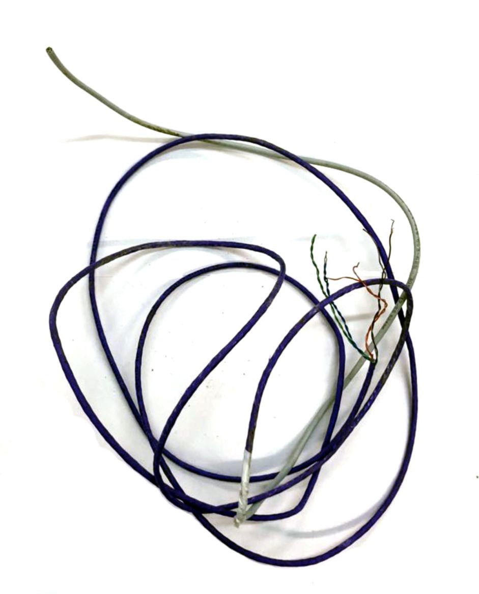
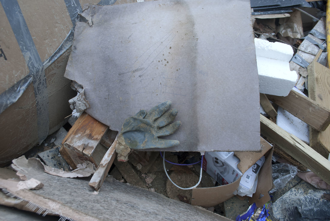
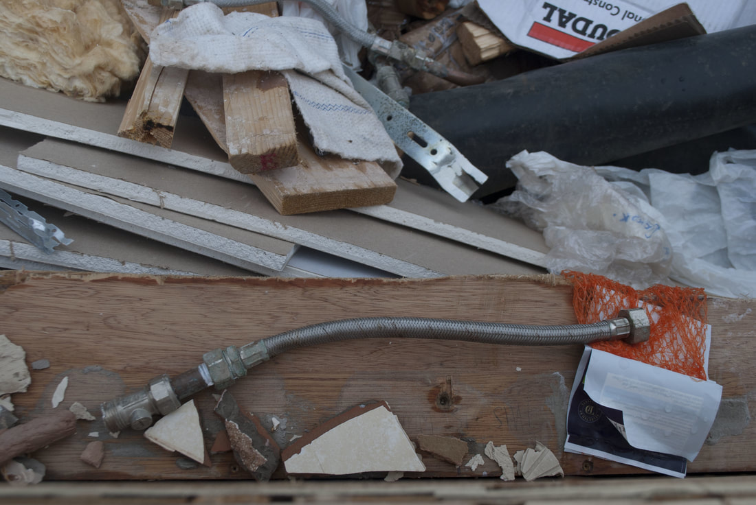
For the third strand, I'm focusing on objects that are deemed normal or ordinary and focusing on these aspects, while exploring their representations and meanings. I'm exploring different types of photography, namely: vector art, installations, photograms and abstract - developing this into a final piece. Experimenting with the different styles of photography reveals the freedom photography gives us to create any image we want - attaching our own personal meanings to it, which as a result can completely change the viewers perception of it. This strand begins with looking at discarded objects, this can relate to the exam title as these thrown away items break through the limitation set on them as 'rubbish', and though different representations and means of photography, they can be interpreted in a new light. The photographer has the power to portray their work in any way which expresses what it means to them - this is what I will aim to do through my developments; by exploring the ordinary and giving them new meanings through various representations.
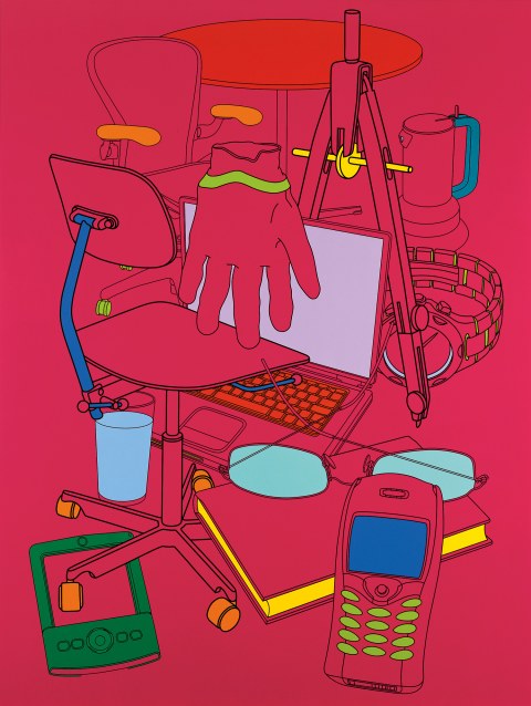
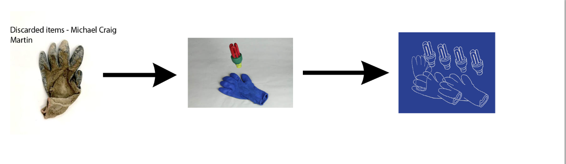
m i c h a e l c r a i g m a r t i n
Michael Craig-Martin was born in 1941 in Dublin, Ireland, he is an Irish-British contemporary conceptual artist and painter. Craig-Martin is also widely recognised as an effective and influential teacher. His teaching career started in 1966, but it is his period at Goldsmiths College, London for which he is best known, he taught now famous artists such as Damien Hurst. In his work he explored the aesthetic character of everyday objects, finding ways to make ordinary items to stand out, and bring something unique out of them. The perceptual tension between object, representation, and language has been his central concern over the past four decades. He uses symbols and pictures and after switching to painting in the 1990s, he used the composition of the bold lines and vibrant colours to explore spatial relationships by juxtaposing and layering colour.
1 s t d e v e l o p m e n t
m y r e s p o n s e
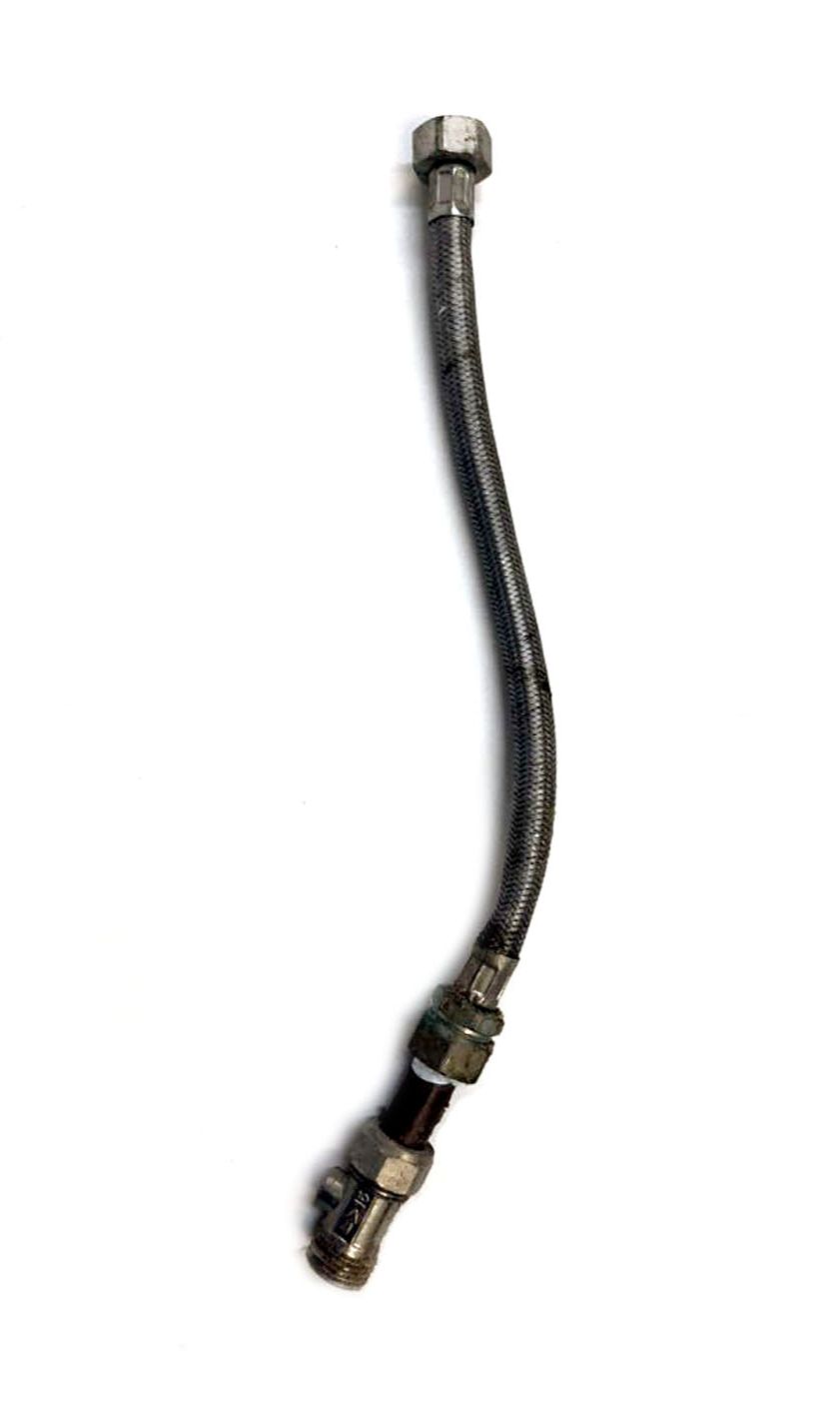
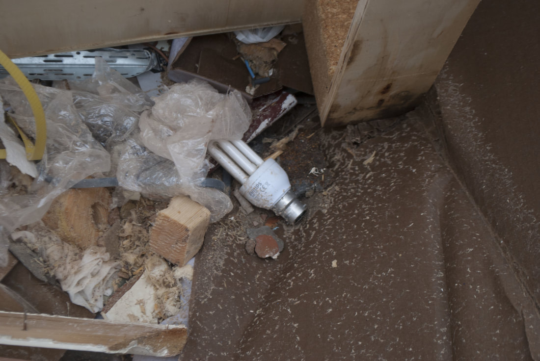
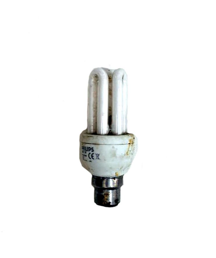
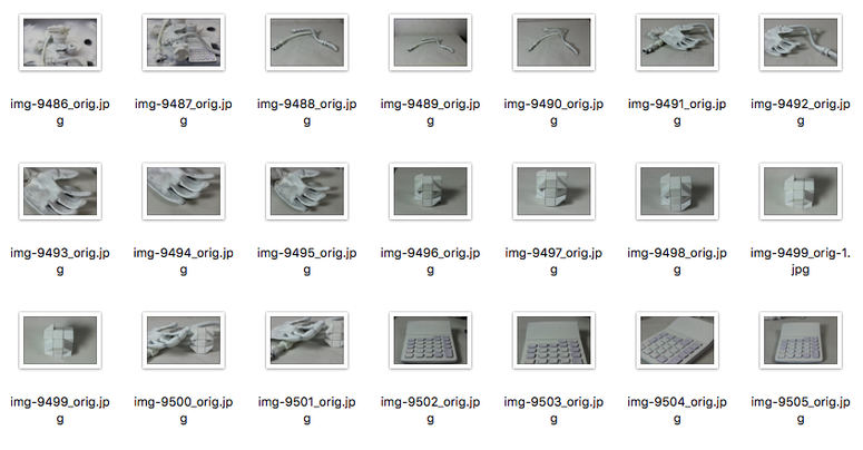
I chose to respond to Michael Craig Martin by firstly visiting many skips and taking things out of them I thought I could use. I used items from skips as many of the objects in Craig-Martin's photographs are everyday objects and I wanted to used discarded items and turn them into something new. Despite this aim, many of the items I found were left over from construction so weren't that interesting. I photographed them as I found them in the skip and took them out and brought them to the studio where I photographed them on a white background.
|
|
|

|
|
|
|
|
2 n d d e v e l o p m e n t
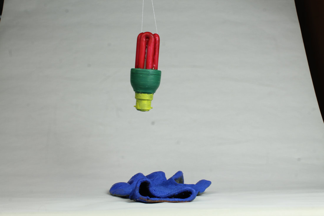
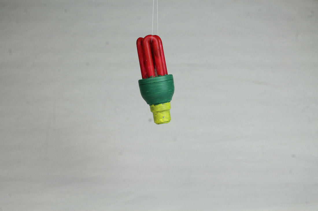
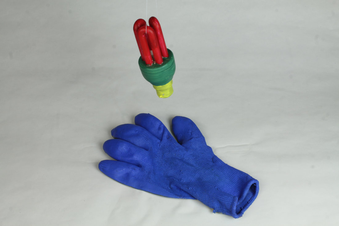
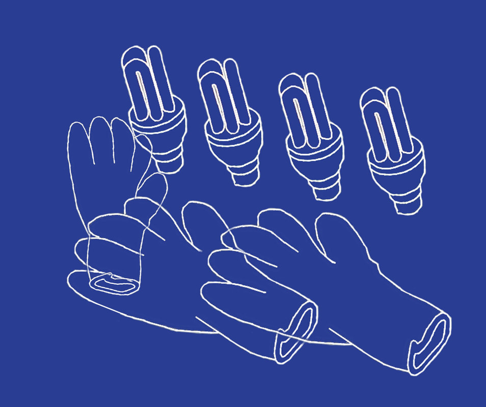
a i m :
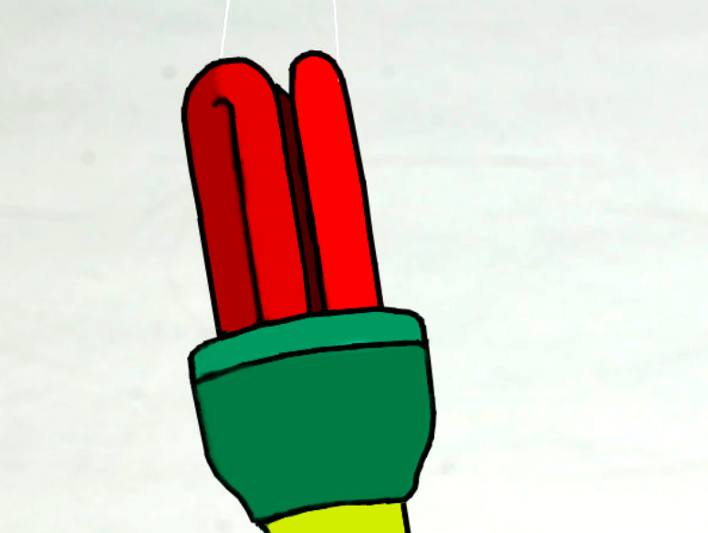
My initial intention when photographing these objects was to capture their colour and them in unusual positions by hanging the lightbulb. The aim of this was to create an image that I would then be able to edit on photoshop in the style of Michael Craig Martin's work.
After taking the images out of the skip, I wanted to explore the freedom of the meaning of different thrown-away objects in a different context. I painted these images to respond to Michael Crag Martin's work by producing a sort of i real life, 3D style of his work. After doing this I placed them in the studio and used string to tie to the lightbulb in order to capture different angle of the objects. I did this because by changing the colours and perspective of the objects, I had completely changed their meaning, as now they were more like a piece of art than just discarded rubbish. This can be related to the exam theme as changing the environment and context of an object breaks through the limitations set on the meaning of thrown away items, and enables the viewer to give a different meaning to it.
e v a l u a t i o n :
In order to improve these images, I would try using many more objects painted in different colours and arrange them to form what would look like an installation piece. I think by using these different discarded objects and painting them to give them a new meaning, it would add more to the final outcome of this series. It would also give me a variety of images that I could use to photoshop. For the few objects I used, I think their colours and arrangement came out well, however I would have liked to have incorporated more into the piece.
3 r d d e v e l o p m e n t
a i m :
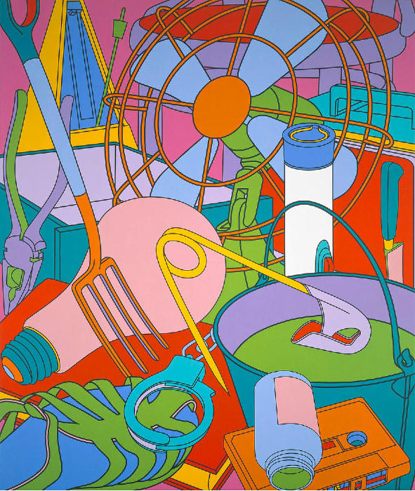
Before editing the photos I took for my previous development I decided that I wanted to replicate Michel Craig Martin's work similar to his simplistic outline images. I thought this would have the best outcome as I didn't have many objects to edit so I wouldn't be able to respond to one of his more busier pieces effectively. I decided that I would try and incorporate more objects into the image by overlapping them.
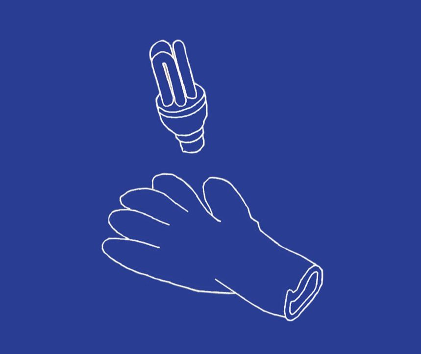
o u t l i n e s
I used photoshop to respond to Michael Craig Martin's work. After painting the objects I found and photographed them, I wanted to replicate Craig Martins, work in the same style, in 2D. I used the photos I took and used the line tool in white to outline parts of the objects. In order to try and make this look more busy, I copied and pasted the images, changed the opacity and rubbed out the overlapping parts so that the outlines looked as if they had been drawn over each other. I think this worked well because of the detail and the simplicity of the objects. I then created a block image, I think this turned out well as it's quite similar to the artist's images of single objects. It also incorporates a lot of colour. These images' outcome were successful, I think that they portrayed the theme of taking old or discarded items and giving them a new meaning well.
|
|
e v a l u a t i o n :
These images turned out how I was expecting them to, I think the idea of overlapping the outlines was effective as it brought more depth to the image. In order to improve these images, however, I would use a variety of objects, intertwining the outlines and colouring some in to create an image more similar to Craig Martin's.
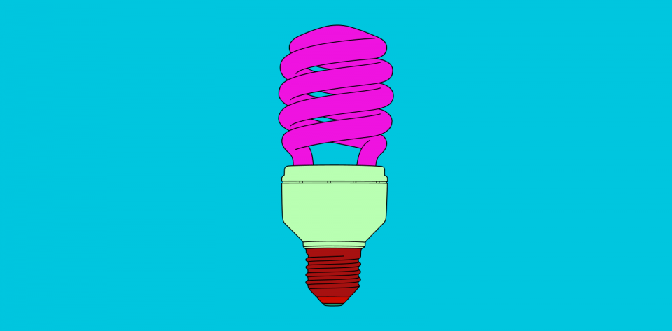
b l o c k i m a g e
a i m :
After creating my outline images I wanted to incorporate more colour to create one of the block images that Craig Martin did. Before doing this, I chose my image from my previous developments and decided that it would look best if I used a single object to focus on.

e v a l u a t i o n :
This image turned out much better than I had expected it to. All of the colours work really well together and contrast against the pale pink background. In oder to improve it I would make the black lines neater and thinner, and after experimenting with a few more single objects, I would try to use other objects in the image too. Overall, I think this image was a successful response to Craig Martin's work.
s t e p s o n p h o t o s h o p :
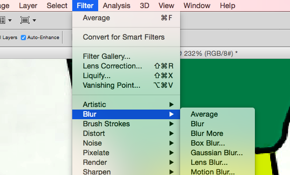
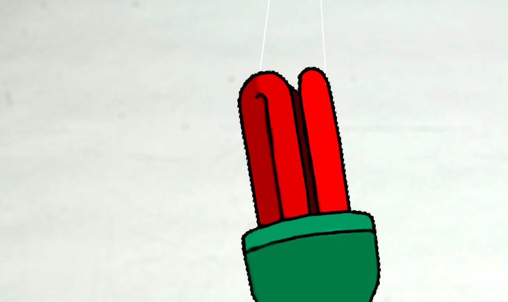
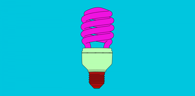
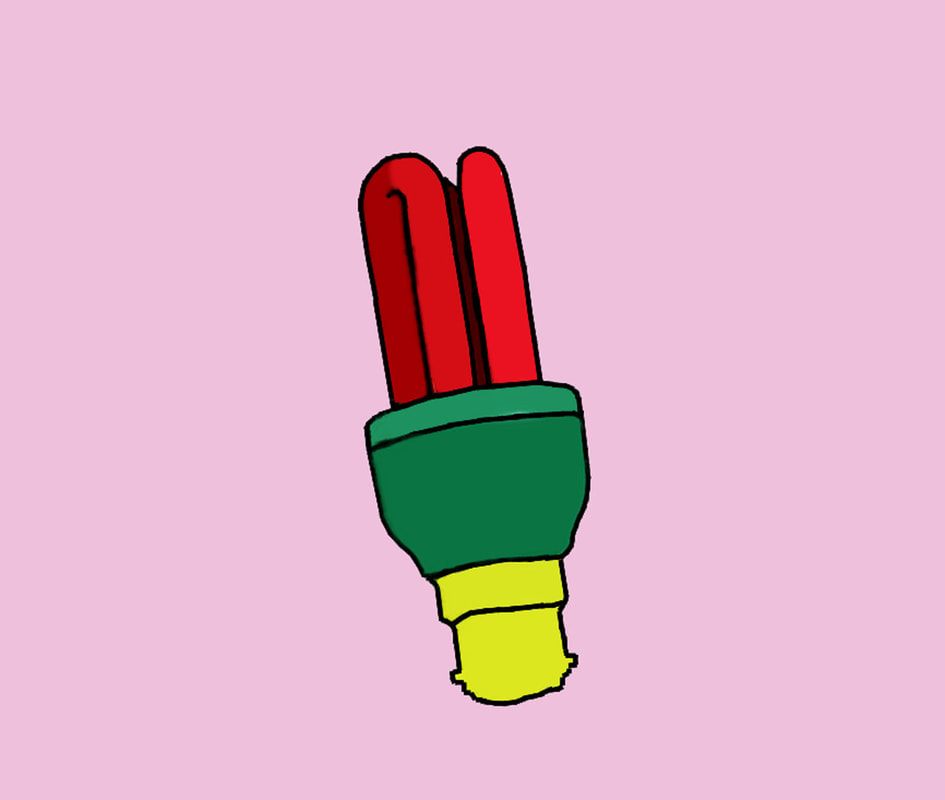
Firstly, I enhanced the contrast and saturation of the image so that I could see the colours and outline more clearly. I then selected the line tool and started drawing over the edges of the image, including the curves and details. After doing this I used the quick selection tool and selected a part of the lightbulb. I clicked on filter, blur and average to smooth out the colour of the selected part, making it look painted and 2D. I did this for each component of the lightbulb separately until it was all coloured in. To finish the image, I then selected the whole object and inversed it so the background was selected, I chose a colour and used the paint bucket tool to fill it in.
a r t i s t & m e
m i c h a e l c r a i g m a r t i n m e
|
|
Responding to Michael Craig Martin's vector art, I chose to do this of a discarded object because he uses normal everyday items and gives them a new meaning though this expression of art. I used bright colours similar to Craig Martin and also created the image in the same style. We used similar colours in our work and outlined the details of the object. However, the lines I drew were too thick in comparison to the artists, and some of the detail is missing in the screw part of the lightbulb. My image is also at an angle which takes away from the flawlessness I was trying to convey.
DEVELOPMENTS:
- Using discarded items and changing their appearance to give them a new meaning
4 t h d e v e l o p m e n t
d a n t o b i n s m i t h
Dan Tobin Smith is a London-based photographer specialising in installations and still life. He uses creates hyper-constructed images and he uses anamorphosis which is a technique when a distorted projection or perspective requires the viewer to take a specific position in order to view the image. "My images are quite constructed, one way or the other. Either by design or editing. A lot of the time the design is worked out well in advance or the materials we will work with are chosen before the shoot so we have limited options which helps refine things."

a i m :
I bought white spray paint and set out with the intention to create what looked like an installation piece by perfectly painting all of the objects I had collected. The aim of this was to create work similar to Dan Tobin Smith's. The reason I wanted to use this as a development was to move from photoshopped block images to actual images of a single colour as this would further change (or remove) the meaning from the image.
m y r e s p o n s e
I chose to respond to Dan Tobin Smith's work as I wanted to develop my idea of taking an old object and putting it into a different context or environment to change the meaning of the image. Using white spray paint, I painted all of the objects I had taken out of the skips and rephotographed them. By making them the same colour and taking all detail and patterns away from them, the image has a new image as the simplicity of it made it look almost like an instillation piece, like Tobin Smith's. After photographing one object at a time, I put them all together
|
|
e v a l u a t i o n :
These images didn't turn out as I had hoped. Although I spray painted them several times, their original colour was still showing through, to improve this I could have used actual paint as it's much thicker. Furthermore, when I put the images together as a piece, they didn't look like an installation piece, I think this was because I didn't use enough objects, so I didn't achieve my desired outcome. As this development didn't turn out well, I decided to move onto photograms instead.
a r t i s t & m e
d a n t o b i n s m i t h m e
|

|
Similarly to Tobin Smith's images, I collected =a number ordinary items from around houses and bins that had been discarded or were just normal objects. I painted spray painted these white to try and replicate his work. This aspect of my work is similar to the artists, however I didn't use nearly as many objects and arrange them as a installation piece. I also didn't include any letters of objects painted a different colour. I photographed my objects on a white background as Tobin Smith did, this was to emphasise the uniformity of the items and how they were presented.
DEVELOPMENTS:
Moved from changing appearance of the objects to change their meaning, to removing colour and context to remove their meaning.
Moved from changing appearance of the objects to change their meaning, to removing colour and context to remove their meaning.
5 t h d e v e l o p m e n t
s a y a k o s u g a w a r a
Sayako Sugawara is a London based Japanese artist working predominately with photography, moving image and installation. Through her work she explores notions of memory and imagination, analysis and poetics, stillness and movement. She uses the darkroom to project everyday images and distorts them to create more abstract photograms.
|
|
|
|
a i m :
My initial aim of responding to this artist, was to move on from block images and changing their meaning through their appearance, to changing the meaning of an item through distorting them and creating a more abstract look. Before taking my photos, I used Sayako Sugawara as inspiration and wanted to take every day objects into the dark room. These included things like keys and earphones, I also wanted to include some discarded objects from previous developments. The aim of this was to see whether I should stick with those discarded items, or if I could more onto developments included more everyday objects.
m y r e s p o n s e
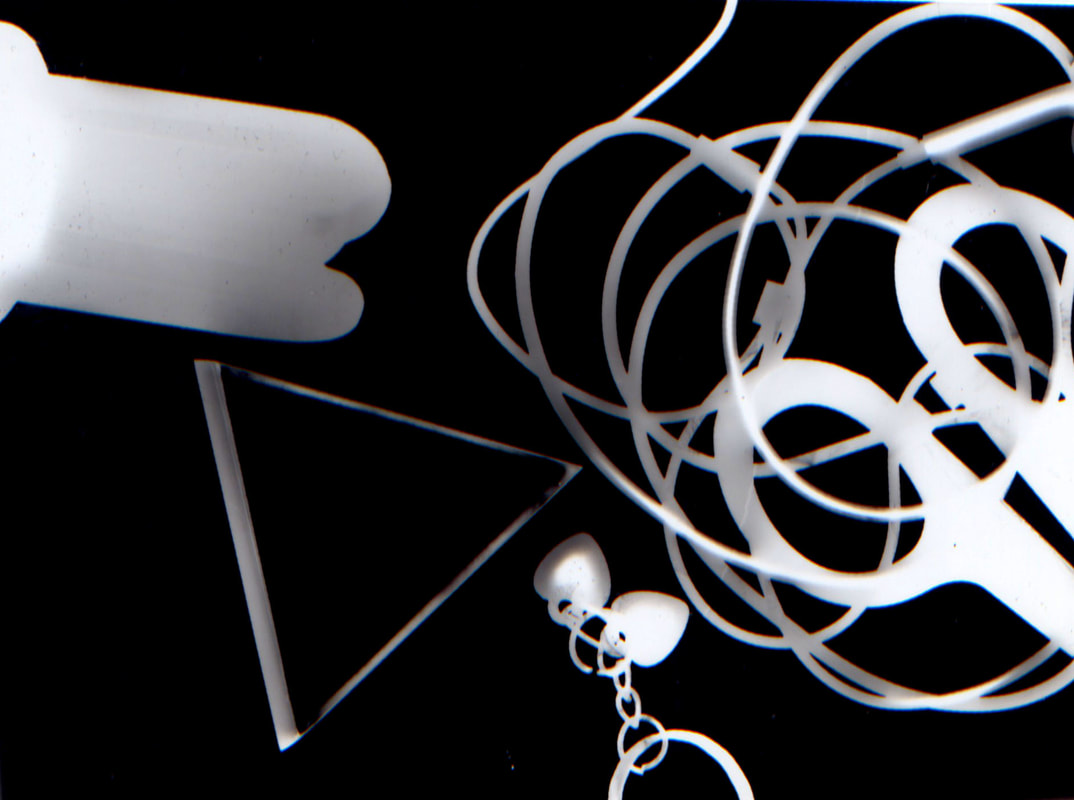
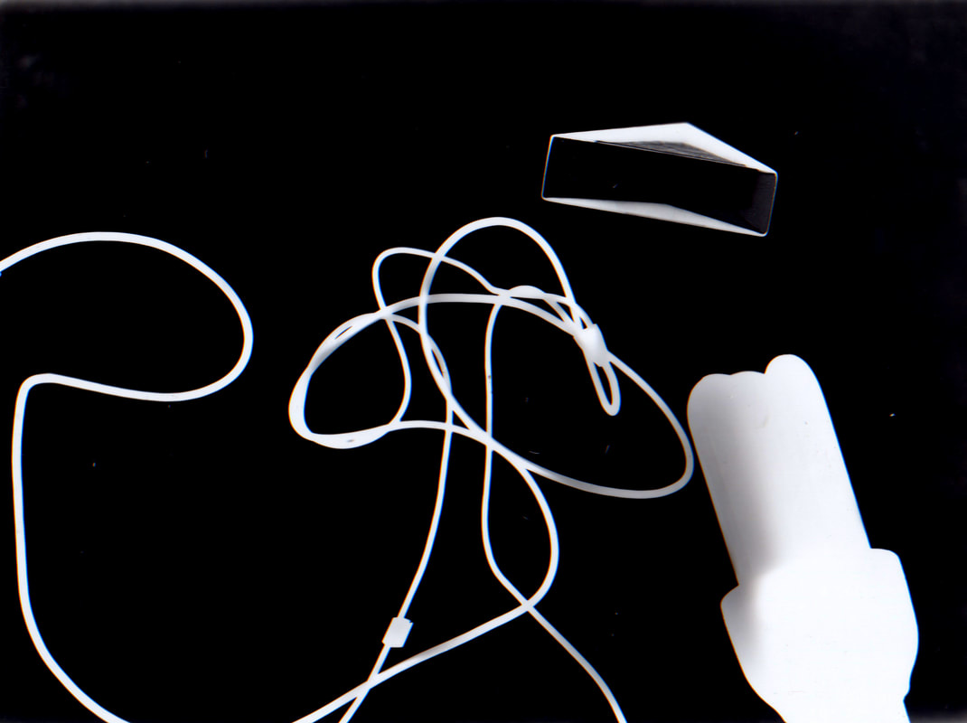
In response to Sugawara's work, I took everyday objects that I thought would create the desired outcome and used them in the darkroom. This included keys, earphones, scissors, and I also used a perspex triangle and a lightbulb to try and create more interesting shapes. The perspex block came out interestingly, however the rest of the images I created looked boring and like a simple photogram. I wanted to use this artist to experiment with this style of photography and also to try a new technique of changing the meanings of object. I have started off with mundane items at the beginning of this strand and put them in various different environments and styles, aiming to change the meaning and context of them. By experimenting with the darkroom my goal was to try and produce a new meaning of these everyday object, however the outcome wasn't as I had hoped so I'm not going to continue with it.
|
|
e v a l u a t i o n :
In order to improve the photographs I would perhaps use more interesting everyday objects, I could have also projected the light onto the wall and taken larger or more interesting photograms. As these images didn't turn out to be abstract I could have used more techniques to alter them, such as double exposure or partly developing parts of the image.
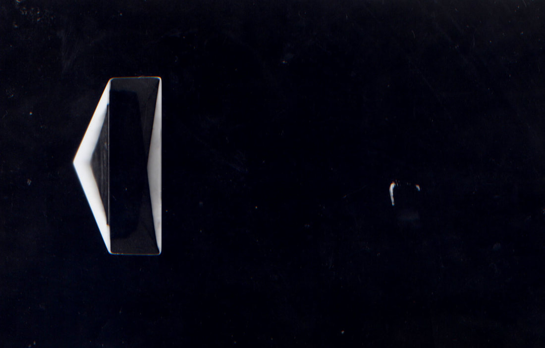
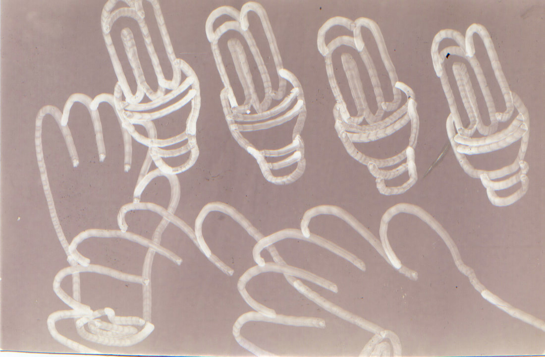
s e c o n d r e s p o n s e - o u t l i n e p h o t o g r a m s
After responding to Sugawara's work with everyday objects, I wanted to use some of my previous work to develop the idea and improve it. I used acetate and traced my image of the lightbulb and gloves outline, and took it into the darkroom. I thought that this would produce better work, however the pen outline made it look unneat and all of the images looked washed out and was not what I wanted the result to be.
|
|
e v a l u a t i o n :
To improve these I should have drawn more neatly onto the acetate and found a different way of projecting the outlines as they turned out to be a different colour and not like a photogram at all. Despite this, through these responses I found that the everyday objects would give me more options to work with as the lightbulb, glove and other discarded objects had been used too much and I wanted to try and develop my images further by using household/ordinary items instead.
6 t h d e v e l o p m e n t
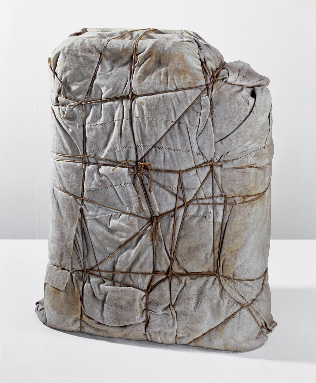
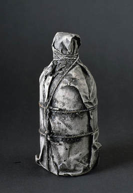
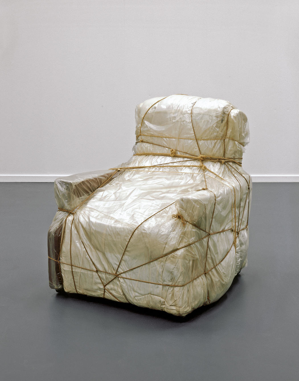
c h r i s t o & j e a n n e - c l a u d e j a v a c h e f f
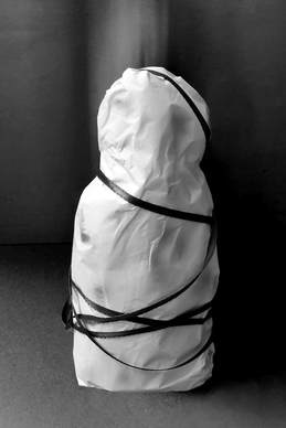
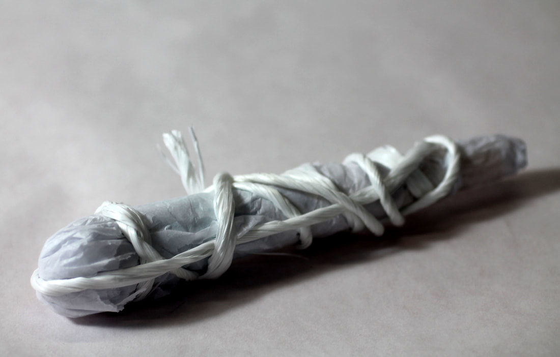
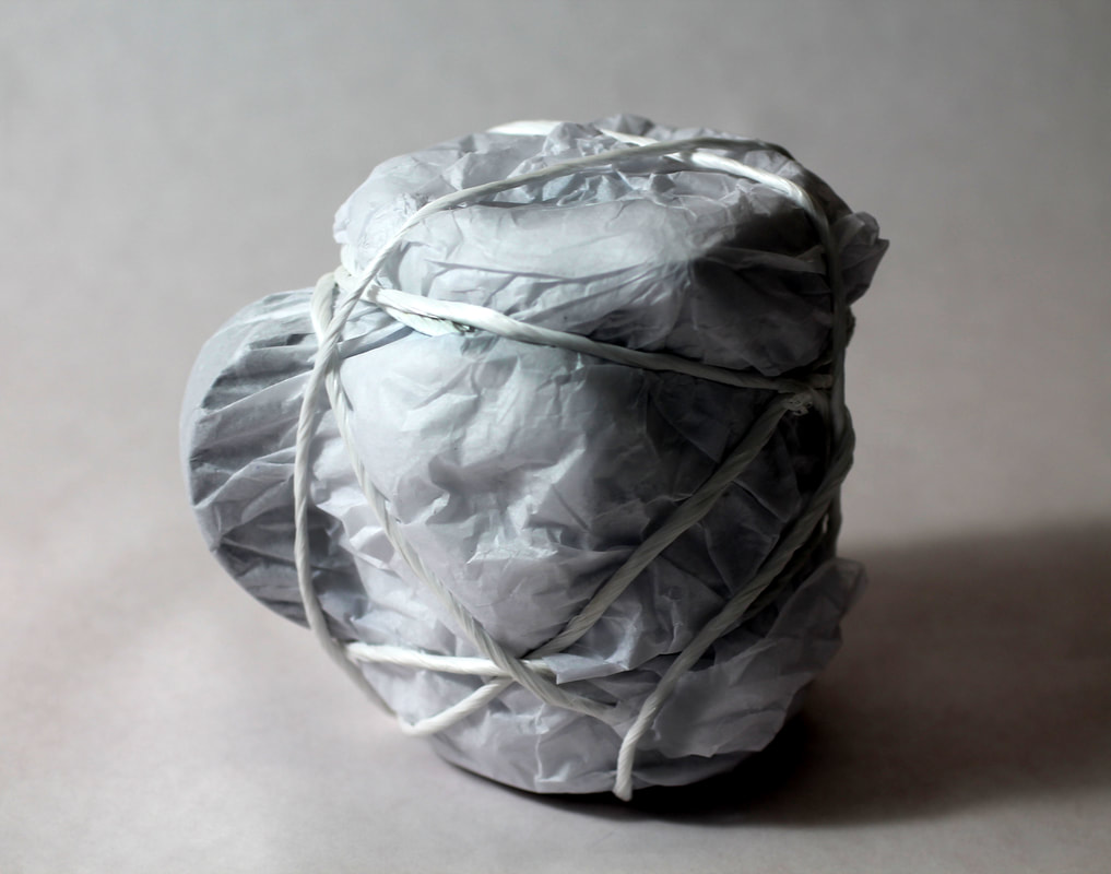
Based in New York, the couple specialised in a unique form of avant-garde art known as 'empaquetage', meaning packaging or wrapping of objects. Christo and Jeanne-Claude Javacheff initially wrapped up everyday objects with fabric or polyethylene. They explore the transformative effect fabric and tactile surfaces have when wrapped around familiar objects. The material used to cover up the object underneath causes the viewer to look at the meaning of the object in a different way. They started this process in 1958, and evolved to wrapping up much larger things, such as buildings, coasts and islands.
|
|
|
m y r e s p o n s e
|
My first response to this artist was done at home. I wrapped up a sun cream bottle in ribbon and photographed it. I didn't like the outcome of this as I didn't have any string and the ribbon did't have the same effect. Additionally, the subject would have looked better if it was photographed in the studio with a white background.
|
s e c o n d r e s p o n s e
I took more photos of items and covered them in wrapping paper before tying them up with string. This was to ry and hide what the object actually was in order to try and change/hide the meaning of it. I took these in the studio on a white background so that the shadows from the string would contrast more against it.
mug makeup brush

|
|
e v a l u a t i o n :
These photos had a much better outcome than my first response. Although you can tell that the first image is a mug wrapped up, you can't tell that the second image is a makeup brush. The string had a much better effect than the ribbon as it created more creases and dents which gave more detail to the image. In order to improve my work further, I would use bigger objects similar to Christo Javacheff's work.
a r t i s t & m e
j a v a c h e f f m e

|
|
Similarly to Christo and Jeanne-Claude Javacheff, I wrapped up everyday objects to hide their meanings. I used wrapping paper as I thought that the crinkles would cause the same effect as the old and dirty paper. I also used string to wrap them up enough to see the shape of the item, without revealing what it actually is. On photoshop I changed the contrast and tones of the photos in order to try and make the creases darker and stand out more similar to Javacheff's photos. Additionally, I used the burn tool on photoshop to enhance these details.
a r t i s t i n s p i r a t i o n 1
m i c h a e l c r a i g m a r t i n
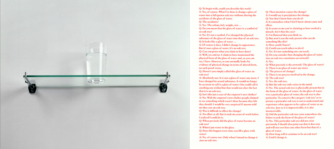
An Oak Tree consists of ideas similar to Joseph Kosuth's work. It is based on the concept of transubstantiation, this is a notion the Catholic faith use, where they believed that bread and wine are converted into the body and blood of Christ while retaining their appearances of bread and wine. The ability to believe that an object is something other than its physical appearance indicates a transformative vision. An Oak Tree consists of an ordinary glass of water placed on a glass shelf. Craig-Martin composed a series of questions and answers to accompany the objects. In these, the artist claims that the glass of water has been transformed into an oak tree. The questions ask things asserting the obvious impossibility of the work. An example of a few of the questions are "Haven't you simply called this glass of water an oak tree?" "Do you mean that the glass of the water is a symbol of the oak tree?" "But the oak tree only exists in the mind". He states that the glass of water is in fact an oak tree because he has changed it's substance, and that is no longer accurate to call it a glass of water, he claims to have done this without altering the physical state of the subject. Craig Martin says that the intention to change the state of the subject is what precipitates the change, and that it will remain an oak tree until he changes it. I used this artist previously, however this body of work can link more closely my strand developments as I have refined my ideas, further showing that by changing the context of something, its meaning can change. This installation gave me inspiration for my developments towards my final piece by exploring how objects are presented as the result of the meanings you give it.
7 t h d e v e l o p m e n t
j o s e p h k o s u t h
Joseph Kosuth is a conceptualist artist who lives in New York and London. He explored words and their meanings and how words relate to the objects and things they name or describe. He has been fascinated with the equivalences between the visual and the linguistic. He looked to Ludwig Wittgenstein, a philosopher who had ideas on language. Kosuth has used the presentation of language to make his audience contemplate issues of poverty, racism, loneliness, isolation, the meaning of life, and personal identity - usually without any clear, overt commentary of his own. Ludwig Wittgenstein was an ideal philosopher worked to remind those confused by abstract theorising of the ordinary uses of words and to set their thinking in order.
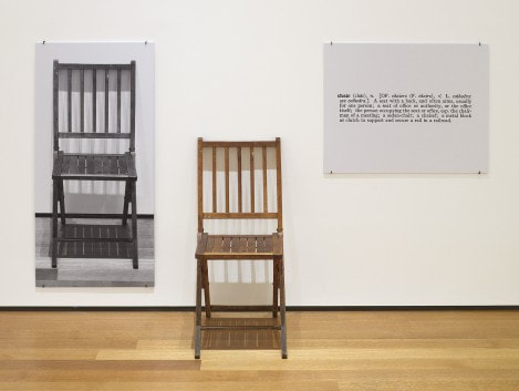
m y r e s p o n s e
The concept of this image is to challenge and explore the limitations words set on objects and how their meanings can change with how they are presented. Kosuth says that only the chair as you see it can be seen as a chair. The object changes as it is presented, for example, as it is printed out as a photograph, it is no longer a chair but a representation. Furthermore, the definition of a chair is not a chair, it is the meaning of it but cannot be used to describe it as the definition in itself is not a chair. I recreated this idea on photoshop alongside the definition. I think for the first response it worked well, however as I edited the floor in it looked a bit constructed so would take the photos of the objects in their natural environment to make them look more realistic.
|
|
Lacan's discussion of the "Thing" constitutes one of the central themes in pyschoanalysis. Lacan counters such objections by pointing out that there are two words in German for "thing": das Ding and die Sache. Lacan's unconscious is structured like a language, which gives language a key role in constructing our picture of the world, but also allows the unconscious to enter into that understanding and dissolve essential distinctions between fantasy and reality. The subconscious meanings that individuals attach to certain people or objects and the deeper meaning that they themselves can associate with that thing, means that they have a different outlook or perspective on something.
e v a l u a t i o n :
The idea behind this development was very useful in moving forward towards my final piece. My response didnt come out like I had hoped, to improve this I would do more responses of chairs or other objects/furniture in real environments instead of photoshopping them, and could also print off their definitions and rephotograph them next to them. Despite this, instead of responding further, I decided to move onto a new development drawing on what I learnt from this one. I wanted to refine this work by focusing on different household items, where I could photograph them differently, which would allow me to explore my strand title further. I didn't think I could do this any further with responses to Joseph Kosuth's work.
8 t h d e v e l o p m e n t
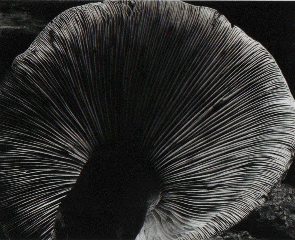
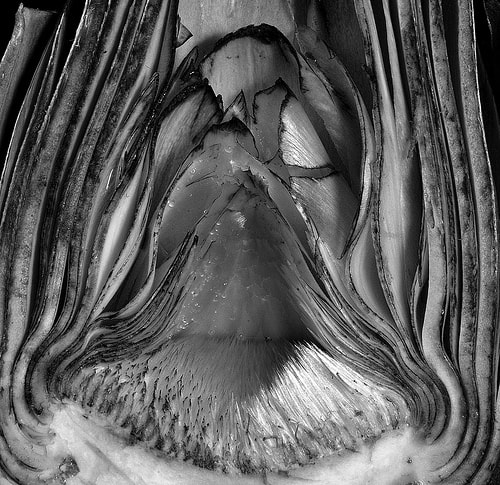
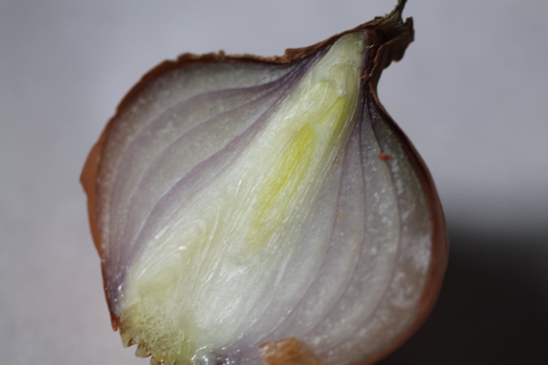
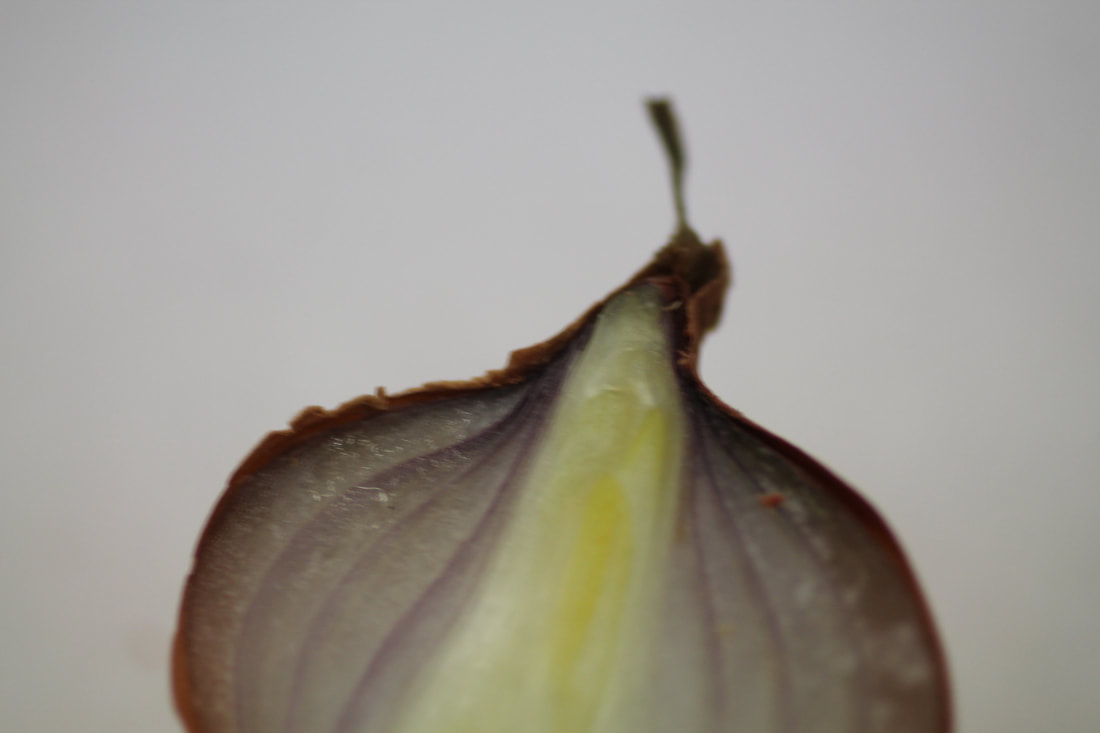
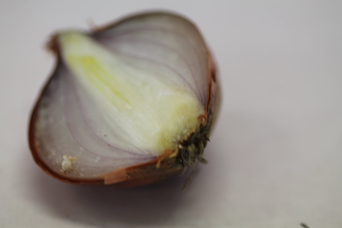
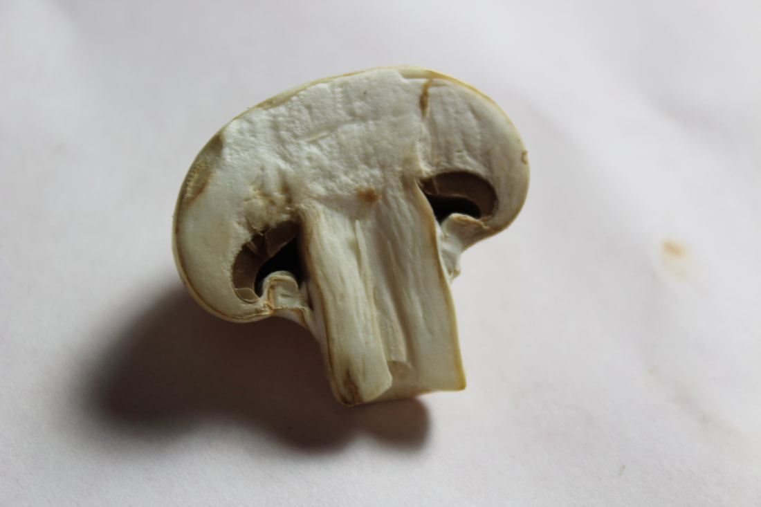
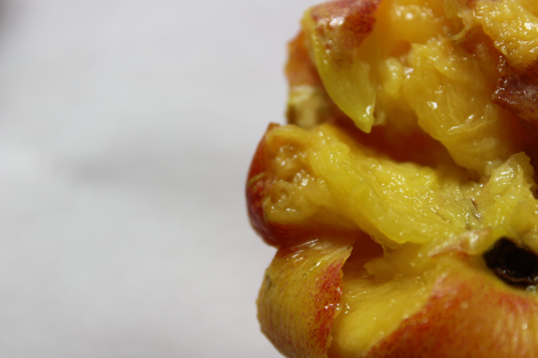
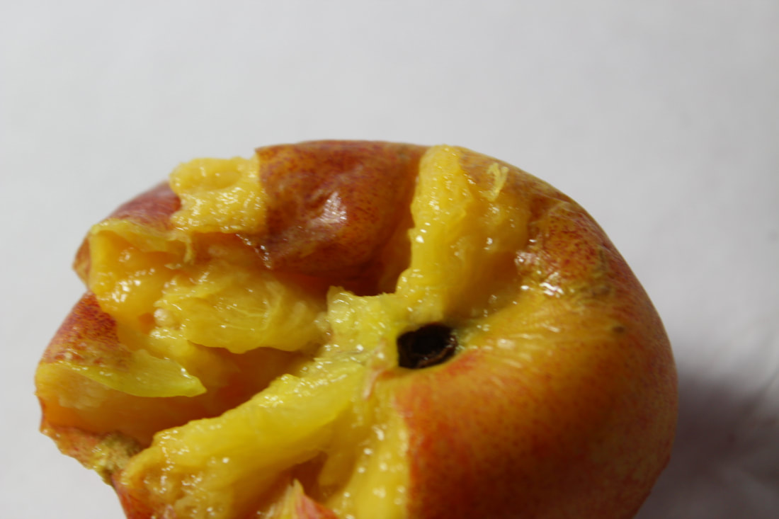
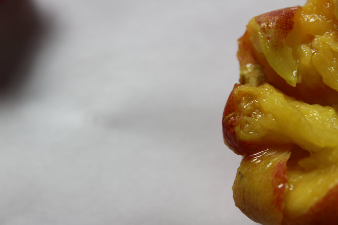
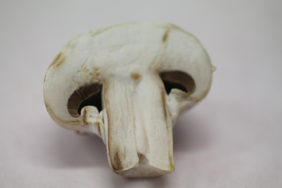
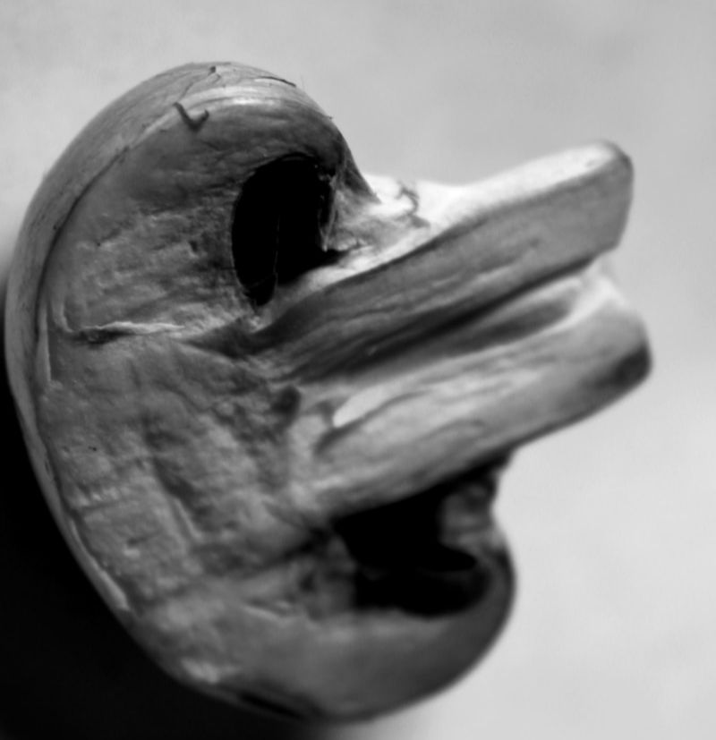
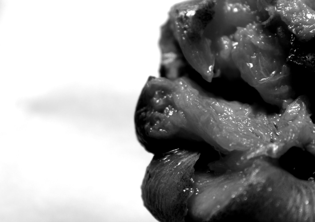
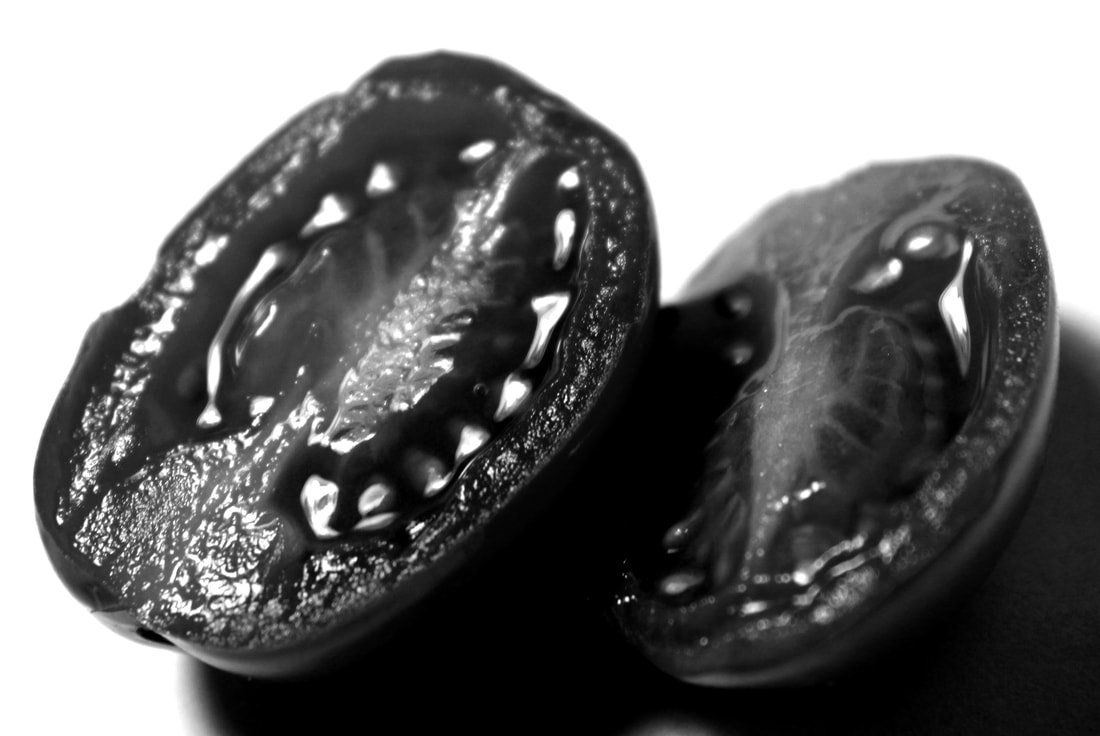
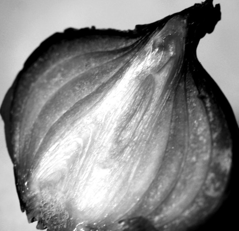
e d w a r d w e s t o n
Edward Henry Weston was a 20th-century American photographer. In 1937 Weston was the first photographer to receive a Guggenheim Fellowship Some of his most famous photographs were taken of the trees and rocks at Point Lobos, California, near where he lived for many years. Weston took photos of landscapes, shells, vegetables and nude photos, he captured them in such a way that allowed the viewer to see beyond the object. Weston reached for the same qualities in his vegetables as he did his nudes, sand dunes and sea shells. He removes what you know about the objects, how they taste or feel, and replaces it with something more visual. The bodies and vegetables hes photographs turn into shapes that hold shadows.
"Cabbage has renewed my interest, marvellous hearts, like carved ivory, leaves with veins like flames, with forms curved like the most exquisite shell…In the cabbage I sense the entire secret of life’s force; I am baffled, emotionally excited, and, because of my way of presenting, I can communicate to others why the shape of the cabbage is this way and no other, and what its relationship is to all other forms."
"Cabbage has renewed my interest, marvellous hearts, like carved ivory, leaves with veins like flames, with forms curved like the most exquisite shell…In the cabbage I sense the entire secret of life’s force; I am baffled, emotionally excited, and, because of my way of presenting, I can communicate to others why the shape of the cabbage is this way and no other, and what its relationship is to all other forms."
|
|
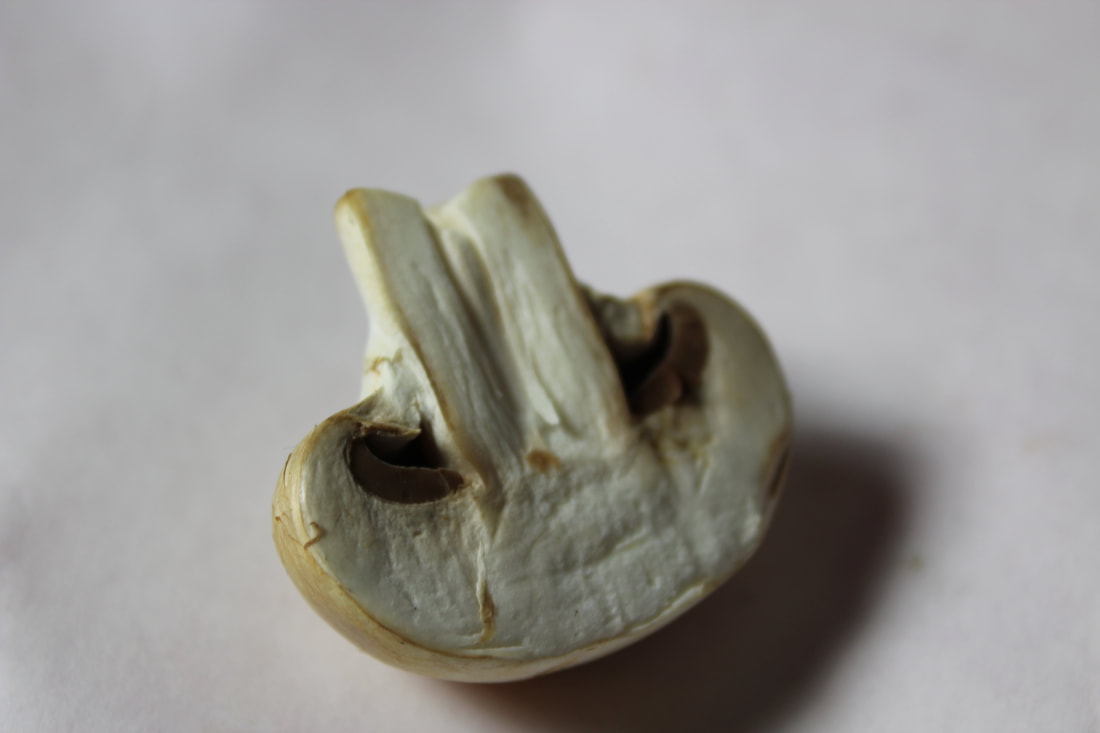
m y r e s p o n s e - s e l e c t s
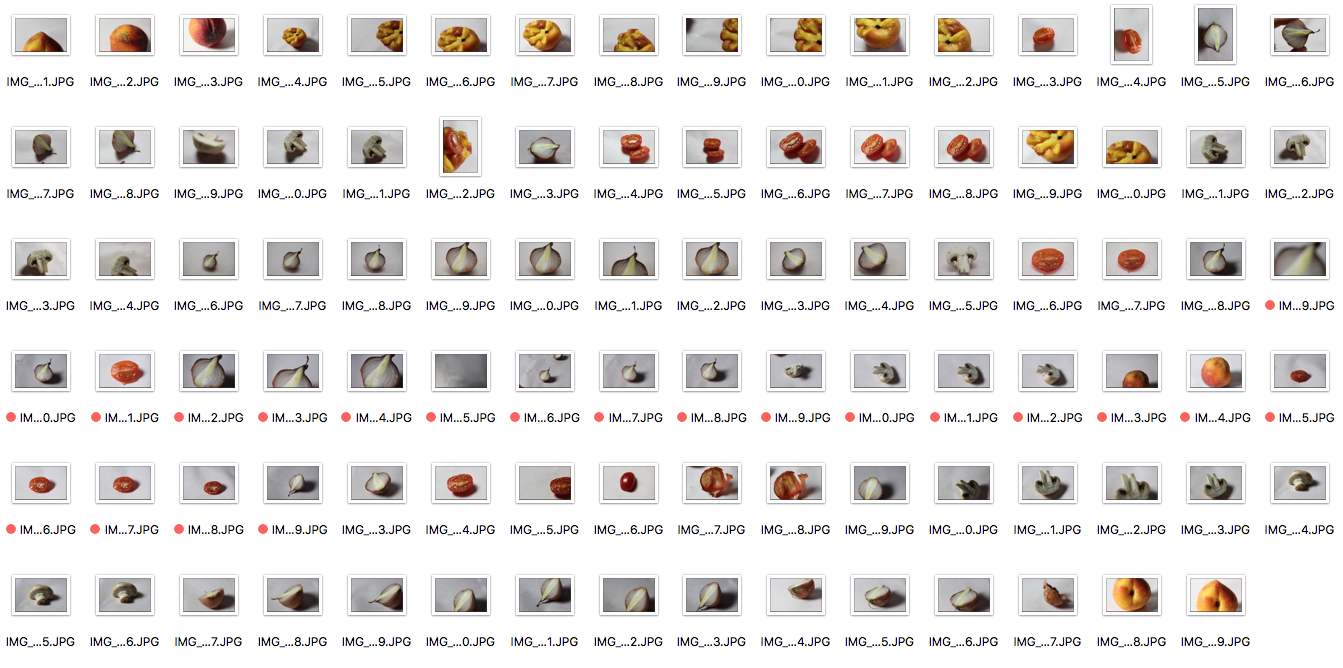
The aim of taking these photos was to show through my developments that I have refined my work. I wanted to see if I could change the meaning of normal objects in the same way that the previous artists did. I wanted to try this by altering their appearance by presenting them in an abstract way. I originally chose to do this with food to as food is an everyday, ordinary item that we consume. By showing this in an abstract way, I can start to refine my developments, focusing on 'exploring the ordinary'. I took these images using a macro lens to capture the same amount of detail Weston did.
e d i t s
|

|
|
|
e v a l u a t i o n :
This development was useful in refining my ideas towards a final piece focused on exploring ordinary things. I liked the detail seen in some of the images such as the tomato, however they didn't quite capture the the beauty of the structure of the food in an abstract way as I had hoped. One reason for this was I switched to a 18-55mm lens as the macro lens stopped focusing. The images taken by the macro lens (some of the onion photos) were much better than the normal lens. To improve this development I would retake these pictures and try to capture them in a more abstract way with the macro lens.
a r t i s t & m e
e d w a r d w e s t o n m e

|
|
Similarly to Edward Weston, I took photos of vegetables in black and white to show their abstract nature and beauty. I used the macro lens as did Weston, which allowed me to capture greater detail. I changed these photos to black and white, however, in order to make my images more similar, I could have changed the background to black. The reason for this would be so that the patterns that are highlighted within the vegetable can be seen more clearly.
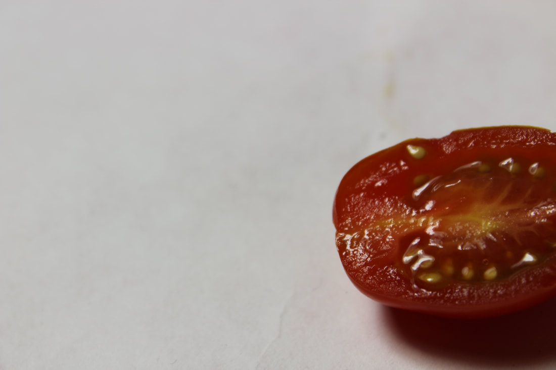
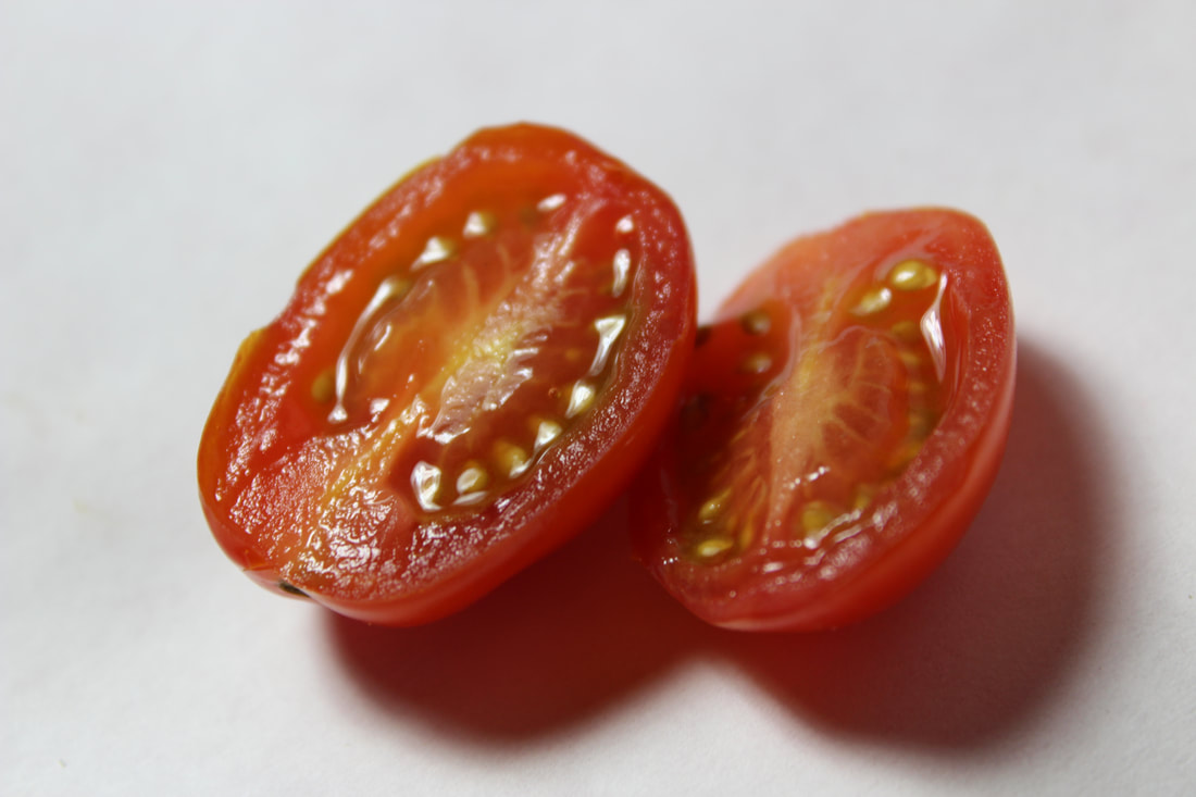
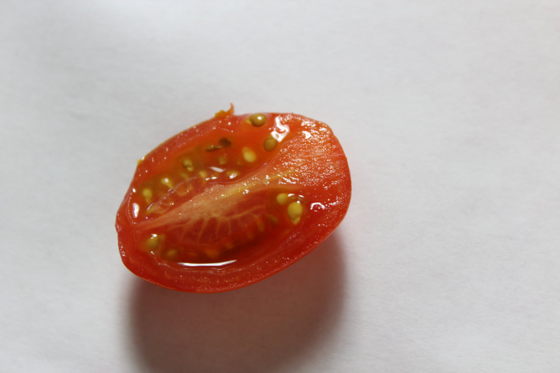
s e c o n d r e s p o n s e - c o l o u r
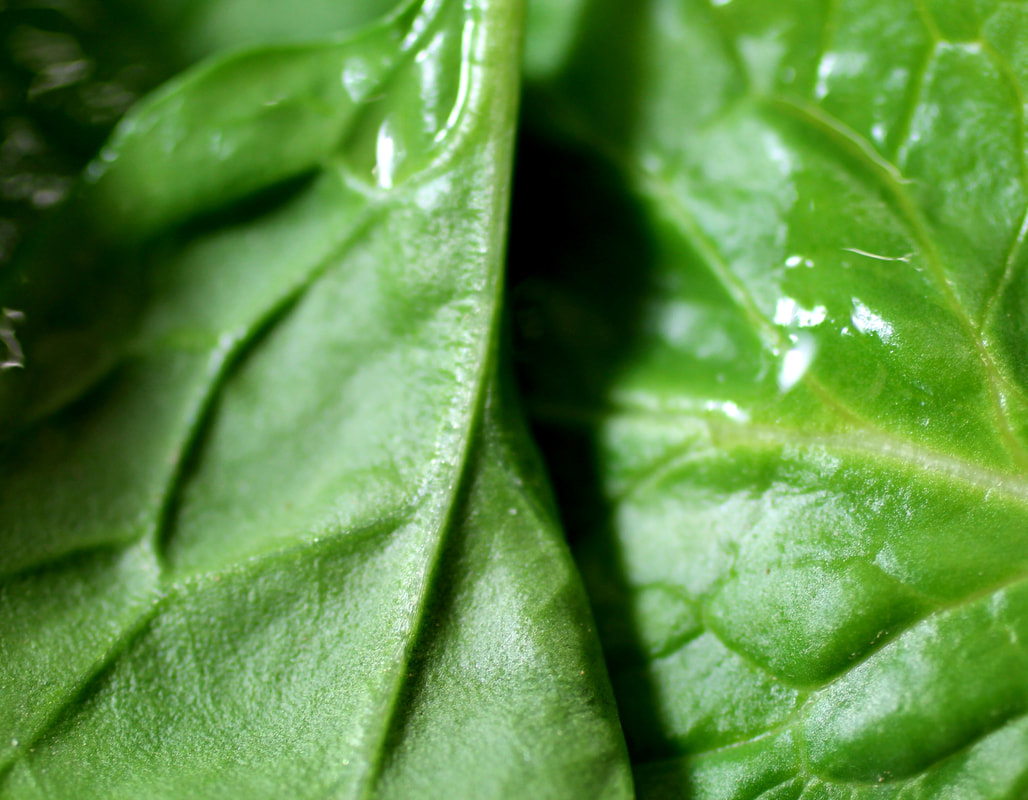
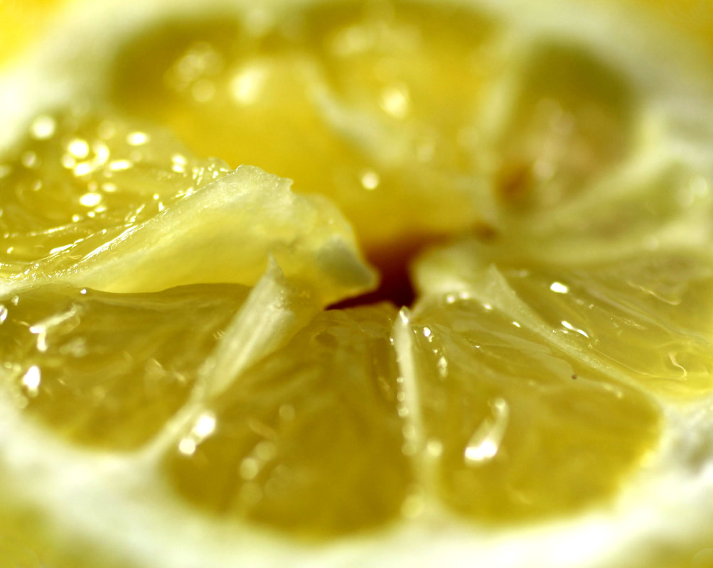
After shooting images of the vegetables and editing them in black and white, I decided I wanted to incorporate colour into to my images. I chose more fruit/vegetables o take pictures of, these were salad leaves, tomatoes and a lemon. The reason I chose these foods specifically was because of their vivid colour and intricate textures and patterns. I think that the outcome of these images was much better than the first response because of the factors taken into consideration when choosing the food. I used the macro lens to take all of the photos.
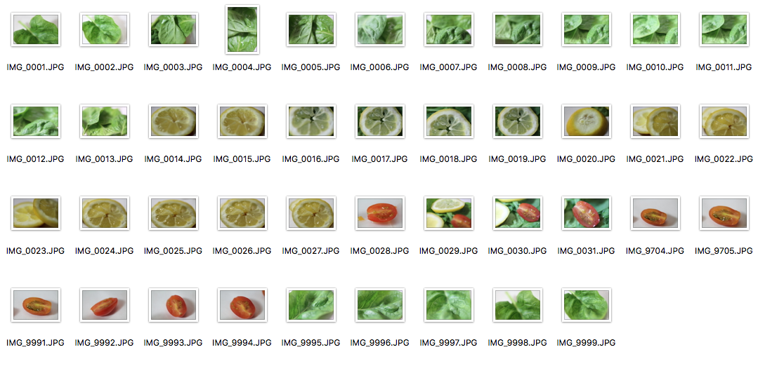
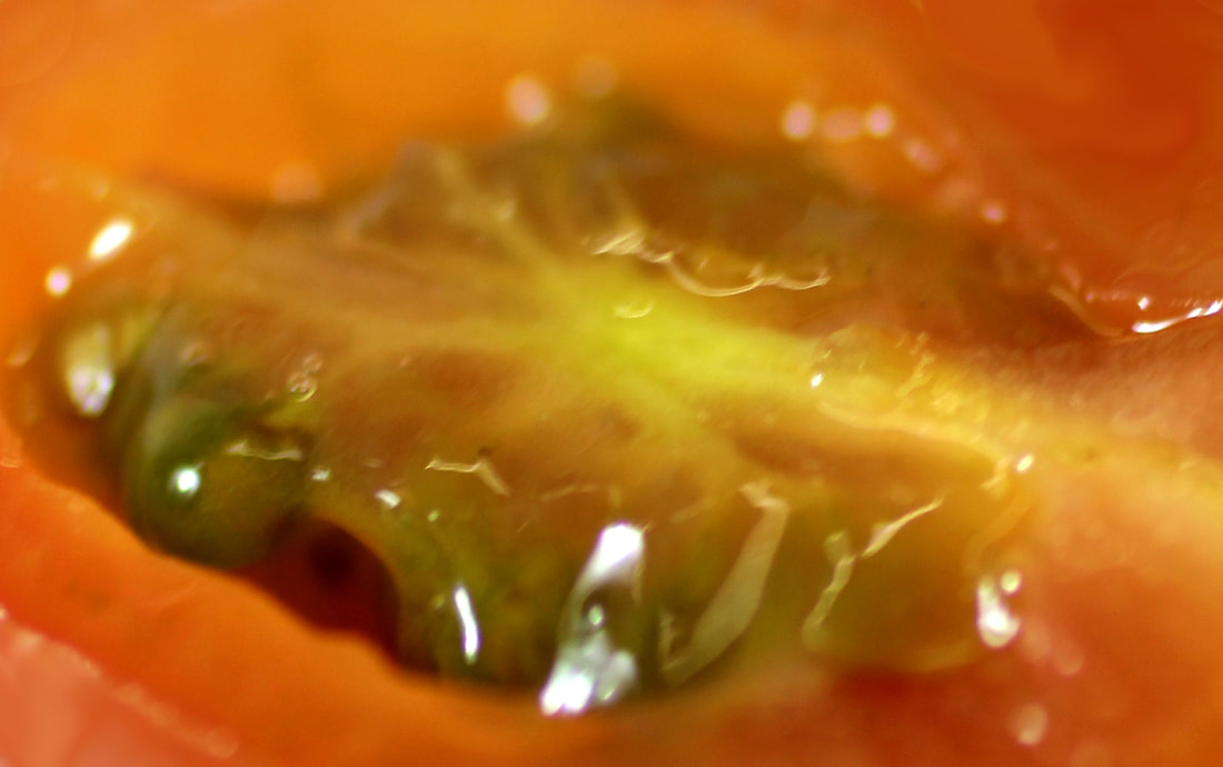
|
|
e x p e r i m e n t a t i o n s :
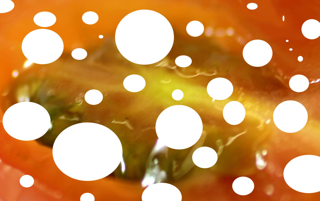
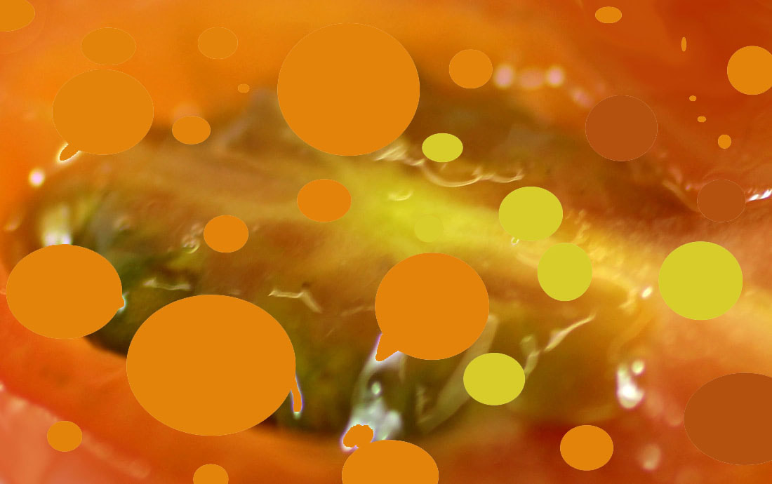
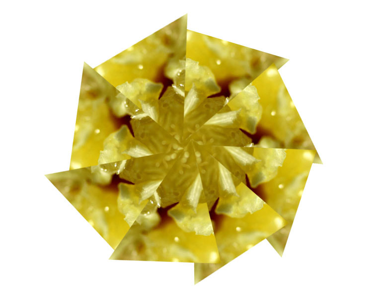
I wanted to experiment with the images I had taken on photoshop to see if I could create a more abstract photo. I cut out circles from the tomatmo and filled them with similar colour paint, the aim of this was to see wether using artificial colour and a new pattern would give the photo a new meaning as it becomes more abstract. I cut out triangles from the lemon image and arranged them to form an octagon. Again, I wanted to experiment with the shapes to see if the outcome would look better if they were presented in a different form. However, I decided I preferred my original images so I won;t continue with this type of photoshopped abstract work.
|
|
s t e p s o n p h o t o s h o p :
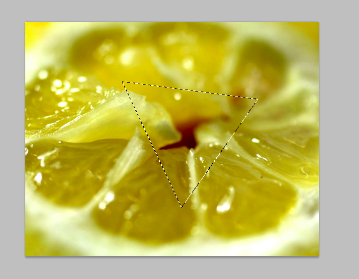
I used the polygonal lasso tool to select a triangle in the lemon and copied the selection, I then created a new document on photoshop and pasted it. Using the free transform tool, I pasted many copied of the triangle and rotated them until they formed a shape.

9 t h d e v e l o p m e n t
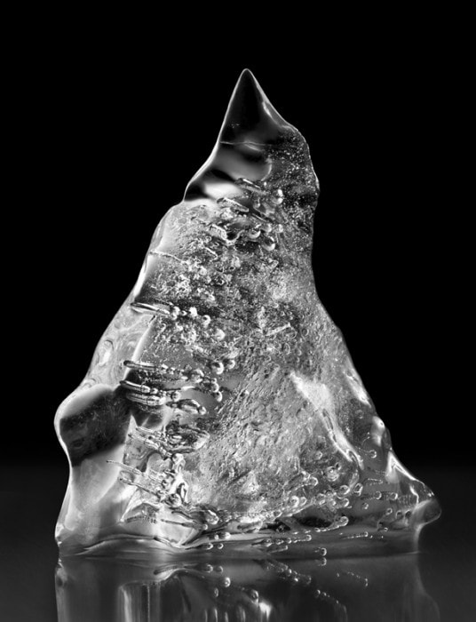
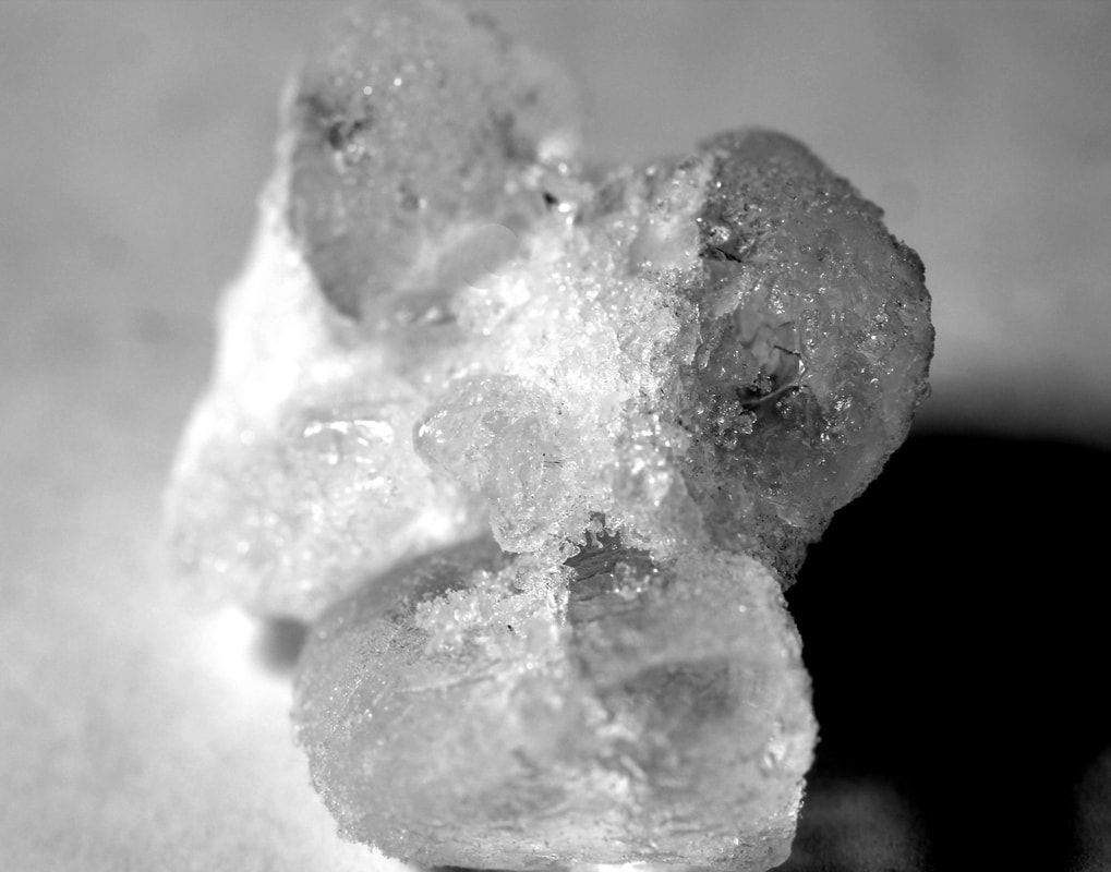
w i l l i a m c a s t e l l a n a
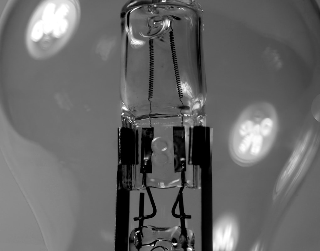
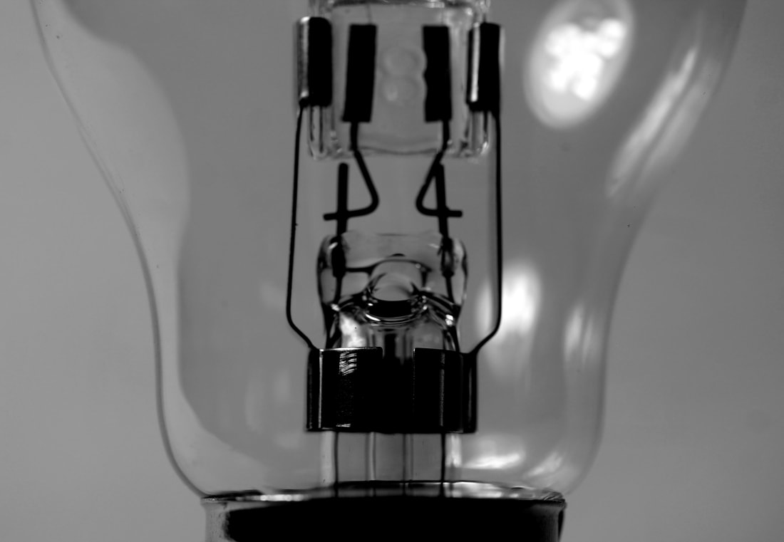
William Castellana is a photographer based in Brooklyn, New York. He is widely known for his still life images. Castellana found his passion for photography in college during a black and white photo course. Seeing images from artists such as Irving Penn and Josef Sudek, inspired him towards his own still life photos in lower tones, using minimal light to enhance the subject.
|
|
|
m y r e s p o n s e
My initial aim when photographing these objects was to capture their distinctive nature. Using close up, black and white images, the focus is purely on the object and allows the photograph to be of more than the object itself, but of the beauty and structure behind it. I wanted to take images of these kinds of everyday items in an attempt to further refine my work and progress from exploring the ordinary in food, to exploring normal, household items in a seemingly abstract way. The intention behind this was to give these ordinary items a meaning beyond their mundane use of being everyday objects.
|
|
After taking photos of the ice in the studio, I was pleased with my result however, I wanted to use objects that were more focused on normal items. Using inspiration from the artist I tried to replicate his images of the lightbulb as they are a more common item.
|
|
e v a l u a t i o n :
I was pleased with the outcome of these photos. I think they successfully represented what I was trying to achieve by taking normal objects and photographing them in a more abstract way. Although you can tell what the mages are, the macro lens gives much more detail and texture, enhancing components of the item, rather than simply photographing the whole object. In order to improve my work further, I would change the lighting so that it came from behind, like Castellana's work and so that this could create shadows that I would be able to incorporate into a. more abstract image.
a r t i s t & m e
w i l l i a m c a s t e l l a n a m e
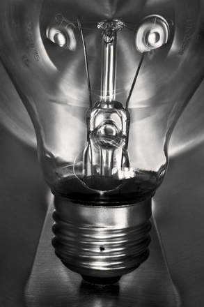
|

|
I tried to replicate this image of a lightbulb by Castellana. I used minimal studio lights as did he, in order to try and get the same type of glowing effect behind the lightbulb. Although I didn't effectively achieve this, I think I photographed the detail of the bulb well, making the small things stand out, which is what William Castellana's work does. I also made the image black and white which allowed it to further resemble the artists work in some way. To try and respond more accurately I would experiment with he lighting to try and achieve the glow on the bulb that Castellana got.
s e c o n d r e s p o n s e - a r o u n d t h e h o u s e
As a second response, I wanted to focus specifically on household items such as bathroom or kitchenware, as we see or use these items everyday. Framlingham Camera Club are a photography group based in Suffolk. I used their work as inspiration for a second response. Below are two of the images submitted to a series called "Around the house - looking at everyday from an unusual angle". Members of this club have contributed various photographs of everyday items that we take for granted. The abstract nature of these images is what I wanted to use alongside photographing this subject.
|
|
m y r e s p o n s e
The abstract nature of these images is what I wanted to draw inspiration from, alongside photographing this subject. The aim of shooting this response is to show refinement of the subject matter, developing from previous responses the movement have progressed from capturing ordinary objects, to specifically household objects such as kitchenware in an abstract manner.

|
|
|
1 0 t h d e v e l o p m e n t
p y a n e k
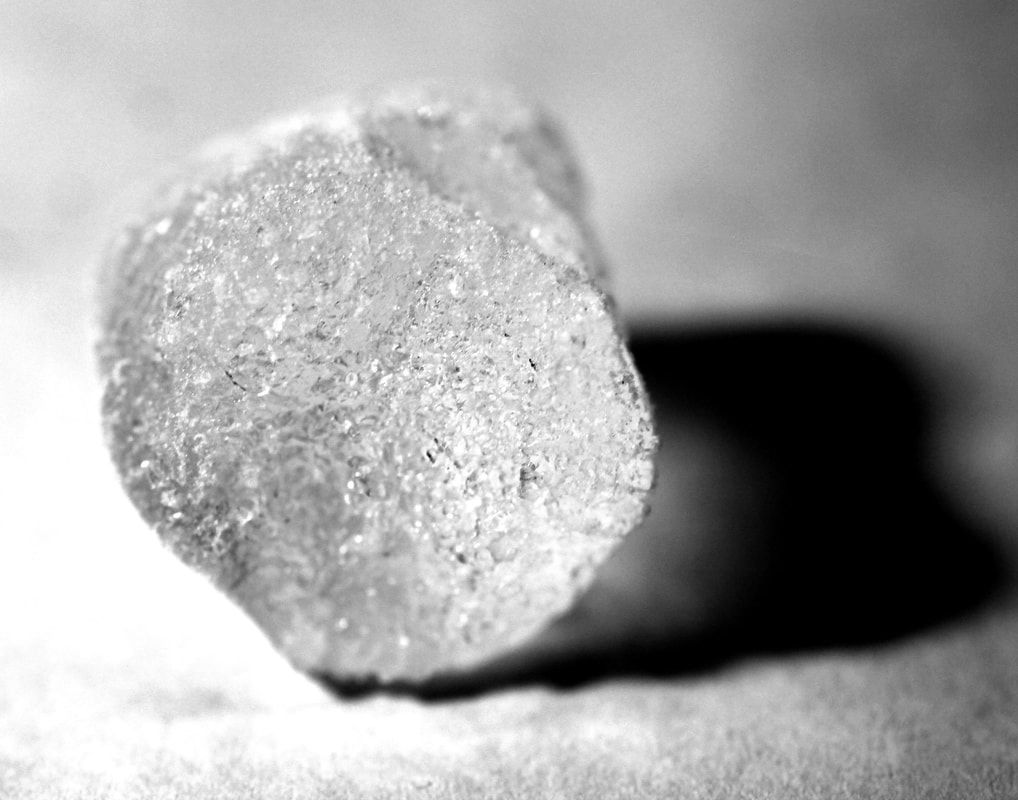
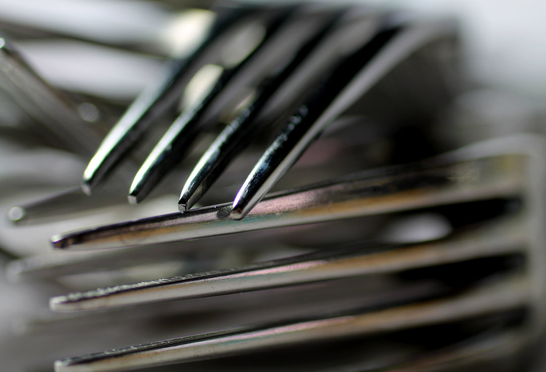
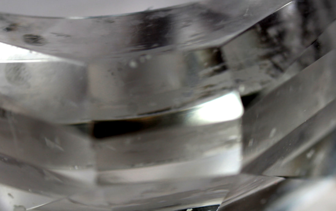
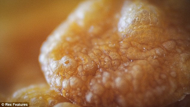
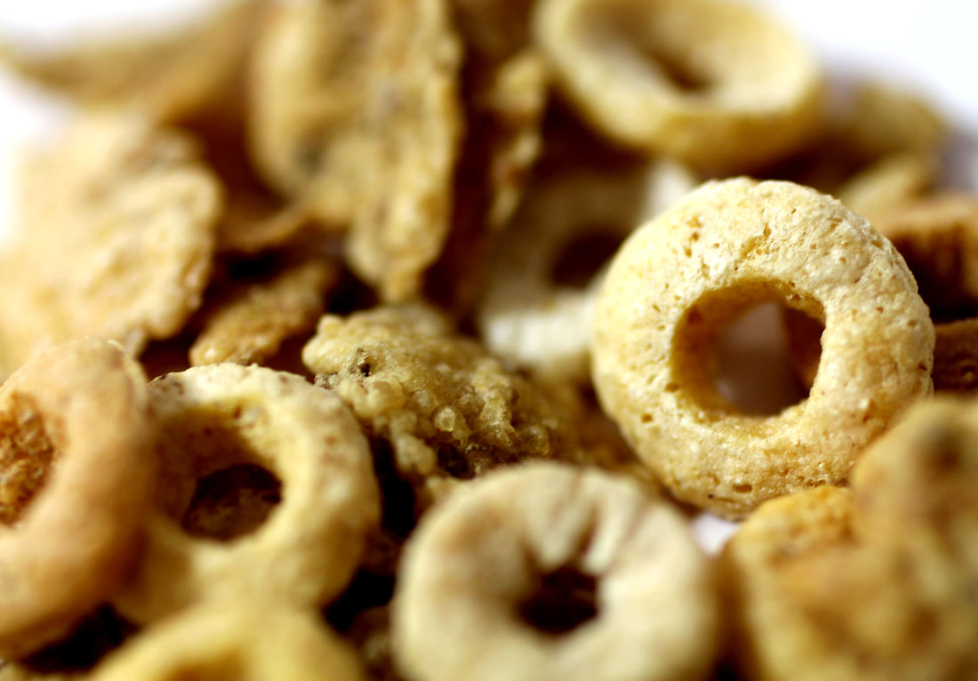
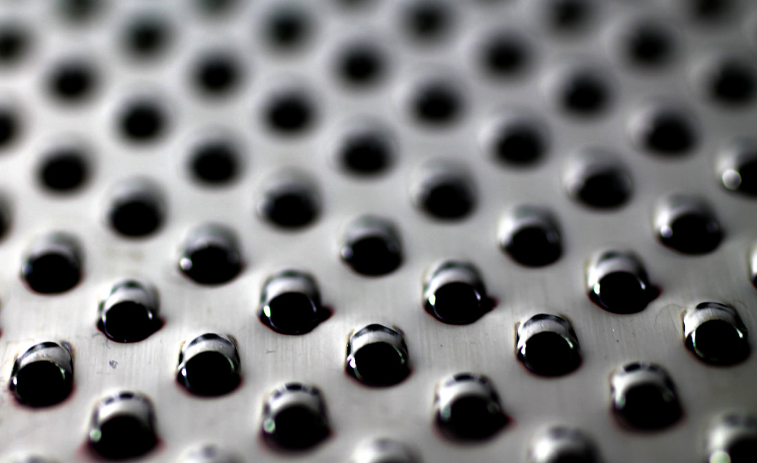
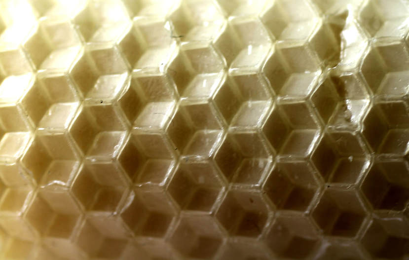
Pyanek is an anonymous photograpaher that has created a series of abstract unrecognisable everyday objects using a macro lens. He has creates a series called "Amazing worlds within our world". The mundane images e captures don't look so ordinary after he has photographed them up close. A once familiar objects becomes unrecognisable though the artist's lens. The zoomed and cropped to the point of abstraction, the detail captured can't be seen by the human eye, some of the images he takes, such as the sponge or sugar looks almost like a strand of DNA.
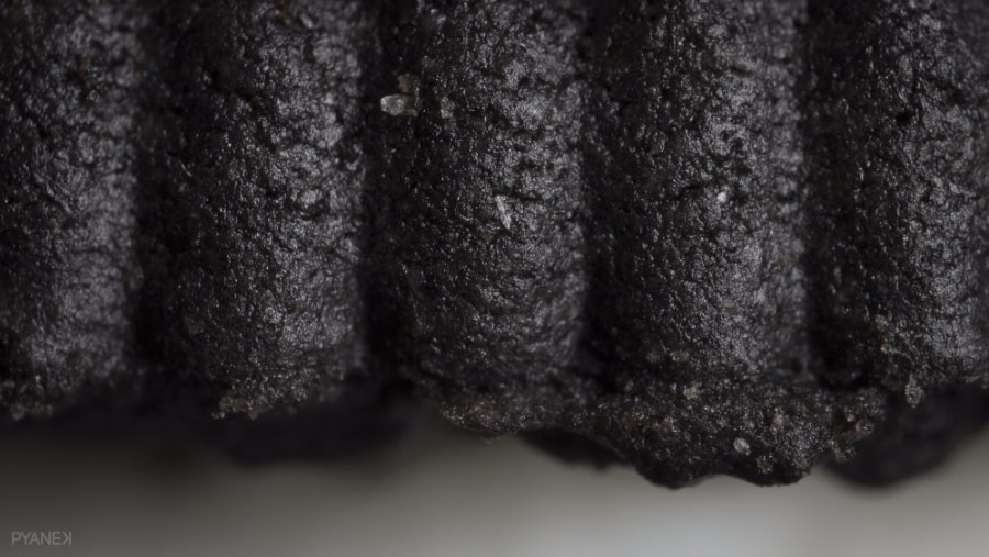
Chocolate cookie
|
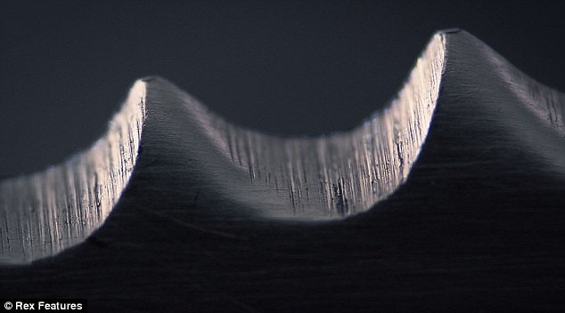
Serrated knife
|
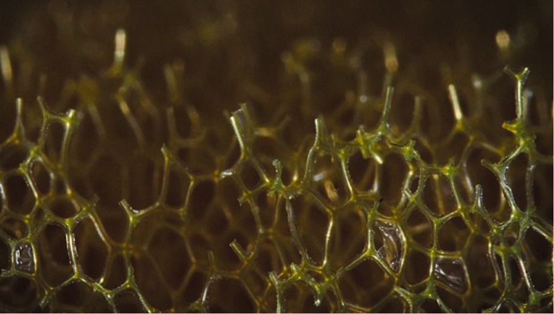
Kitchen sponge
|
Cornflake
|
m y r e s p o n s e
The aim of taking these images was to achieve an ultimately abstract photograph from the most normal household items that I could find. I brought in a number of objects including a sponge, cheese grater, candle, and cereal. I wanted to do this to refine my work from normal objects to trying ot capture these kitchen items in the most abstract way possible through the macro lens. The series of photos I take in response to this development will be used as inspiration for my final piece.
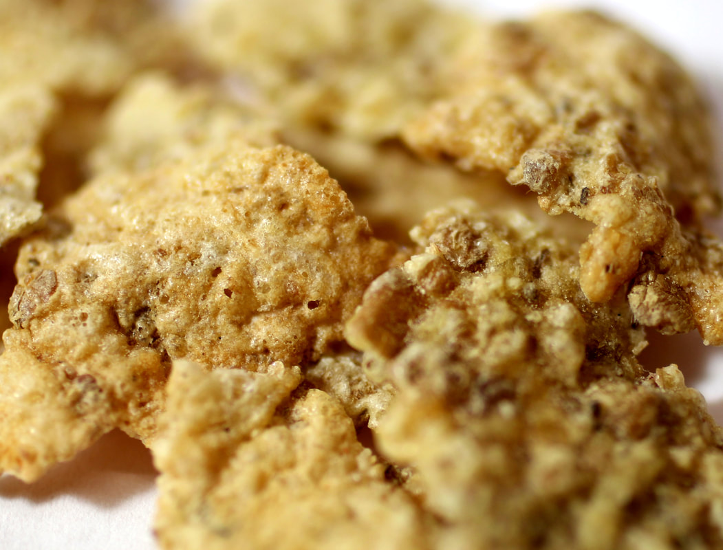
|
|
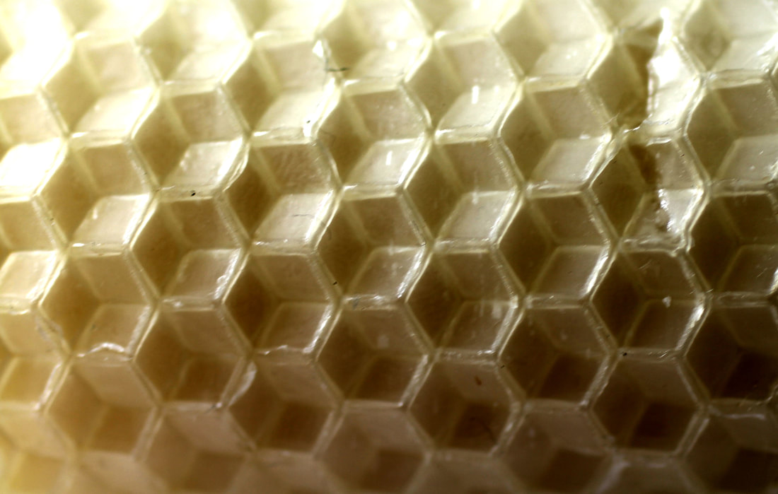
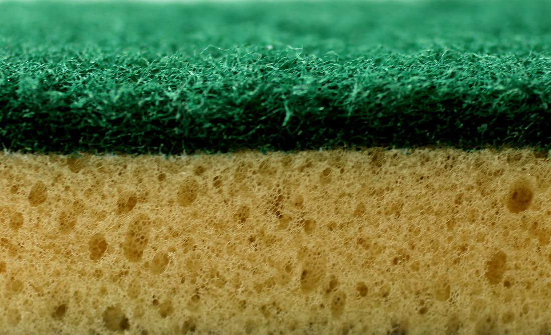
e v a l u a t i o n
The images taken in response to Pyanek turned out successfully, although the macro lens I used wasn't as zoomed in as the artists, I think that this outcome was good. I also liked the use of colour in these photos in comparison to the black and white macro photos I took in earlier developments. For my final piece I want to make these everyday items even more abstract, not through consuming the whole frame, but by using multiple objects at one, and by using more colour and shadows to distort the image further.
e x p e r i m e n t a t i o n s :
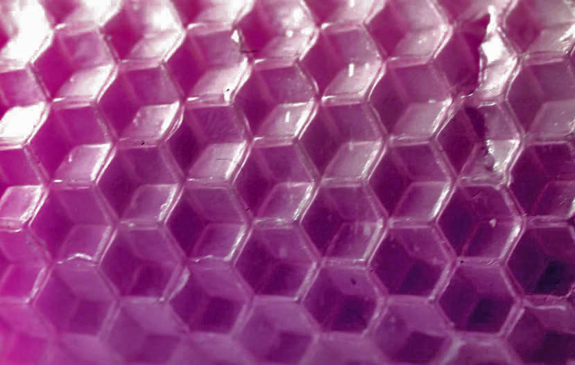
I wanted to experiment with the macro photos I took of household items to see if I could obtain a more abstract result through photoshop. Although I liked the outcome of my previous development, I thought I could experiment with these photos to see if there are any aspects I could use in my final piece. Below, I merged the layers of two, and then three of the photographs I took to see if I could get an interesting texture, or to see if the opacity aspect of the layering was something I could use in my final piece, however, I don't think this worked out well.
|
|
s t e p s o n p h o t o s h o p :
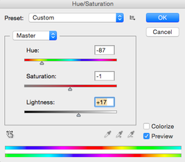
The screenshots below shoe the opacity changed on each of the layers to make them blend into each other. The screen shot on the right is for the process of the pink image below. For this photo I wanted to experiment more with colour so I changed the hue and lightness to obtain the result below. I liked how that image turned out and I may use bright colours similar to that in my final piece.
|
|
|
|
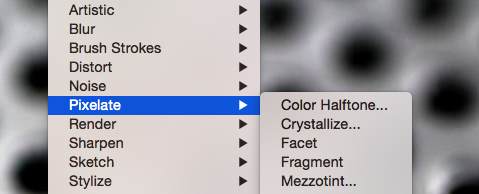
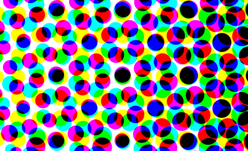
This photoshop process is for the series of four images below. This photo was originally the cheese grater seen in the macro photos. I clicked on filter>pixelate>colour halftone to change the image.
|
|
The reason for doing this to my image was to explore how abstract I could make an image by editing it on photoshop. After discovering the coloured circle pixels it created, I increased the radius until the fourth picture showed. I liked this image as it incorporates colour into it and it's completely abstract, deferring from the original image entirely so that it's context, environment and meaning has changed. Despite this, I decided that the only aspect of this experimentation I am going to use in my final piece is the use of colour. This is because I much preferred photographing normal objects and making them abstract through the lens, rather than through photoshop, and because I preferred the outcomes of the original macro images compared to these.
|
|
|
|
|
a r t i s t & m e
p y a n e k m e

|
|
Pyanek and I took photos of similar objects, I used this artist as inspiration of this reason. I think I achieved Pyanek's aim of creating an abstract image purely by taking it up close. I chose objects that had intricate texture's in order to get a similar effect, I think that this worked well as you can't tell what I took the photo of. Using the macro lens, the focus is more in the middle, or in certain areas of the picture, this gives a greater abstract image. Despite this, in order to respond further to this artist, I would use more objects that had an interesting pattern and would also try to create a more zoomed in image by using the reverse lens macro technique. This involves using the normal camera lens and attaching it the other way around. This is the technique that Pyanek used.
DEVELOPMENTS
1. Using discarded objects in response to Michael Craig Martin
2. Painting the objects to give the 'old' a new meaning
3. Giving the objects a new meaning through a different style of presentation - outlines
4. Changing the meaning again, but through removing the colour and context to remove meaning
5. Using a different style of photography
6. Wrapping objects, hiding an object removes its meaning and causes the viewer to see the item in a different way
7. Philosophical aspect, visual and language. The meaning changes as the representation does
8. Abstract presentation, focusing on food
9. Second response, in colour
10. Move from food onto 'normal' or common objects - ice
11. Focus shifts onto household items
12. Refinement from household items to kitchenware photographed in an abstract way
13. Everyday household items photographed with a macro lens
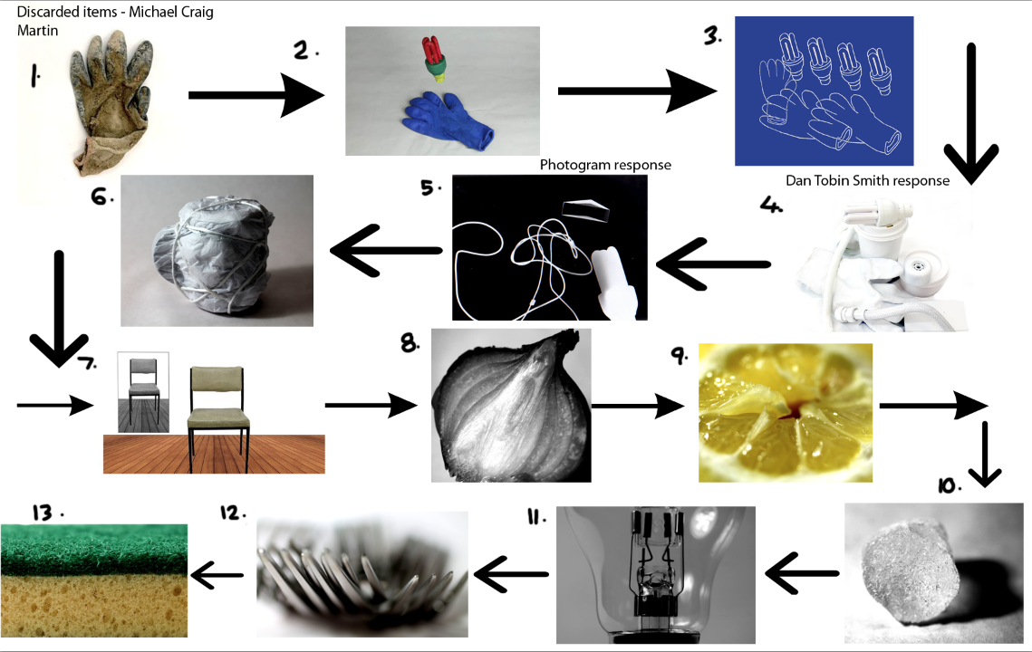
f i n a l p i e c e i n s p i r a t i o n
artist inspiration 1
g a l a x y g a t e s
I found this abstract video by Oilhack and Thomas Blanchard, they mixed various paints and perfected a process which 'opened' the paint up. As the colours moved and split, they were shot with a macro lens.
m y r e s p o n s e
I responded to this video as I wanted to use it as inspiration for my final piece, however I chose to use liquids from everyday items rather than paint. Although this may take away from the beauty and colours of the artist's work, I'm aiming to create something abstract. Below I photographed the products I used in creating the video and images. These included: washing up liquid, bleach, oil, black food colouring, barbecue lighting gel and vinegar. I chose the items as this steered me back into the concept of exploring everyday household objects and giving them a new meaning by changing and exploring how they are presented.
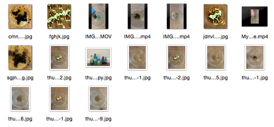
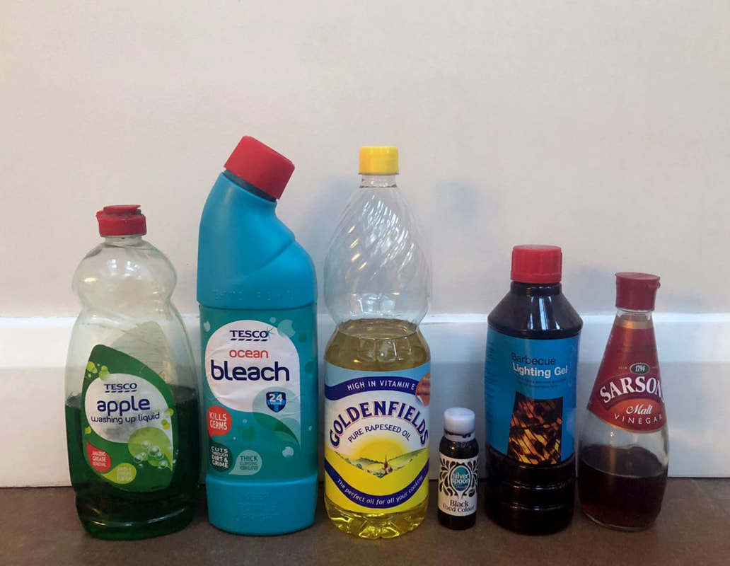
|
|
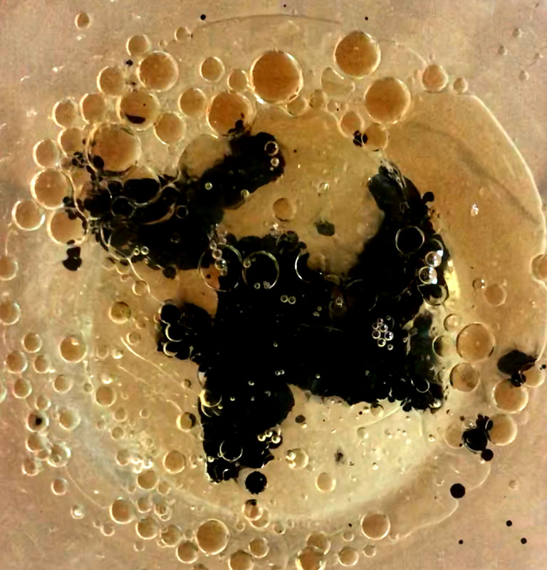
|
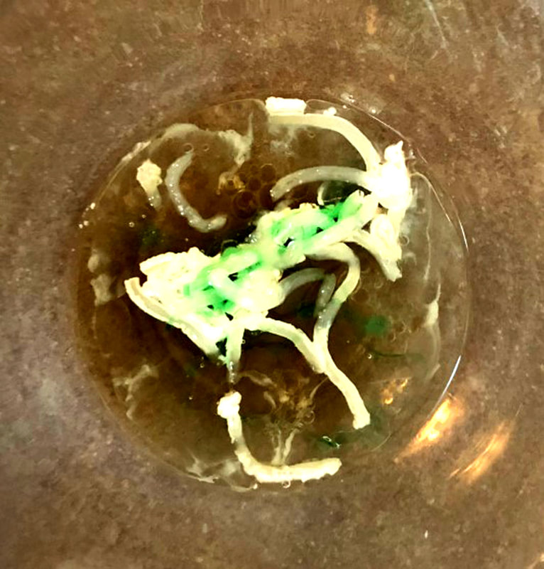
|
e x p e r i m e n t a t i o n
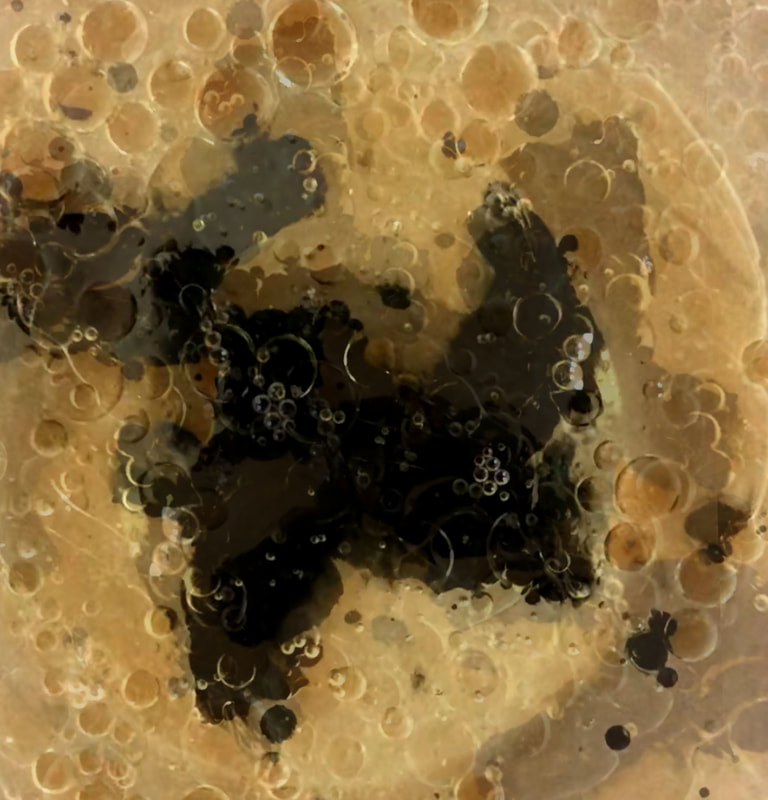
|
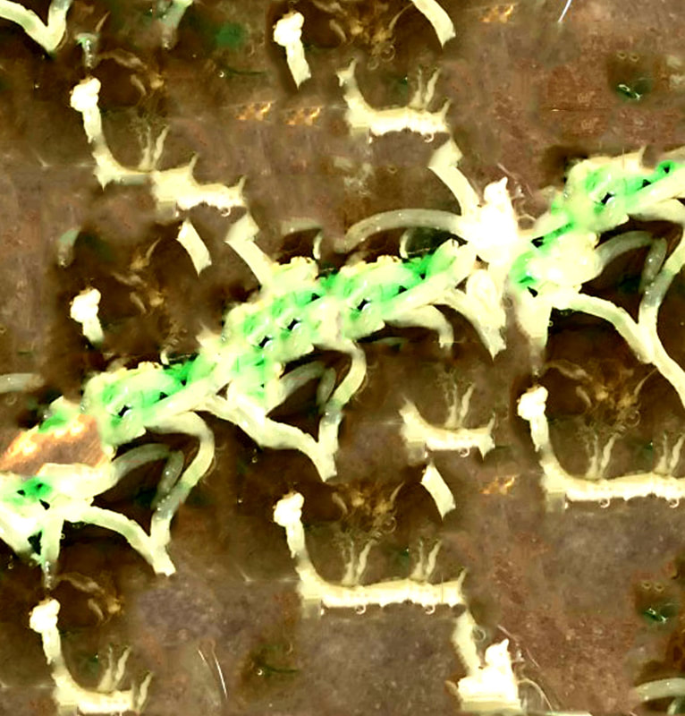
|
s t e p s o n p h o t o s h o p :
For the first image above, I experimented on photoshop by selecting the whole image and pasted it as a new layer. I then used free transform tool and changed the size of the image. I did this 3 times, using varying sizes and changing the opacity to make the image look more abstract. For the image on the left, I selected parts of the image and repeatedly used the content aware tool to distort the image.
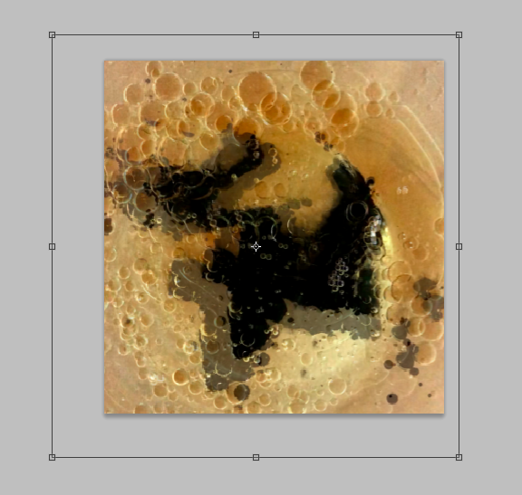
I wanted to include this in my inspiration because of the use of colour in making an abstract photo/video done through photoshop. As this was moving away from the macro household items, I decided not to develop this work any further into more abstract images as I wanted to continue photographing everyday items.
artist inspiration 2
t i m n o b l e & s u e w e b s t e r
Aside from capturing abstract images of household items, I wanted to use a final artist as inspiration to incorporate shadows into my final piece. Tim Noble and Sue Webster are London based artists. They turn discarded heaps of rubbish into a sculpture that creates a shadow of a much more interesting and figurative structures. In the first instance, you can see societies everyday items that have been thrown away, however we see self-portraits of the artists themselves. Their aim of doing this was to show the people who are literally, 'behind the mess'. The projections symbolise the how the small choices we make everyday can accumulate into the piles of trash that we see before us. Using this series of work, I drew on the use of shadows for my final piece, although I didn't want this to be a main feature of the work I produced, I liked the idea that the shadows were independent of the items and created a new picture, where the shadow was an important aspect. The use of shadows changed the meanings behind these images - this is something I will try to do.
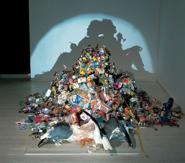
|
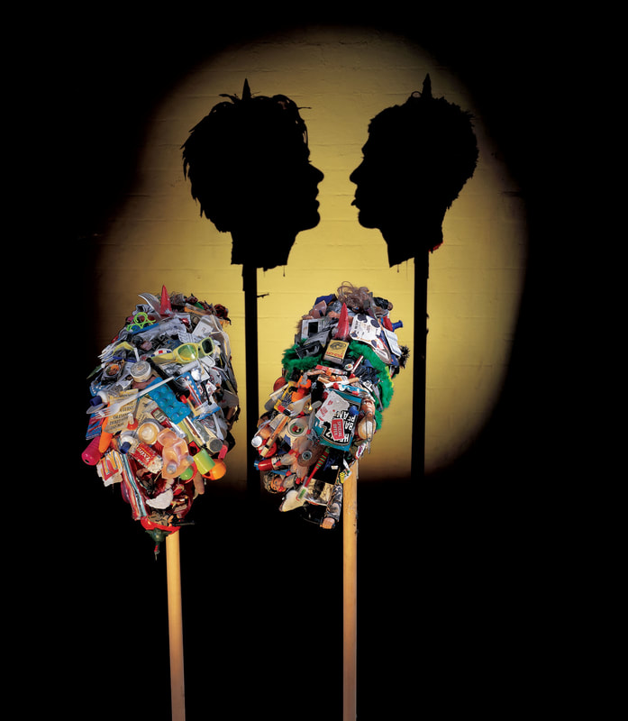
|
artist inspiration 3
k a t e j a c k l i n g
After researching Tim Noble and Sue Webster for my final piece, I found that Kate Jackling's work was more appropriate to respond to for my final piece. Her subject matter is more similar to the household objects that I'm shooting as my final response. Unlike Noble and Webster, her photography is much more abstract, which is the style of photos I'm achieving to get. Addtionally, the first image of the wine glasses linked much more strongly to everyday normal items that I wanted to explore than sculptures of rubbish. Jackling is a UK based artists known for her editorial work. On top of this, she has created many series' involving shades, shadows and reflections.
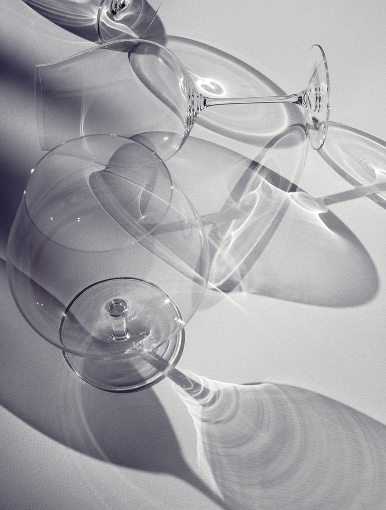
|
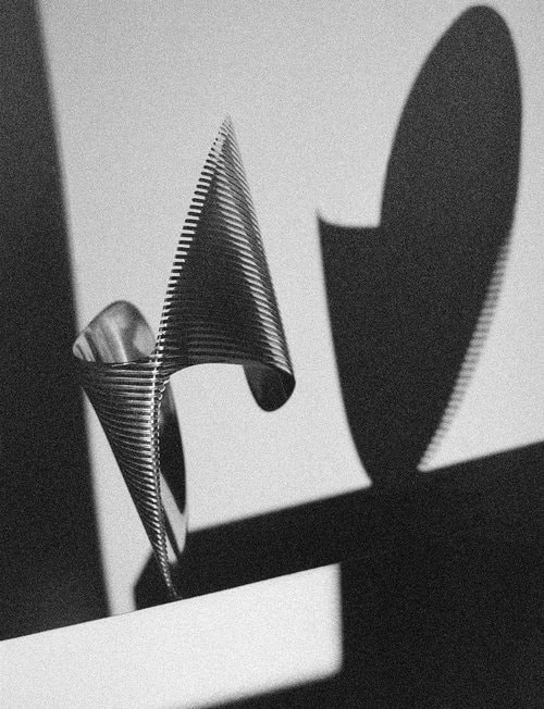
|

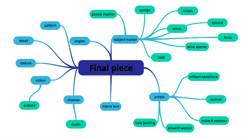
p r e p e r a t i o n
Before taking photos for my final piece, I looked around my kitchen for objects with detail and texture that I could bring in to the studio to photograph. I brought in knives, forks, spoons and most of the utensils from the image on the right.
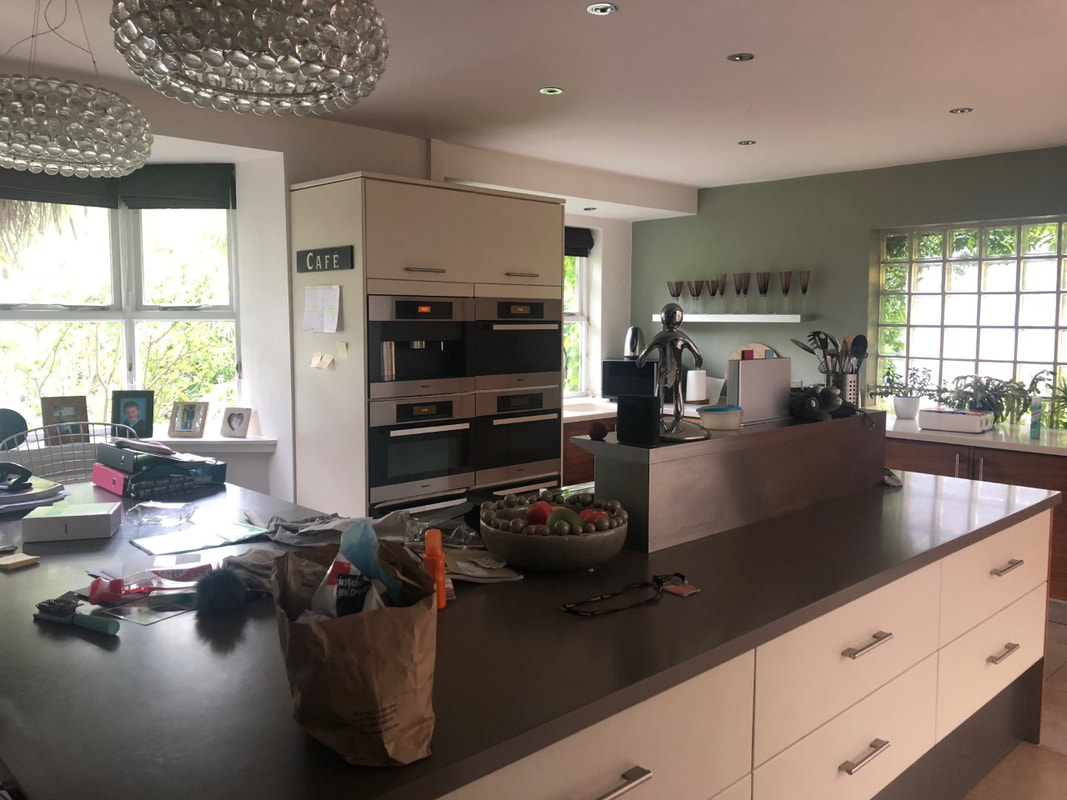
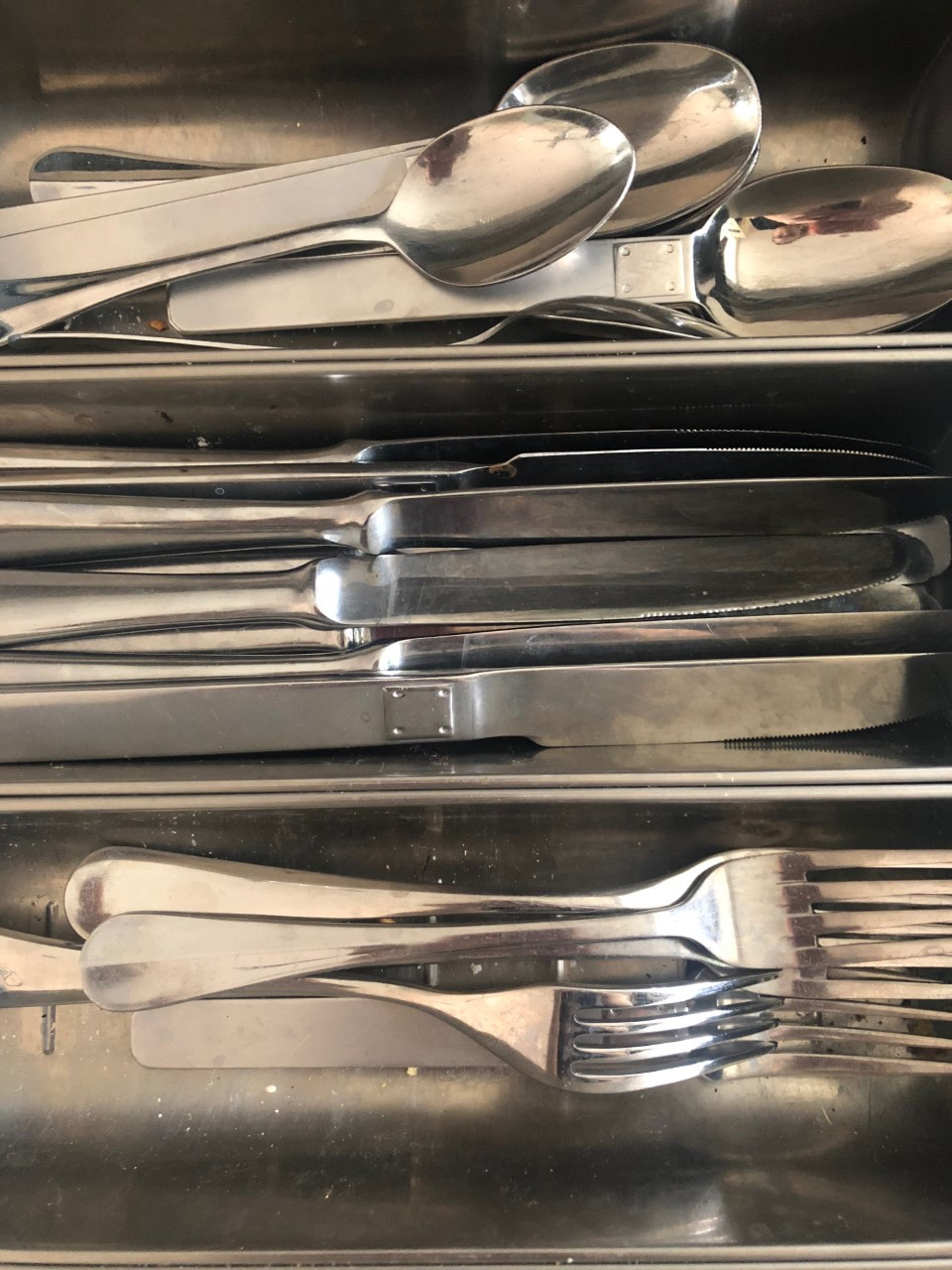
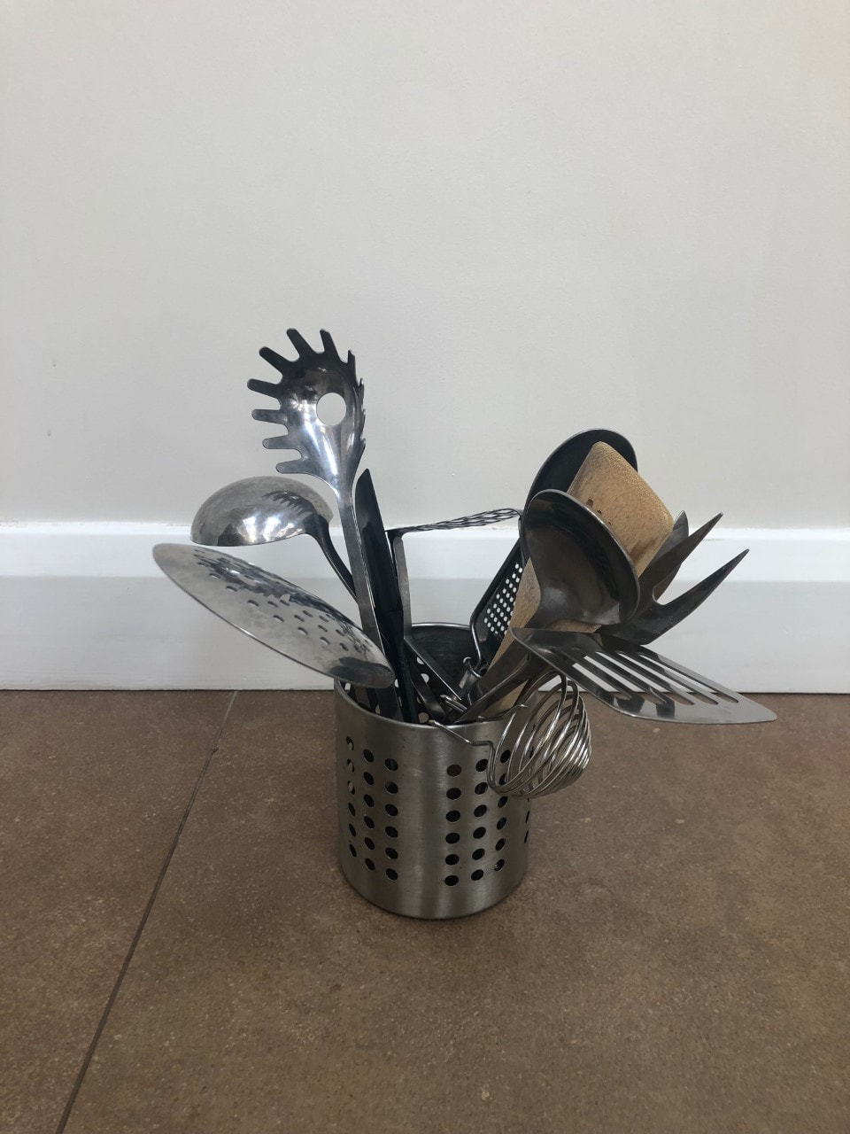
f i n a l p i e c e
By collecting items from around the house I will photograph everyday things in the studio, experimenting with the style of photography, taking them up close using the macro lens, and at different angles to create more abstract images. I will also experiment with creating artificial shadows with these images using inspiration from the artist above. This can be linked to the exam title Freedom and Limitations by exploring how pushing the limits of the meanings of everyday object and create new ideas and images. I have been doing this through my strand developments. For my final piece I'm focusing on everyday objects and exploring how these normal items can be presented and displayed in different ways; thus changing the representation of the everyday things and the meanings of them. The concept behind this can link to the philosopher, Ludwig Wittgenstein's theory, exploring the relationship between visuals and language, and how this can change items' representation. I created these photographs by capturing angles that helped disguise what the object was, and used coloured acetate to put over the studio lights in order to experiment with the colours. I chose to do this after taking macro photos of food and kitchen items because I preferred the outcome of the coloured images. I thought that using block colours alongside shadows would create a more abstract image. I also used an additional light to create these shadows, to show another side of representation of the objects, without actually showing them. This hid their meaning even more and presented them in a way which altered their physical form.
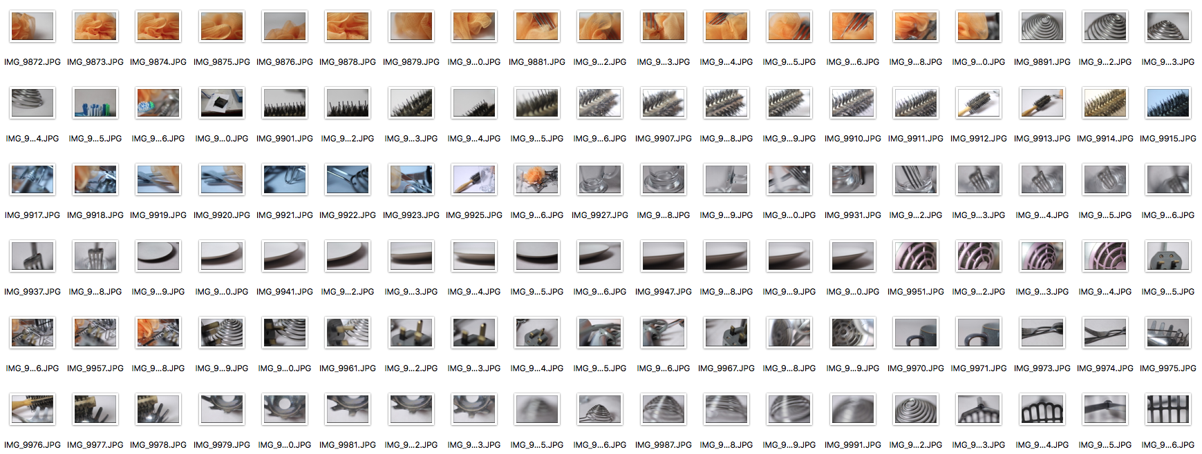
s e l e c t s
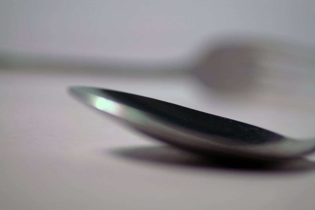
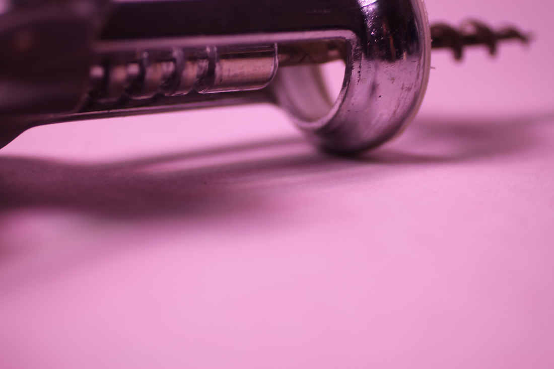
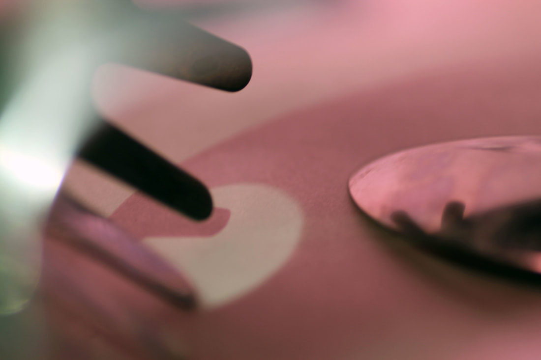
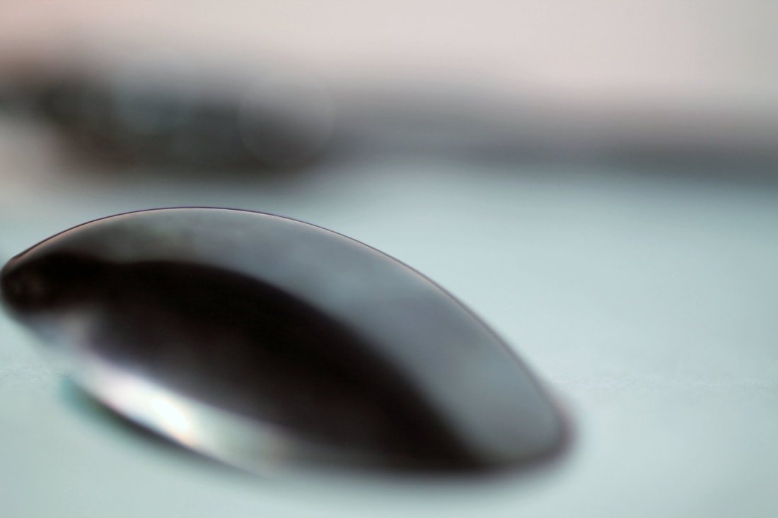


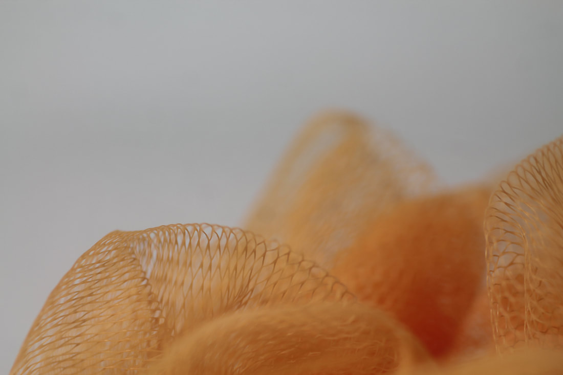
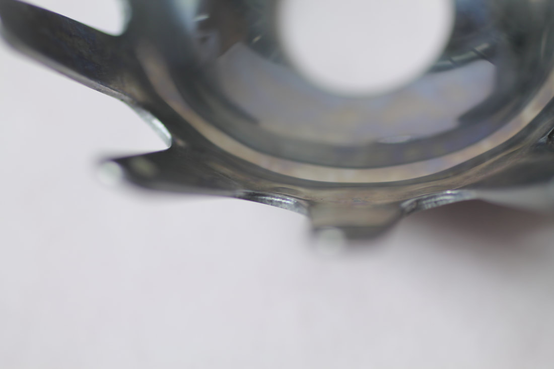
e d i t s
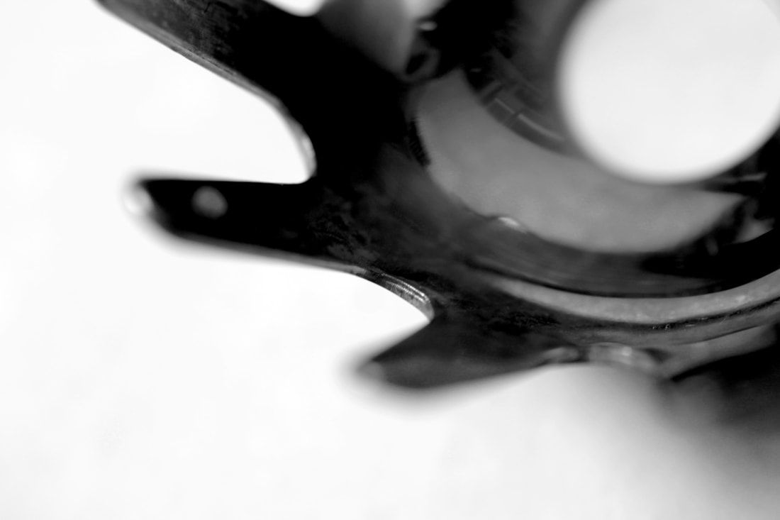
|
|
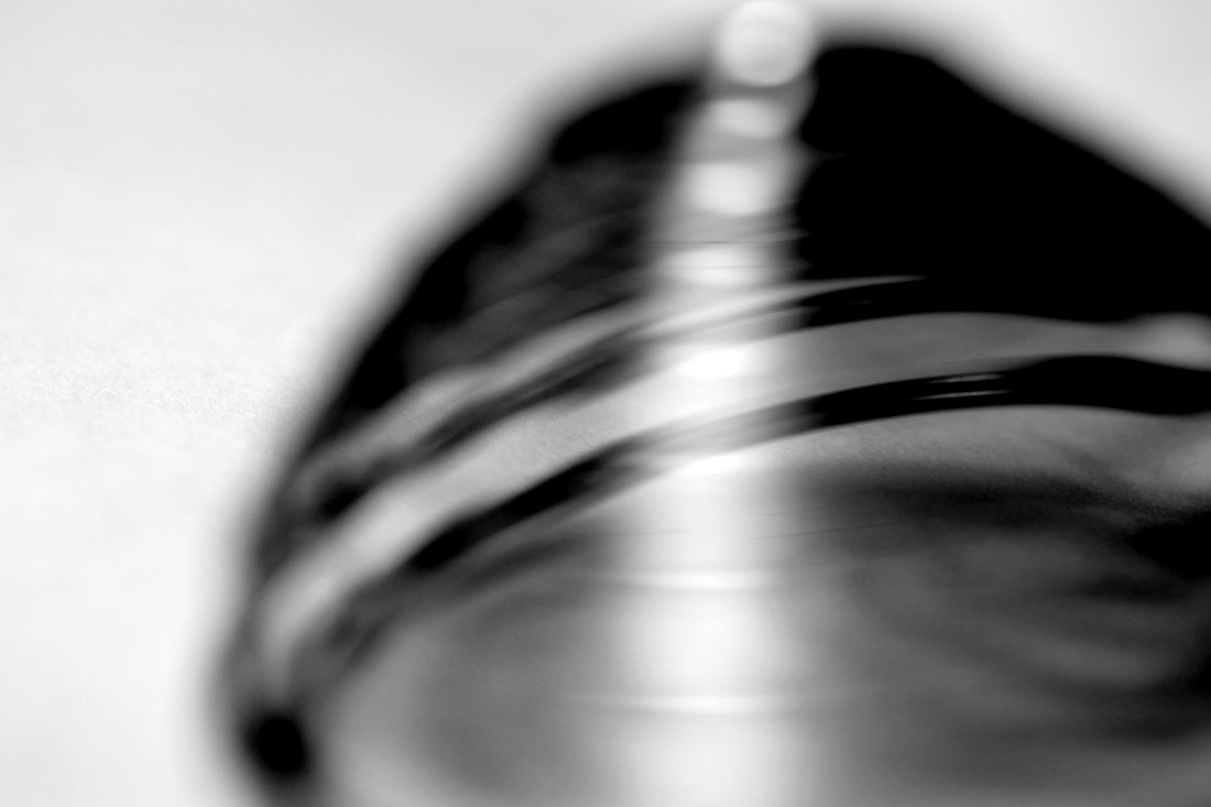
|
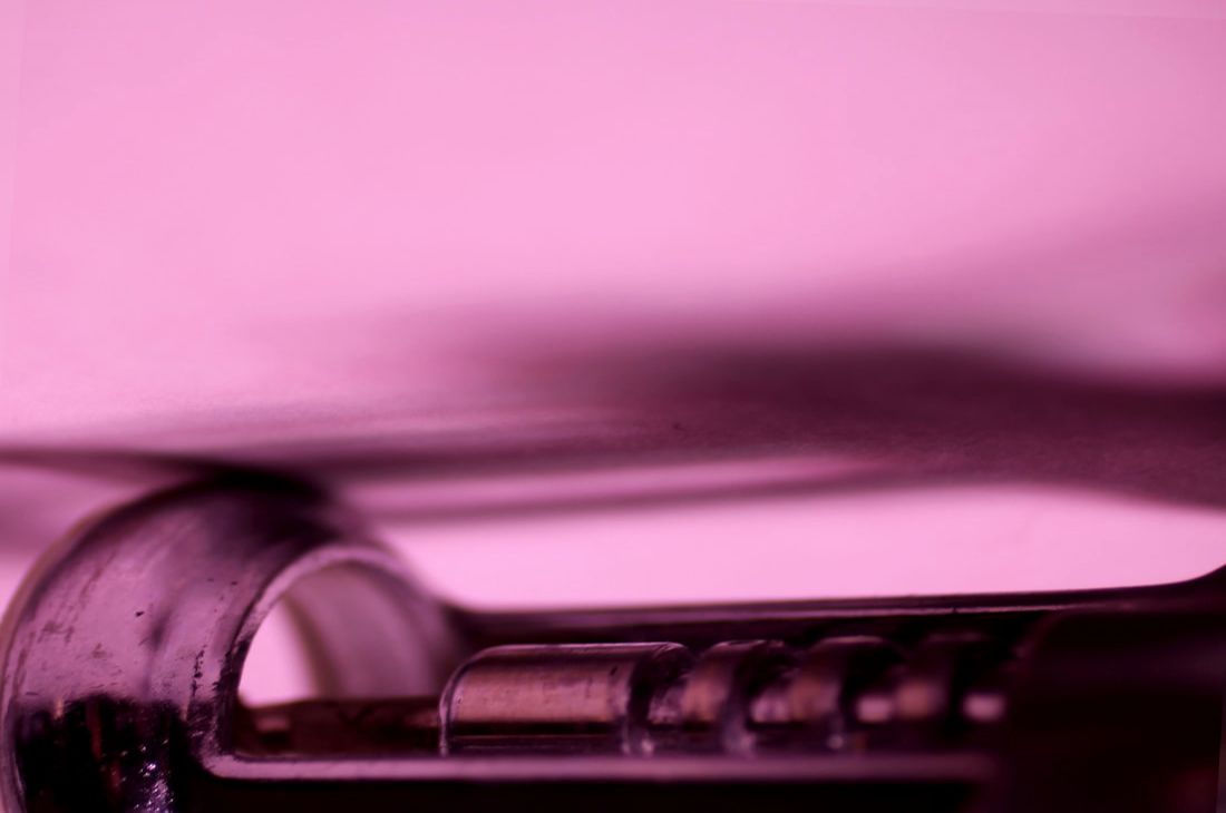
|

|
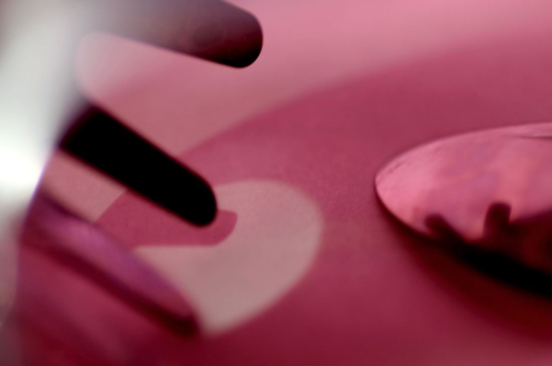
|

|
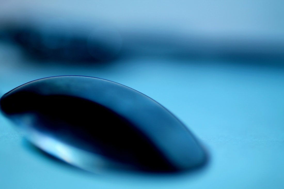
|

|

|
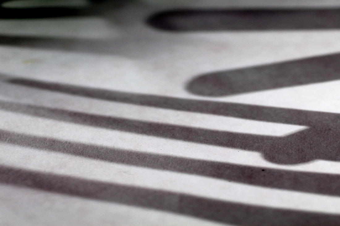
|
|
13/05/18
You need to make sure each section has clear intentions at the start of each shoot and then how you would improve the work at the end. Also your final piece is good but it needs to have some developments before you get to the final piece. Showing the examiner that you have tried out different types of objects and also different colours. You need to show that you have journeyed to the final piece and not just arrived at it. There is time to do this before the end of Wednesday
You need to make sure each section has clear intentions at the start of each shoot and then how you would improve the work at the end. Also your final piece is good but it needs to have some developments before you get to the final piece. Showing the examiner that you have tried out different types of objects and also different colours. You need to show that you have journeyed to the final piece and not just arrived at it. There is time to do this before the end of Wednesday
