s u m m e r g a l l e r y v i s i t
T H E R A D I C A L E Y E - M O D E R N I S T P H O T O G R A P H Y
The Radical Eye is an exhibition from the Sir Elton John collection, it displays photograph from the classic modernist period of the 1920s-1950s. Over the last 25 years Sir Elton John has put a collection together including portraits of Man Ray, Picasso, Matisse and Breton and has over 70 artists and nearly 150 rare vintage prints on show. The exhibition consists entirely of rare vintage prints, all created by the artists themselves, the quality and depth of the collection allows the exhibition to tell the story of modernist photography in this way for the first time in the UK. Featuring portraits of great cultural figures of the 20th century, including Georgia O’Keeffe by Alfred Stieglitz, Edward Weston by Tina Modotti, Jean Cocteau by Berenice Abbott and Igor Stravinsky by Edward Weston, the exhibition gives insight into the relationships and inner circles of the avant-garde. Ground-breaking experimentation is seen both in the darkroom and on the surface of the print, such as Herbert Bayer’s photomontage and Maurice Tabard’s solarisation, examine how artists pushed the accepted conventions of portraiture.
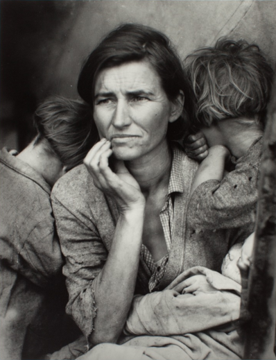
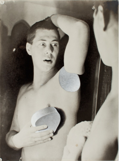
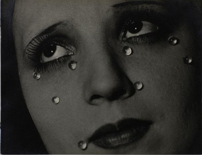
Dorothea Lange 'Migrant Mother', 1936 Herbert Bayer 'Self-Portrait', 1932 Man Ray 'Glass Tears', 1932
s e t t a s k s
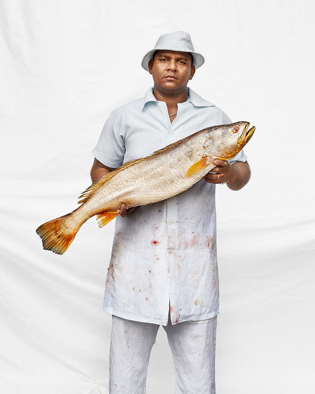
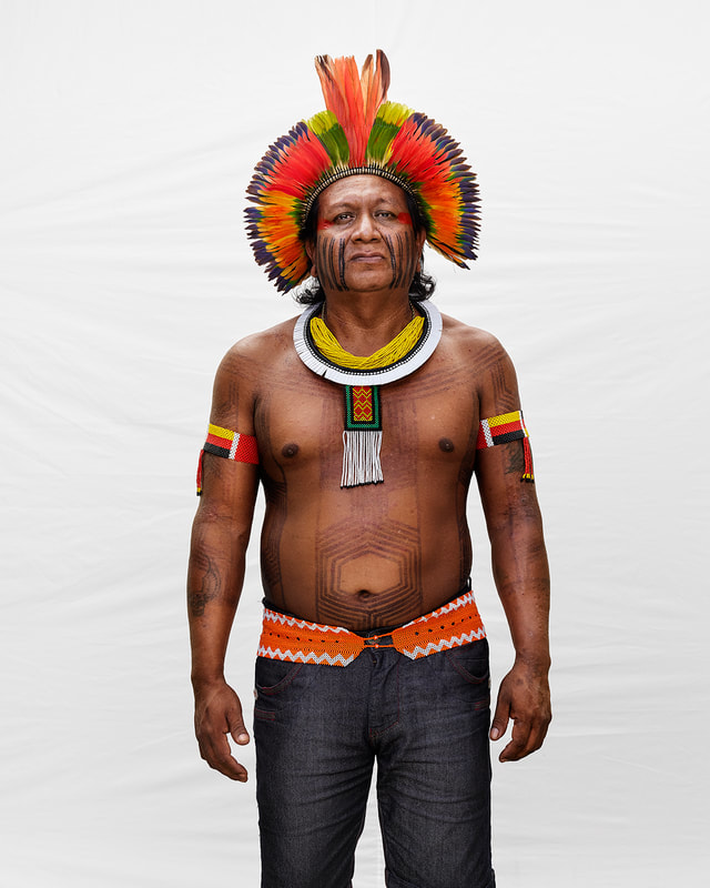
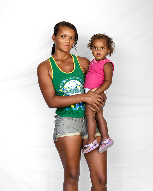
s t r e e t p h o t o g r a p h y - m a r c u s l y o n
Marcus Lyon shot a series called Somos Brasil and it is a multimedia exhibition and book. The project explores the diversity of Brazilian identity. He created an app consisting of high quality images, the stores of the people's lives, and includes a DNA test which allows each individual to see where they come from. Over a six-month period Lyon toured Brazil exploring the most diverse corners of the country and they mapped the ancestral DNA, personal stories and visual identity of over one hundred remarkable Brazilians. Somos Brasil draws three elements of identity: visual, spoken and genetic together to cast light on the personal, social and cultural diversity of Brazil.
|
|
|
c o l o u r
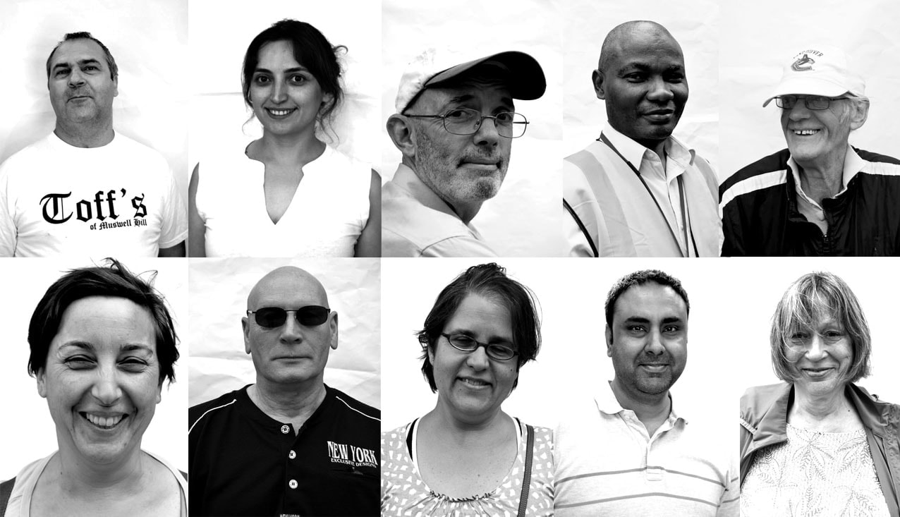
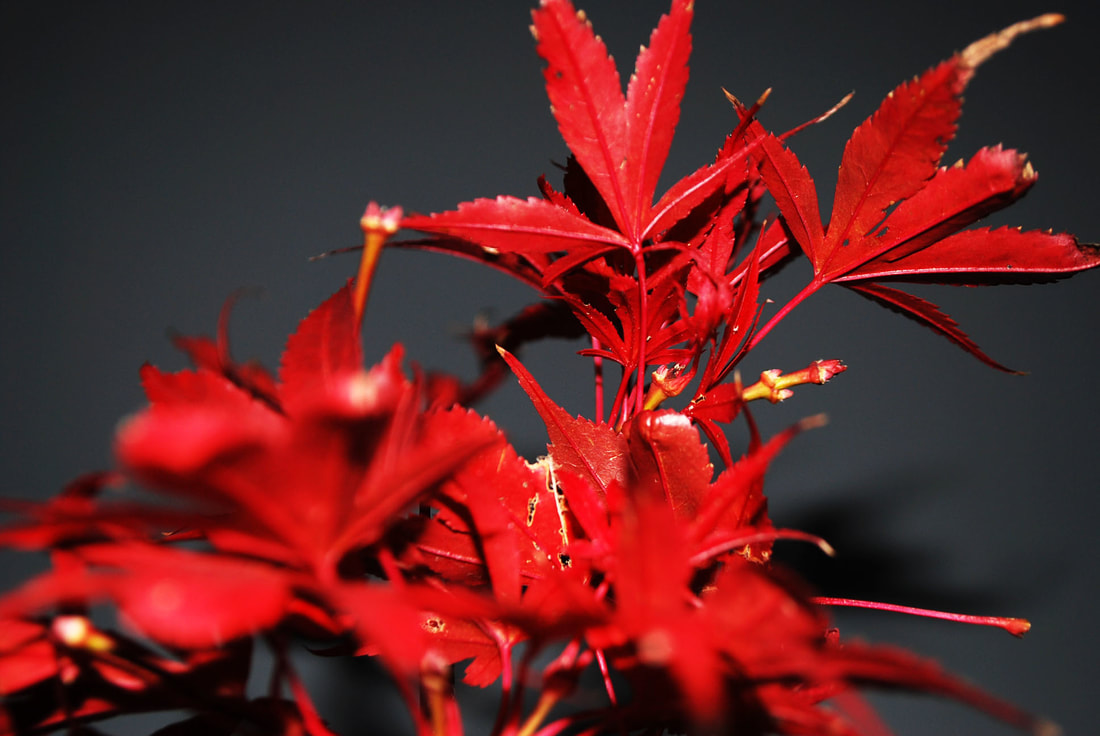
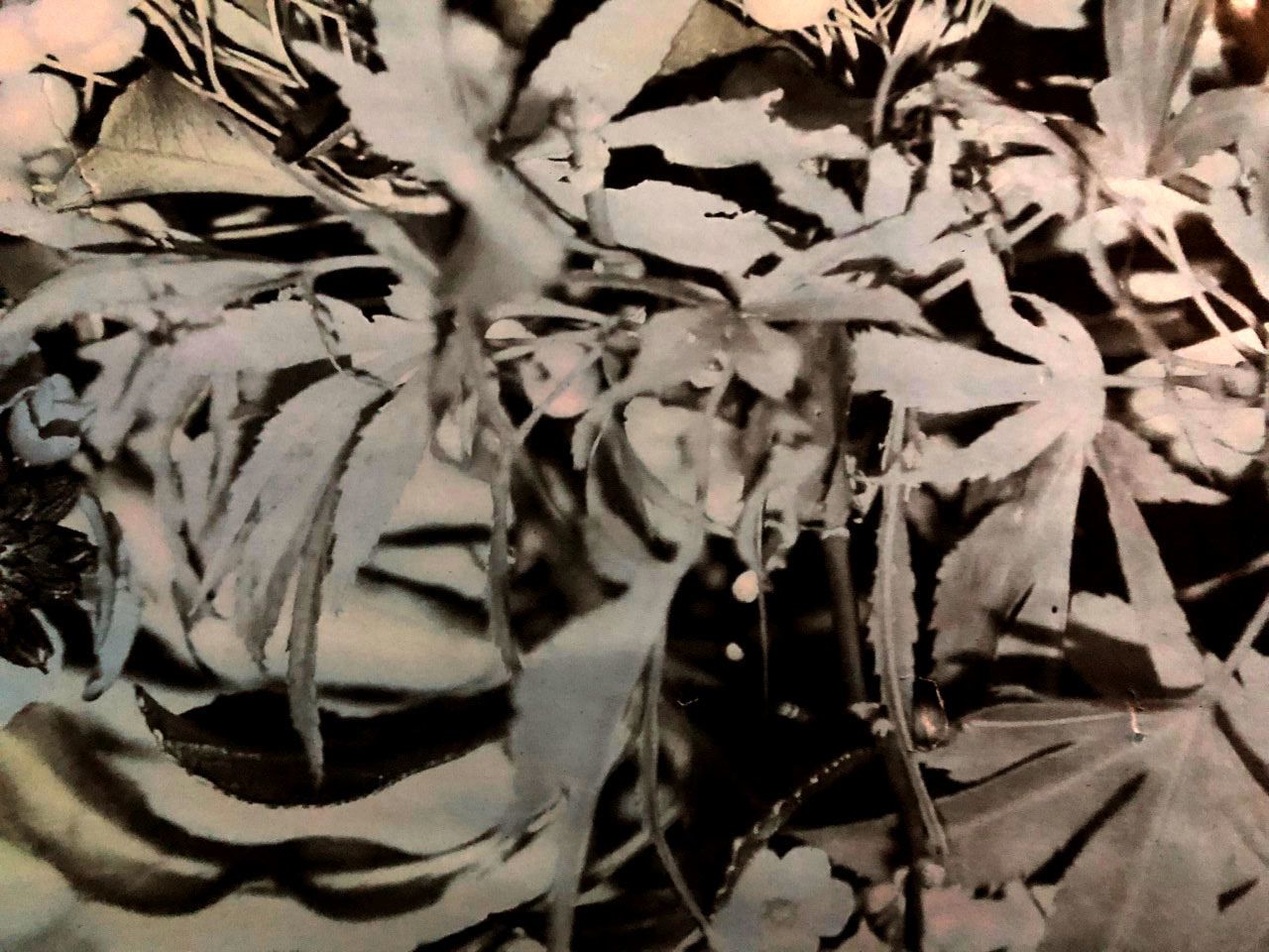
My response to this included taking photos of people around Muswell Hill, we asked them to stand in front of a white canvas that we brought out with us. This was in order to emphasise the subjects in the photos and to draw attention to their features and clothing.
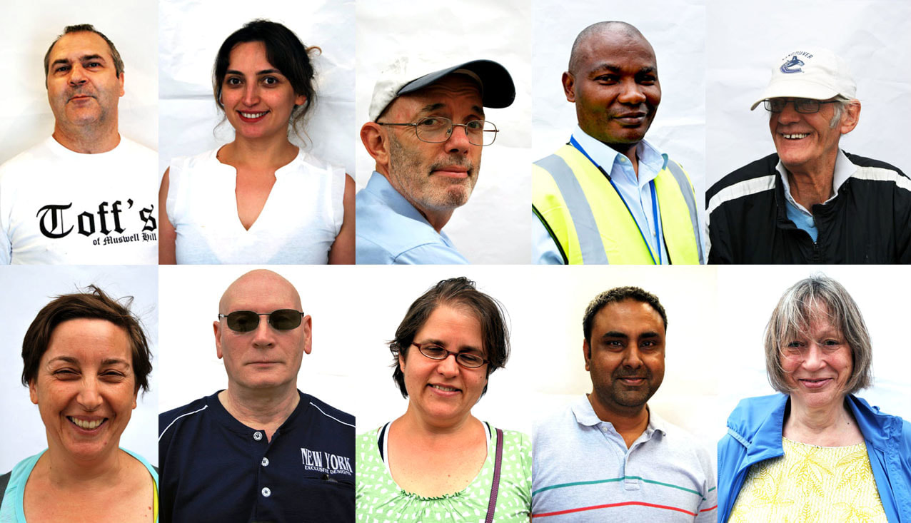
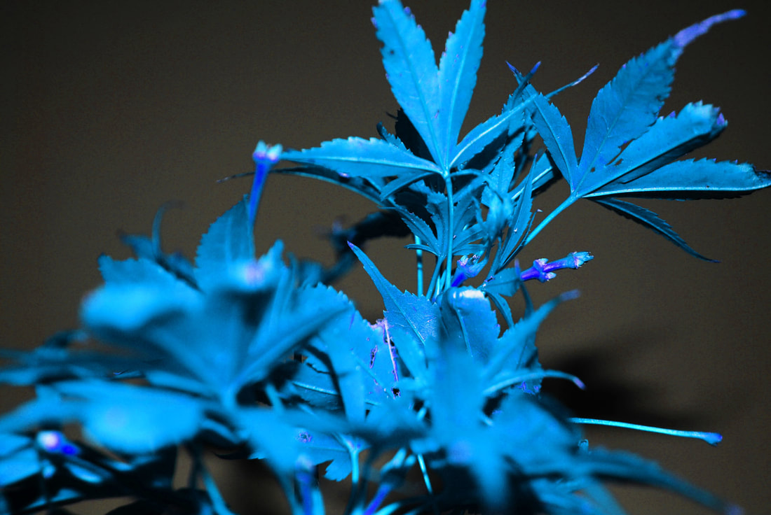
b l a c k & w h i t e
I changed the photos on photoshop to black and white in order to see if there was any difference in how the white canvas works behind them. They're less prominent, however, the bright coloured clothing doesn't distract any attention away from the face as the colour images did.
BRIEF : Exploring the impacts of globalisation, consumption and
pollution on urban environments
There are many definitions for globalisation:
- the process by which businesses or other organisations develop international influence or start operating on an international scale.
- the process by which the world is becoming increasingly interconnected as a result of massively increased trade and cultural exchange. Globalisation has increased the production of goods and services.
- This is the integration of economies, industries, markets, cultures and policy-making around the world.
- increasing economic interdependence of national economies across the world through a rapid increase in cross-border movement of goods, services, technology, and capital
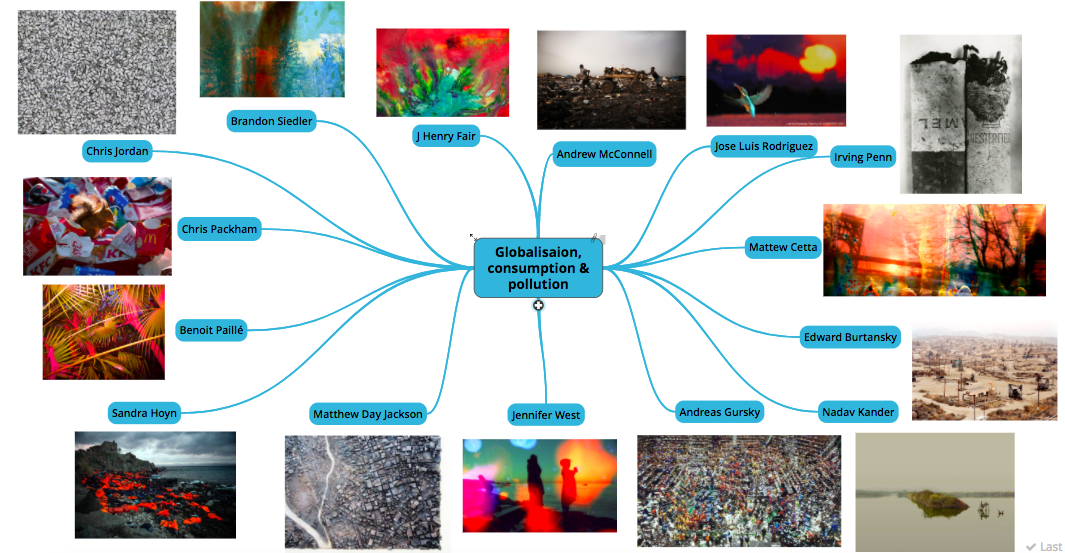
a r t i s t i n s p i r a t i o n m i n d - m a p
r e s e a r c h f o r b r i e f
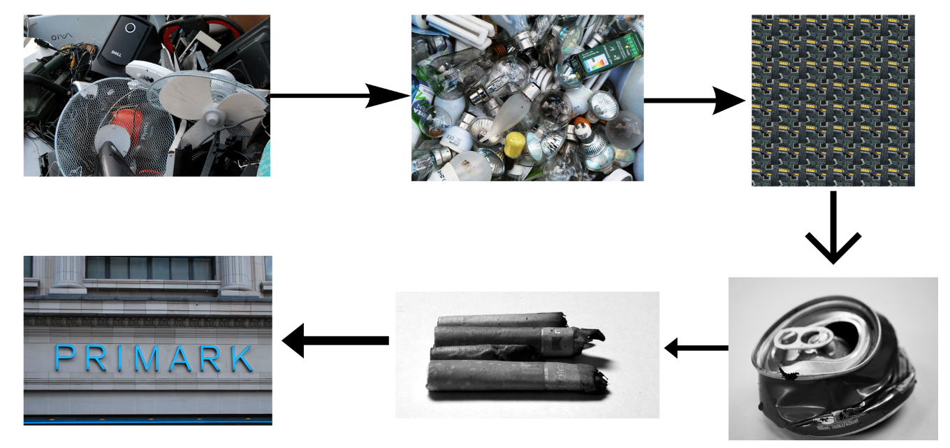
After exploring the various artists for my curatorship task on urban architecture, I decided I wanted to focus my practical portfolio on the globalisation aspect of it. Marcus Lyon was one artist I looked at which caught my attention and made me want to look at the topic and issues around it in more detail. Globalisation is a worldwide occurrence that affects everyone, and also the planet. It link closely to consumption and as globalisation increases and furthens, more societies become consumerist and buy more products and items. This can be viewed as a result of the media emphasising the latest products, technologies and clothes which further encourage people to buy new things. A direct result of this is waste, the higher frequency at which we discarded these old objects for new ones has a massive impact on our environment. Ir can be argued that increased use of technology should be able to counteract these problems, however with mass consumption and waste reaching an all time high, it is having detrimental impacts on our landscape that is becoming harder and harder to stop.
|
|
|
|
|
|
|
|
|
|
|
|
|
|
c o n s u m p t i o n & w a s t e
Globalisation is the process by which the world is becoming increasingly interconnected as a result of massively increased trade and cultural exchange. Globalisation has increased the production of goods and services. The increase in globalisation means that as a result mass production has increased, and therefore so has mass consumption. As we live in a consumer society that largely focuses on the newest trend or fashion, which means there is a massive increase in the production and also waste. The detrimental impacts of this includes factors such as a multitude of pollution, inequalities and may provide poor working environments and the loss of local jobs.
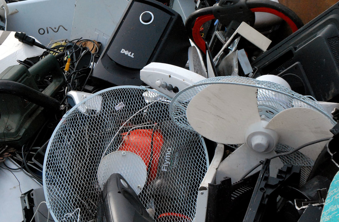
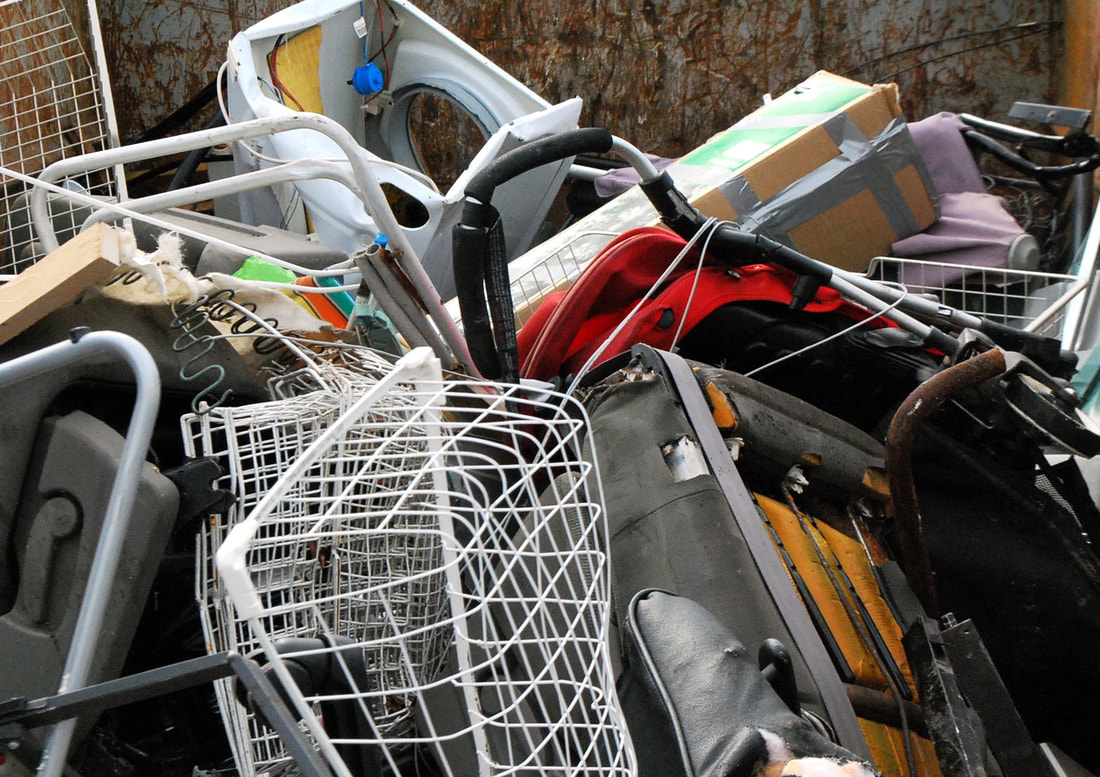
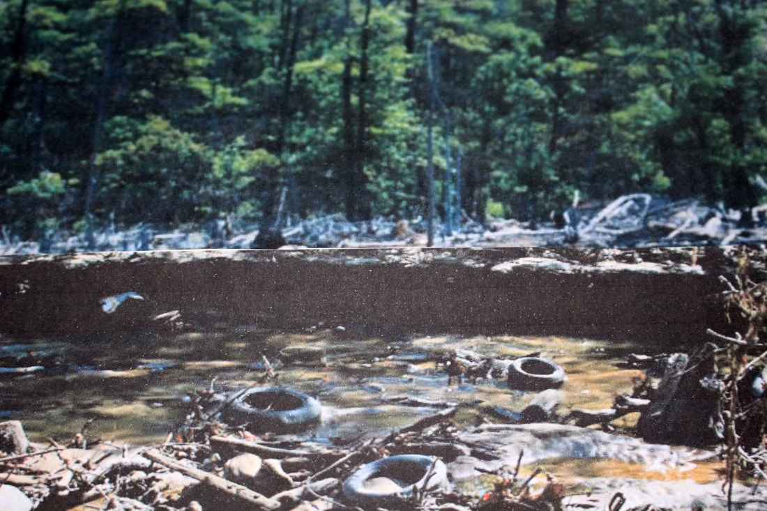
F I R S T R E S P O N S E - F R I E N B A R N E T R E C Y C L I N G C E N T R E
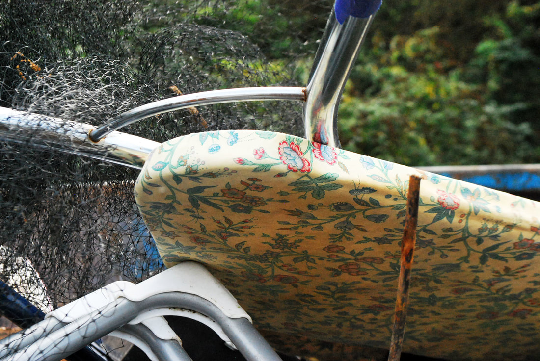
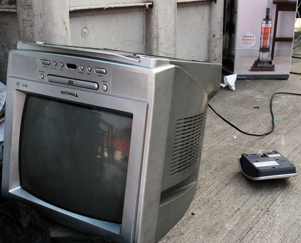
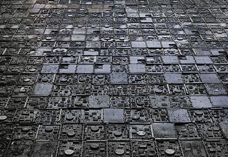
When I visited this recycling centre I was attempting to address the consumption and waste aspect of my brief. By obtaining these photos I tried to capture household items to represent waste within societies. However, as this was quite small dump there wasn't a lot of variety in the items available to photograph. I found a lot of fans, tv monitors, wires and general waste which was not what I had really aimed to capture. Although the subjects weren't ideal i managed to photograph prams and washing machines which suited my project more.
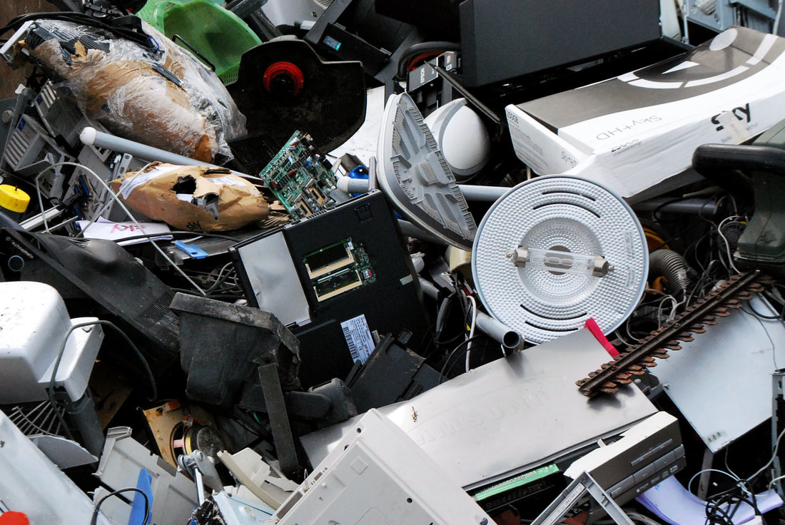
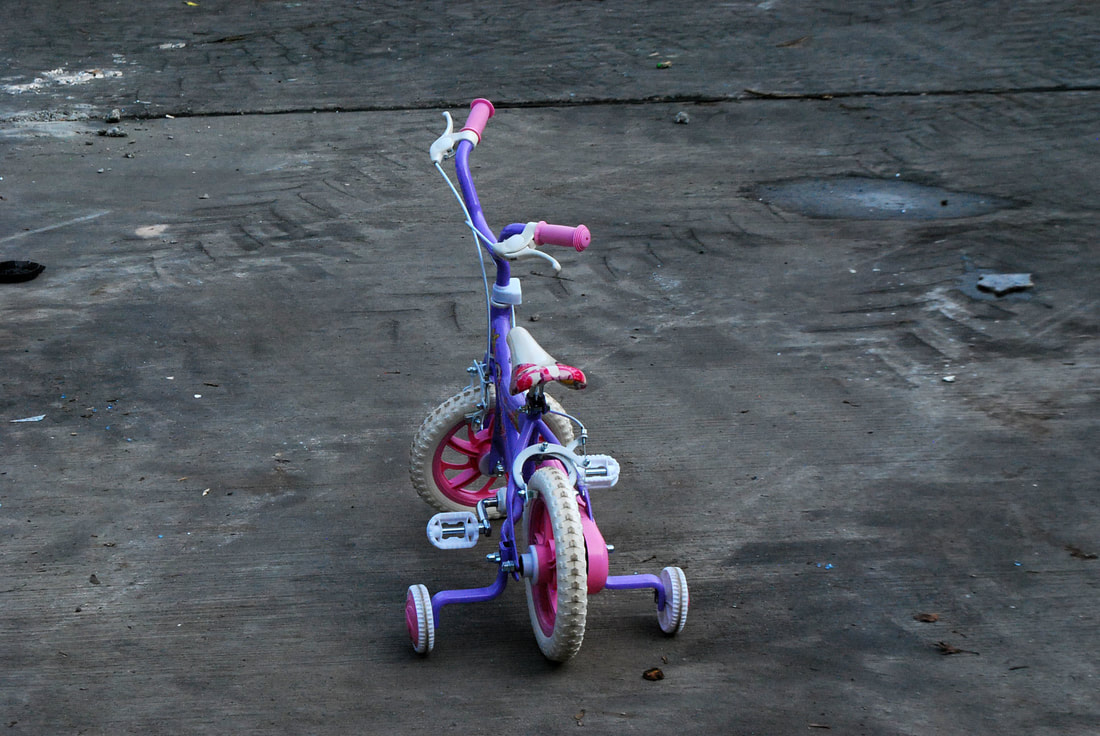
f i r s t d e v e l o p m e n t - w e s t e r n r o a d r e c y c l i n g c e n t r e
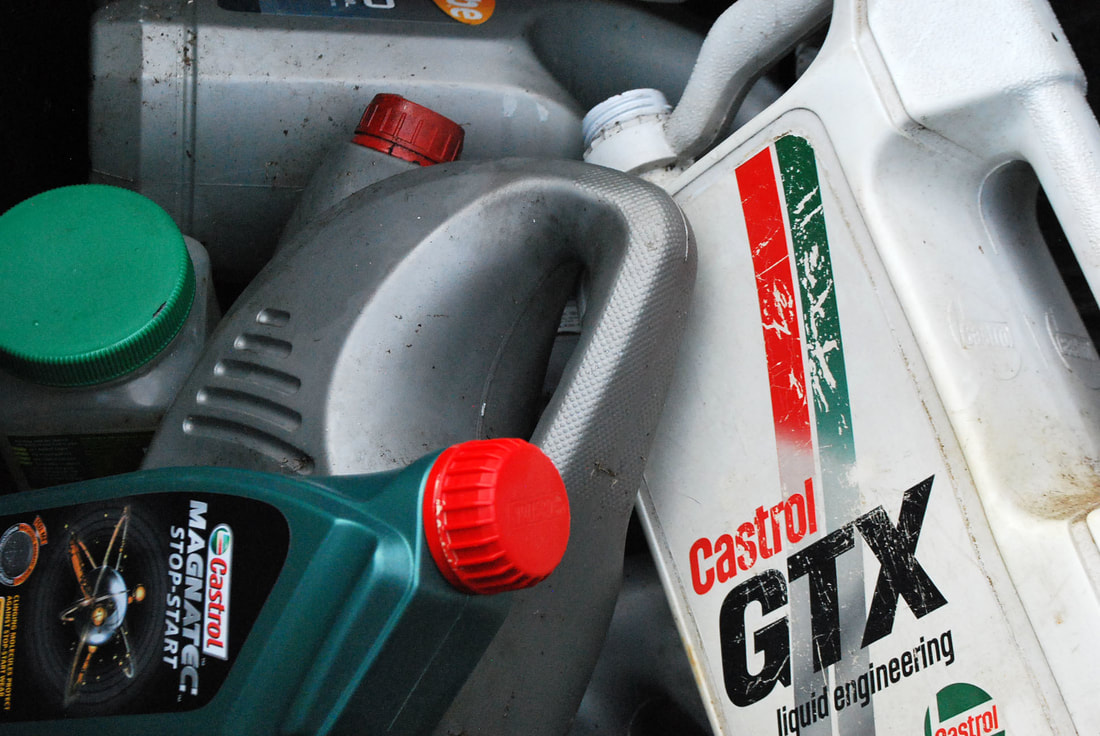
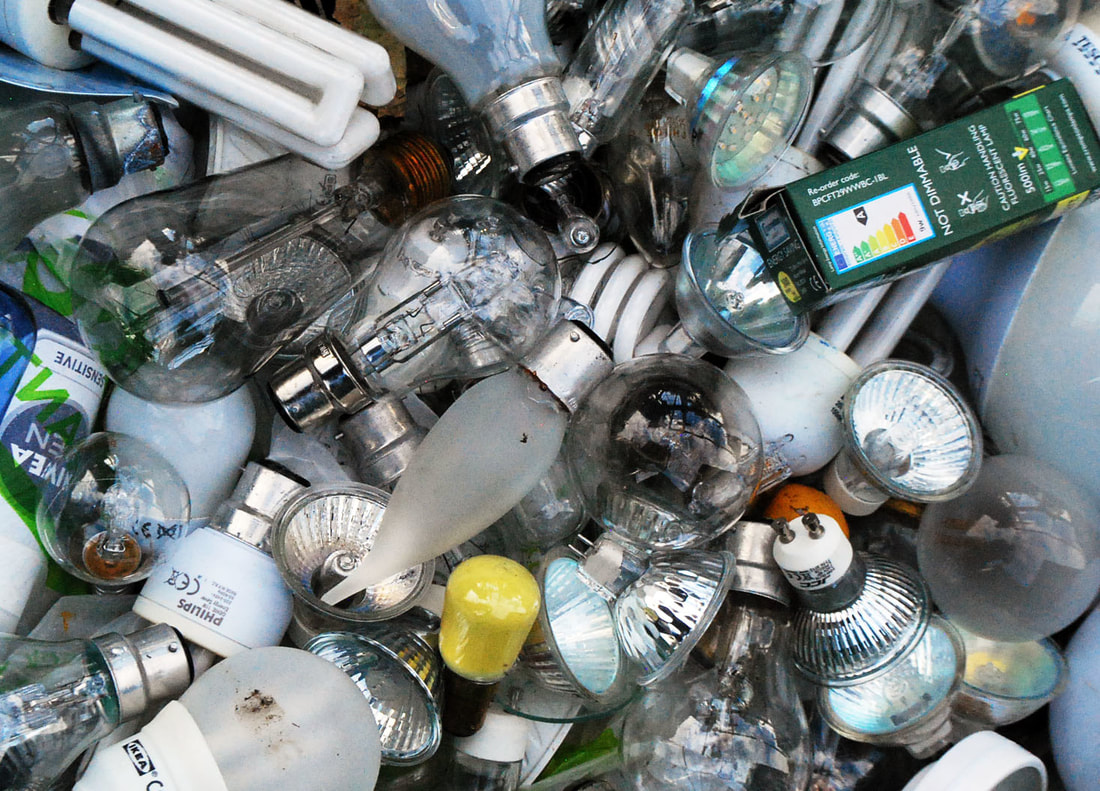
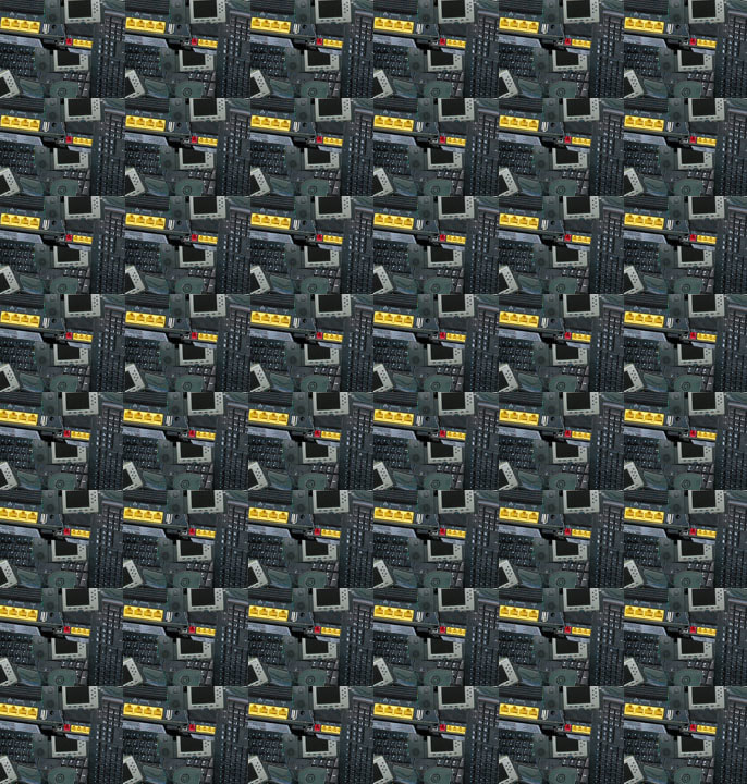
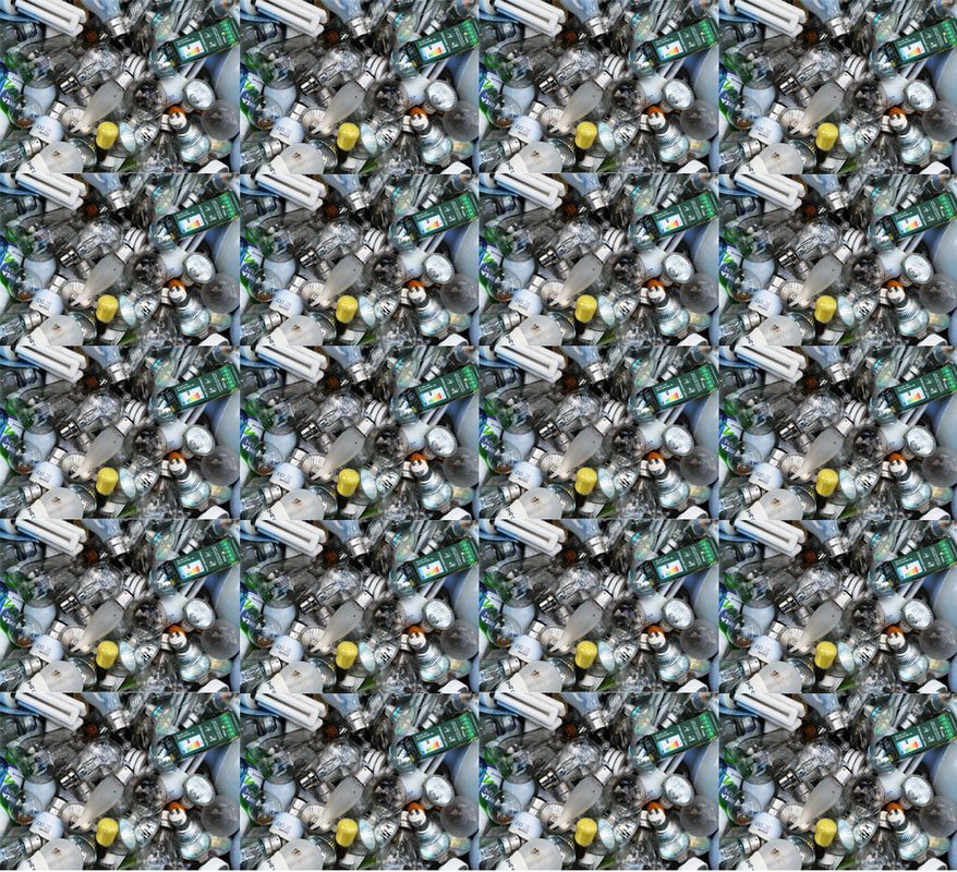
After shooting at the Frien Barnet Recycling Centre I decided to go to the Western Road one as it is much larger and contains a much larger variety of objects. I saw more household items present, alongside things like bikes and kids' toys which were effective. I aimed to single out items and get closer up images of these things as my last response wasn't clear in my objectives. With items such as the lightbulbs and petrol I photographed them up close but as multiples as I though this gave the concept of consumerism and waste more emphasis. I was also more able to access electronics and TV's much more easily as the layout of the centre was much more organised. I think overall this response was a lot better than my first attempt and the photos I captured reveal more about consumerism than my previous one.
E V A L U A T I O N
I think my second set of rubbish dump photos are much better than the first as I photographed singular items as well as close up images of multiples which I thought was effective. Going to a second rubbish dump was useful as I was able to refine my images to a better standard and I made sure I considered composition, colour and the range of items I wanted to take pictures of, unlike the mass of wires I photographed as my first response.
s e c o n d d e v e l o p m e n t
c h r i s j o r d a n
Chris Jordan is an American artist and photographer, many of his works are created from photographs of garbage and mass consumption. He first started using this technique after visiting an industrial yard to capture photos of colour and order. The message he tries to portray through his work is one about how we behave in our everyday lives, and he leaves it up to the viewer to determine what consequences will come from these habits. Jordan uses everyday items such as plastic cups to emphasise and reveal the the impacts American consumerism can have.
I tried to recreate some of Jordan's multiples' images from the photographs I took at the second recycling centre I visited. The first imaged comprised of selecting electrical equipment from different photos (telephones, wires, routers & a keyboard) an putting them onto one image, then repeating this image on photoshop to create a multiplied effect. For the second image I used a photo already uploaded of the multiple of lightbulbs which was the effect I wanted, however I copied and pasted this image several time to create more emphasis. In order to improve my work I would take more photos of the many images I found in their natural environment instead of manipulating them on photoshop as this would give a more similar result to Jordan's work.
|
|
s t e p s o n p h o t o s h o p
Using photoshop I used the free transform tool to make my image smaller, copy and paste it, and make duplicates, moving them all next to each other.
|
|
t h i r d d e v e l o p m e n t
I R V I N G P E N N
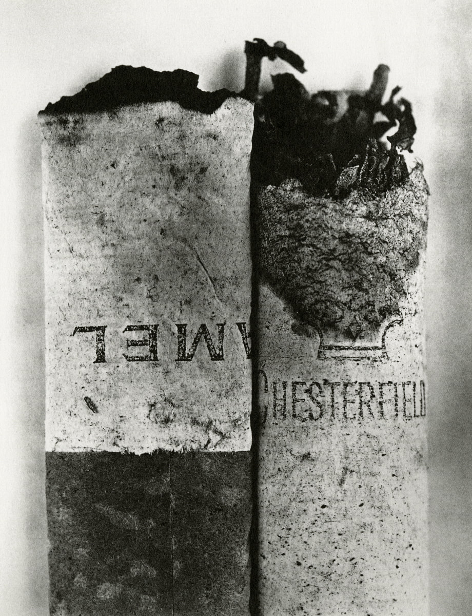
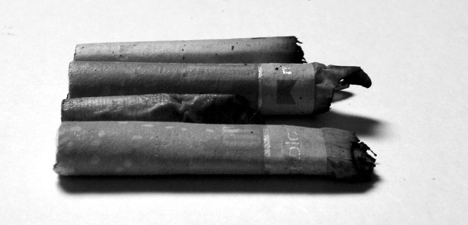
Irving Penn's series 'Cigarettes' was composed by picking up these subjects from the street. He brought them into his studio and carefully composed them to create minimalist images. He transformed one of the most widely consumed and discarded products of consumer society into a symbol representing contemporary culture. His technique of printing his images consisted of printing with platinum. This technique accentuated the tonal ranges and highlighted the characteristics of the material of the cigarettes, creating a much more intricate image than a previously discarded subject of waste.

|
|
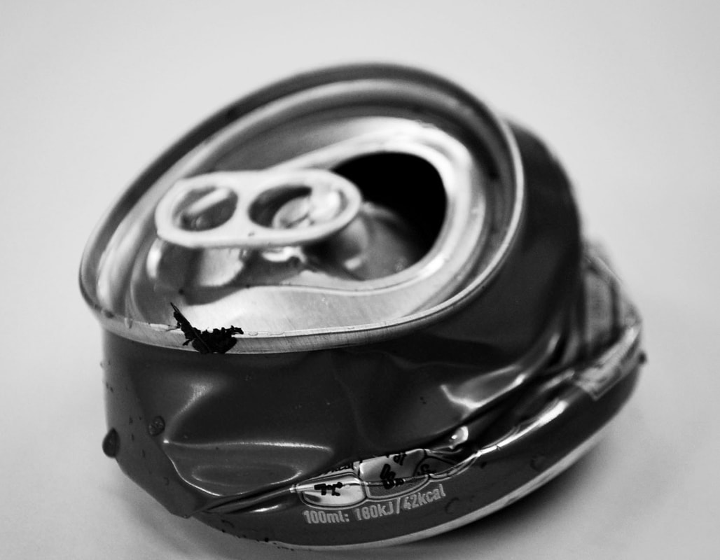
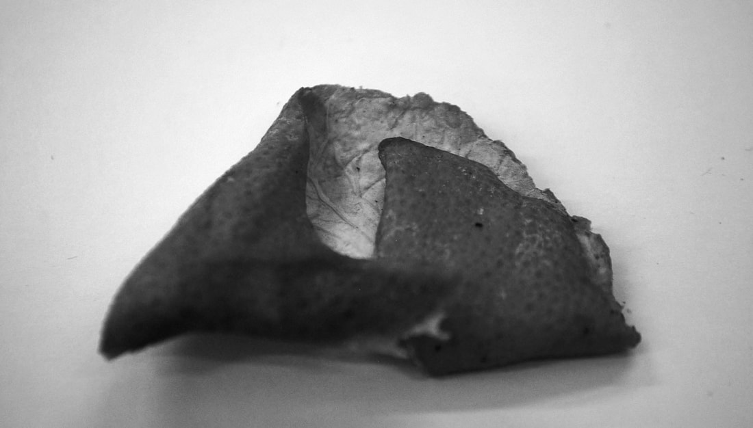
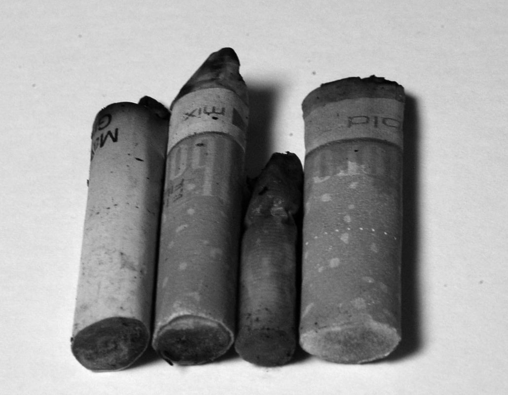
M Y R E S P O N S E
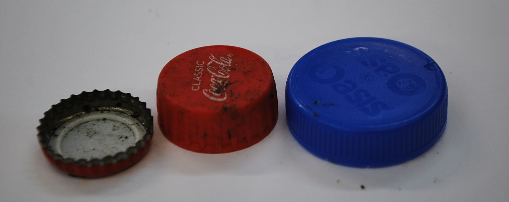
I walked around Muswell Hill broadway collecting cigarette butts and other small items of waste I could find on the floor. Although Penn only photographed the cigarette butts I wanted to do a more varied response by collecting other items. The branded bottle lids reveal how big brands like Coca Cola and Oasis end up being discarded after being processed, this emphasises consumerism waste in society.
|
|
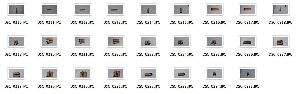
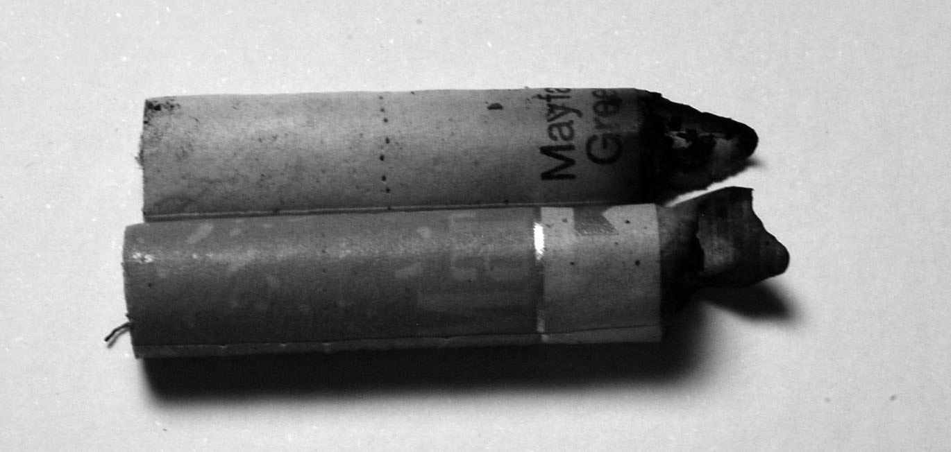
S E C O N D R E S P O N S E
After photographing my first set of items, I wanted to focus more on Penn's work, as he only photographed cigarettes I walked round and collected more before capturing them on a white canvas in the studio to manipulate the light and shadows. Additionally, I used this technique of photographing them to mirror Penn's minimalist approach. They represent how quickly a certain item can become mainstream and immerse itself in a culture, whilst still being massively discarded on a daily basis. It reveals the height of waste and consumerism due to its symbolism of contemporary culture.
e v a l u a t i o n
I think that these set of images worked well as they are quite similar to Irving Penn's. However, I think that if I used a macro lens like he did I would have got a much better outcome as more details can be seen in the cigarette. I should have also picked up more cigarettes and shot a range as I only used around 4 or 5, if I did this I could have made a response to Chris Jordan using multiples of the images.
s t e p s o n p h o t o s h o p
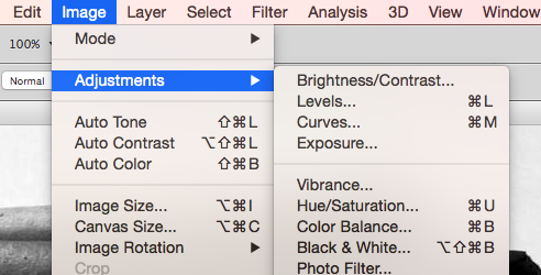
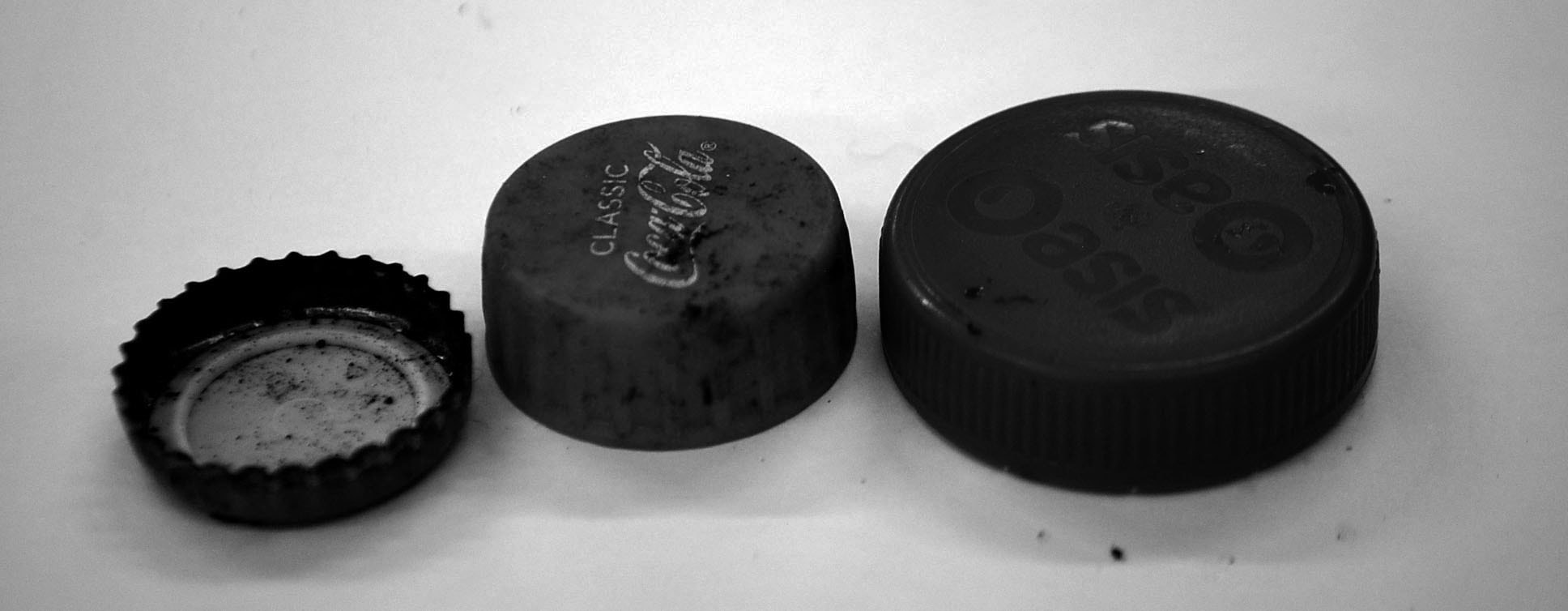
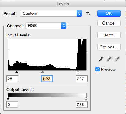
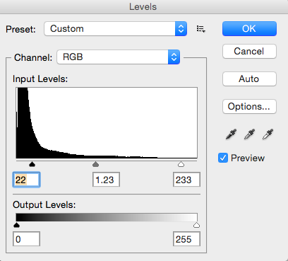
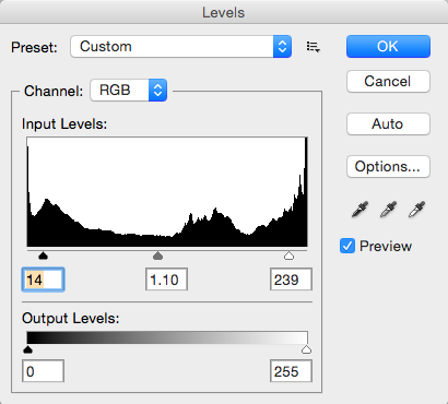
In order to edit my cigarette images in the style of Irving Penn's work, I simply changed the image to black and white through adjustments, and also used the levels to change the contrast and tones of the photo.
|
|
A R T I S T & M E
In response to Irving Penn's cigarette series, I took photos of them side by side. Similarly to Penn's I took black and white up close photos, trying to include the detail of the discarded subject. I did this by including the creases, dents and brands of them, however as mine weren't as old, I didn't achieve the same effects. I tried to enhance these by creating more shadows and increasing the contrast to emphasise the dirt and marks on them. My photo is not as in focus or at the same angles and Penn's and this takes their similarities away as his look very orderly. Although I did use my angles and cigarettes to try and capture my subjects in the same way as him, I would use a macro lens to improve my work.
m y r e s p o n s e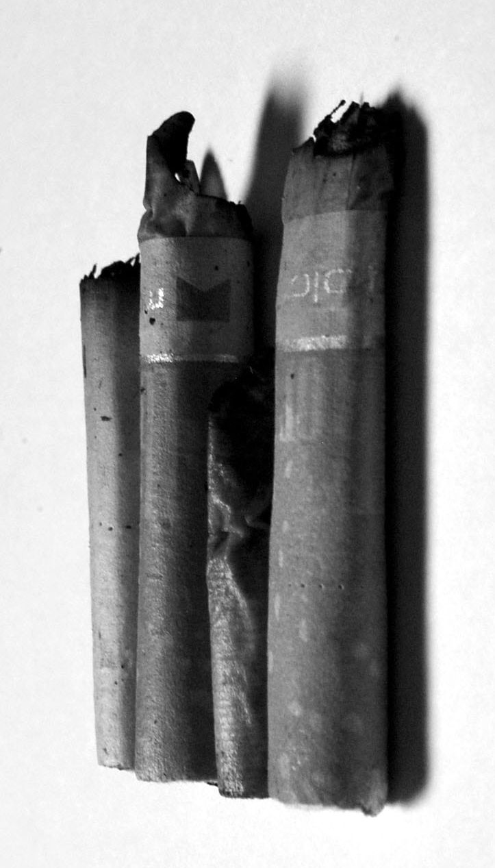
|
i r v i n g p e n n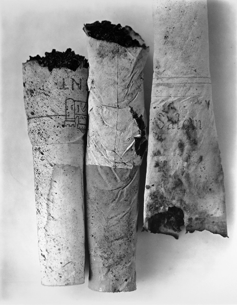
|
f o u r t h d e v e l o p m e n t
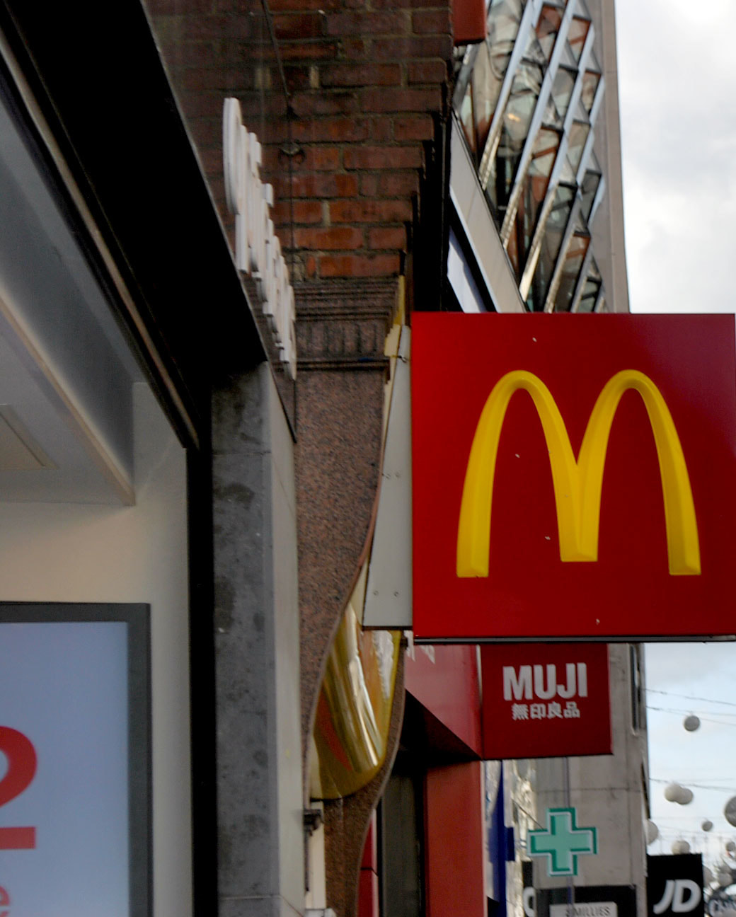
C O N S U M E R I S M I N C E N T R A L
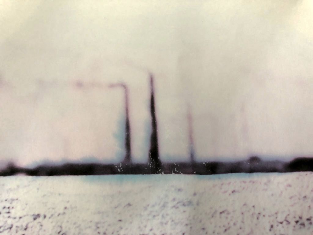
I went to Oxford Street to photograph big brands to show how consumerism is placed and advertised in society. These are some of the big branded signs I captured, these exist all around the world as Westernisation and Americanisation mean that globalisation of products are turning society into one global culture. This means that more and more people are consuming the same types of things, which means that more is produced and therefore wasted.
e v a l u a t i o n
I liked the idea of taking these images, as I wanted to show consumerism and consumption, however the way in which I did this wasn't very effective. I should have used a map to mark out where these big brands existed or taken more head on images however, I didn't think these images turned out well and they also weren't very interesting.
C o n s u m p t i o n m i n d - m a p
My consumption aspect of my personal portfolio began at looking at trash and thrown away household items which represents our consumerist society. I developed this by focusing on more specific items such as the bike and the discarded lightbulbs as this refined my idea much more. Following this, I decided to try and replicate Chris Jordan's work which aimed to emphasise the mass scale of this consumerism. I then focused on discarded objects such a coke cans and responded to Irving Penn's work by photographing cigarettes, one of society's most discarded items. The final part of consumption I looked at was big branded shops around Tottenham Court Road to see how many existed in a central area due to globalisation.
f i f t h d e v e l o p m e n t
A A R O N F A R L E Y
Aaron Farley is based in Los Angeles. He takes photos of clouds and water and manipulates the by turning them on their side, and rephotographing them. He also reprints and refolds his images to create a different image to the original, while still maintaining the previous effect.

M y r e s p o n s e
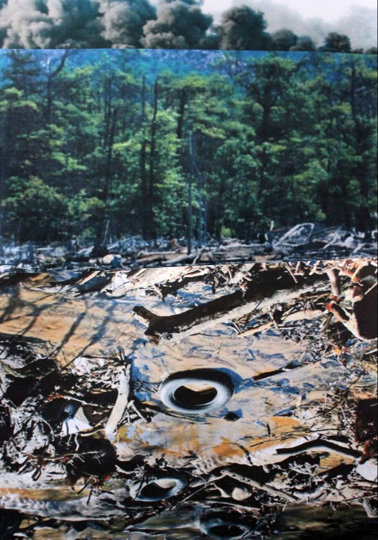
In order to respond in the style of Farley's work, I used several pictures of polluted land, industry or waste as the topic of my subject is pollution. I then cut these images out and placed them on either a white background, or held them up to change the depth of field of the images. These imaged worked the best as shown in the first one as it looks more realistic. In order to improve my work I would cut out the images more neatly and could use photographic paper to stop he rolling up of the side as this didn't give me a flat surface to photograph.
|
|
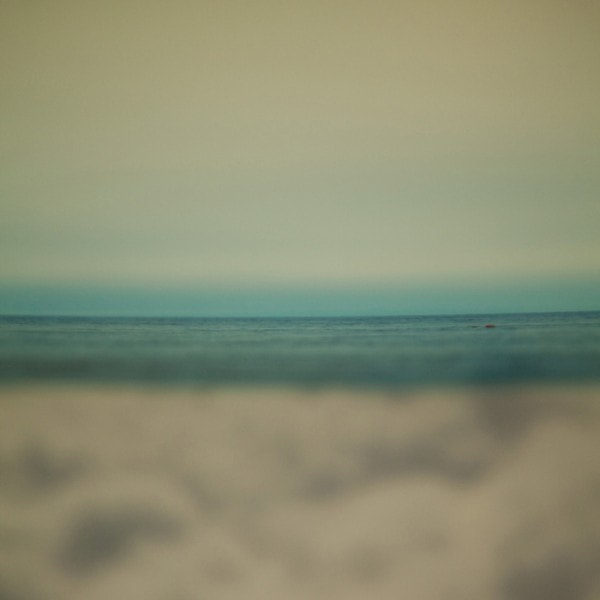
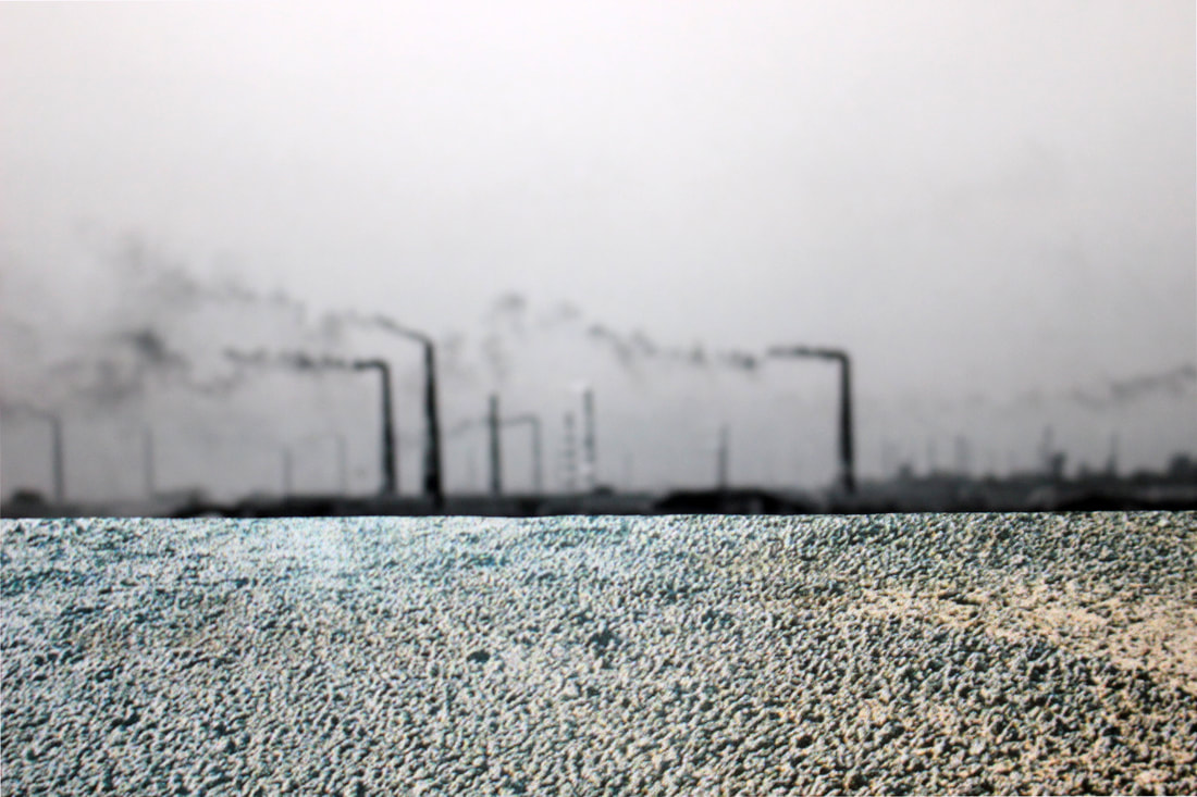
a r t i s t & m e
I used Aaron Farley's work as inspiration to construct my own photographs to represent pollution. Similarly to Farley, I used two images to create a new one, the line of the horizon is seen in both images, however Farley uses more to create a gentle sea whereas the pebble beach and pollution background are the only two images used in my response. I think it worked quite well as I was happy with my outcome as I thought it looked quite realistic as Farley's work does and also manages to look like a representation of pollution. In order to improve my images, I would use a multitude of pictures to create a new photograph instead of just two, and I would also use my own images to create a better picture.
a a r o n f a r l e y
|
m y r e s p o n s e
|
s i x t h d e v e l o p m e n t
b l e a c h e d i m a g e s
As a further development to Aaron Farley's work, I wanted to portray the impacts of pollution as a physical representation of the images. I used some of the images I captured or created that I though best represented pollution and waste and printed each image out before placing it in bleach. The aim of this was to emphasise the impacts of pollution by creating a more physical piece of work that represented the destruction caused by it. This worked quite well on some of the images, the washed out effect clearly showed the draining and bleakness that can occur. With 2 of my photographs, I painted the bleach directly onto the paper, instead of putting it in bleach water like I did the other two. I think this produced a more effective outcome as the blue ink colours that ran down the pictures gave me the result I'd hoped for, however if I were to improve this I would use more bleach directly painted onto the images to make the physical representation of pollution more noticeable.
|
|
|
|
f u r t h e r e x p e r i m e n t a t i o n
I wanted to experiment further with how I could show pollution physically whilst also capturing it in the actual image, so I explored different ways I could manipulate my chosen 4 images to show this. I printed my images out onto acetate and used the acetate projector to blow up my images onto a white screen. This gave them the effect of looking older and more run down which portrayed the impacts of pollution. The contrast outlined the imposing structures which gave me the outcome I hoped for as they looked much more effective.
|
|
|
|
c o l o u r e d i m a g e s
I used coloured acetate to try and portray pollution, I felt that the green and yellow colours represented this best, however, the green was too bright and didn't look real. The yellow acetate worked well as it changed the colour of the sky, I think this was effective as it represents the colour of pollution.
|
|
s e v e n t h d e v e l o p m e n t
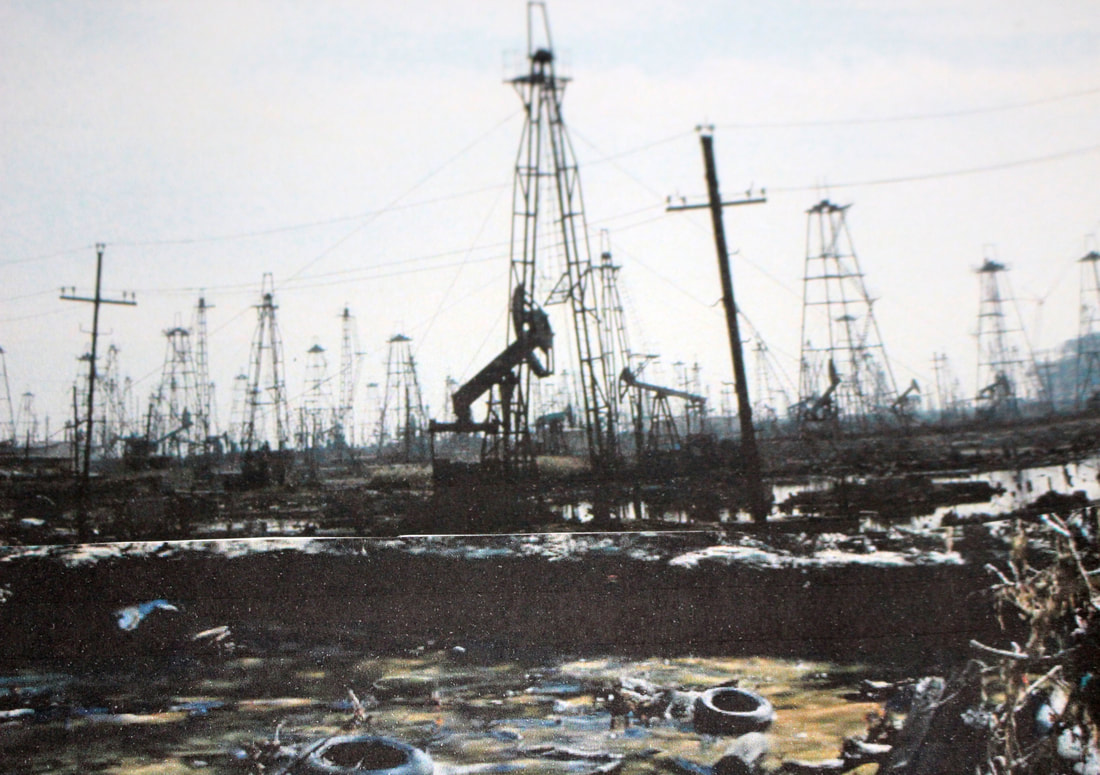
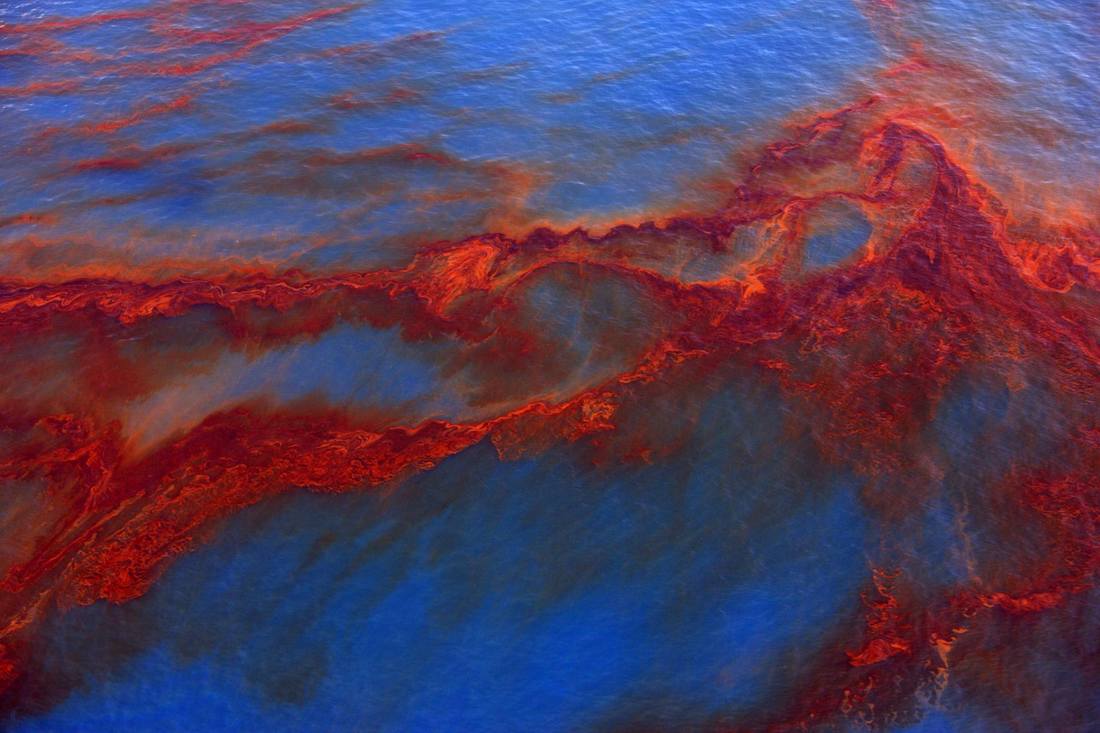
j h e n r y f a i r
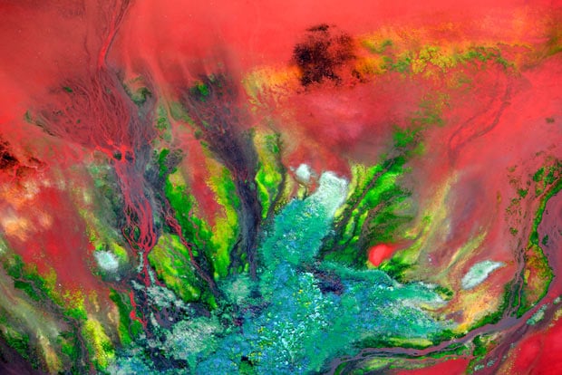
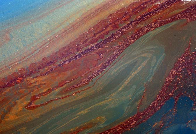
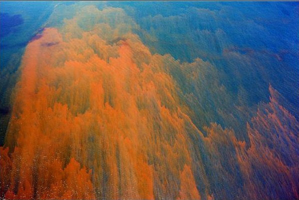
J Henry Fair is an American photographer, environmental activist, and co-founder of the Wolf Conservation Center in South Salem, New York. He was born in South Carolina and now currently lives and works in New York. Fair takes aerial images of the waste and destruction caused by industrial pollution. His work looks abstract as it consists of toxic waste from oil, aluminium and other metal refineries. His series is called 'Industrial scars' and captures the striking beauty as well as the ruin of industrial sites to uncover the hidden impacts of the things we buy.
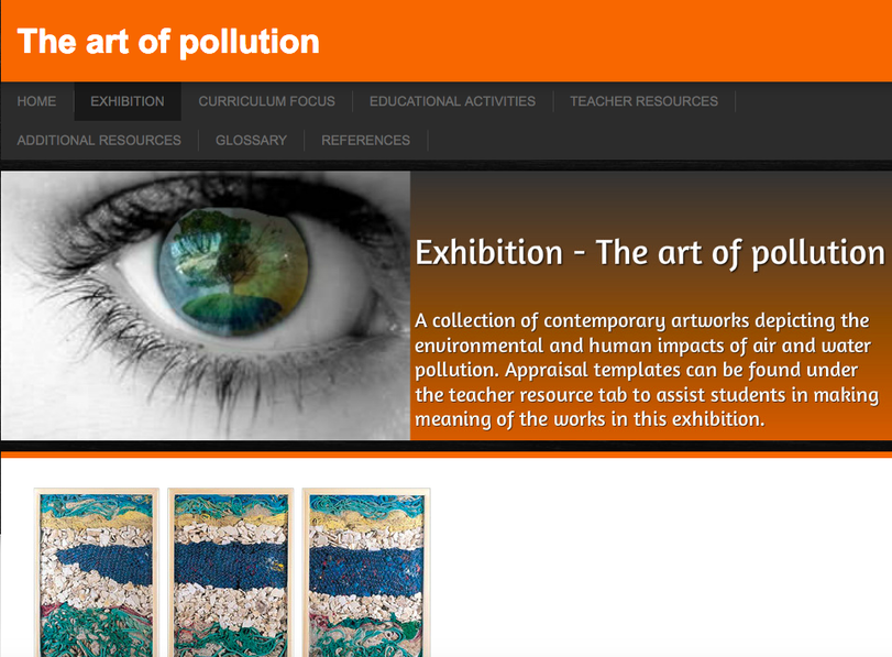
t h e a r t o f p o l l u t i o n e x h i b i t i o n
Although I did not go to this exhibition,I found it really interesting. I particularly liked seeing the ways different artists portrayed and depicted pollution through their photography or artwork. Many of the artists seen influenced my further exploration of the topic of pollution and it even included some of the artists I had looked at, namely J Henry Fair. Link - https://theartofpollution.weebly.com/exhibition.html
e i g h t h d e v e l o p m e n t
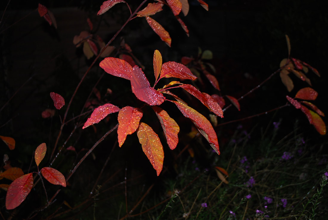
B E N o i t p a i l l é
Benoit Paillé is a 26 year-old French-Canadian photographer. He studied medical biology for a number of years before accidentally falling into photography, he taught himself and became a successful photographer. He photographs portraits, the exploitation of mass tourism, the concept of private properties and manufactured landscapes. He aims to create surreal images taking them spontaneously and doesn't edit them, only using the flash as it appears. "I often see myself like an hyper realist painter, my pictures documenting an altered state of mind."

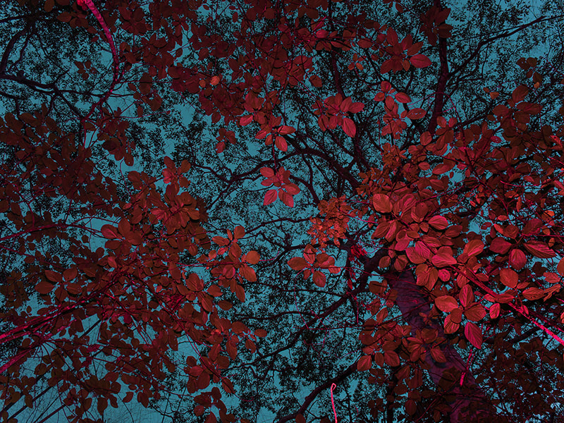
M y r e s p o n s e
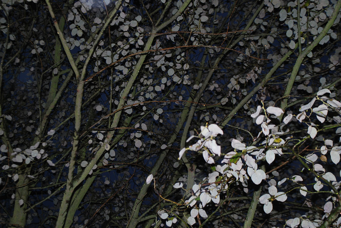
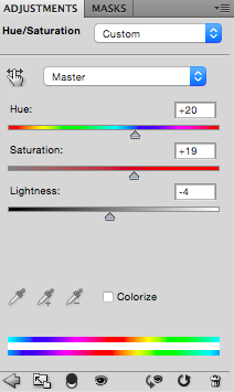
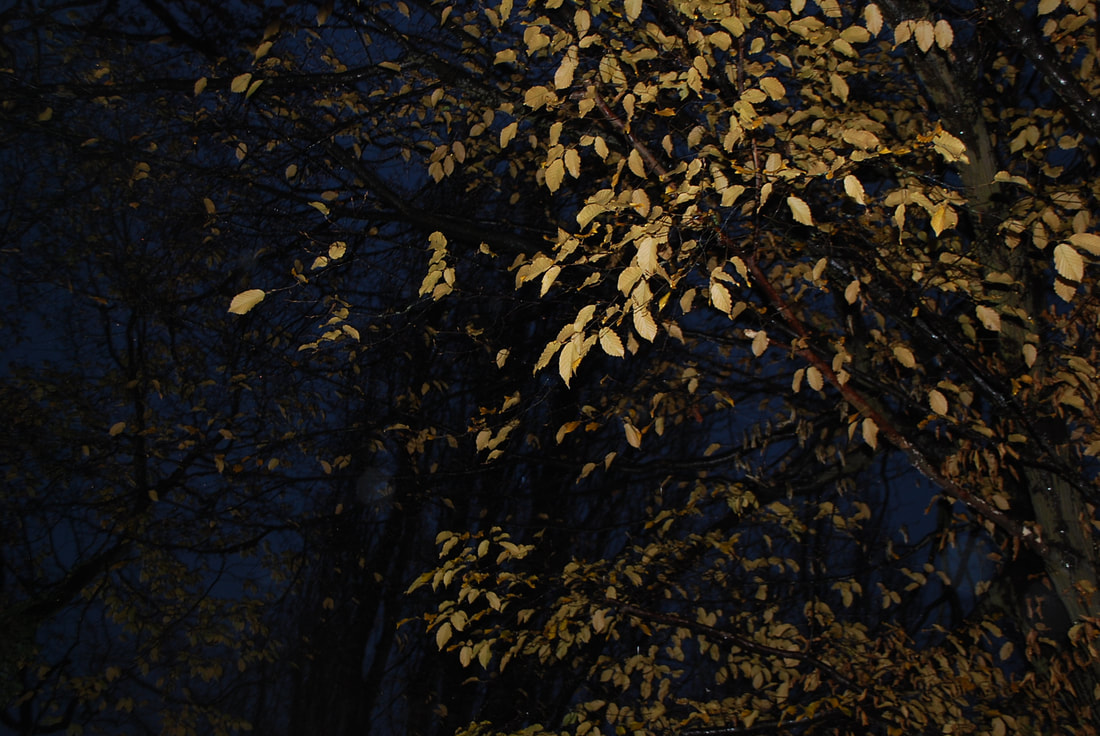
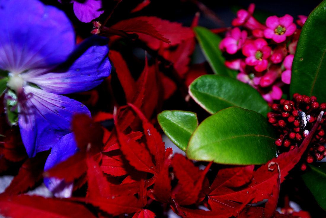
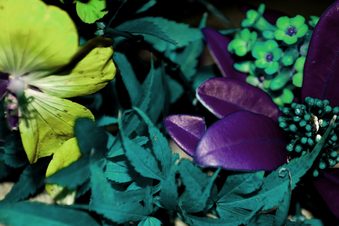
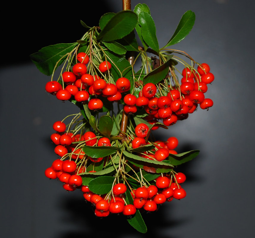
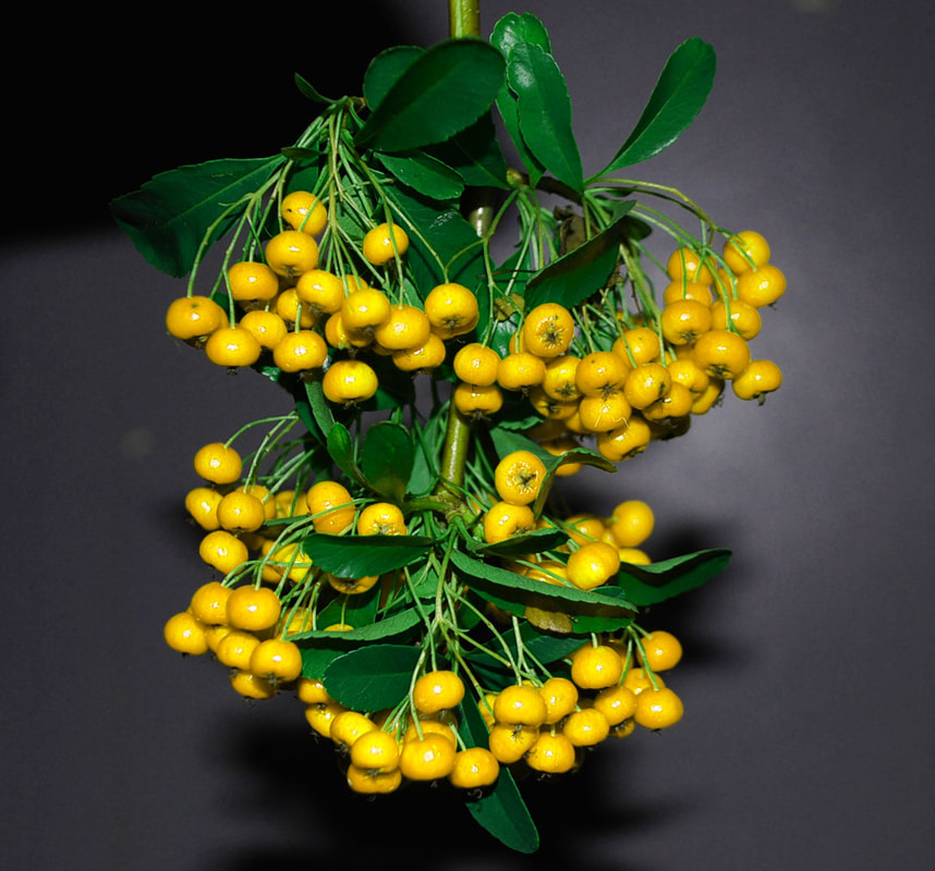
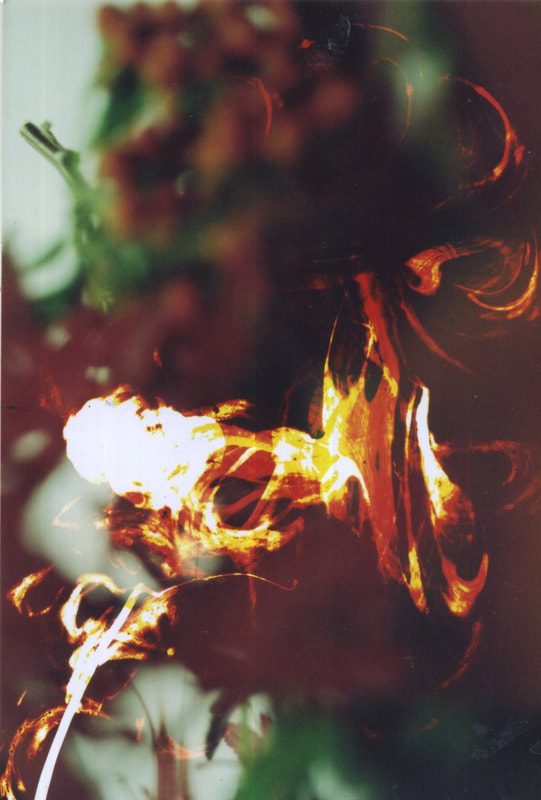
My first response consists of taking photos of trees and plants in my garden. I did this when it was dark so that I could use that flash more effectively and hoped to reveal more of the colours shown. As I photographed them. I tried to use a range of colours and position myself so I could try and get the flash to capture the whole image, as Paillé did creating an image that looked almost symmetrical and edited. Below are my unedited versions of the images as Paillé didn't photoshop his - he only used flash. When selecting my edits, I tried to chose a range of colours and then I did edit them further by changing the hue and saturation of the colours so show more of the visual effects of the toxicity on the natural environment.

|
|
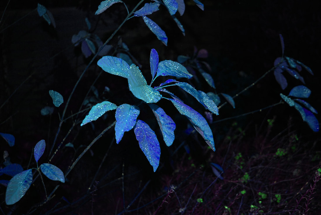
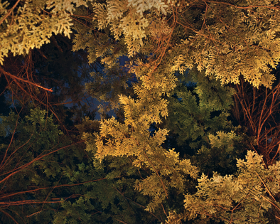
I then edited my images on photoshop to alter the colours, as my first response revealed I changed the colours to make them look like the pollution in the air and in the environment has physical impacts which show the toxicity and how it can effect the wildlife. As my refined response, it is much closer to the works of Benoit Paillé's, whilst still showing my initial theme of waste and pollution impacts.
e v a l u a t i o n
I think these images turned out well, I managed to capture the colour of the trees and plants with the flash which is what I set out to aim in order to respond to Benoit Paille, and I successfully edited the images so that they were more in his style of work. I think if I were to respond to this again I would go to a different location and try and find an environment where the trees were brighter or more colourful naturally so I wouldn't have to photoshop the images.
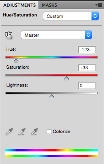
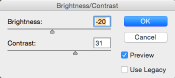
s t e p s o n p h o t o s h o p
|
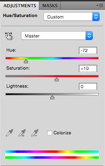
When editing my photos in photoshop, I wanted to change the colour of them so that they looked more like Benoit Paille's work. In order to do this I changed the hue of my images to colours similar to his, and also changed the levels to increate the contrast and saturation, the aim of this was to make the colours stand out more against the dark background.
|
|
|
a r t i s t & m e
My response on the left reveals some of the same colours that Paillé has used, they both sow how the flash affects the image , however, my response is much darker as there were less leaves for the flash to bounce off. Enhancing my image on photoshop may make it look more similar to the artists work, but additionally, taking them when it is a bit lighter outside may give better effects without manipulation.
|
|
S E C O N D R E S P O N S E
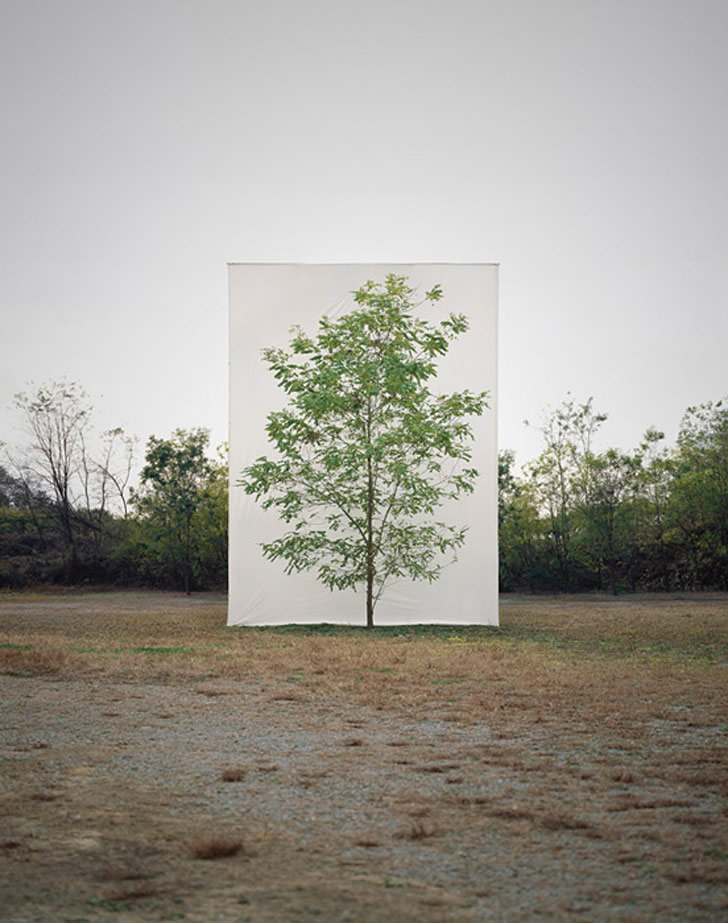
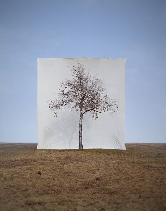
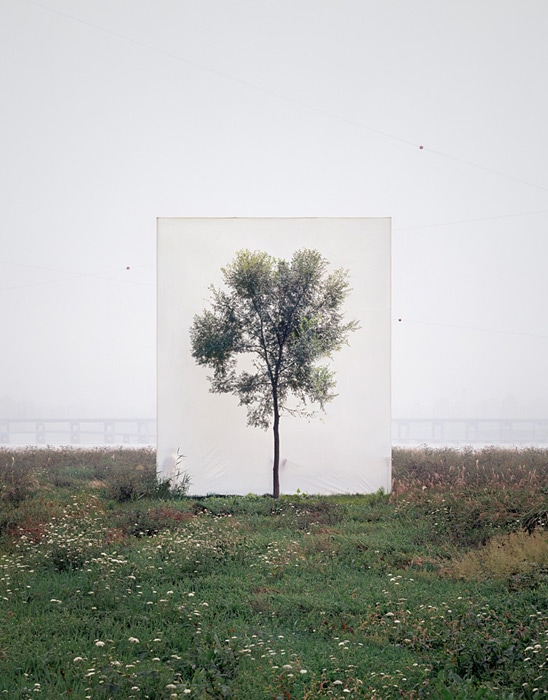
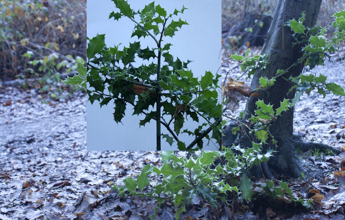
M Y O U N G H O L E E
Myoung Ho Lee photographs solitary trees framed against white canvas backdrops in the middle of natural landscapes. He makes us look at trees in their natural environments, but separates them from their natural surroundings creating a divide between nature and the artificial aspect by presenting it on an immense white background like a photograph on a billboard. He makes the subject appear neutral from its original context, creating amore ambiguous image.
His works are largely composed by following four procedures:
1. Selection of The Subject
2. Separation of The Subject (meta-subject)
3. Photographing
4. Confirmation of The Separation
His works are largely composed by following four procedures:
1. Selection of The Subject
2. Separation of The Subject (meta-subject)
3. Photographing
4. Confirmation of The Separation
For my second response, I took a white piece of card to Coldfall woods and photographed the plants and trees with and without the paper. I then used a mixture of these images to paste the ones with the white background onto the original images. The aim of this was to enhance specific features and areas of the plants. I did this in order to show the shapes, patterns and colours as that's a factor that Paille considers when he shoots his images. The purpose of this was also to start physically showing the change in focus from the environment and trees, to plants and flowers.
|
|
s t e p s o n p h o t o s h o p
|
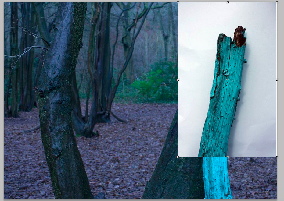
As I took two separate sets of photos, some of the environment without the canvas, and some with it, I used the photos of the tree/plant that were in front of the white canvas and photoshopped it onto the photo without it in order to make it stand out more and reveal how the white background creates separation.
|
a r t i s t & m e
m y o u n g h o l e e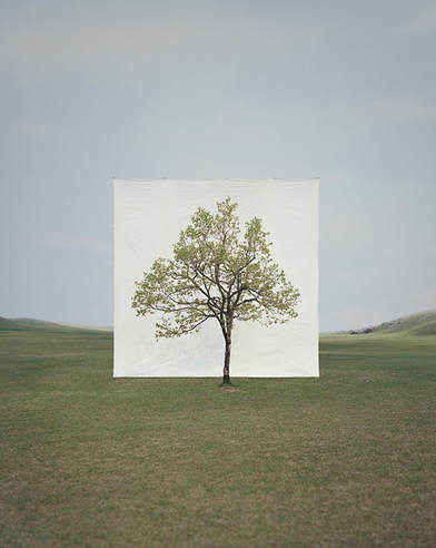
|
m y r e s p o n s e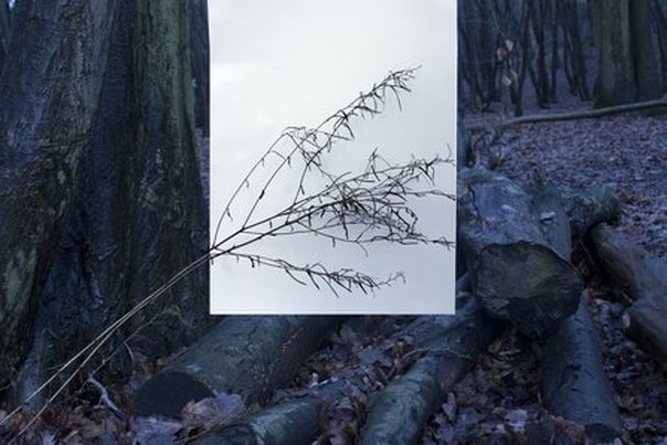
|
The image on the right is my response to Myoung Ho Lee's work. They were both done in areas with vegetation in order to find a place to put the canvas. However, mine was taken very close to the plant, unlike Myoung Ho Lee's far away shot of a whole tree. Furthermore, her image is much brighter and has lighter settings and a large expanse in front of the camera, whereas my image is quite dark and had a tree in the image directly behind it. I used photoshop to change the contrast and make the canvas more white like her image, however, because of this it looks less natural. My composition consisted of the subject being in the centre of the image, but the plant doesn't stem from the middle like Myoung Ho Lee's, it comes from the left. Overall, I am pleased with my outcome as I was able to successfully use the canvas and also this was a useful response in starting to photograph more plants in nature and the environment instead of my previous response of the trees.
t h i r d r e s p o n s e
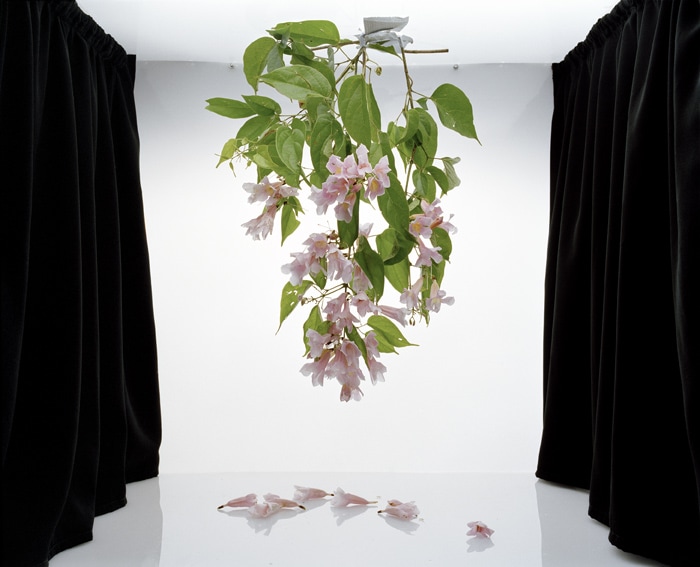
s a n n a k a n n i s t o
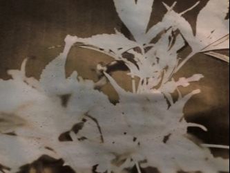
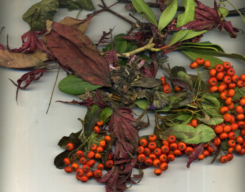
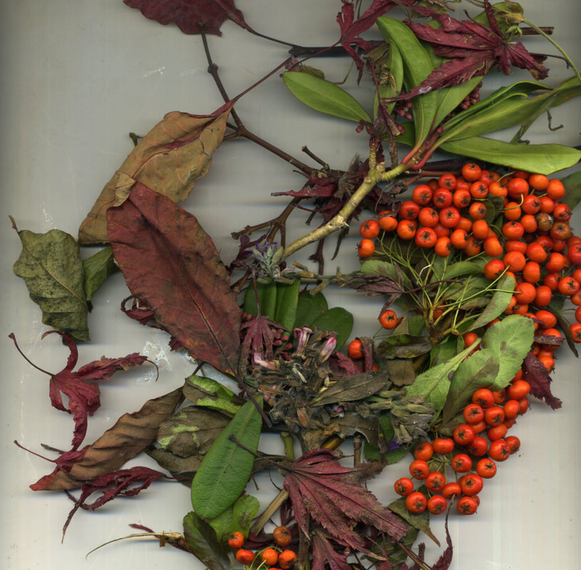
Sanna Kannisto is a Finnish artist who explores the way in which we approach nature in art and science through her photography. She does this by using scientific apparatus in her work, e.g. retort stands, clamps etc, to reveal the science aspect of her work, as well as using plants, leaves and flowers to represent nature. As soon as the natural object is removed from its environment, we can really focus and understand that piece of nature as a single unit and notice specific characteristics that we wouldn't normally, in an everyday environment. The use of the white backdrop in the 'field studio' further emphasises this as a greater contrast is seen. Kannisto collects a variety of species' in a great range of ways, then exploring and archiving them.
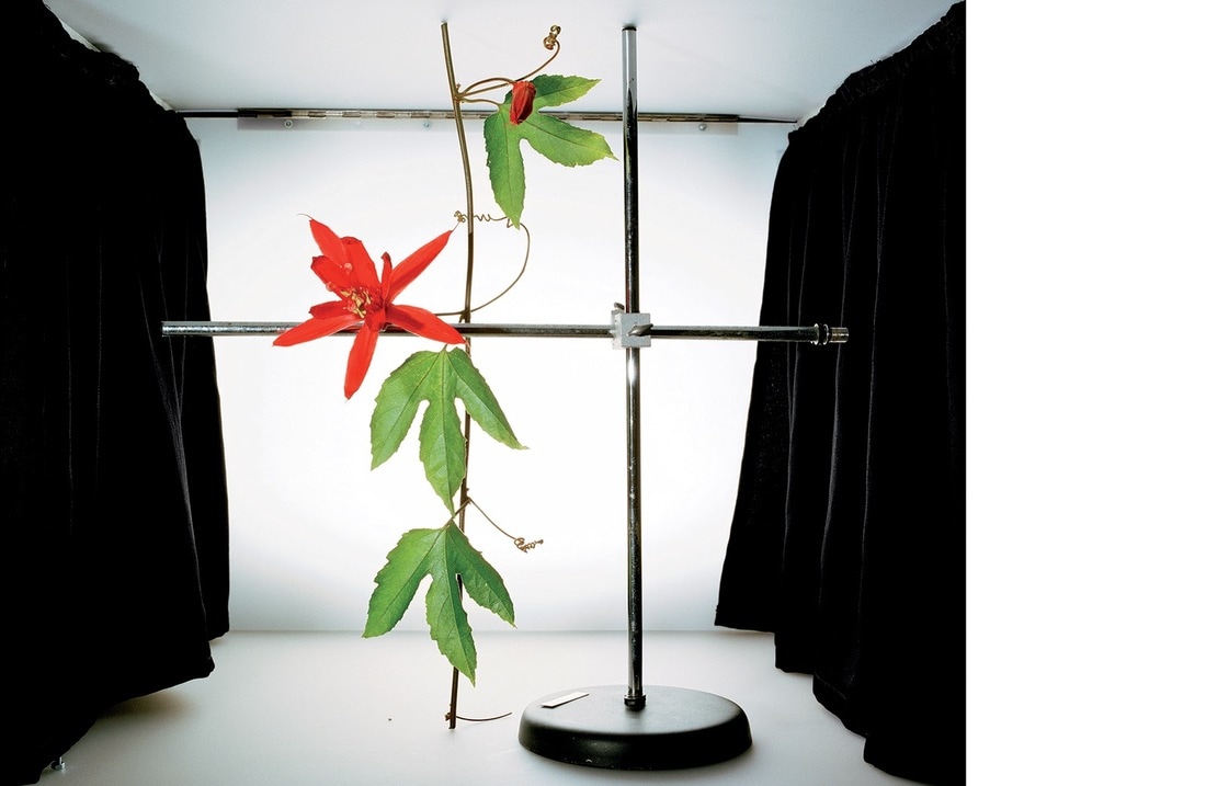
As I moved away from Paillé's dark, abstract nature photography, I focused more on capturing flowers and plants and took more photos of them with a blank background in order to draw all the attention to the shapes and colours. I used a retort stand to hold the flowers in place as I captured them in order to arrange them in a way that I liked. I chose to photograph these as a third response because I want to shift from trees and nature to flowers and plants. This response was useful as it showed the change in capturing images in the natural environment to an artificial environment.
|
|

|
a r t i s t & m e
s a n n a k a n n i s t o |
m y r e s p o n s e |

Responding to Kannisto's work, I used flowers and plants placed in a retort clamp - like she did, taken with a white background. My work had more flowers in the frame, compares to her more simplistic approach of just justing a few. Additionally, she used exotic plants and flowers that varied in the composition and also took up a large space in the frame. Mine was more compact and central, however, with my other images, I did include the long stems and bigger flowers in order to achieve this. Additionally, I did use a white background, and used photoshop to enhance the colours, however, Kannisto revealed the black curtains in her photographs which made it looks more staged, but also increased the contrast between the background, curtains, and plants.
f o u r t h r e s p o n s e
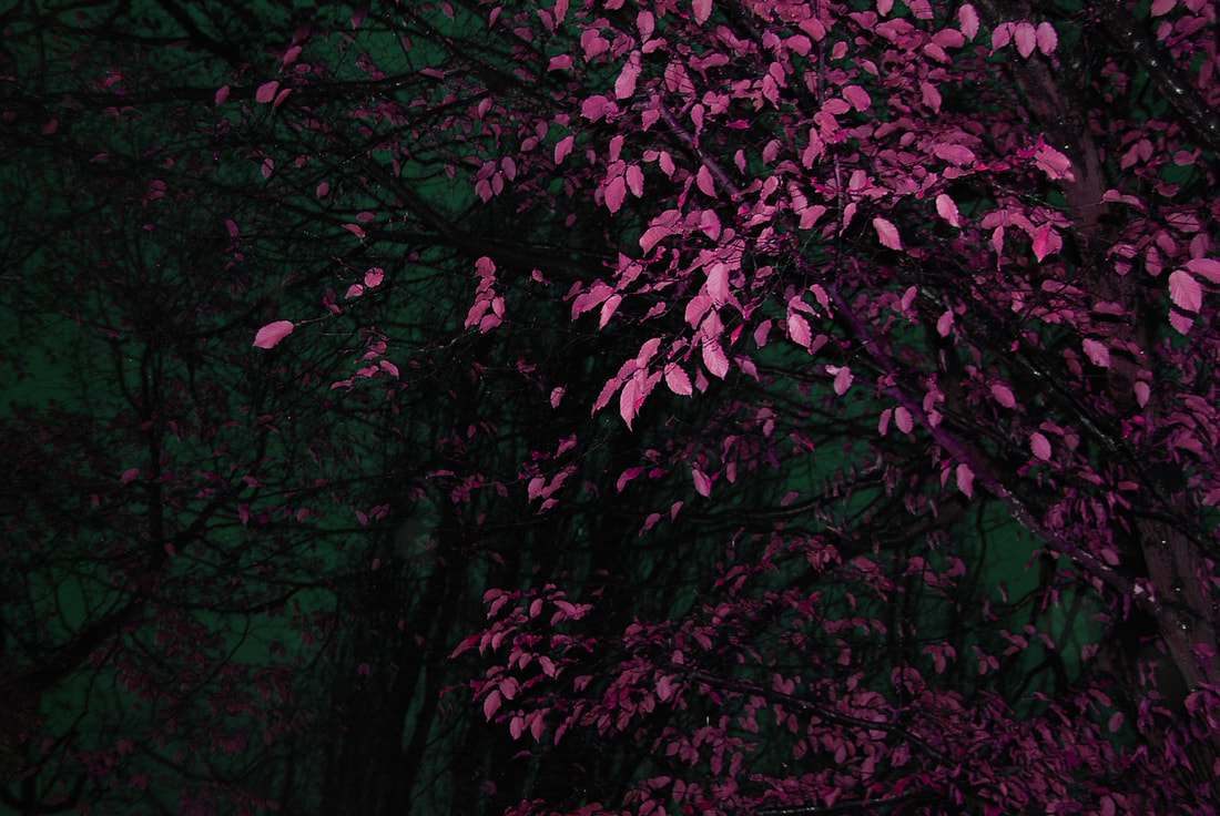
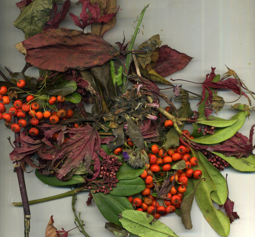
In response to Benoit Paillé's work, I chose t take photos of plants and flowers similar to his. As I did this by picking them and bringing them into the studio to photograph I didn't get the same effect as him of taking the image from a birds eye angle to make it look almost symmetrical. I did this as a second response in order to focus more on the individual plants and flowers as they were more colourful. I went into a slightly darker room and arranged the plants and took them with flash to try and capture some of the same effect that Benoit Paillé got. In order to further develop my work I used photoshop to try and change the hue of the images to make them different colours. The aim of this was to replicate the coloured images Paillé's work of creating coloured flash photographs. This continues from my theme of pollution by revealing the effects the toxicity of the air and water has on the natural environment. It can chemically alter substances to make them change colour, and can contaminate them.
|
|
|
|
|
|
|
|
|
|
|
|
e v a l u a t i o n
I think I met my aim of photographing the images and changing them on photoshop to seem more toxic and affected by pollution, and I also used a range of plants which worked well. When taking the images I should have used a different light or photographer them in a different way in order to not get the shadows behind the berries in the last photo.
s t e p s o n p h o t o s h o p
|
In order to show how pollution affects plants through manipulated images, I used photoshop to change the hue of the flowers and plants to make them look more toxic or surreal. I also increased the saturation to bring the colours out more and changed the brightness and contrast so that they would stand out against the back background.
|
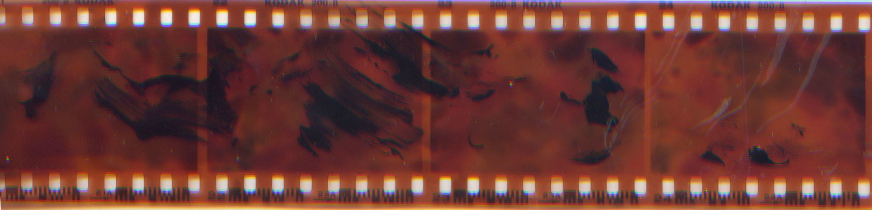
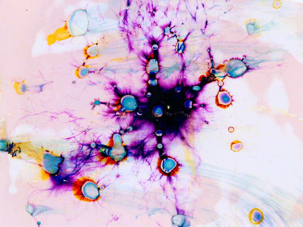
I printed out 3 of my digital photos onto paper and put them in bleach to see the effects. The colour ran off the paper, leaving a blue and black image, and I left the second photo in tea overnight which resulted in the brown colouring. After changing the colours of the plants to reveal the toxicity of the natural environment, and bleaching the images taken digitally, I decided to take more photos on a film camera and get them developed in colour. After this I'm going to paint some of the negatives with bleach to further show how pollution can have an impact on these things.
|
|
n i n t h d e v e l o p m e n t
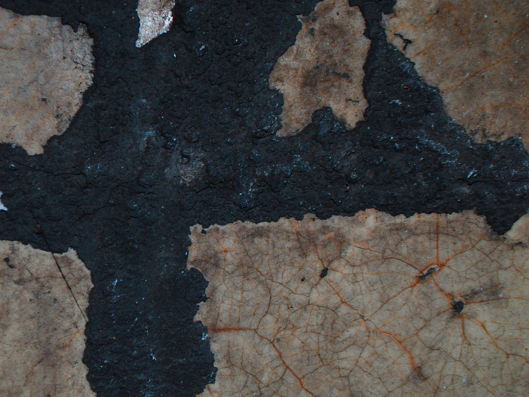
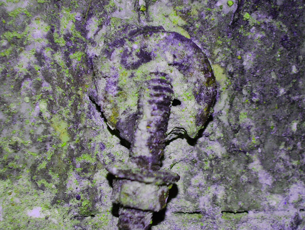
p h y s i c a l p o l l u t i o n
I decided to go to the bridge next to Hornsey Station and photograph the walls as they portrayed the grimy and decayed effects of pollution. I found that the dirt and marks left behind on the wall revealed how the impacts of pollution can not only leave a race on the environment, but can ruin appearances and cause greater decay in the long run.
s t e p s o n p h o t o s h o p
|
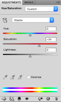
For these images the only thing I did on photoshop was increase the saturation to quite a high number as it enhanced the colours that were on the wall and made them seem orange and green which is what I used to demonstrate the physical pollution.
|
t e n t h d e v e l o p m e n t
f i l m i m a g e s
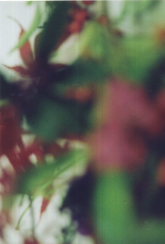
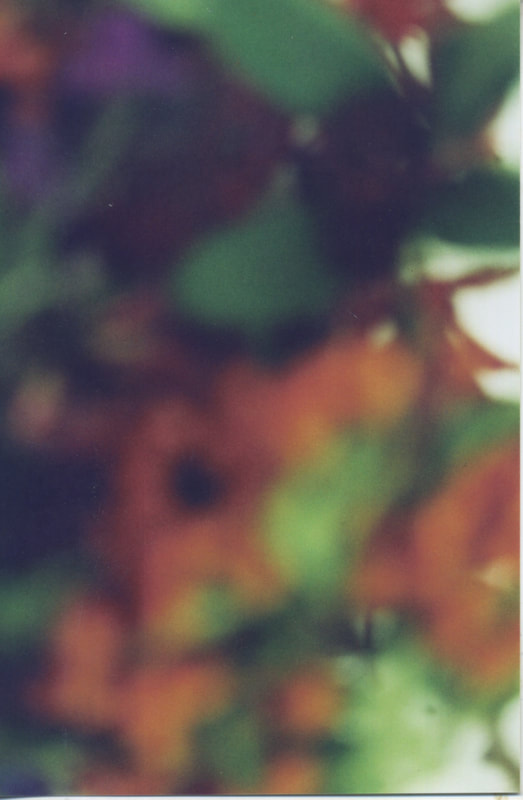
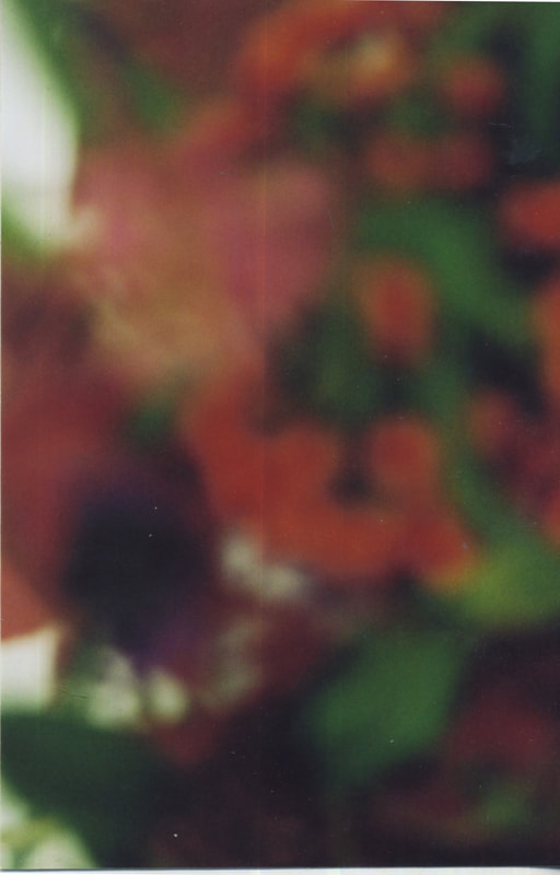
After shooting my images on a digital camera, and changing the colours on photoshop in order to portray greater toxicity, I decided to shoot on film so that I could further manipulate and experiment with my images. I also preferred the outcome of the photos as they didn't look so vibrant. However, I took them quite closely in order to get a more blurred abstract effect as when I took the previous photos as single images, they didn't look much like the natural environment. I used the same flowers and plants as before in order to maintain the physical appearance of the images I was using, and so that I continued to use a range of colours.I shot 36 photos, each slightly varying with the angle, colours, proximity, and focus in order to gain a range of images.
|
|
|
f i l m s o u p
Tom Evans and Barbara Murray - "This is film soup: chemically altering the film to produce unexpected results. You'll often see this kind of photography referred to as “Lomo," a term popularized by Lomography's website. The beauty is that you can use the same “recipe” on numerous occasions and each result will be unique." They use a number of different substances to experiment with the outcomes, such as food colouring, energy drink, alcohol, perfume and many others. This was my inspiration to try and edit my film images by using bleach, lemon juice and tea.
|
|
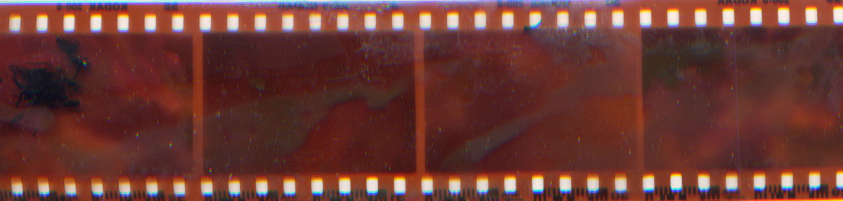
s e c o n d r e s p o n s e
After getting my photographs developed, I scanned a few of them before putting out several trays. One was bleach, one tea, one, lemon juice, and also a try of water. I varied in manipulating my images, with some I completely left them in bleach which removed all of the ink, some I put in lemon juice before bleaching, which is what is shown in the second image. I also put some of the images in a tray of tea to try an alter the colouring of the photo. Furthermore, I dipped parts of the photos in bleach, and also painted on them using paintbrushes and my fingers in order to completely blur the images. I think this gave the result I had hoped for of displaying an image which represented the effects of pollution a lot more visually, as they accurately portrayed the impacts, including the idea of the bleach stripping back layers of the photographs to reveal what was left behind/what was underneath. The idea of using bleach aimed to represent how pollution can have such great impacts as it represents how chemicals can ruin landscapes.
b l e a c H |
l e m o n j u i c e |
b l e a c h & t e a |
P A I N T E D B L E A C H |
|
|
a r t i s t & m e
m y r e s p o n s e
|
e v a n s & m u r r a y
Like Tom Evans and Barbra Murray, I used a variety of substances to try and chemically alter my images. I got a range of results, bleach being the biggest alterer. In order to improve my photos I would use more substances to get different effects to the bleach and leave them on the photo for longer to get a greater impacts like Evans and Murray got with their coloured and patterned images. Additionally, the photos I used to chemically alter were all quite similar, to achieve better results I would try the process on a new set of images.
|
e l e v e n t h d e v e l o p m e n t
j e n n i f e r w e s t
Jennifer West is an American artist who lives and works in Los Angeles. She is known for her digitized films that are made by hand manipulating film celluloid. She uses nailpolish, liquid eyeliner, deodorant, wine, spices, Jell-O shots, body glitter, paintballs, Jack Daniels and hot springs water to manipulate her images and make alchemical transformations. In addition to this, West also used physical concepts to make her work more unique. These include skateboarding, smearing, crushing, drawing and throwing. West is influenced by classical structuralist film, urban mythology, folklore and popular culture, combining everyday actions and materials to create hypnotic, fast paced films. Performance is as essential to West’s practice as the material composition – united to not only construct the work itself, but also provide a conceptual context..
m y r e s p o n s e
I used the roll of film from my up close plant images shot in the studio to manipulate. Like Jennifer West did, I used things such as floor cleaner, bleach, glue and paint to try and change my images. Although they did not come out like West's did, as few changes could be seen through the film, if I were to get the film images developed the results may be more extreme than the images seen below. If I were to repeat this response I would use more chemicals and items and leave them on the film for longer, and also get the developed to reveal the drastic changes to the film.
d e c a y e d p l a n t s
After using these plants to shoot digitally and on film, I left them for about a week before using them again. As they had decayed, the dead plants seemed to portray a more realistic view of how nature can be affected. Although they were just left in a plastic bag, I thought that this was able to represent how pollution and waste can occur very quickly over time and drastically change the appearance, and functions of these things.
t w e l f t h r e s p o n s e
p h i l l i p s t e a r n s
Phillip Stearns is an artist and textile designer working with electronics and electronic media, based in Brooklyn. He created a series of high voltage images which explore the use of electrical discharge as a means of creating images in photographic media. Stearns manages to alter the structure of colour film by administering as many as 15000 electrical volts to its surface to create these vivid colours and patterns. He is bends, cracks and breaks the medium to explore similarities and differences to our cells in the retinal. For his practice, in addition to the use of electricity, he also applies various household chemicals to the surface of a film in order to distort them.
P H O T O S H O P r e s p o n s e
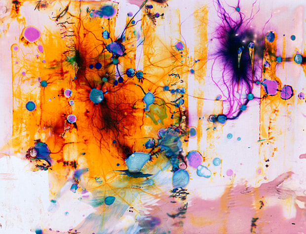
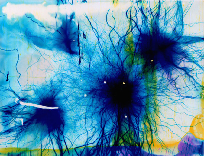
In order to respond to Phillip Stearns I decided to try and replicate his images on photoshop rather than using electricity. I changed the hue and saturations of one of my bleached film images as a starting point, and then used the eclipse, smudge and liquify tool in order to create a variety of shapes and patterns. I think it worked well considering it was edited, and not done in the same way., ad I was able to use many colours and managed to get some of the same effects to a degree. However, I think it would have worked better if I used some kind of ink to try and make the image look like it was dripping, or bleach to try and create the burning away of the image.
p r o c e s s :
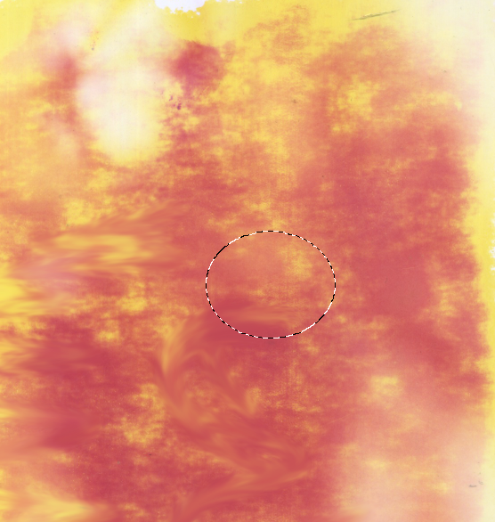

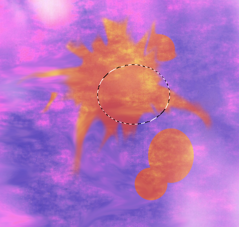
I created these images by first using the scanned image of my bleached flowers. I changed the hue and saturation of it to make the colours more vibrant and used the elliptical marquee tool to select circles and the smudge tool to make the colours run and the circles smudge. I repeated these steps until I manipulated the image until it looked more abstract. The aim of this was to create an image in response to Phillip Stearns which portrayed
|
|
e v a l u a t i o n
t h i r t e e n t h d e v e l o p m e n t
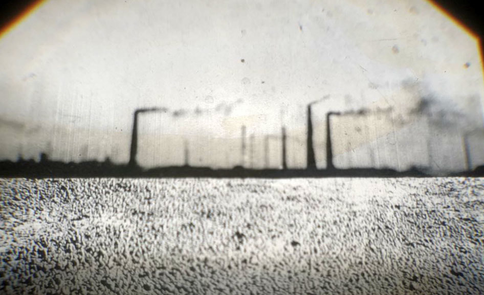
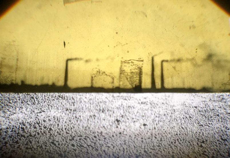
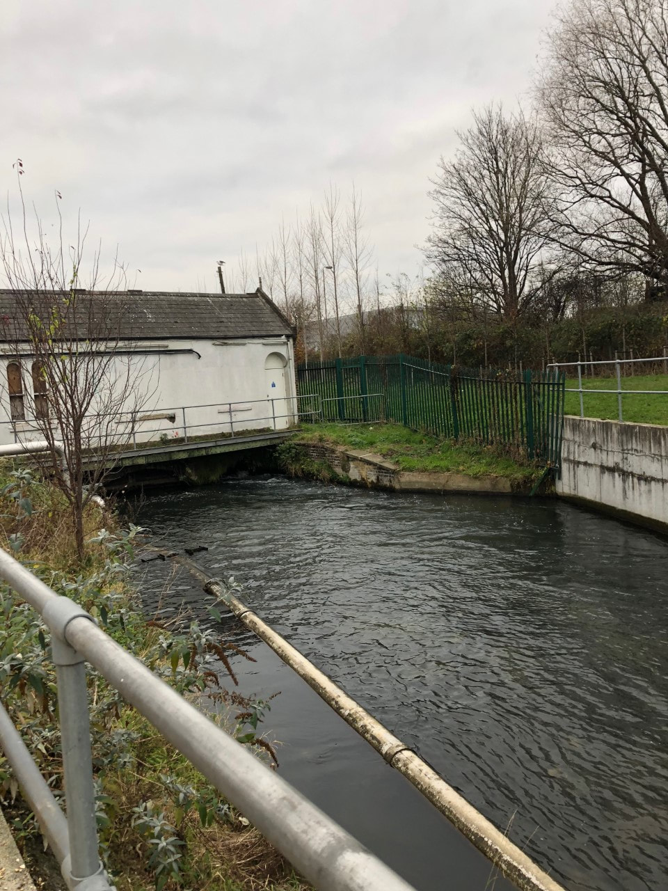
To develop my responses concerning pollution and the impacts of it on the natural landscape, I decided to begin my next development by going to canals, or rivers where I collect water and use this in multiple ways. I ordered litmus paper and used this to test the pH of a variety of different water sources, not only straight from canals, but also houses and bottled water that originate from different places. The aim of this was to discover whether the water would be neutral, acidic, or alkaline and research what this meant in terms of water quality and health issues.
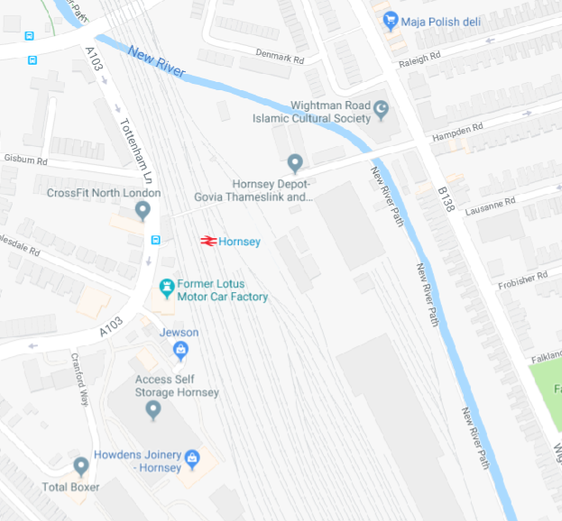
m u s w e l l h i l l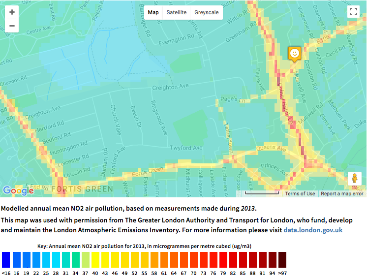
|
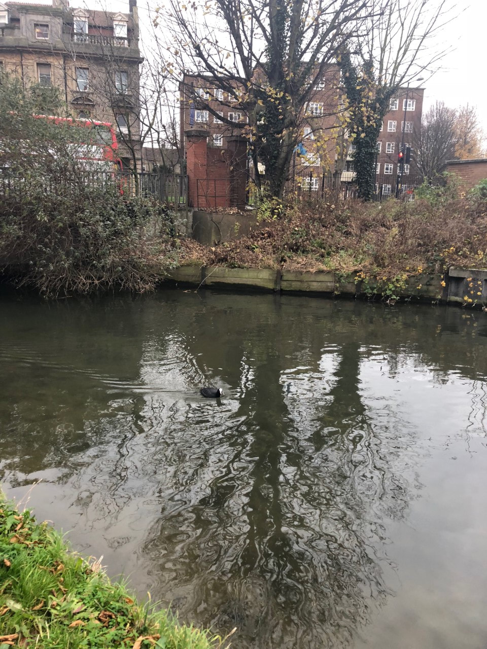
h o r n s e y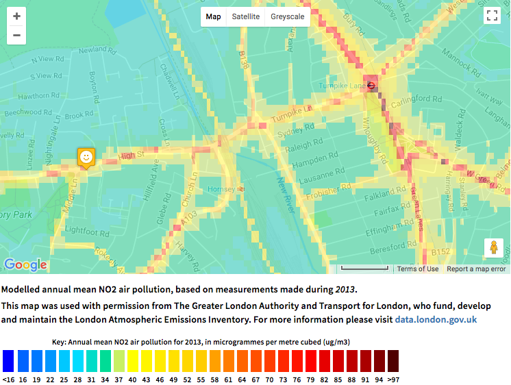
|
These are two air pollution maps from Muswell Hill and Hornsey. Air pollution levels seem to be much higher around the Hornsey area, however, as I didn't have the means to test the pollution of the air in this area, I thought that the levels would be similar to water pollution so decided to focus on this water source instead. I used the Hornsey canal as my subject area to photograph and collect water from.
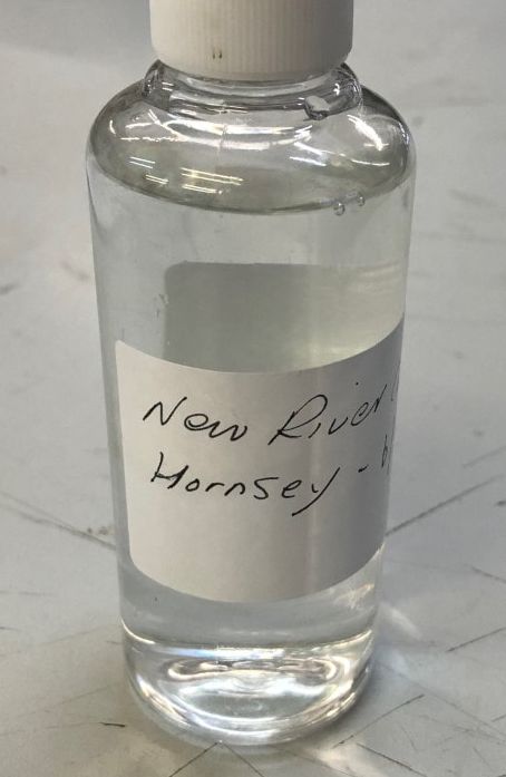
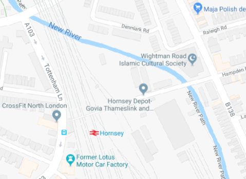
h o r n s e y c a n a l
|
|
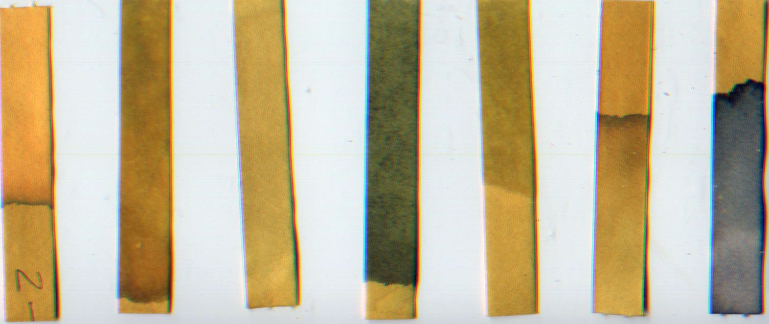
L i t m u s p a p e r
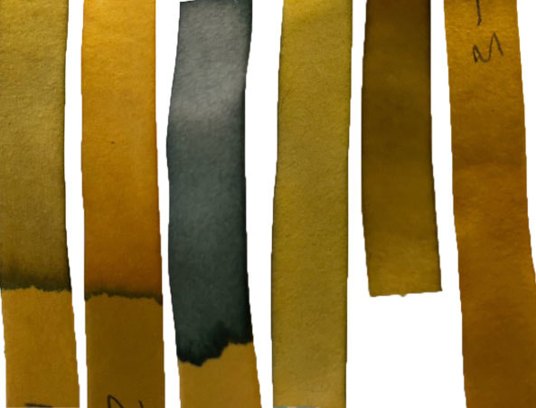
I used litmus paper to test 6 different sources of water. The darkest (most alkaline) water was from the hornsey canal as it had a pH of 8.
|
Left to right:
|
|
Although having a more alkaline water source can be beneficial to health, excessively high and low pHs can be detrimental for the use of water. High pH causes a bitter taste, water pipes and water-using appliances become encrusted with deposits, and it reduces the effectiveness of the disinfection of chlorine, creating the need for additional chlorine when pH is high. Low-pH water will corrode or dissolve metals and other substances. Pollution can change a water's pH, which in turn can harm animals and plants living in the water.
|
|
|
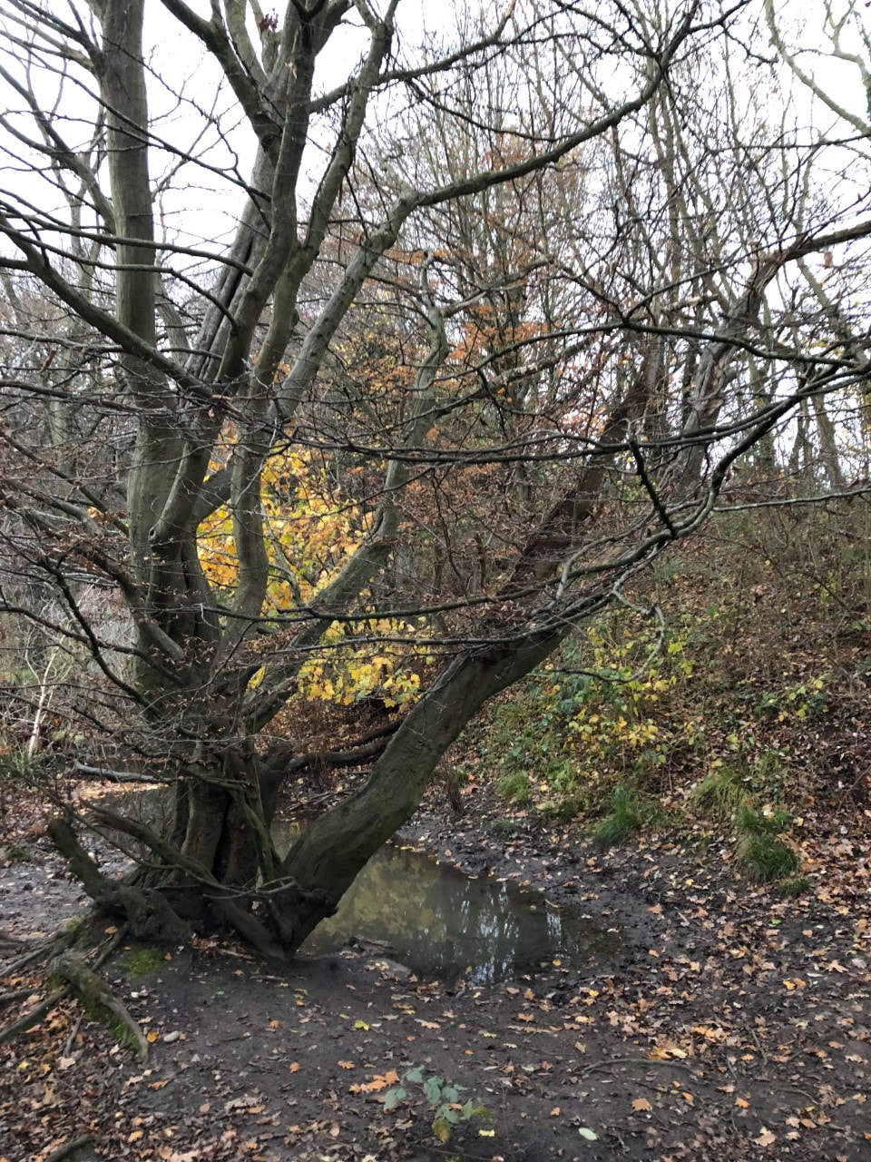
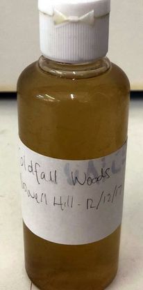
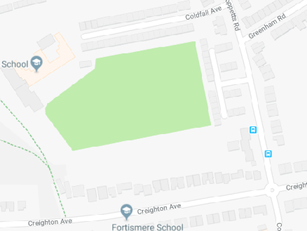
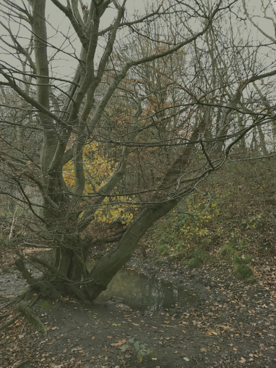
c o l d f a l l w o o d s
I went to Coldfall woods and collected water as it was a different source of water to the New River.
|

|
l i t m u s p a p e r 2
I scanned the original litmus paper in and includede the new one from the water of Coldfall woods, this had a pH of 9.
|
|
|
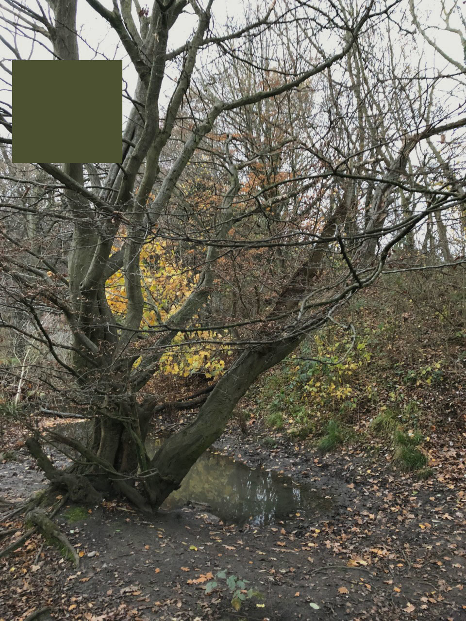
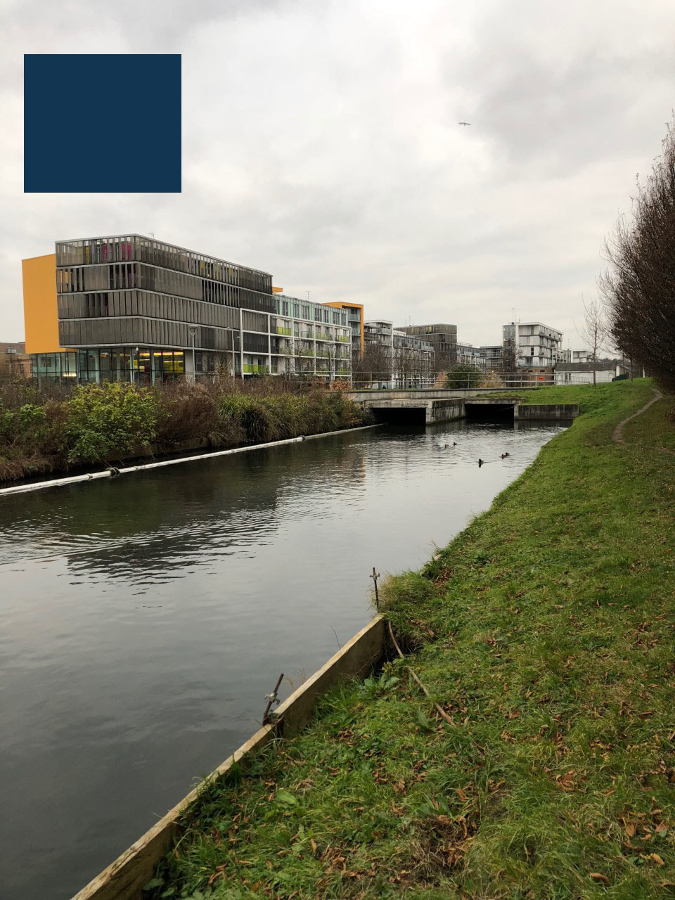
After visiting these locations, I decided to use photoshop, and use the colours of the pH from the litmus paper and incorporate this into the photographs of the areas. I made a new layer and filled it with the pH colour and changed the opacity to create a faded effect for both pictures. I then selected a square of the colour and added it to the corner of my image to make it seem like part o a colour palette.
|
|
|
|
While continuing my development finding out about the water quality and pollution of certain areas, I discovered the health effects of this and also compared these sources of water to more natural ones, e.g. bottled water and tap water. After doing this I wanted to find out more about the imminent impacts in more closer detail, focusing on the chemicals and the effects on the natural environment, considering trees, plants and landscapes instead of just looking at photographing water. In order to do this I decided to use what I have learnt from this development and use my previous work where I used film to capture plants, however, this time I am going capture a wider variety of environments, as well as plants, instead of just photographing close up flowers. An artist I am going to use and respond to is Brandon Seidler.
e v a l u a t i o n
After using representations of pollution, I was excited to try and be able to show the physical effects by collecting water and testing the pH of it. I think that doing this was useful as it allowed me to explore pollution further and allowed me to progress my developments from pollution impacts on the natural environment, to water sources which is what I was more interested in. By doing this I was able to start more developments using actual chemicals which is how I refined my work through my developments. However, if I were to repeat or add another response to the water pollution in the canal, I would collect more water and let my image of the location soak in it for a while to see what impacts the polluted water would have on the physical image. This is a technique used by Brandon Siedler and various other photographers.
F O U R T E E N T H D E V E L O P M E N T
M A R C U S L Y O N
|
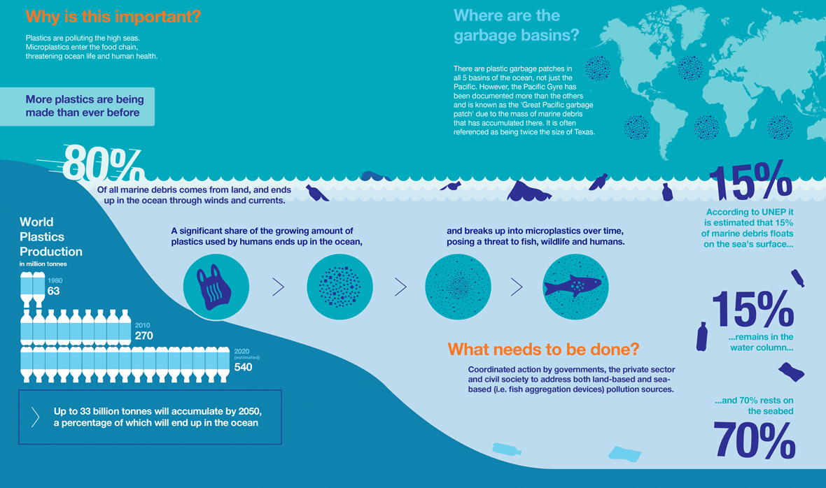
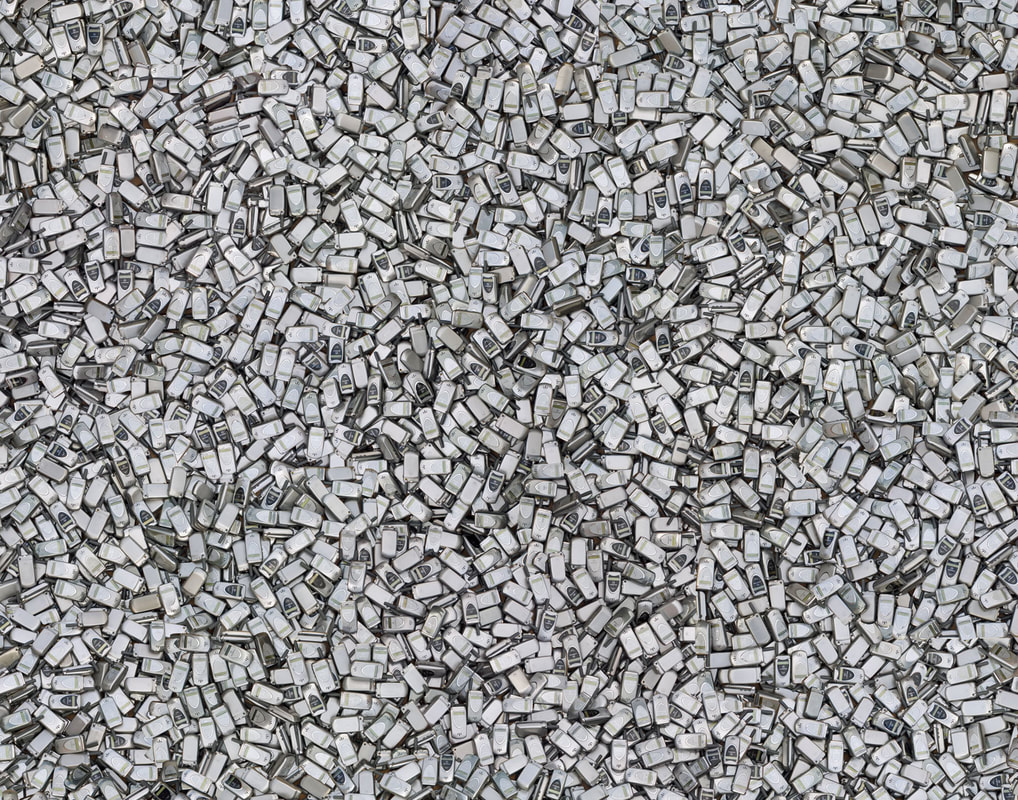
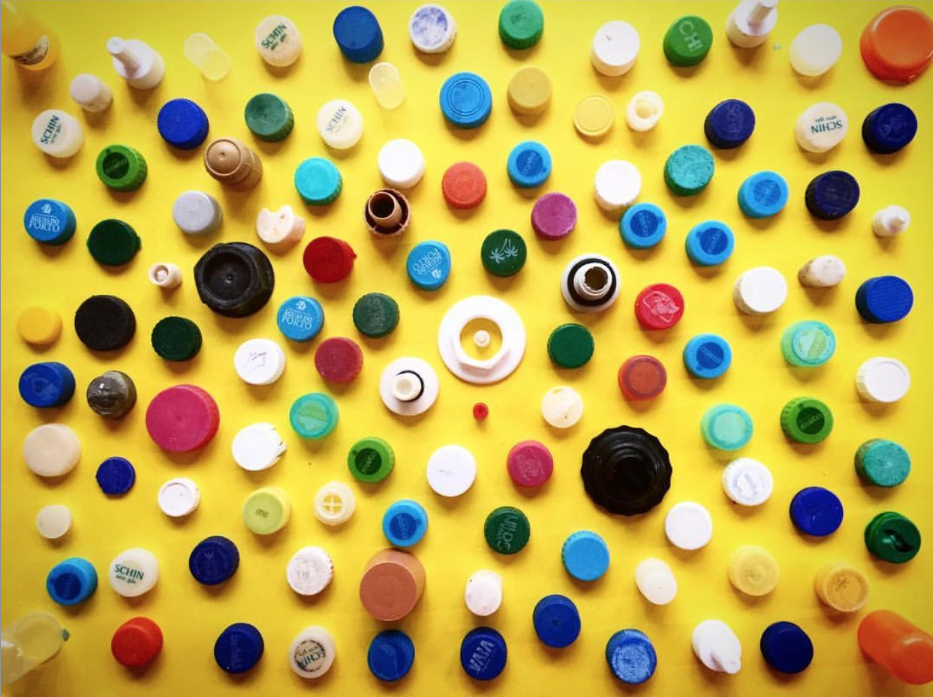
Through looking at and photographing water sources and the waste that is involved in making them toxic or detrimental to the environment, I found that one factor that contributes to this is the use of plastic and its waste being thrown in water. This image taken by Marcus Lyon demonstrates some of the effects it has and why it's such a problem. He displayed a range of plastic bottle lids and explains how it takes over 500 years for the estimated 8 million tonnes of plastic that we discard into the sea each year to degrade. This is part of the reason for the many environmental impacts that are affecting the ocean and the biodiversity that lives within it.
|
b r a n d o n s e i d l e r
Brandon Seidler began experimenting with chemical manipulations on processed film, he started researching the chemicals he was using to create bold and colorful photographic compositions. He found that the very chemicals that he was using were the focus of a chemical pollutant spill in a nearby area. In an effort to raise awareness of the effect that toxic chemicals can have on our environment, he fuses the actual chemicals with his photographs taken in that area to juxtapose both toxin and landscape in disturbingly vibrant photographs created from his film manipulations. While researching chemicals for a photo class, he learned about a toxic spill that occurred nearby 15 years earlier. He’d already been experimenting with alternative film processes, and wondered what would happen if he took pictures of the area and introduced the negatives to the nasty chemicals once spilled there.
c h e m i c a l s f o u n d i n p l a s t i c
Polyethylene - used in supermarket bags and plastic bottles
Polyethylene terephthalate - carbonated drinks bottles, peanut butter jars, plastic film and microwavable packaging
Polypropylene - bottle caps, drinking straws, yogurt containers
Polyvinylidene chloride - food packaging
BPA - Found is supermarket water bottles, foods and baby bottles. It is feared to disrupt hormones and cause health problems.
Polyacrylonitriles - One of the most hazardous polymer types according to their monomer composition
Methanol - toxic to aquatic life
|
|
|
Success criteria for taking film photos:
-Aim to get the water and plants surrounding
-Wildlife
-Any waste/plastic seen
-Framing using reefs
-Aim to get the water and plants surrounding
-Wildlife
-Any waste/plastic seen
-Framing using reefs
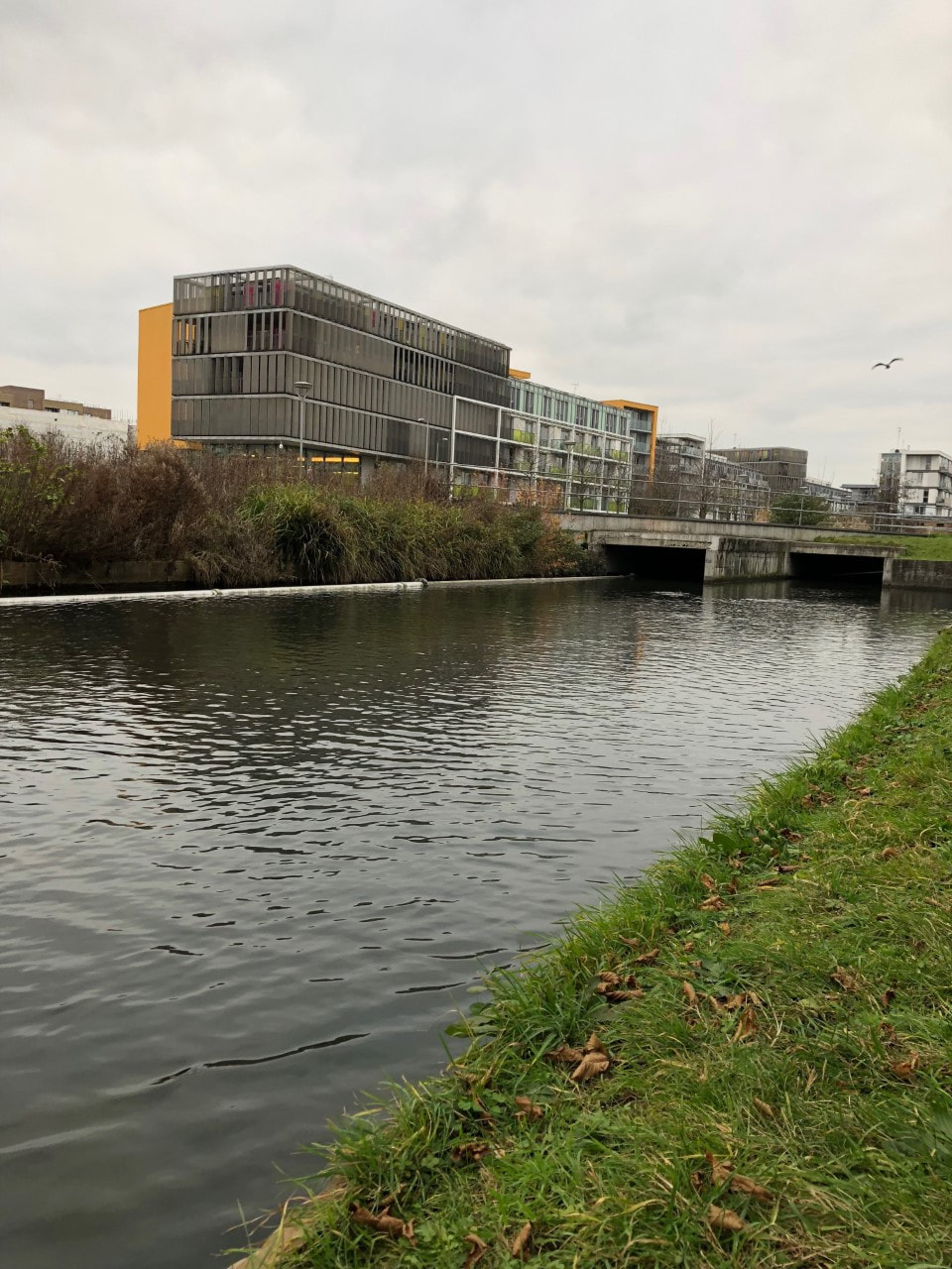
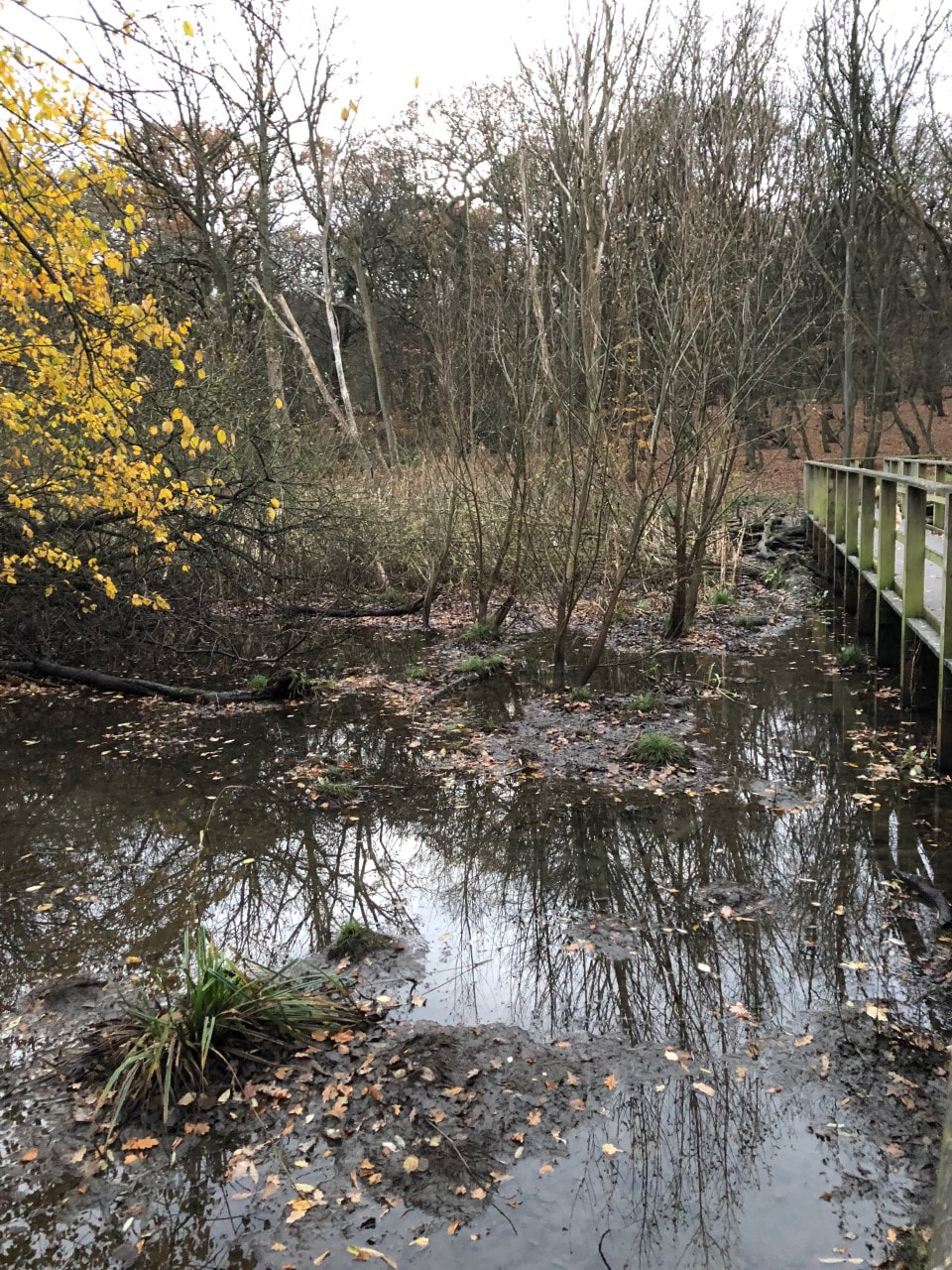
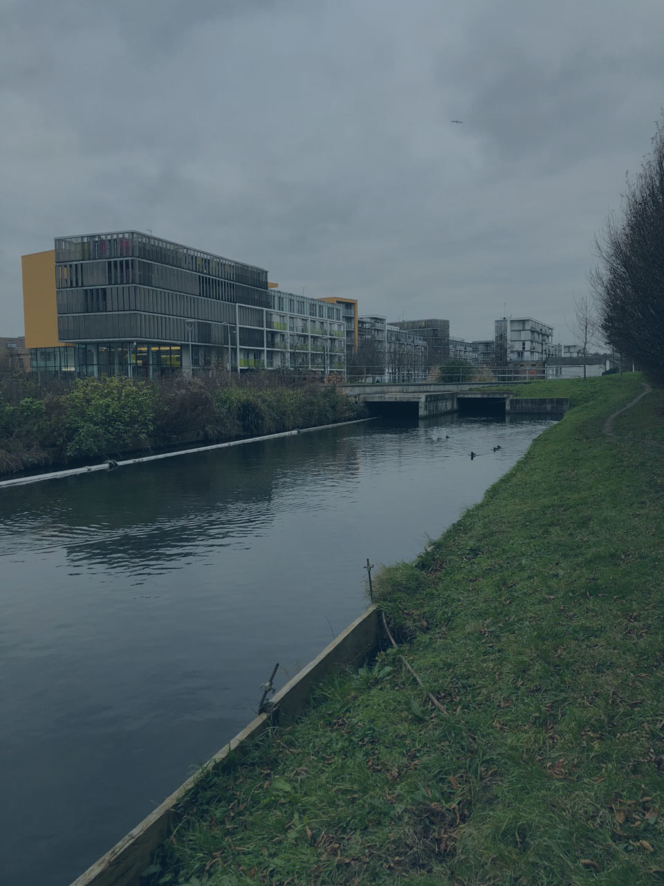
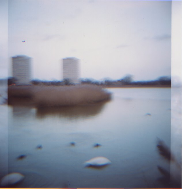
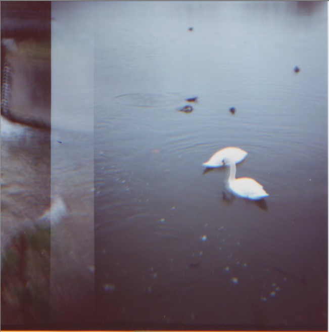
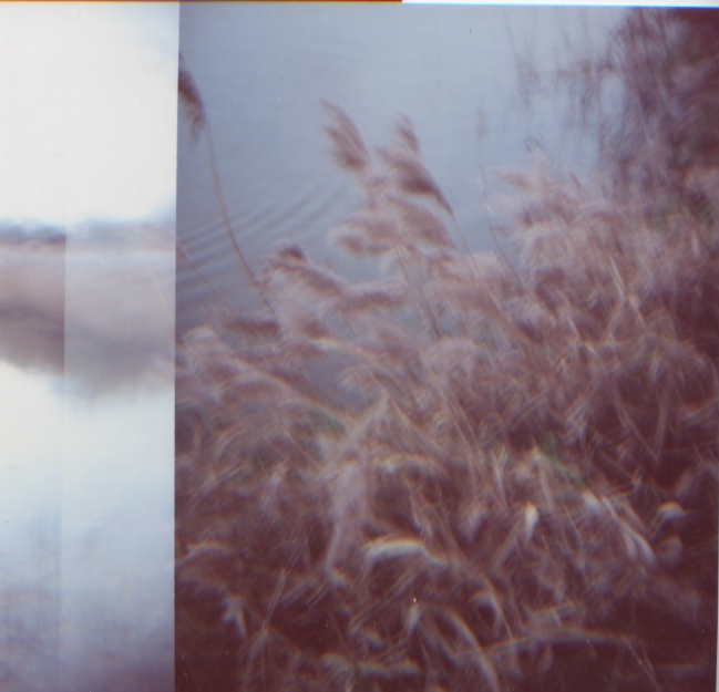
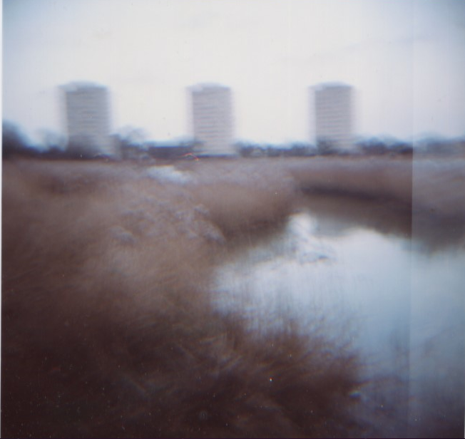
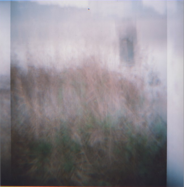
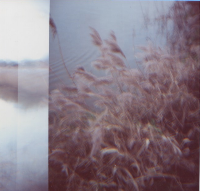
W E T L A N D S - F I L M
I visited Woodberry Wetlands and captured images of the nature reserve on my Diana Plus film camera. I chose to take them on this image as the camera itself is made of plastic and is made from the same materials found in plastic bottle tops and also correlates to my photography. The image sizes are also 6x6 which are larger than the other film prints. I wanted to choose a place that was aesthetically pleasing, as well as in an urban area (Stoke Newington). The aim of this was to incorporate human aspects such as waste, and the plastic bottles demonstrated by Marcus Lyon and show what affects the chemicals in these do to our environment. There are many harmful substances that seep and disintegrate into our water sources, however as our eyes can't see them, we can't see the imminent consequences. They may cause health problems, environmental problems such as pollution, can affect wildlife and ecosystems.
|
|
|
|
|

|
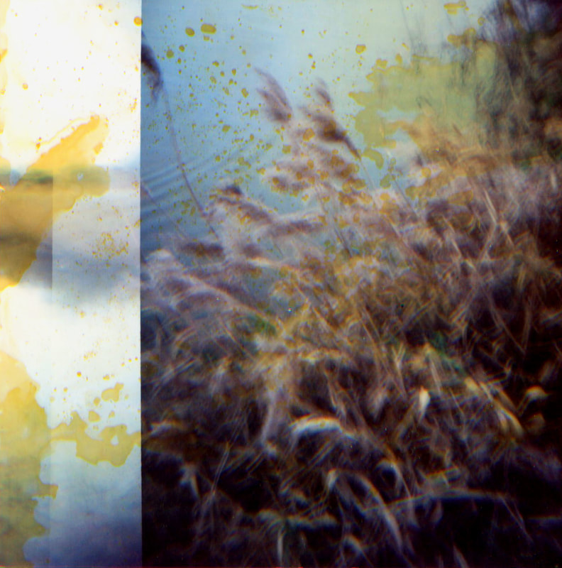
f i n a l p i e c e s
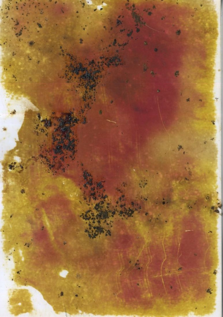
In order to create my final pieces, I scanned in my images and took them to the science block where I used chemicals to either soak my images, or use pipettes or paintbrushes to create different effects. The chemicals I used were ammonium, ammonium nitrate, iron, acid, methanol and chloride. After manipulating my images with these chemicals, I scanned them in again, and edited them on photoshop to enhance the colours, saturation and contrasts to create image that appeared more damaged. The aim of this was to represent the detrimental impacts that human waste in water sources does to our environment, and how if the chemicals can create such impacts on a piece of paper, what must they be doing to our landscape?
|
|
|

M E T H A N O L |
|
C H L O R I D E |

|
|
s t e p s o n p h o t o s h o p
|
|
Firstly I changed the hue to various colours as I wanted the chemicals on the image to appear different to what they originally looked like. I then adjusted the levels to find the right tones and contrast to use and finally I changed the vibrance and saturation levels to brighten up the image and enhance the colours.
|
a r t i s t & m e
B R A n d o n s i e d l e r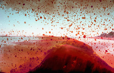
Similarly to Siedler's work, I photographed a wetlands location and used chemicals to alter the image, I think this worked well as the chemicals I used were found in plastic or associated with plastic, and Siedler used chemicals from the location of his photographs. The colours in my images are similar to his too, in order to improve my work I would have taken more photos in a different location and leave them in the chemicals longer to achieve photos that resemble Siedler's.
|
m y r e s p o n s e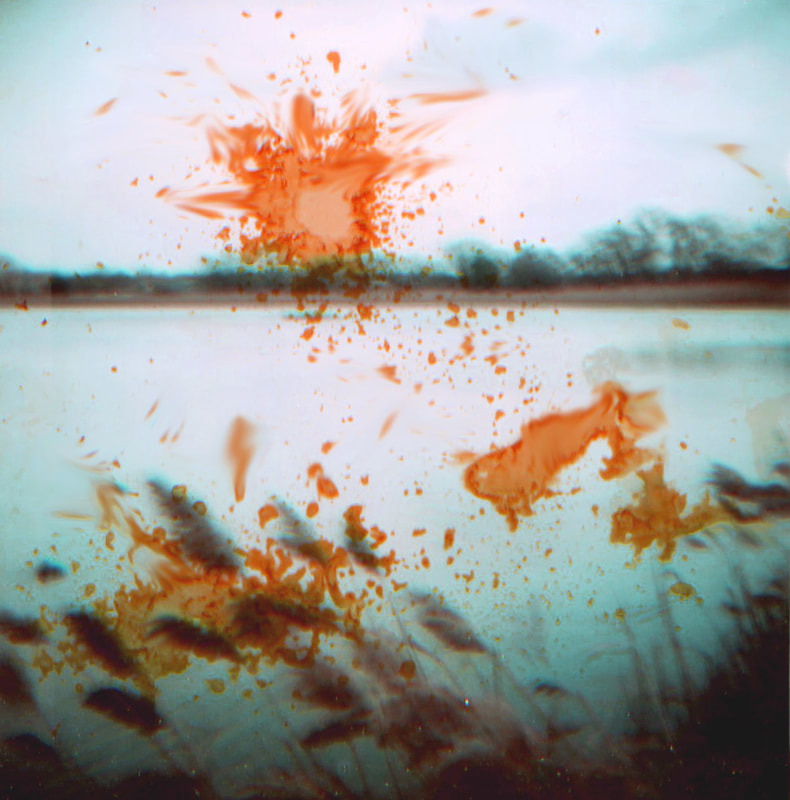
|
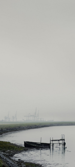
n a d a v k a n d e r
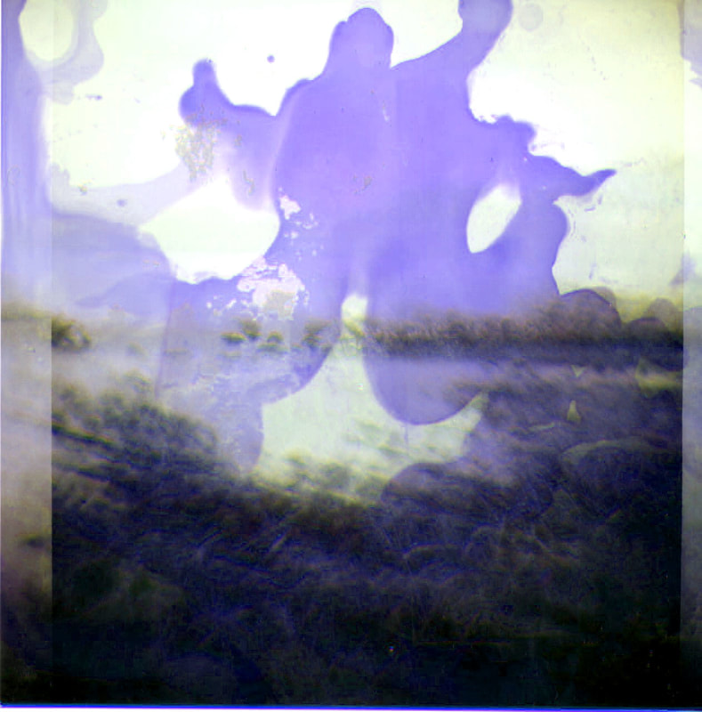
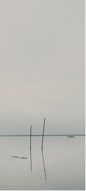
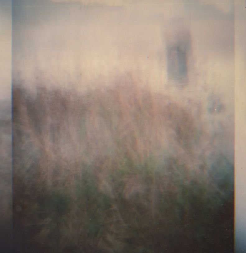
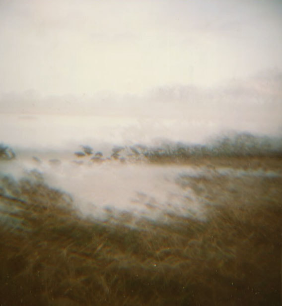
Nada Kander's series 'Dark Line' consists of images taken at the Thames Estuary. It is a landscape he’s been photographing and “absorbing” since 2015, it is characterised by mudflats and marshes, and there is little trace of human activity. The series “is a personal reflection on the landscape of the River Thames at its point of connection with the sea, through atmospheric images of its slow-moving dark waters and seemingly infinite horizons”. “Kander’s increasingly abstracted photographs describe the landscape through minimal compositions and a painterly layering of tones that appear to stain or bleed through the photographic surface, conveying an inner experience parallel to that of the visible world.”
|
|
|
I wanted to use Nadav Kander's work as influence when editing my images. They have a quite profound and eerie look to them, and after seeing one of my images that I thought gave out the same kind of response, I decided to edit them all in that style.
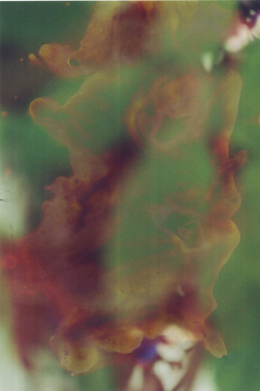
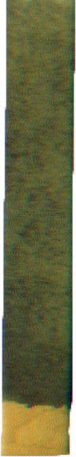
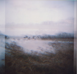
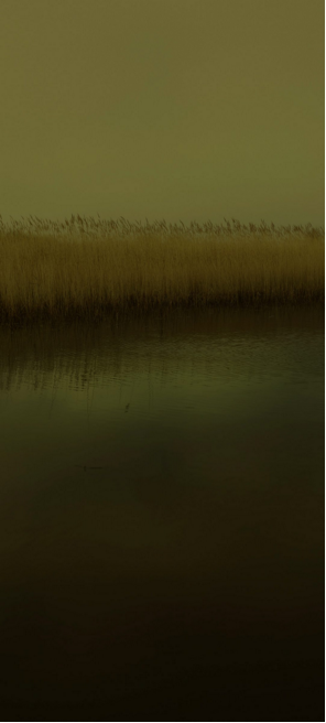
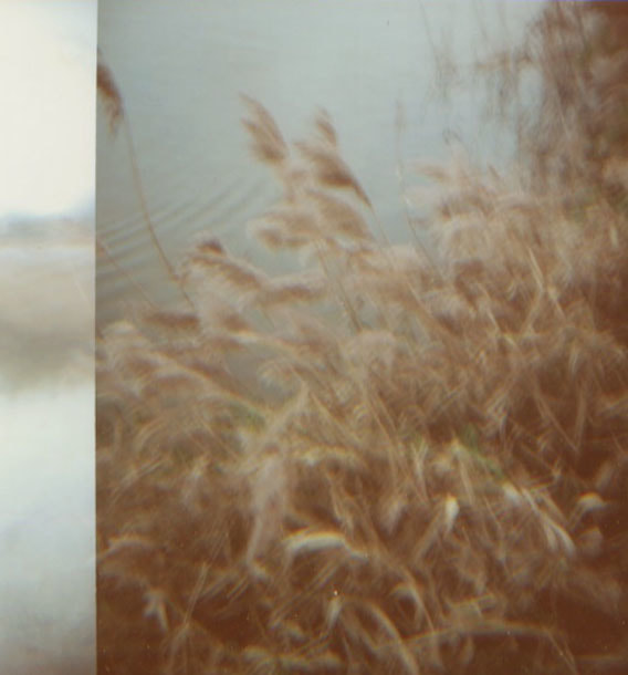
O R I G I N A L I M A G E
Using one of my images, I dipped this whole photo into chemicals and it came out with this faded and decayed type of effect. I thought that out of all the images I manipulated with chemicals, this one showed the most realistic portrayal of how chemicals and the plastics they are in can change an image. It looked like it had the biggest impact on the photo due to its worn down and drained style, which is what my intention of showing the impacts of plastics in water was.
A C I D
p h o t o s h o p i m a g e s
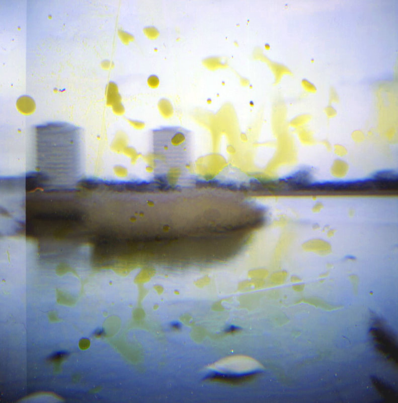
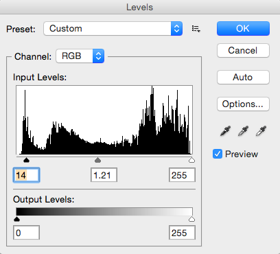
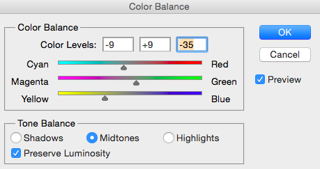
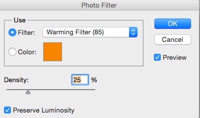
I wanted to use the effect I had created with the chemicals and use it as a mask on my other photos. As I only obtained this effect on one of my images, I used photoshop to manipulate the images to try and get the same style. I used the colour balance to make the photo look more yellow, lowered the contrast to try and get the faded style and also used the levels, saturation and hue on the images.
|
|
|
|
s t e p s o n p h o t o s h o p
|
In order to edit these photos in the same style of the original one I put in chemicals, I used photoshop to firstly change the colour balance to a more yellow tone, as the image looked slightly washed out. I then used the warming photo filter to make it look more orange and like it had a warm mask on it. I then changed the levels to change the contrast and tones of the image.
|
|
E v a l u a t i o n m i n d - m a p
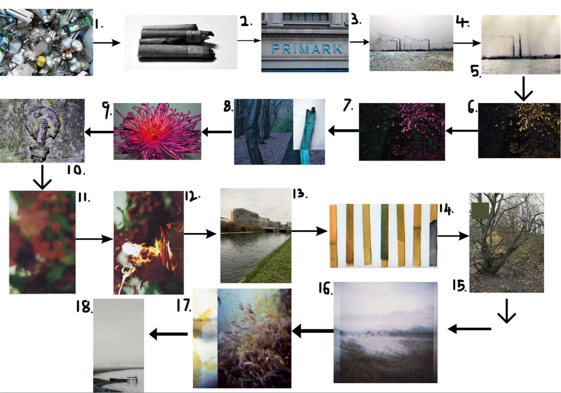
This flow diagram shows my development processes throughout my weebly. Firstly I explored mass consumption and thrown away items by visiting rubbish dumps (1) where I photographed household items and then I moved onto discarded items and cigarettes (2) as they represented the throwaway culture of society. I then took pictures of big brands of shops (3) and uploaded them to reveal the Westernisation of globalisation and how this impacted consumption. After this I started to look at pollution more specifically, I responded by creating my own images (4) and then started using bleach (5) as a means to represent the chemicals of pollution and the effects they had on my images. After this, I responded to various photographers (6), exploring pollution's impacts on our landscape (7) by looking at the environment. I continued looking at this by focusing more nature (8) and flowers and plants (9), and captured physical pollution on a bridge (10) in order to show how pollution affects the environment and living things. I then started taking film pictures as I wanted to be able to experiment with the outcome and physically manipulate my images. I took close up images of plants and flowers (11) and used bleach and other substances to alter them (12), further exploring the impacts of pollution and the chemicals had on them. After looking specifically at plants, I moved onto focusing more on water pollution (13). I tried to show this by using litmus paper (14) to measure the pH of the water, therefore revealing the toxicity of the water, I used photoshop to put the colour of the litmus paper alongside the location (15). After this, I used my film camera to photograph the wetlands (16), I used my Diana plus camera as it was made out of plastic and wanted to produce images which were taken with something I was exploring the issue of. Continuing this, I used chemicals I found in plastic and dipped, painted and smeared my images in them to create a result that was represented pollution and its impacts (17). After this I looked at Nadav Kander's 'Dark lines' series (18) and photoshopped my wetlands images to resemble his, while taking inspiration from one of my original images that I thought best revealed pollution's impacts.