S T R U C T U R E
structure
ˈstrʌktʃə/
noun
1. the arrangement of and relations between the parts or elements of something complex.
"the two sentences have equivalent structures"
2. a building or other object constructed from several parts. "the station is a magnificent structure and should not be demolished"
3. construct or arrange according to a plan; give a pattern or organization to.
P I N T E R E S T B O A R D :
E X H I B I T I O N V I S I T
T H E R A D I C A L E Y E - MO D E R N I S T P H O T O G R A P H Y
The Radical Eye is an exhibition from the Sir Elton John collection, it displays photograph from the classic modernist period of the 1920s-1950s. Over the last 25 years Sir Elton John has put a collection together including portraits of Man Ray, Picasso, Matisse and Breton and has over 70 artists and nearly 150 rare vintage prints on show. The exhibition consists entirely of rare vintage prints, all created by the artists themselves, the quality and depth of the collection allows the exhibition to tell the story of modernist photography in this way for the first time in the UK. Featuring portraits of great cultural figures of the 20th century, including Georgia O’Keeffe by Alfred Stieglitz, Edward Weston by Tina Modotti, Jean Cocteau by Berenice Abbott and Igor Stravinsky by Edward Weston, the exhibition gives insight into the relationships and inner circles of the avant-garde. Ground-breaking experimentation is seen both in the darkroom and on the surface of the print, such as Herbert Bayer’s photomontage and Maurice Tabard’s solarisation, examine how artists pushed the accepted conventions of portraiture.
Dorothea Lange 'Migrant Mother', 1936 Herbert Bayer 'Self-Portrait', 1932 Man Ray 'Glass Tears', 1932
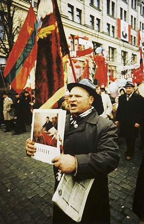
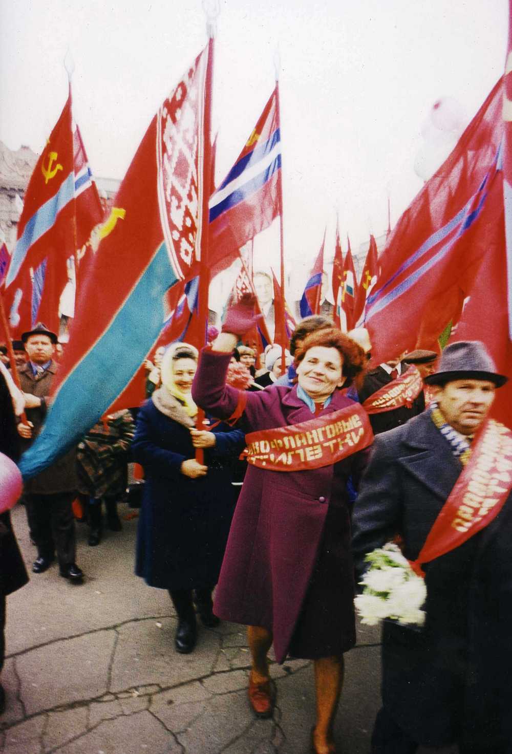
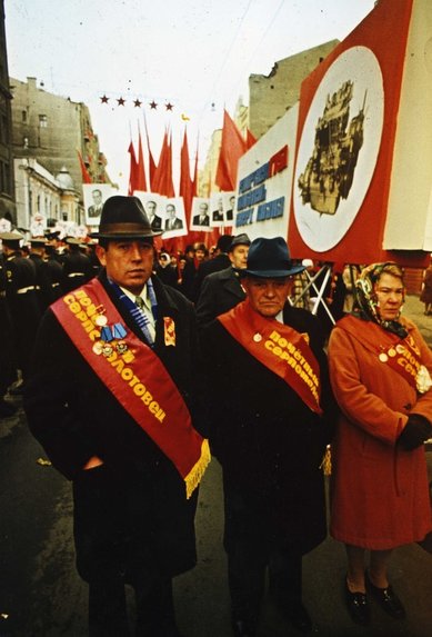
'R E D' - B O R I S M I K A L I H O V
Red is a group of eighty-four colour photographs taken between 1968 and 1975 in Mikhailov’s home town of Kharkiv in the north-east of present day Ukraine. A diverse array of subjects and situations are depicted: scenes from official military parades and political rallies, views of the Kharkiv cityscape, and unofficial private moments between family and friends. The snapshots do not document significant events; instead they trace the Soviet byt, the banal mundanities of everyday life in the Soviet Union under communist rule. Mikhailov suggested that ‘the more we can exclude the event from representation, the closer we can approach the most important thing – being’.
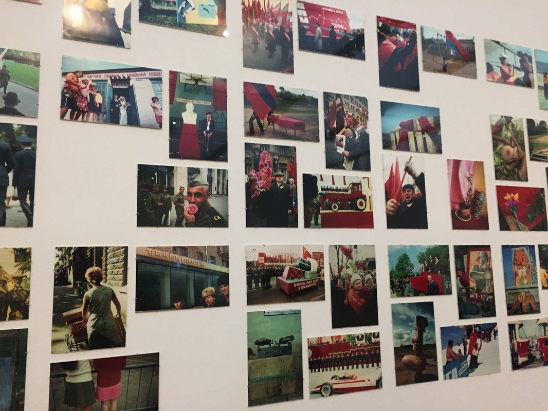
Every one of the eight-four disparate images in the series contains the colour red, after which the series is named. The art historian Urs Stahel has observed how Mikhailov ‘attentively, seismographically even, traces every little speck of red in the Russian-Ukrainian landscape ... and visualises the saturation and thorough coloration of the social body’
|
|
|
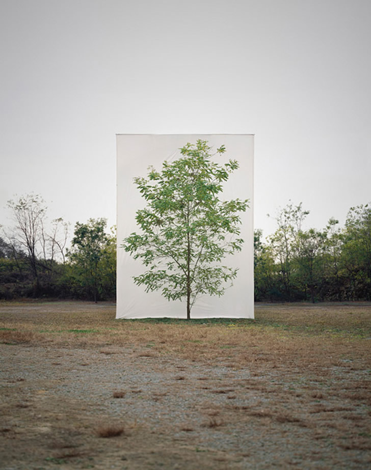
S T R U C T U R E I N N A T U R E
M Y O U N G H O L E E
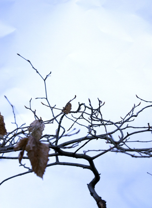
Myoung Ho Lee photographs solitary trees framed against white canvas backdrops in the middle of natural landscapes. He makes us look at trees in their natural environments, but separates them from their natural surroundings creating a divide between nature and the artificial aspect by presenting it on an immense white background like a photograph on a billboard. He makes the subject appear neutral from its original context, creating amore ambiguous image.
His works are largely composed by following four procedures:
1. Selection of The Subject
2. Separation of The Subject (meta-subject)
3. Photographing
4. Confirmation of The Separation
His works are largely composed by following four procedures:
1. Selection of The Subject
2. Separation of The Subject (meta-subject)
3. Photographing
4. Confirmation of The Separation


In all of Myoung Ho Lee's photograph's, the trees photographed are in the centre of the image, this singles out and emphasises the trees that stand alone in the natural landscape. This further enhances the separation of the trees from the environment. The images where the sky is more blue creates a greater contrast between the trees and the white canvas behind, and this isolates the subject further. However, the image on the left has more depth as it has other trees behind it and butting a canvas inbetween this has a greater effect.
M Y R E S P O N S E
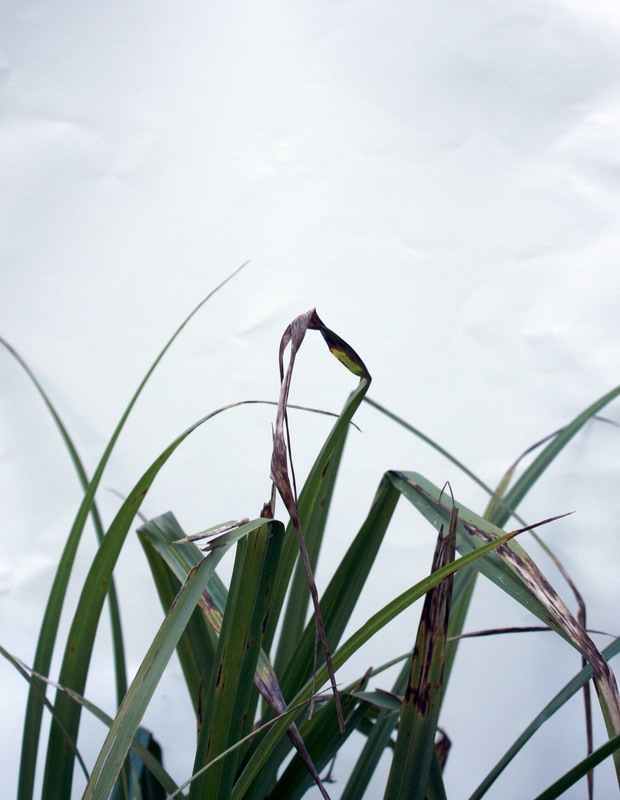
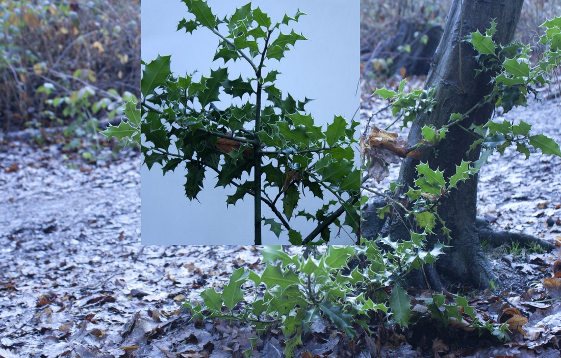
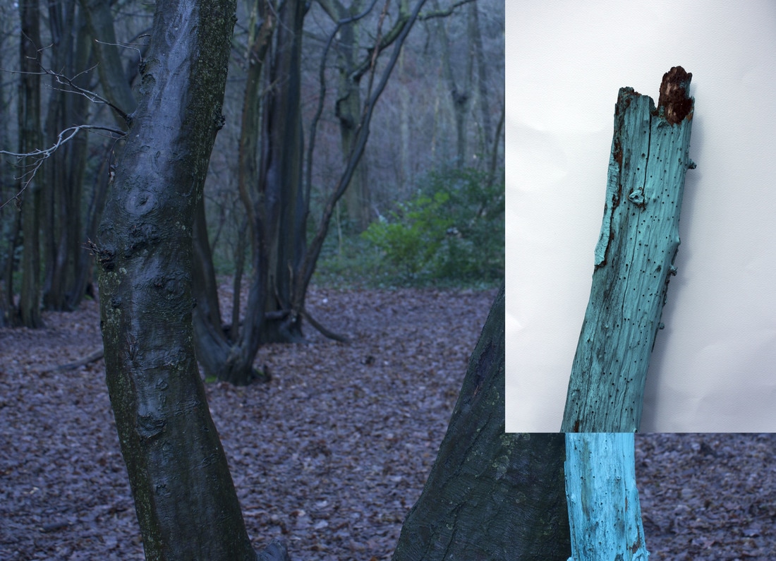
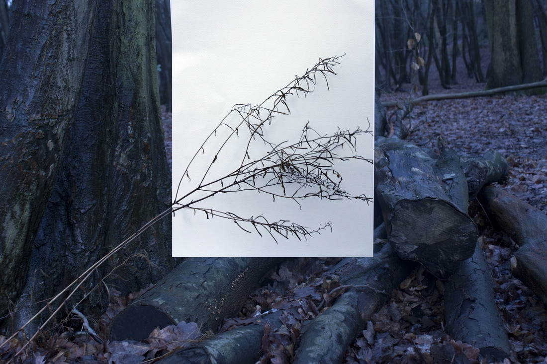
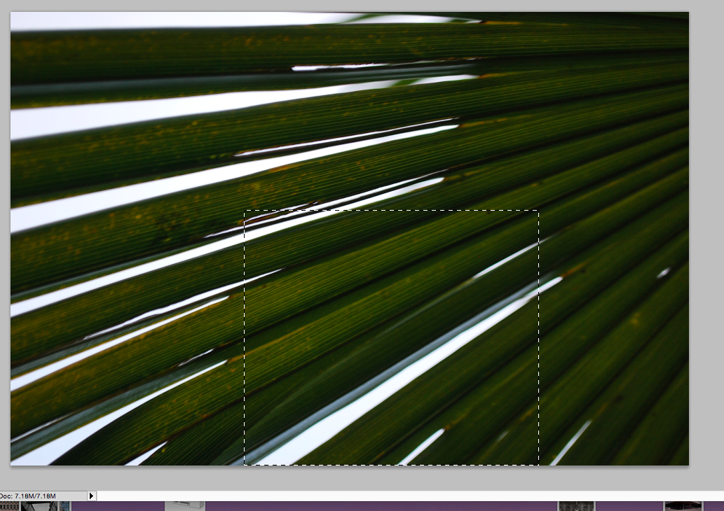
To respond to Myoung Ho Lee's work we went into Coldfall woods to try and replicate his images. We took large pieces of white card out with us to act as a canvas and took close up and wide angle photos of particular branches, bushes or plants. We did this so that the difference between the natural environment was completely separated by closely taking pictures against the white card, and taking wider angled photos where the white card is seen against the environment. I then selected 4 images and edited them on photoshop, using auto-contrast, auto-tone, auto-colour. editing the levels of contrast and brightness and cropping my images to enhance the colours and contrast of the image.
|
|
|
|
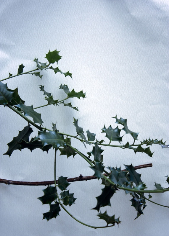
I then used a different method of editing my photos to try and further develop my images. I used the images that I took close up against the white card and edited them on photo shop before copying and pasting them onto the wider angle photos. This was more effective as it reveals the natural environment as opposed to just the close up edited photos much like Myoung Ho Lee's work. Additionally, editing before copying and pasting allowed me to change the colour and contrast of the plant and the white card which futher enhanced my images. My first image worked the least well as the card in the wider angle photo wasn't straight so it was hard to photoshop onto it, so the holly leaves don't match up. However, my second and third images worked much better as they lined up perfectly and the contrast between the white card and the environment was much clearer and looks more like Ho Lee's work.
A R T I S T & M E
M Y R E S P O N S E M Y O U N G H O L E E

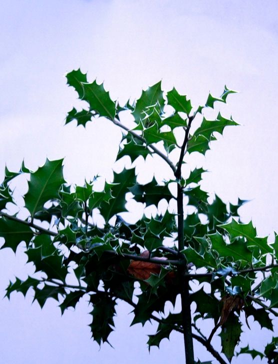
The image on the right is my response to Myoung Ho Lee's work. They were both done in areas with vegetation in order to find a place to put the canvas. However, mine was taken very close to the plant, unlike Myoung Ho Lee's far away shot of a whole tree. Furthermore, her image is much brighter and has lighter settings and a large expanse in front of the camera, whereas my image is quite dark and had a tree in the image directly behind it. I used photoshop to change the contrast and make the canvas more white like her image, however, because of this it looks less natural. My composition consisted of the subject being in the centre of the image, but the plant doesn't stem from the middle like Myoung Ho Lee's, it comes from the left. Overall, I am pleased with my outcome as I was able to successfully show the structure in nature with the white canvas, and using plants.
S A N N A K A N N I S T O
Sanna Kannisto is a Finnish artist who explores the way in which we approach nature in art and science through her photography. She does this by using scientific apparatus in her work, e.g. retort stands, clamps etc, to reveal the science aspect of her work, as well as using plants, leaves and flowers to represent nature. As soon as the natural object is removed from its environment, we can really focus and understand that piece of nature as a single unit and notice specific characteristics that we wouldn't normally, in an everyday environment. The use of the white backdrop in the 'field studio' further emphasises this as a greater contrast is seen. Kannisto collects a variety of species' in a great range of ways, then exploring and archiving them.

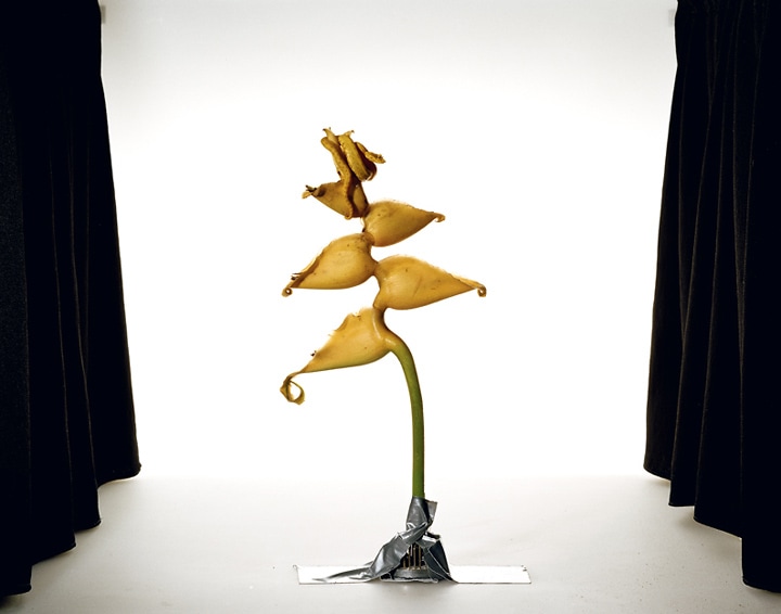
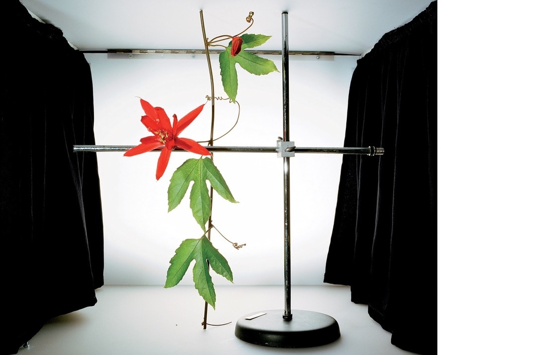
The objects chosen to be photographed all have vibrant colours, the vivid greens seen are to emphasis the nature aspect and the fact that whilst being removed from its natural environment, the intensity remains. All three images have different compositions, Kannisto explores the variety of these species through photographing them in a number of ways. These include using the scientific apparatus, and placing the pants in different positions to achieve the focal point. Bright colours are used and when these are put against the white backdrops their vibrance and exotic nature is further emphasised. As Sanna Kannisto mentions, more specific characteristics are noticed and this focuses out attention more on the object.
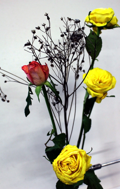
M Y R E S P O N S E
To try and replicate Sanna Kannisto's work I photographed a variety of different flowers against a white background. Like Kannisto's images, I used a retort clamp and stand to hold the flowers in place. I then photographed them in a number of different angles, experimenting with the different angles and how close up the images were taken. I then selected 3 of my best images and edited them on photoshop, changing the contrast, tone and brightness of the images until they appeared more vibrant and focused and aimed to make the background more white to further enhance the colours, like Sanna Kannisto's work.
|
A R T I S T & M E
S A N N A K A N N I S T O M Y R E S P O N S E

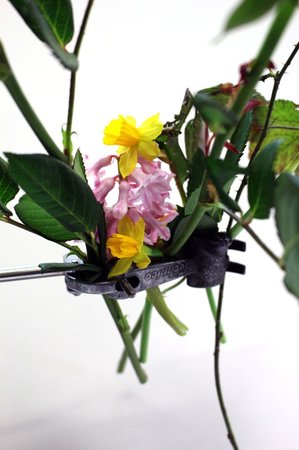
Responding to Kannisto's work, I used flowers and plants placed in a retort clamp - like she did, taken with a white background. My work had more flowers in the frame, compares to her more simplistic approach of just justing a few. Additionally, she used exotic plants and flowers that varied in the composition and also took up a large space in the frame. Mine was more compact and central,however, with my other images, I did include the long stems and bigger flowers in order to achieve this. Additionally, I did use a white background, and used photoshop to enhance the colours, however, Kannisto revealed the black curtains in her photographs which made it looks more staged, but also increased the contrast between the background, curtains, and plants.
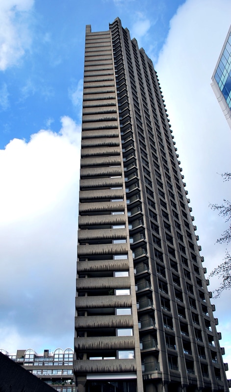
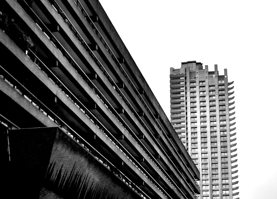
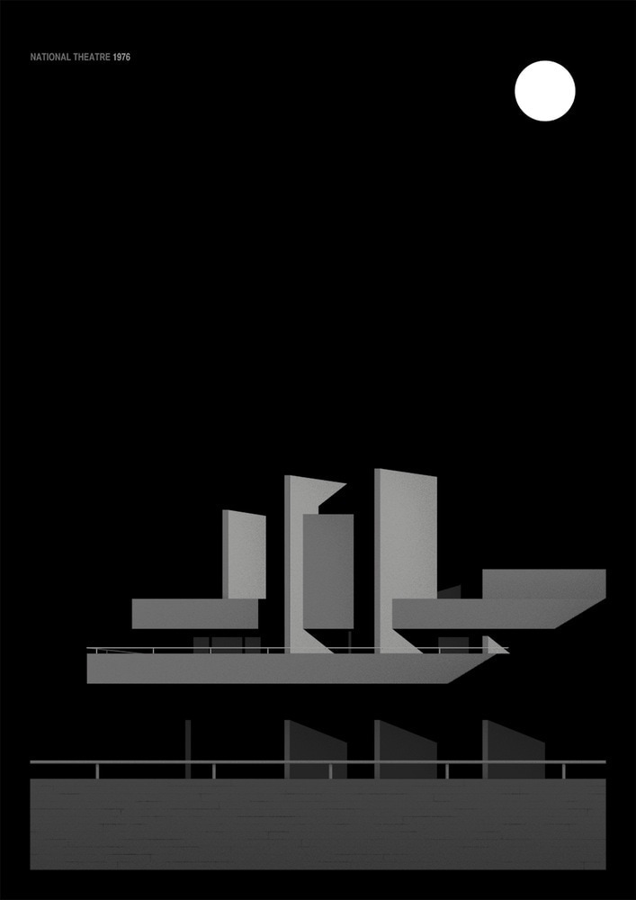
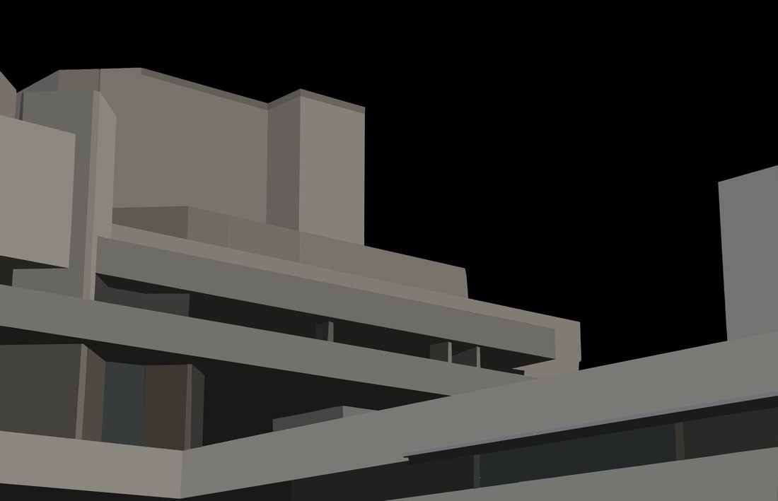
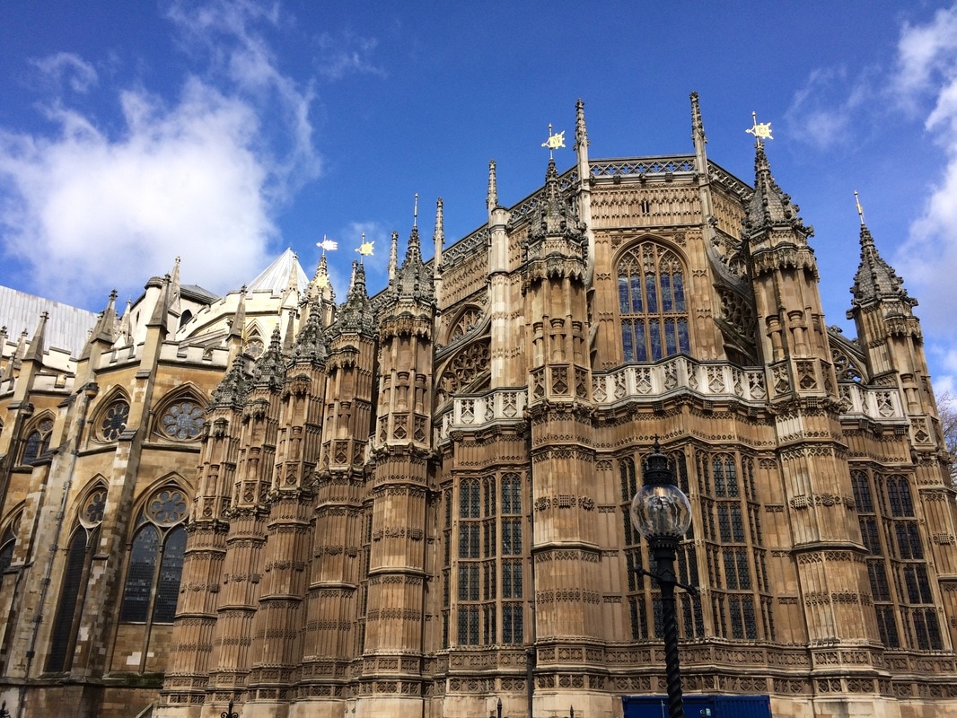
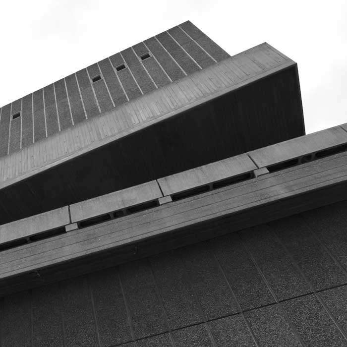
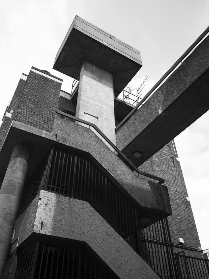
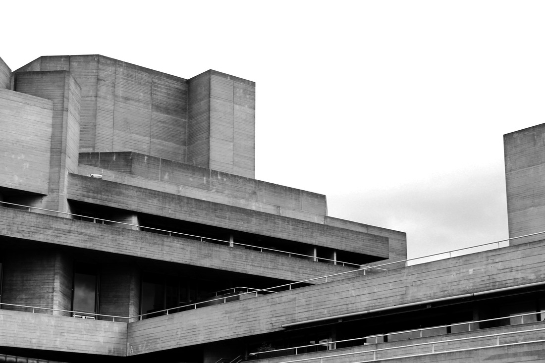
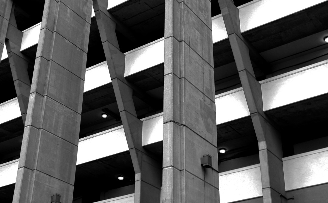
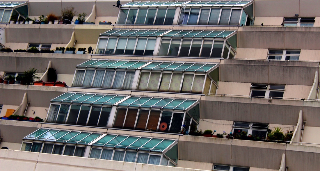
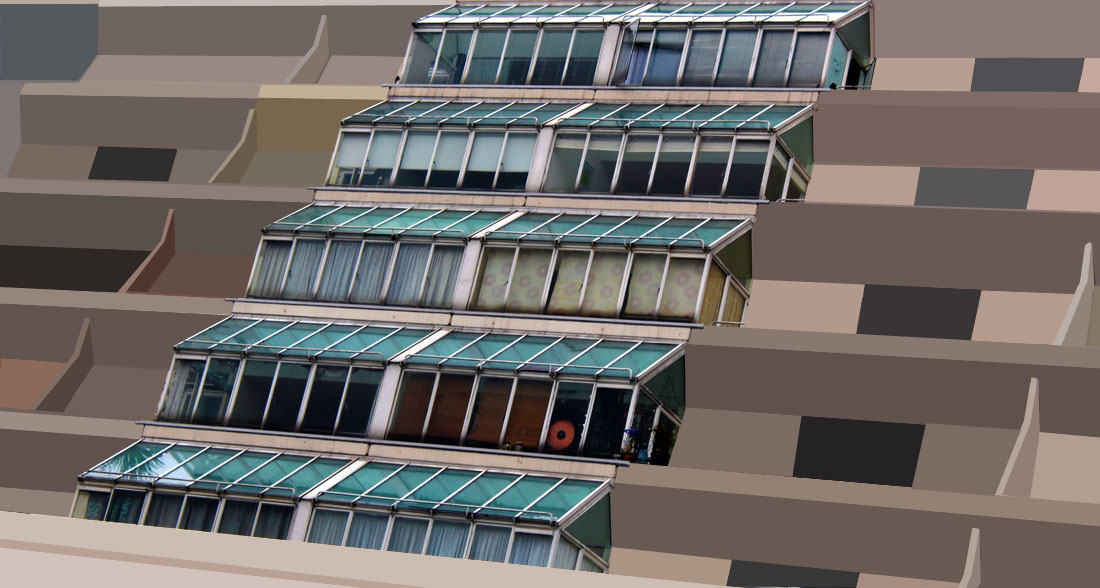
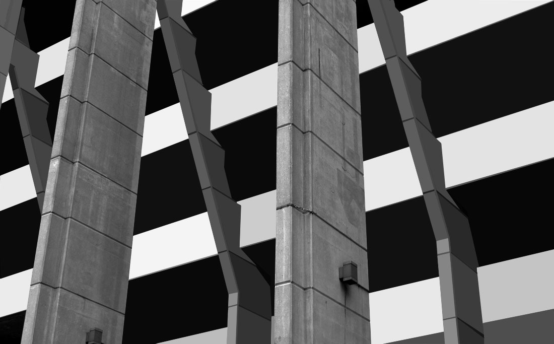
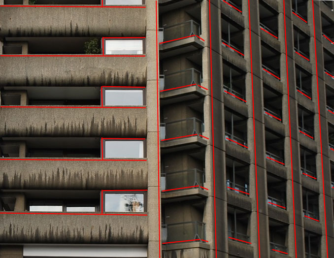
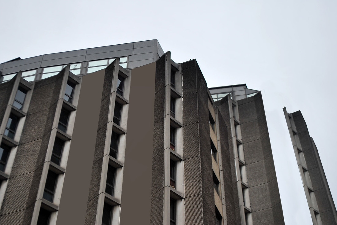
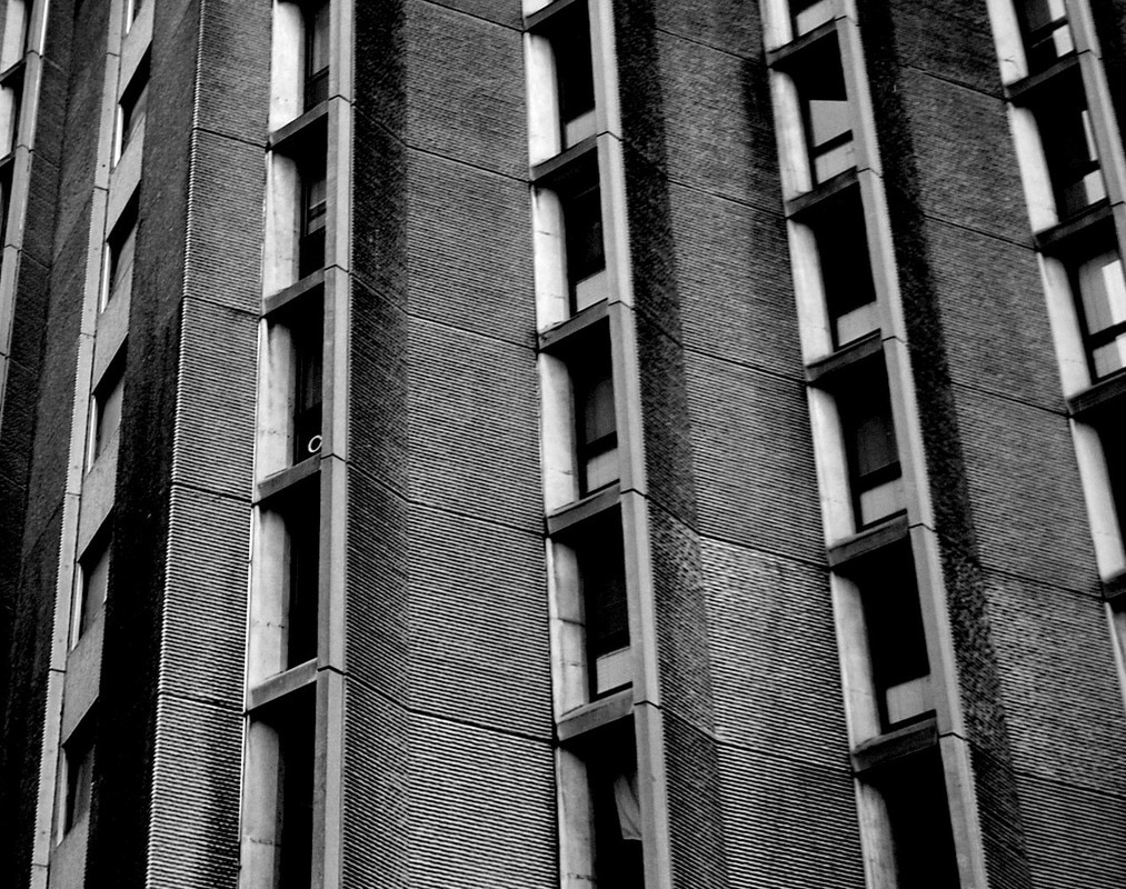
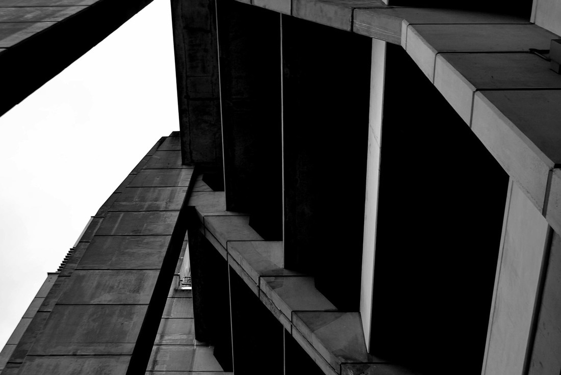
B R U T A L I S T A R C H I T E C T U R E
S I M O N P H I P P S
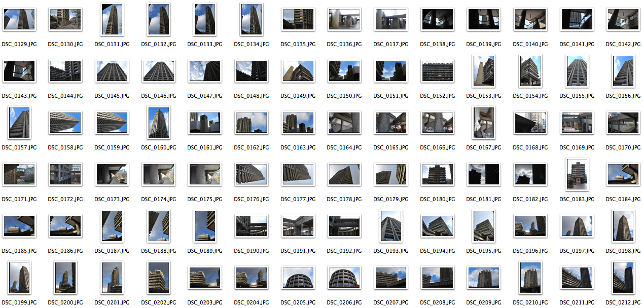
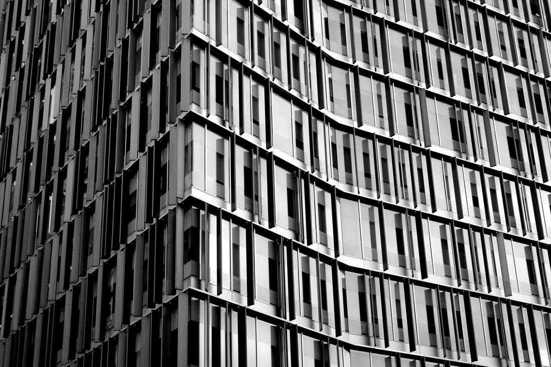
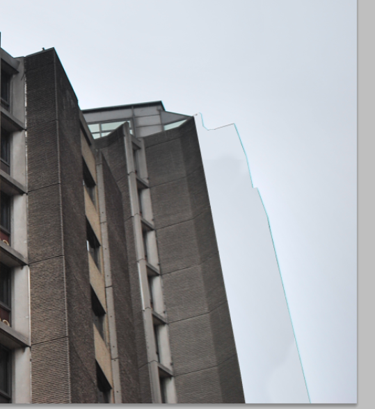
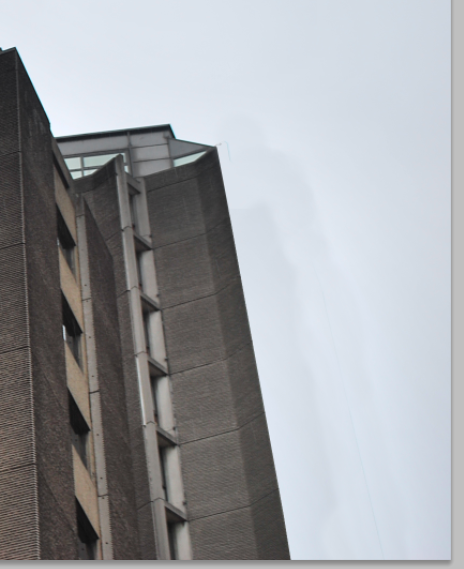
Brutalist architecture is a movement in architecture that flourished from the 1950s to the mid-1970s, descending from the modernist architectural movement of the early 20th century. The term Brutalism was derived from the French ‘Béton brut’, or raw concrete, and the expression became associated with a movement emerging in postwar British architectural offices. Simon Phipps photographed a number of buildings that sit within a loose Brutalist principle and rather than present them as photographic prints have produced them as monochrome images printed directly onto an aluminium substrate.
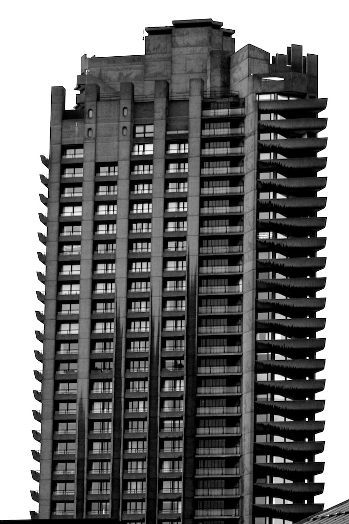
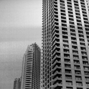
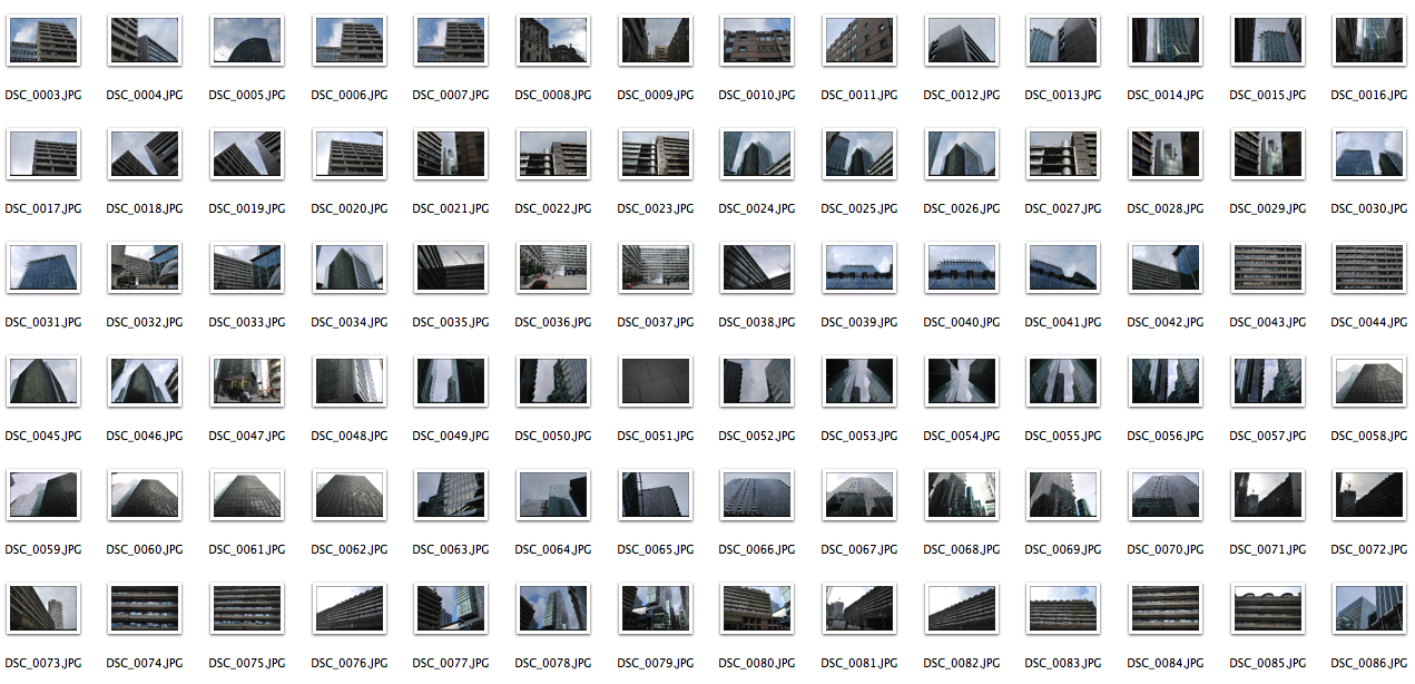
Simon Phipps portrays brutalism in a sensitive and realistic manner. He has photographed a wide variety of these brutalist buildings over the last 15 years, demonstrating the breadth of his continuous architectural style. He photographs these buildings far away and close up to reveal the scale of some of these images, and edits them black and white to further emphasise the rigidity. He changes the composition of his images, photographing buildings head on, or in different angles to adjust and change the focal points of his work.
M Y R E S P O N S E
|

|

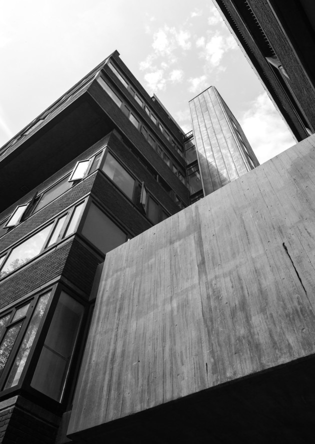
A R T I S T & M E
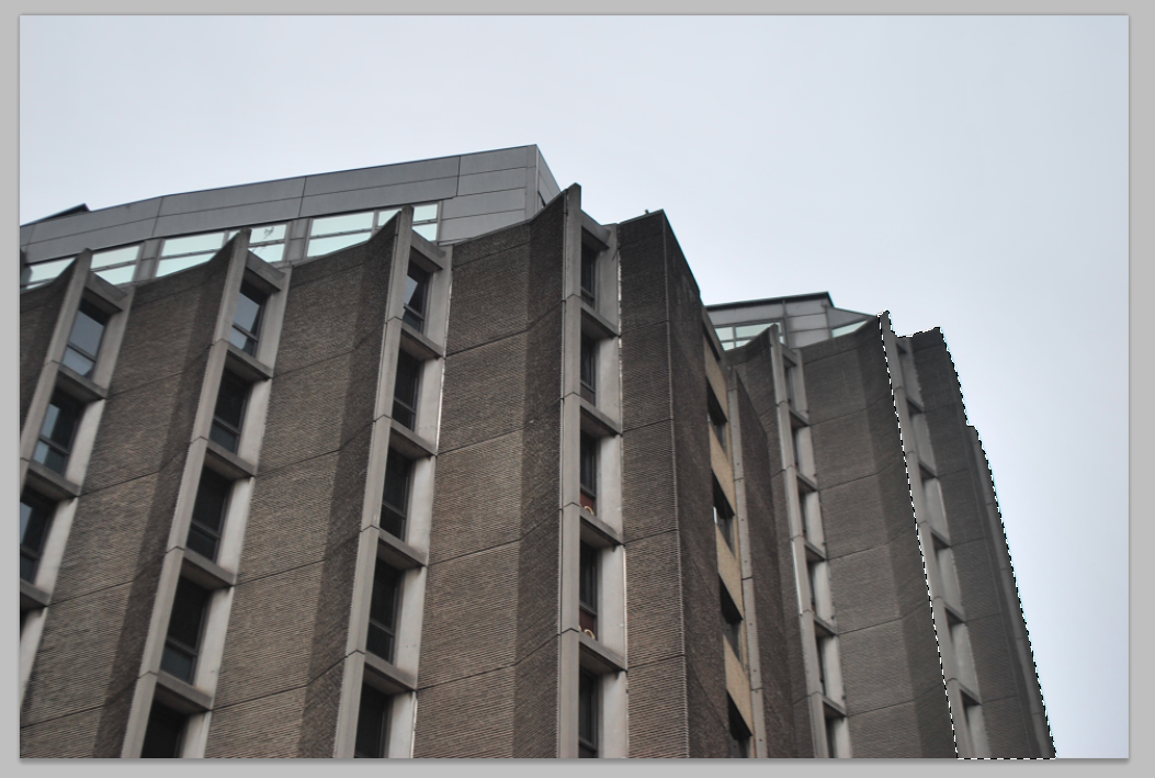
S I M O N P H I P P S M Y R E S P O N S E

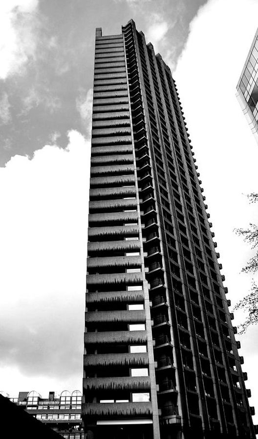
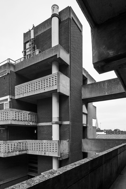
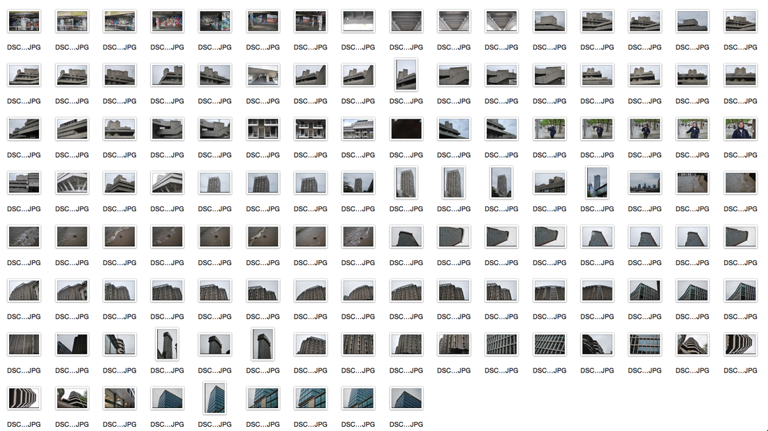
I responded to Simon Phipps's work by taking brutalist pictures in many places, the most successful being at the Barbican. My image is similar to Phipps's as the composition is quite similar, as well as the angle it was taken at. His photos mainly consist of brutalist buildings that have been taken quite far away in order to capture the whole image, and I tried to do this with some images, as well as taking images closer to show the brutalism close up. Additionally, I tried t capture more that one building in the frame at once to try and recreate his photos. Furthermore, I experimented with the colours of my images, however, the black and white style that Simon Phipps's used proved to look better as it further enhances the concrete brutalism concept.
T H O M A S D A N T H O N Y
Thomas Danthony is a french artist based in London. Often narrative, Thomas's work is characterized by a clever use of light, bold compositions and a dose of mystery.

|
|
|
M Y R E S P O N S E
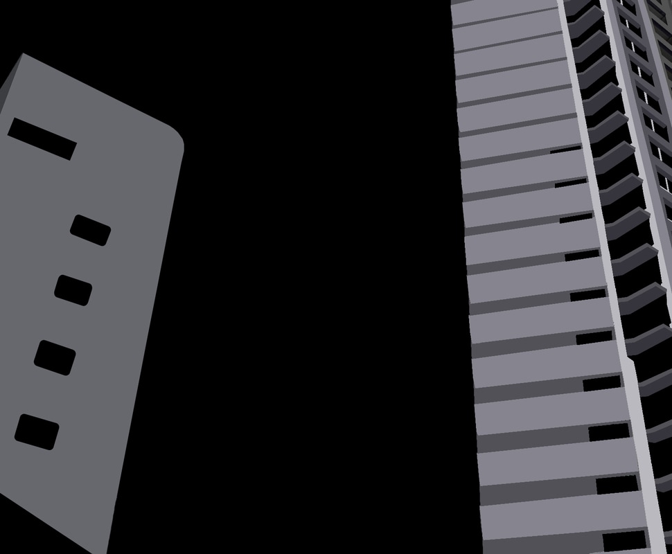
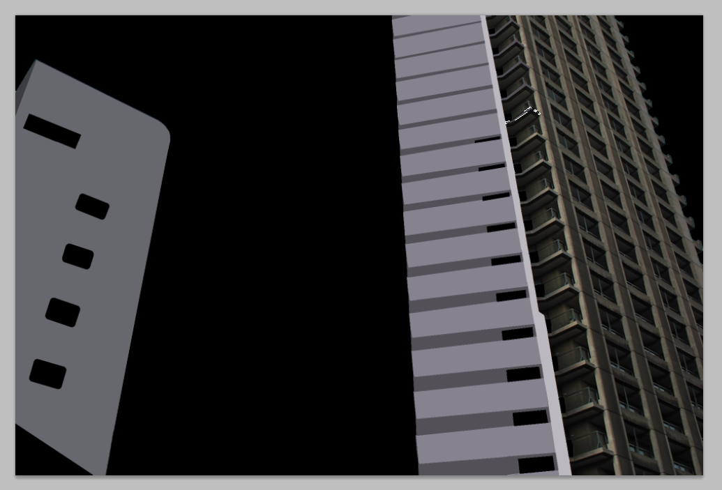
I tried to replicate Thomas Danthony's work in the same way how he simplifies brutalist architecture on photoshop into screen print images.
S T E P S O N P H O T O S H O P :
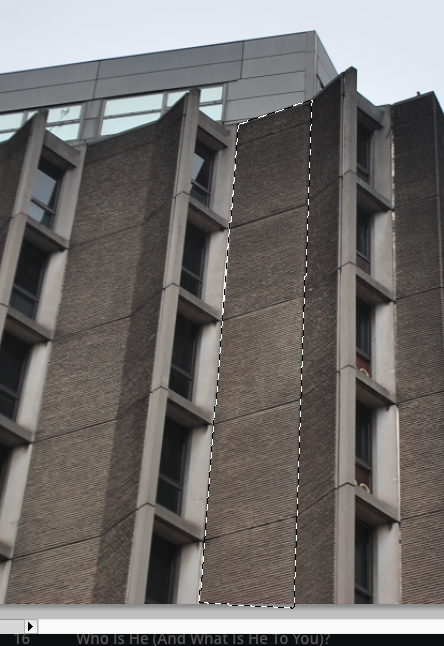
For my first attempt of creating this on photoshop, I used the lasso tool and individually chose the shades of grey I wanted to use as shadows and tones, however this took a very long time and the colours weren't consistent so when trying to do this again with different buildings, I used the lasso tool to select separate parts of the buildings and went to filter>blur>average to create my result.
|

|
|
|

|

A R T I S T & M E
T H O M A S D A N T H O N Y M Y R E S P O N S E
I used photoshop to try and recreated Thomas Danthony's simplification work. My first attempt wasn't successful however, I changed the technique and now my work looks more similar to his. My response has less black space behind it as the buildings fills up much more of the image, this take the concept of simplifying away as much more complex detail can be seen. Additionally, his work consists of more shades of grey and has gaps of black which adds to the simplification and the tones and shadows of the image, however, my work looks slightly more brown and no gaps were left as I chose to do it of a close up brutalist building;this makes my image look more block-like as not much shadows are seen. If I were to improve this, I would change the photo into black and white before I photoshopped it in order to create an image that looked more similar to Danthony's.
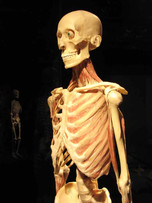
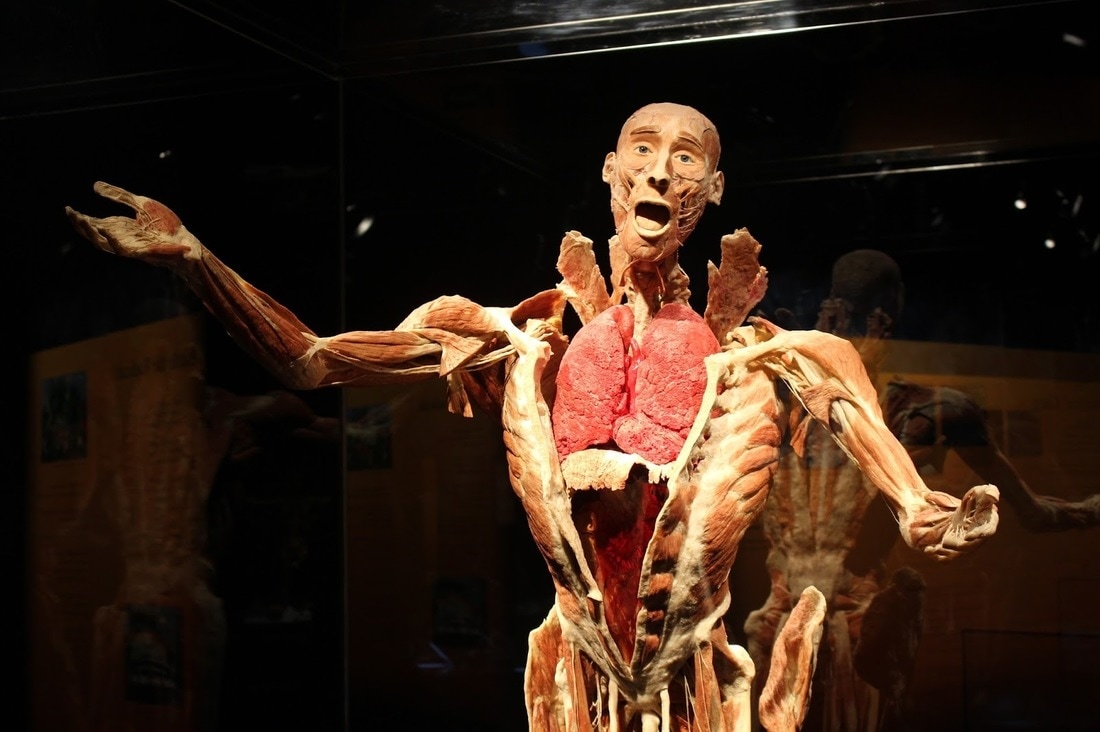
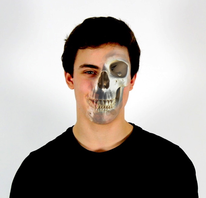
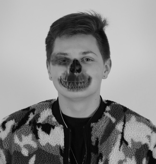
G U N T H E R V O N H A G E N S
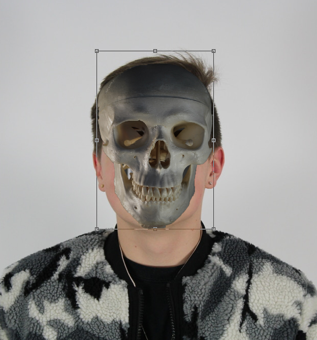
Gunther von Hagens is a German anatomist who invented the technique for preserving biological tissue specimens called plastination. "The anatomist alone is assigned a specific role-he is forced in his daily work to reject the taboos and convictions that people have about death and the dead. I myself am not controversial, but my exhibitions are, because I am asking viewers to transcend their fundamental beliefs and convictions about our joint and inescapable fate."

M Y R E S P O N S E
For my response to this I tried to use two different people and 1 skull as I wanted to see the variety of the outcome by changing them on photoshop. My second attempt was much better than my first as the skull blended into the face much more smoothly and the differences with how I used the skull on the eye are prominent. The second eye is much better as the skull eye in the first one looks unrealistic, and the skull isn't properly blended into the face. Whereas the second image is in black and white and I used the opacity tool to blend around the eye.
|
|
S T E P S O N P H O T O S H O P :


P E T E R H I C K L E Y
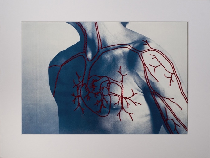
In his series complex series Peter Hickley creates a series of hand printed cyanotypes on watercolour paper and then hand stitched thread that represent the different muscle structures of the body. The blue cyanotype used is effective as it contrasts with the red stitches, this contrast makes the image more effective as it stands out more, and each and every thread can be seen in detail.
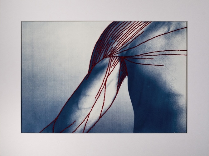

M Y R E S P O N S E
For my response I tried to recreate Hickley's work on photoshop instead of threading them. I changed the hue to blue and changed the contrast and brightness to make it as much alike to Hickley's work as I could. The image on the right work best with the colours as the left one is too dark and too blue, however I think the red veins on the neck of the first image are much more similar to the work above than my attempt on the right.


A R T I S T & M E
P E T E R H I C K L E Y M Y R E S P O N S E
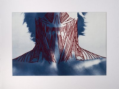

I used photoshop to respond to Peter Hickley's work. I think this was effective as the pen on photoshop gave similar effect to the thread Hickley used. My images wasn't done on cyanotype so I had to edit it to make it more blue, however this was hard as my image is much more blue than the artists. I did the same part of the body in order to have guidance, however it was still very difficult to try and draw lines on the neck. Additionally, the person I used had necklaces on which took away focus from the red lines. Furthermore, the red lines aren't as dark as I hopes as I decided to lighten the blue after drawing them on, which lightened the red too. To improve this I would take the image of the subject with her head up so I could draw further up the neck like Hickley did, change the colour balance and brightness of the blue and red to create a greater contrast, and to refine it further I would try to thread it on the image.
T H R E E S T R A N D S
As our exam theme is structure, I have decided to look at the structure of patterns in architecture through Kaleidoscopes as the architecture strongly relates to the theme, and the patterns aspect is a more abstract link to structure. My developments include looking at the structure of nature and plants. For my second strand I'm going to focus on Brutalism as I like to experiment with the angles and contrast levels to create more effective images. My final strand is on buildings again, however my developments show advances in what I experiment with on photoshop. I'm going to develop this strand into my final piece as I want to carry on my abstract experiments with buildings on photoshop.
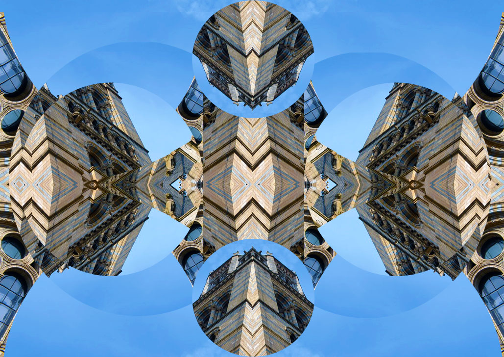
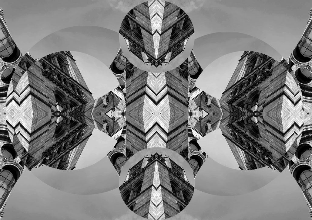
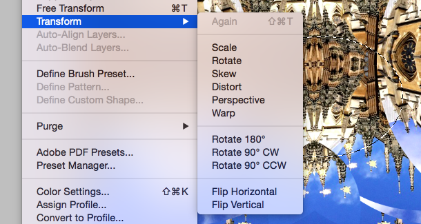
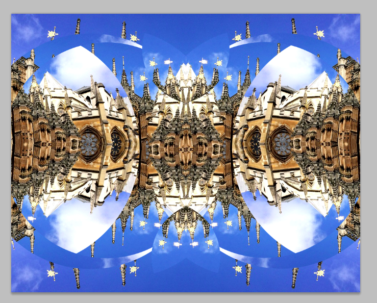
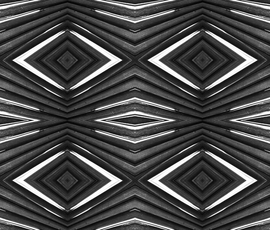
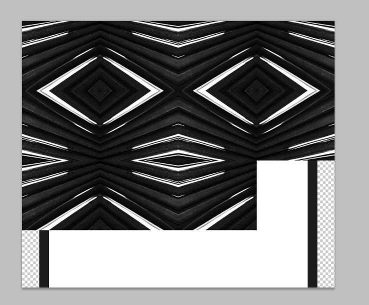
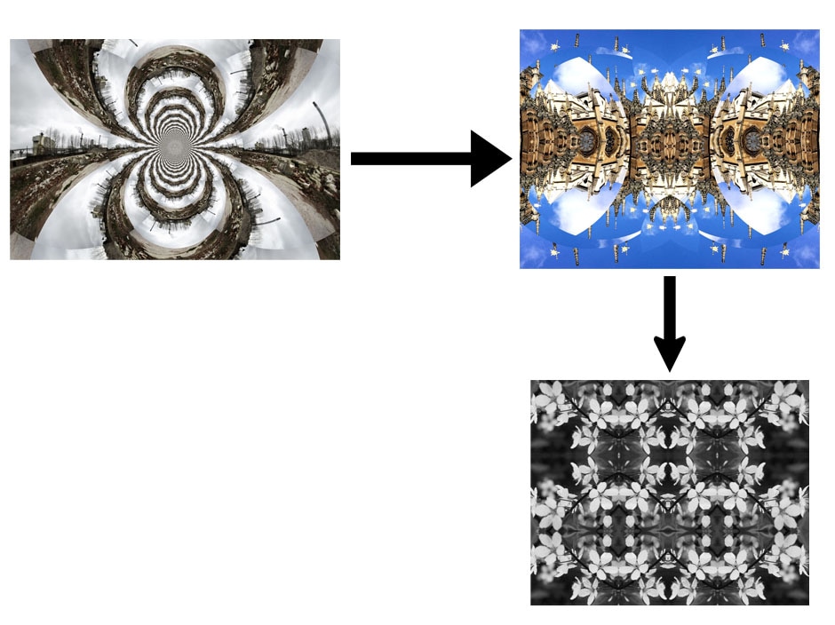
S T R A N D O N E
For my first strand I'm going to look at architecture and urban landscapes and develop this by creating a kaleidoscope. The urban environment displays the structure of our society as well as showing the architecture that exists within it. Furthermore, the use of the kaleidoscope further distorts the structure and makes the image look more abstract as ou can't quite tell what the image is of at first glance.
J A C K D E A N E
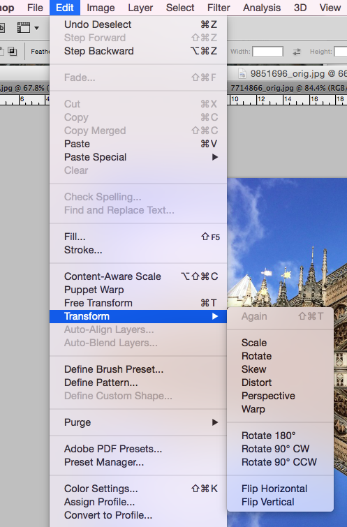
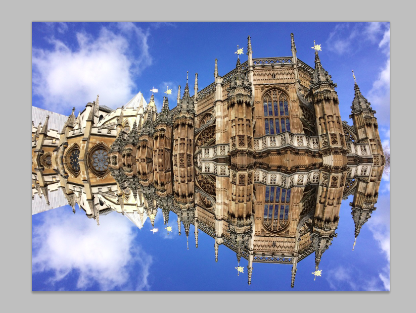
Jack Deane created these images on photoshop using the kaleidoscope tool.
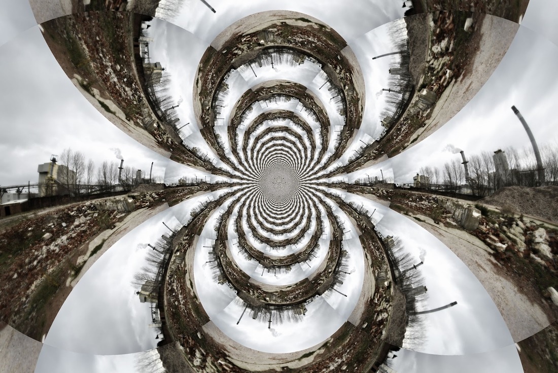
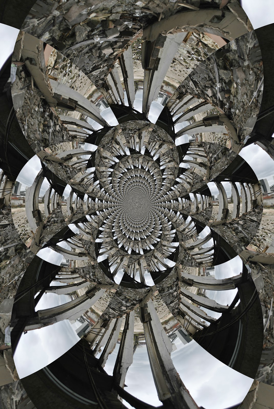
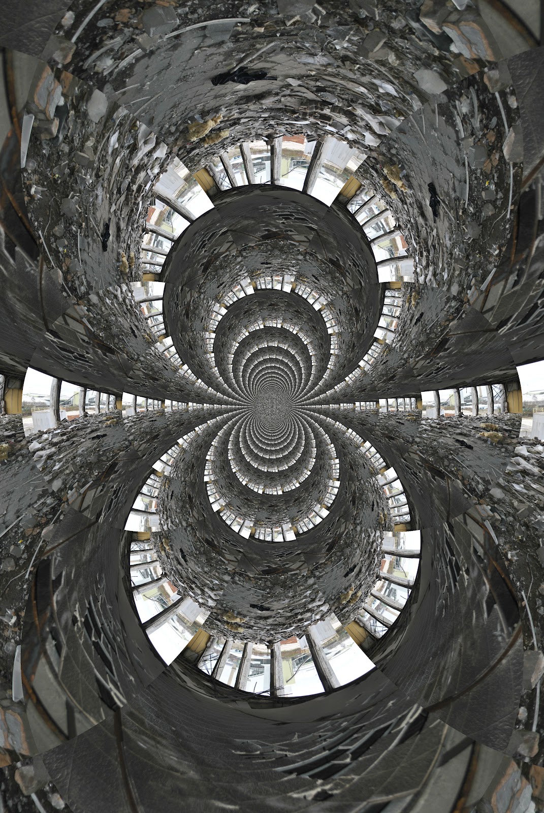
In responding to Jack Deane's work, I decided to try and use reflection and symmetry instead of making kaleidoscopes. I did this because they do give a similar result however the process allows you to change the outcome and shapes more than just repeating and creating a kaleidoscope. This allowed me to change the structure of my images more. I chose o manipulate images of imposing architecture

|
|
S T E P S O N P H O T O S H O P :
S E C O N D D E V E L O P M E N T
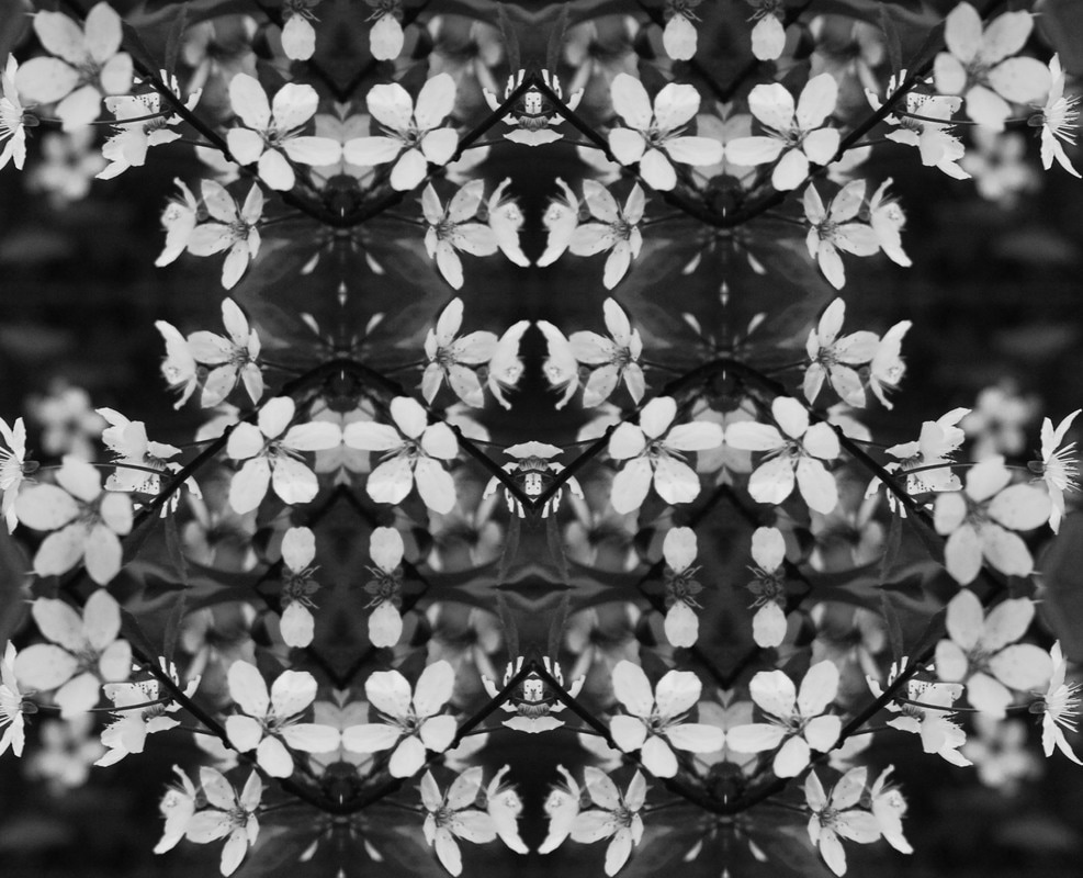
H O R S T ' S P A T T E R N S F R O M N A T U R E
Horst's book presented a series of straight, close-up, black-and-white shots of botanical specimens, including plants, shells, and minerals, naturally lit and often experimental in composition. They were taken in Mexico, New York Botanical Gardens, and along the Atlantic and Pacific coasts, using a 5×4 inch Graflex Graphic View camera and a Rolleiflex shooting 2¼x2¼ inch negatives. With these abstract studies of the natural world, there is an emphasis on repeated structures, both in the individual pictures and in their comparative pairing. All of the images shown are in black and white as they're negatives, however this also emphasises the contrast between the repeated images and the actual plants and the space in-between them. This displays a more exaggerated outline that clearly shows the differences in pattern in nature.
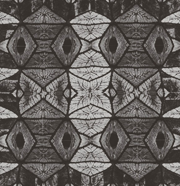

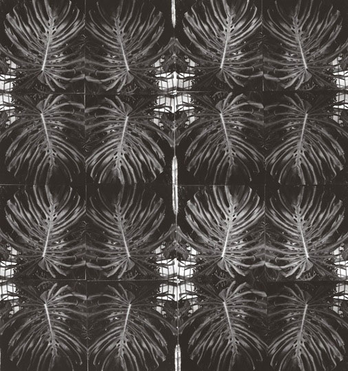
In order to respond to Horst's work, I took close up photos of trees, plants and flowers and edited them on photoshop to black and white on photoshop and changed the contrast and brightness levels to try and replicate his work. I then selected certain parts of the image and repeated these serval times until I got the effect I desired. I chose to do this in respond to the theme as structure as it reveals the structure within nature, as well as the actual physical structure of these aspects, and then this is developed even more by creating patterns and symmetry out of this.
S T E P S O N P H O T O S H O P :
I progressed from responding to Jack Deane's work of urban environment kaleidoscopes, with architecture, and developed this into responding to Horst's 'Patterns in Nature' by creating mirrored images of nature.
S T R A N D T W O
"The term originates from the French word for "raw" in the term used by Le Corbusier to describe his choice of material béton brut (raw concrete). British architectural critic Reyner Banham adapted the term into "brutalism" (originally "New Brutalism") to identify the emerging style."
For my second strand I'm going to continue with taking photos of brutalist architecture. I chose to develop this as a strand because I think that architecture best represents the theme of structure. I think that the rigid construction of these buildings show the stability and core meaning of structure.
For my second strand I'm going to continue with taking photos of brutalist architecture. I chose to develop this as a strand because I think that architecture best represents the theme of structure. I think that the rigid construction of these buildings show the stability and core meaning of structure.
S I M O N P H I P P S
M Y R E S P O N S E
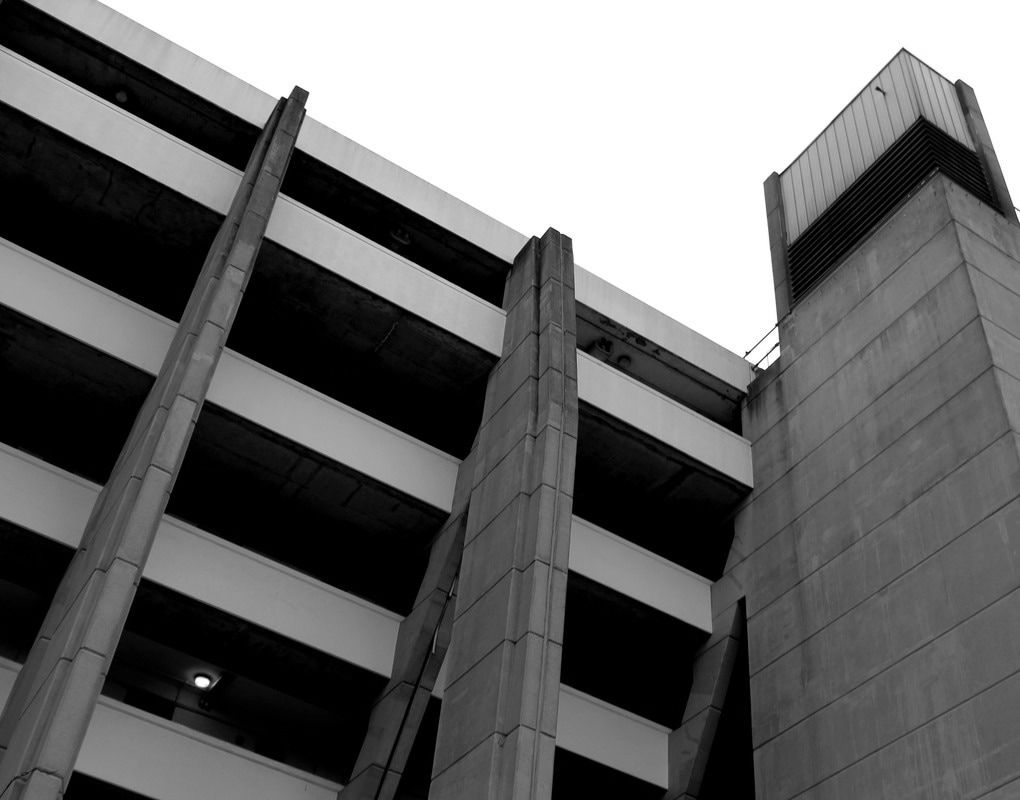
C L O S E U P I M A G E S
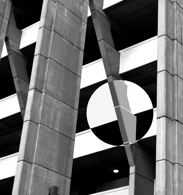
I decided to also take close up images and/or zoom into the images I've already taken to show the brutalist architecture's details. I edited them on photoshop to enhance the colours or make them black and white. This varies to the images I've taken previously of whole buildings as you can see a clear contrast in the style of building once you have zoomed into certain aspects of the image.
S E C O N D D E V E L O P M E N T
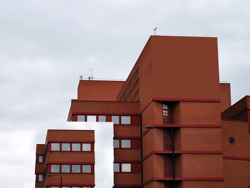
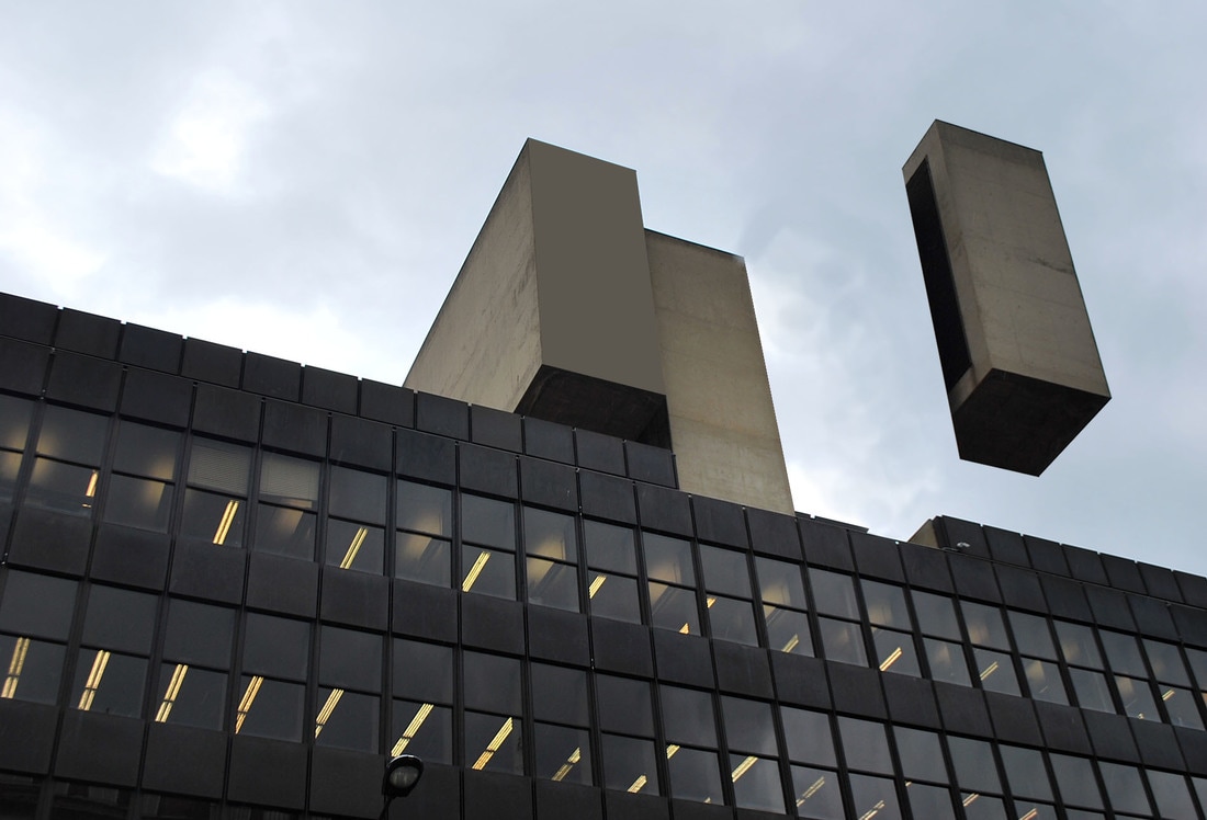
I chose to develop my work further by using Thomas Anthony's work as inspiration to create simplified images. I've used my previous brutalist images and only simplified some areas of the photo using the filter>blur>average to show a clear contrast between the edited and the real building. This relates to the theme structure as there are two variations of it; the simplified which shows the structure in a more defined way, it shows the tones and shadows used without actually seeing the picture, while the ,middle of the image is unedited and shows the more colourful structure that appears in brutalism.
T H I R D D E V E L O P M E N T
C H R I S D O V E
Chris Dove works in London, and he uses drawing as a way to get an idea from your mind to reality. He works as an architectural illustrator and is currently working through a series titled 'Rooves' that examines the urban grain of cities he's visited, through detailed illustrations of the rooftops and streets of the city.

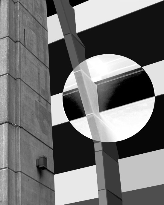
All of these images are architectural illustrations that have been drawn by Chris Dove as a means of expressing himself through drawing, which is what he loves to do in his free time. All of the drawings are very simple but have great detail concerning the tones and shadows. They're all in black and white, however the main focal point of each image is the circle of colour in each image. This creates a great contrast of colour and reveals the difference between the drawing and the coloured aspect bringing it to life. This catches your eye at first glance and makes you want to examine and appreciate the drawing and its details and contrast more deeply.
M Y R E S P O N S E :
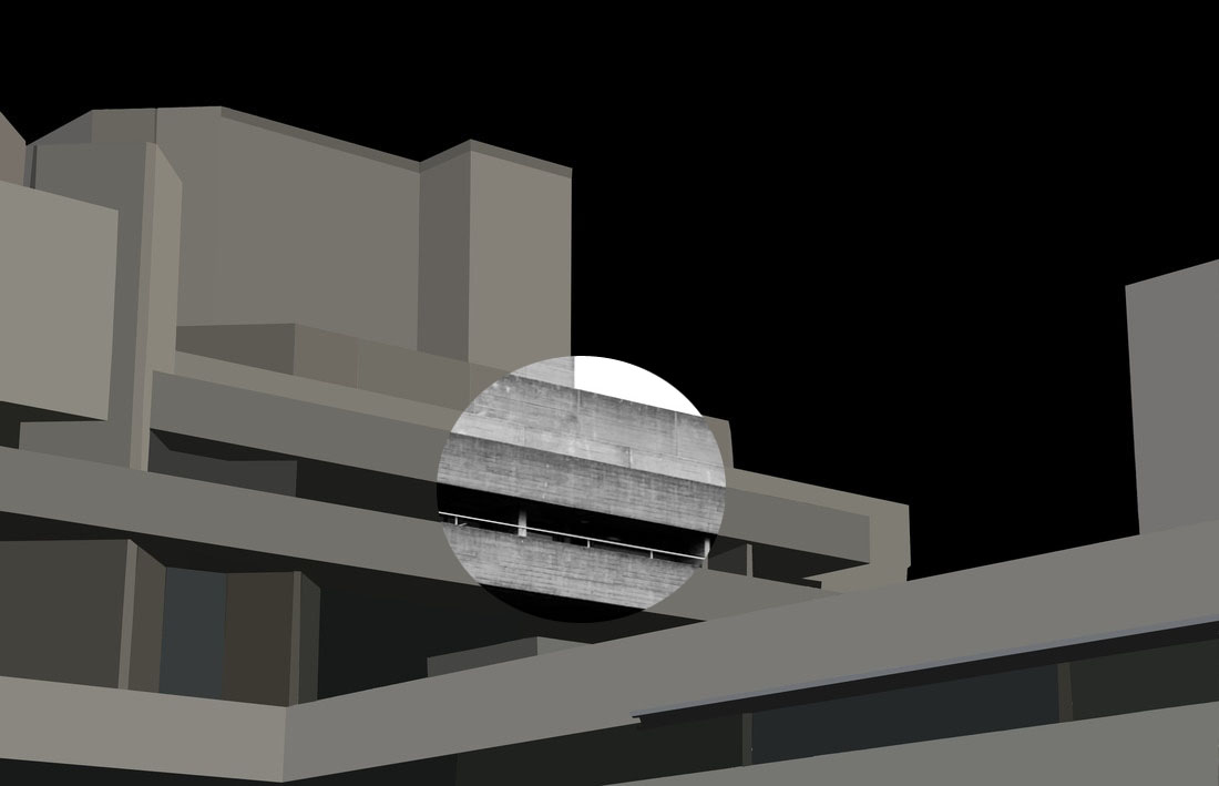
I tried to use this technique with another photo I had taken, I used the average tool on photoshop again to simplify the image. I then selected the ellipse tool and made a selection on the original, unsimplified version and copied and pasted to the corresponding place on the simplified version. However, as the image was already in black and white, I inverted the colours of the selected circles on the images to see a greater contrast, as previously not much difference between the two photos could be seen.
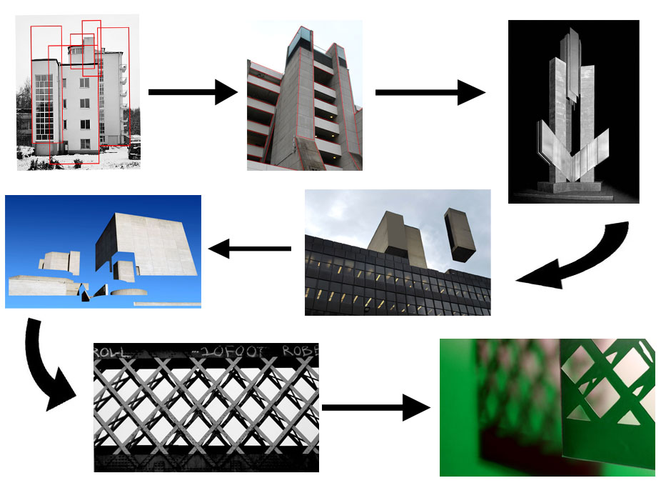
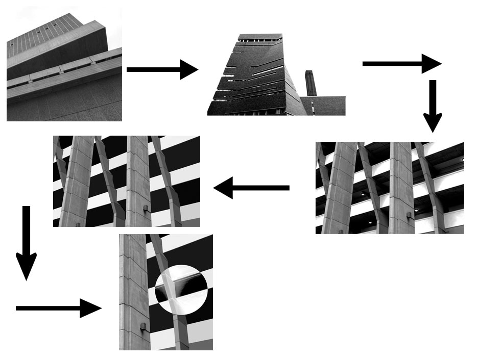
I started this strand by looking at Simon Phipps's brutalist work, I responded to this my visiting several brutalist locations such as Southbank, the Ministry of Justice, Brunswick Centre, the Institute of Education and Centre Point. I took wider angled photos and then focused on taking close up images of the brutalist architecture. I then developed this by created simplified images of these buildings on photoshop, and finally responded to Chris Dove.
S T R A N D T H R E E
A L E X E Y B O G O L E P O V
Alexey Bogolepov is a freelance photographer based in St Petersburg. His work focuses on the architecture and ideology of modernism, both in the former Soviet states and worldwide. With the rapid expansion of his neighbourhood he has witnessed a changing cityscape. "Where recently there were only swampy grasslands dotted with lonely wooden houses and unsightly garage cooperatives there is now, and will be in the foreseeable future, a never-ending construction site,” he says. "For an observer this is a chance to catch a territory in transition, in a delicate and almost poetic state of being not quite urban and not quite rural.”
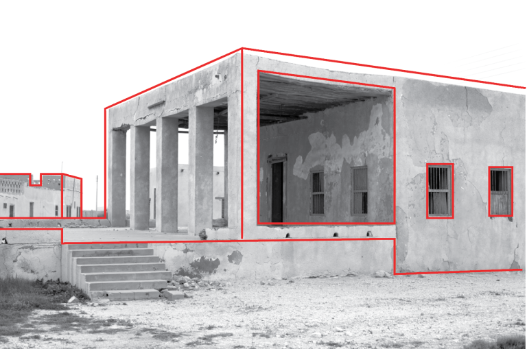
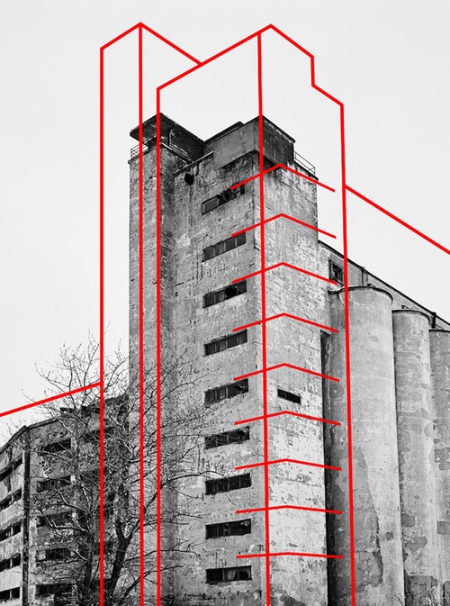
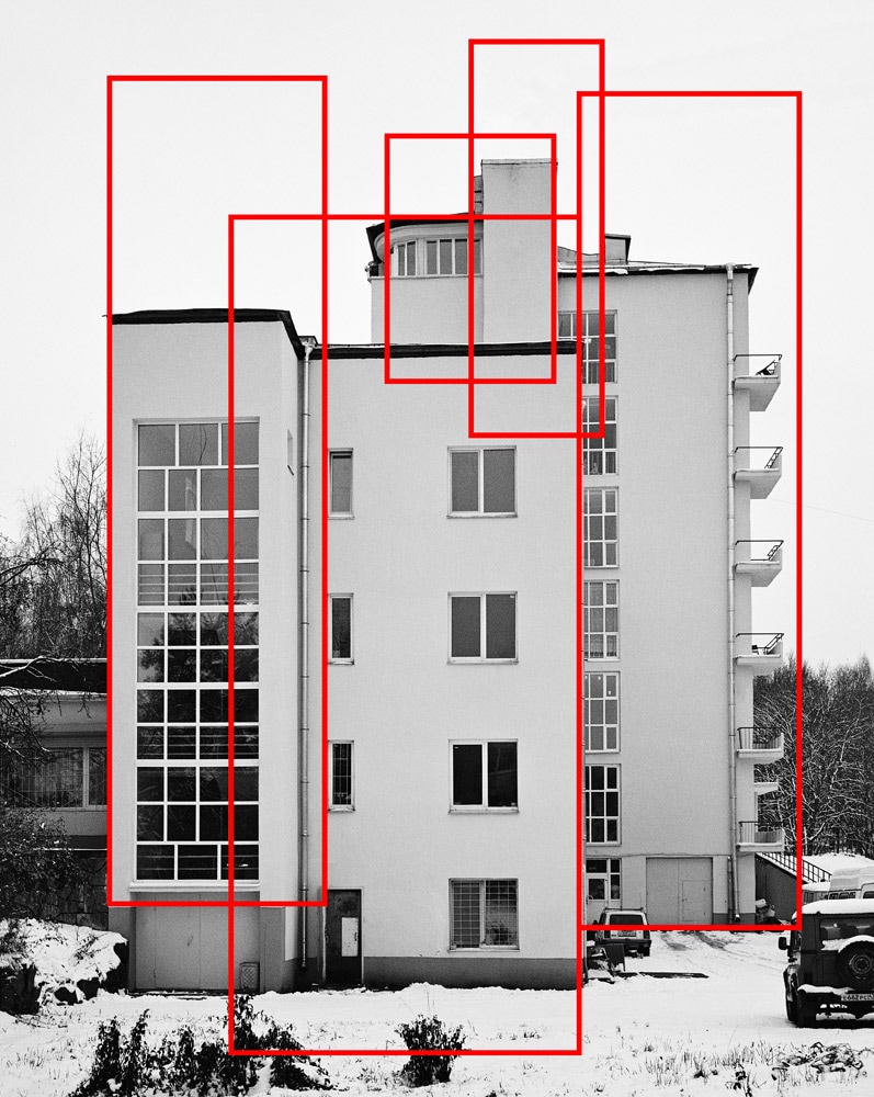
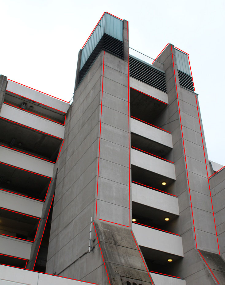
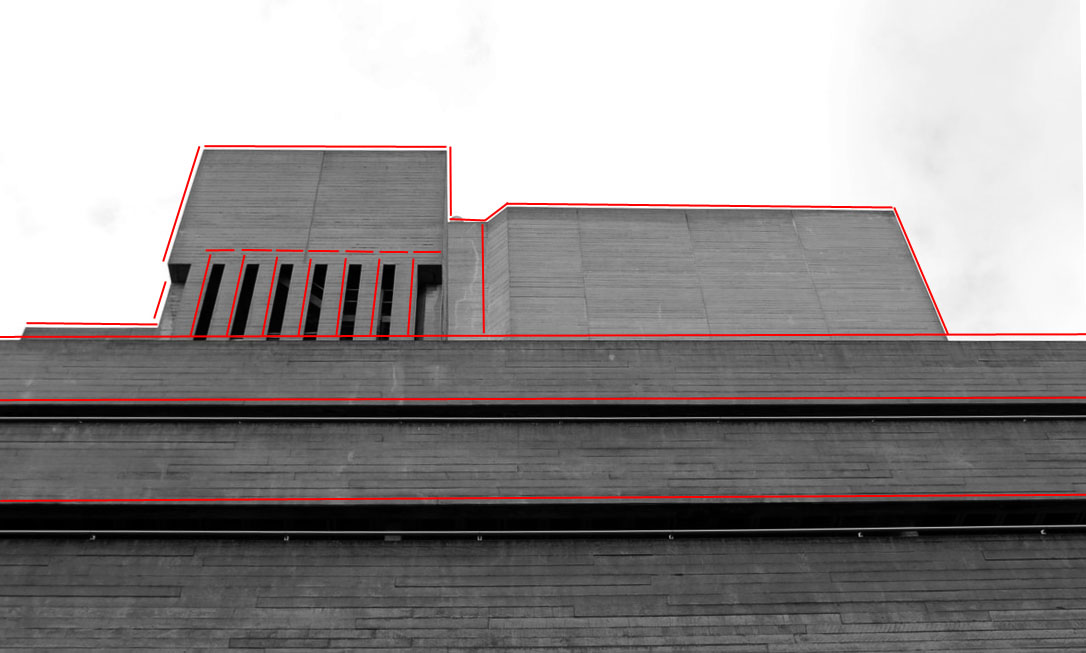
In response to Bogolepov's work I tried to recreate his work. By doing this, I went out and took more photos of buildings around London and then used photoshop to edit them in his style. I used the pen tool and changed the colour to red and dragged the lines in the corners and edges of the building. This enhanced and emphasised the structure of the buildings and created an outline that allows the viewer to see the design in a more rigid form.
M Y R E S P O N S E :
S E C O N D D E V E L O P M E N T
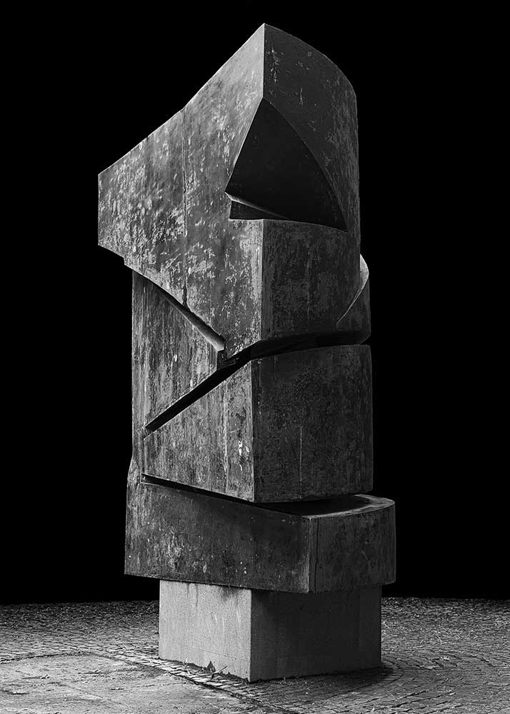
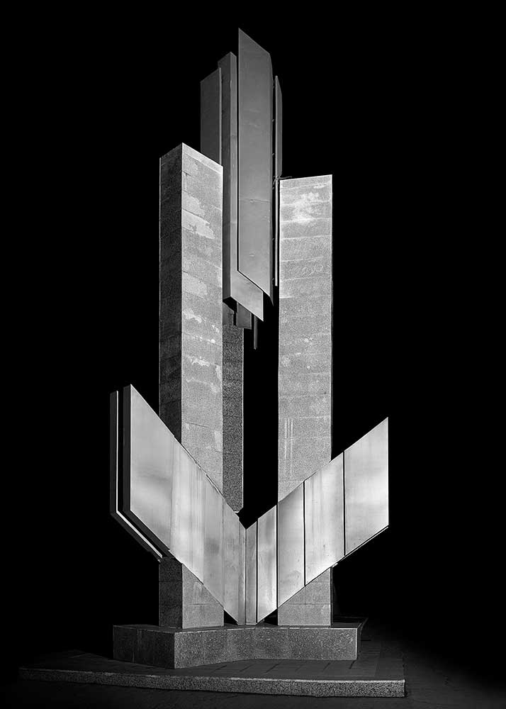
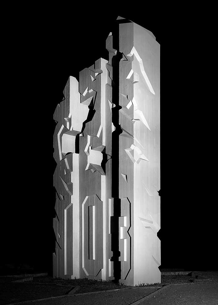
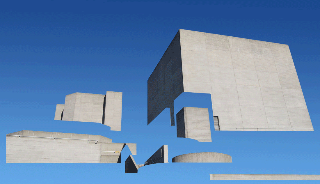
Alexey Bogolepov also created work in the style shown below, they appear to be abstract sculptures of concrete or metal, I chose to respond to this work as I think that it shows a different type of simplified structure, which is enhanced by the solidarity of the standing sculpture against the black background.
M Y R E S P O N S E :
I created these images by selecting one of the images of buildings I had taken and edited it on photoshop. I turned my image black and white and made it 180 degrees in order to make it look more abstract. I used the magic wand tool to select the background and fill it with black and then used the polygonal lasso tool to select certain parts of the building and filling those selected parts with black too. I did this with different shapes and blocks of the image until I got a result which I thought looked more like a sculpture than the picture of the original building.
|
|
To improve my work I would've chose more obvious brutalist images, as the concrete structure would have looked more abstract and unrecognisable as a new, edited building. Additionally, I would cut out more parts of the building in order to change the shape and appearance like Bogolepov's work.
T H I R D D E V E L O P M E N T
For my third development I'm going to start the process of deconstructing buildings on photoshop. I'm going to do this so that it looks very natural and so that the rest of the photo looks normal apart from two aspects. I'm using the concept of simplifying my images in a different way. I'm only going to simplify one or two faces of the buildings and separate one part of the structure so that it looks normal at first glance, however the structure has been slightly distorted. I wanted to do this because I'm slowly going to develop my work into more abstract concepts of structure, but portraying this through rigid concepts of structure - buildings. I'm leaving the background in colour so that the images look more natural, but slightly surreal at the same time; due to the slow deconstruction.
S T E P S O N P H O T O S H O P :
I used two concept to create these images. (Hover over the gallery to see the steps).


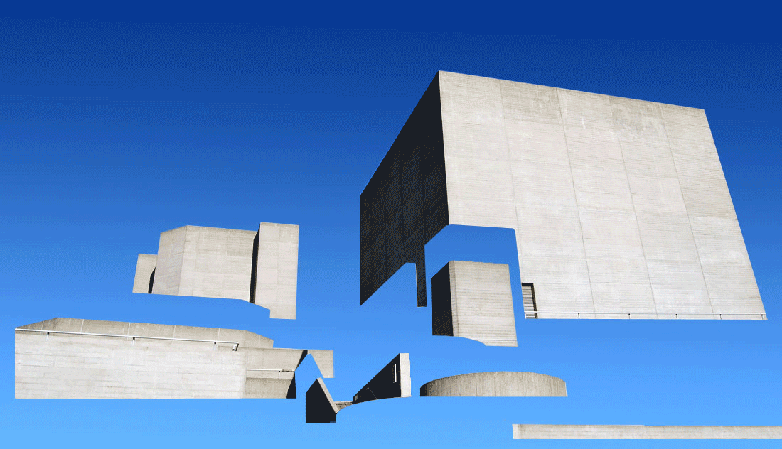
F O U R T H D E V E L O P M E N T
Using Espen Dietrichson, I'm going to continue developing this aspect of structure by using his work of deconstruction architecture. I've taken many pictures of buildings around London that I can deconstruct by using photoshop. My last development consisted of this aspect of deconstruction, however, I'm going to develop it much more and deconstruct the whole building. This will give the surreal/abstract impression of structure that I want to achieve through my developments. My first attempt wasn't that successful as the background of different shades can be seen, and the buildings looks very 2D and just as if it had been cut up, which is not the effect I wanted to achieve. To improve my second attempt I would have created a more 3D images by cutting out more parts of the buildings and changing the contrast and position to create back walls of the building.
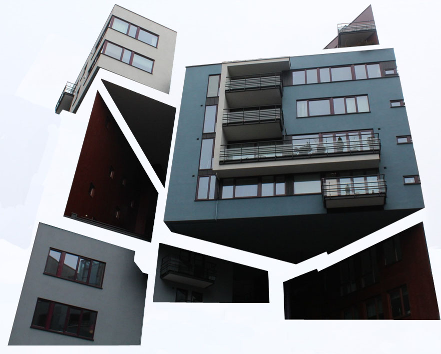
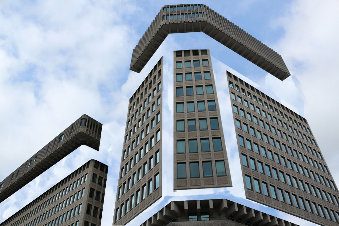

P R O C E S S : I selected each block of the building individually, and each time I used the clone tool to recreate the background and use the tool to colour in the selected area. This was hard as the image that had clouds as a background was particulry hard to made it look natural. I did this with each segment of the building and replaced them in different areas. My first two attempts weren't great as they looked very 2D, and the backgrounds didn't look natural. To improve this I used a brutalist buildings with a more rigid structure and I think the result was a lot better. The sky originally was blue however it was very hard to clone, so I used the colour picker and the gradient tool to try and recreate the sky in the most natural way.
F I F T H D E V E L O P M E N T
I changed the opacity by 20% between each frame, saved them and created a gif on photoshop in two different styles. The aim of this was to show the fluid deconstruction of the building, as a whole image, and with each part disappearing one at a time.
S I X T H D E V E L O P M E N T
Although there isn't a completely direct link between my fifth and sixth development, I was increasing the amount of abstraction I used in each development to get to this point. I started to focus less on the actual structure of the buildings, and by looking at the structural shapes made from the deconstruction, I decided to focus more on the structure of the shapes and geometry that originated from the architecture of the buildings. This is why I have chose Kate Jackling to use as inspiration, as she indirectly links the themes of abstract structure of geometry within buildings, to create my final piece.
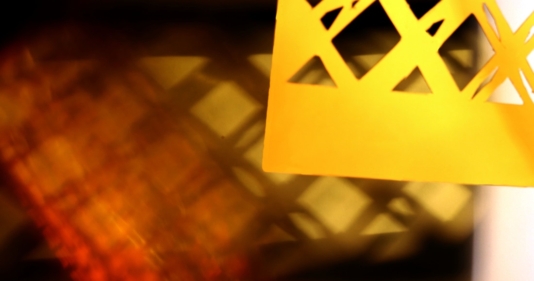
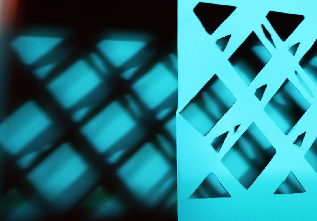
K A T E J A C K L I N G
Kate Jackling is a London based still life photography, she plays with shadows and reflections to create abstract images. She uses different shapes and sizes of mirrors and card and varies the light i order to obtain these different results. They create effective lack and white images with high contrast to create photographs that create big projections and fill the image; creating different shapes and angles with the light. The images are always in the centre, which instantly focuses your attention on them, further enhancing the contrast of the shapes.
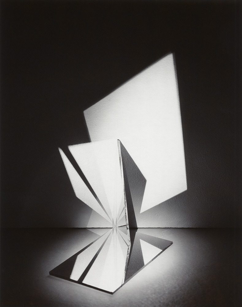
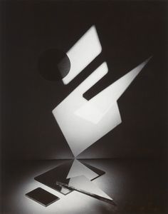
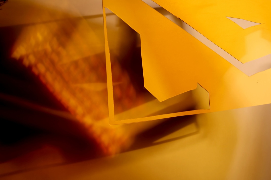
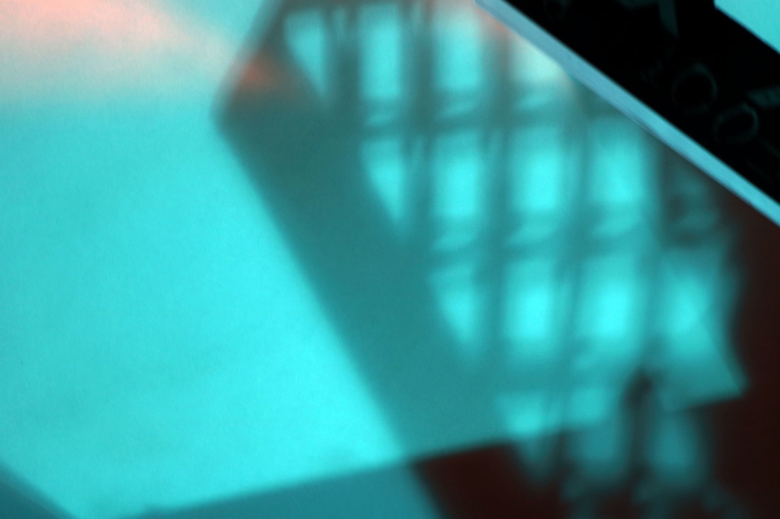
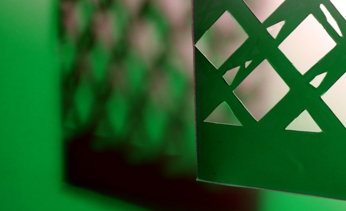
I'm using this artist as a development in relation to structure as I'm going to take more photos of architecture that display sharp angles and interesting shapes. I'm then going to manipulate them on photoshop by making them black and white and changing the contrast to make my next step easier, before printing them out onto card in order to develop my previous idea of simplified images, to create the most simplified varied of my photographs. Then I'm going to place these in the studio, using light, shadows, coloured acetate and mirrors to create coloured abstract images of structure.

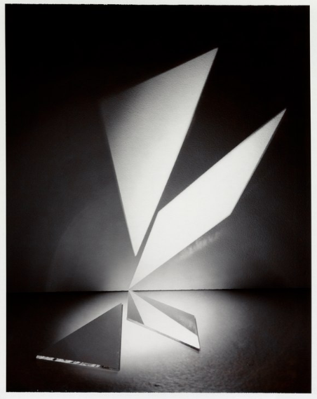
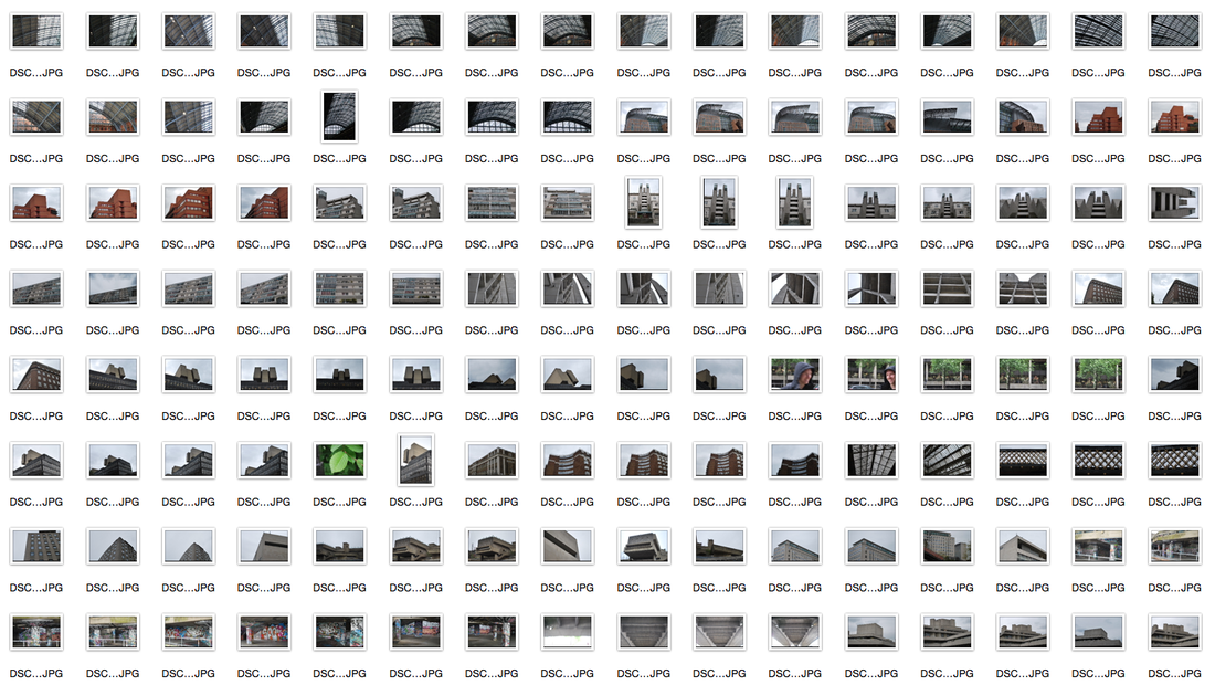
These are the five images I chose from my contact sheet that I wanted to develop into my final piece. I made them all black and white, printed them out on a4 paper and stuck them to card. I decided to only use the bottom two as they had the most intricate patterns, I used a cutting board and a stanley knife.
M Y R E S P O N S E


F I N A L P I E C E S


My final strand had several developments as it is the one I chose to develop into my final piece. Below is my development process. I looked at two types of Alexey Bogolepov's work, firstly I outlines architecture with a red pen on photoshop; this was in order to emphasise the rigid structures of these buildings. Next I looked at the work he did that made buildings look like sculptures, I wanted to do this as the black background enhanced the brutalist structures whilst also not quite being able to tell what the building actually was. I hose to do this as I decided I wanted to start making my developments abstract in structural ways so it could lead up to my final piece. From there, I started deconstructing buildings, and also using the simplification process seen in my second strand. Then I took brutalist buildings and completely deconstructed three of them, and then made gifs to show the deconstruction process. The next development I did directly linked to my final piece, I used photos that I took that either were brutalist, or had evident geometric shapes, edited them on photoshop, printed them out onto card, cut them out and used the studio lights and acetate to create my final pieces.